Learn Coding Visually
Learn to code with interactive, live-preview playgrounds — HTML, CSS, JavaScript, React & more.
 HTML Playground42 lessons · Click-based · Live preview
 CSS PlaygroundLearn CSS with a live editor
 JavaScript Playground60 lessons · DOM · Async · Canvas
 React PlaygroundLearn React with a live code editor
 GSAP PlaygroundLearn GSAP animation interactively
 SVG Playground44 lessons · shapes · paths · animation
 SCSS Playground45 lessons · Sass modules · tokens
 Tailwind PlaygroundLearn Tailwind CSS with a live editor
 Bootstrap 5 Playground50 lessons · live preview
Auth Login Card — Sign-In Form UI Snippet
Auth Login Card · Forms · Plain HTML, CSS & JS · Live preview
What's included
Features
About this UI Snippet
Auth Login Card — Social Sign-In, Validation, Show Password & Loading State
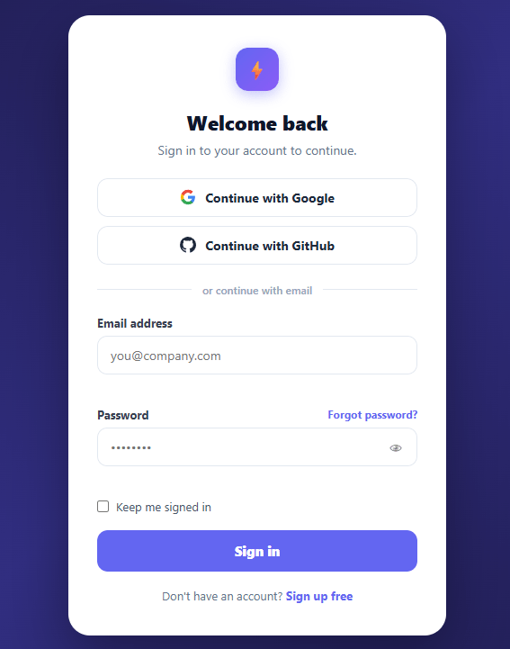
A login card is the single most-visited UI in any authenticated application and one of the most-searched UI components on the web. First impressions of the authentication screen directly affect sign-up and sign-in completion rates. This snippet provides a production-quality login card with social sign-in buttons (Google and GitHub), an email/password form, client-side validation, a show/hide password toggle, a "Keep me signed in" checkbox, an inline loading state, and a forgot-password link — the full set of elements a real login screen needs.
Social sign-in first
The social sign-in buttons appear above the email form because most users prefer a one-click sign-in with a trusted provider over managing another password (a magic link is another low-friction option). The "or continue with email" divider is a standard pattern that lets the email form remain available without competing for visual attention. The divider uses flex with pseudo-element lines for a pure-CSS implementation that scales to any card width.
Client-side validation
The form validates on submit (not on every keystroke, which is frustrating). Email is checked with a lightweight regex for the at-sign and dot pattern. Password requires at least eight characters. setError() applies an error border class and writes a message below the field; a successful field clears both. The error state persists until the user fixes it and re-submits, which is the right convention — clearing the message on every keystroke is distracting.
Loading state
On submission, the button is disabled and its label changes to "Signing in…". This prevents double-submission (a common bug) and gives users immediate feedback that the form was received. On error, the button is re-enabled and an inline error message appears under the email field, because invalid credentials are an email-level error in the standard login flow.
Show/hide password
The eye button toggles the password field between type="password" and type="text" — the standalone password toggle snippet covers just this. On a sign-up form, pair it with a password strength meter. This reduces login failures from typos and is expected by users, especially on mobile where hidden-character typing is error-prone.
Autocomplete attributes
The email input has autocomplete="email" and the password has autocomplete="current-password". These are the correct values for a sign-in form. Browsers and password managers use these attributes to offer the right auto-fill suggestions, which significantly increases completion rates on return visits.
Accessibility
Every input has an associated label (via for/id). Error messages are associated by id. The show/hide button has a title attribute for screen readers. Focus styles are visible with a ring. These details matter for WCAG compliance and reduce friction for all users.
Build with AI
Build, Understand, Optimize, and Extend It With AI
Rather than reading every branch of handleLogin() yourself, paste this snippet's HTML, CSS, and JS into an AI coding assistant like Claude and ask it to explain exactly why validation runs on submit rather than on every keystroke, or why the socialLogin() handler reads event.currentTarget instead of taking the button as a parameter. The same assistant can help optimize it — ask whether the setTimeout-simulated API calls should be replaced with a real fetch and AbortController so a slow network doesn't leave the button stuck in "Signing in…", or whether the setError() pattern of manipulating a sibling error span by id would break if two fields shared an id. It's also good for extending the form: ask it to add a rate-limit lockout after repeated failed attempts, wire in a magic-link fallback next to the password field, or add real password-strength feedback tied to the existing show/hide toggle. Treat the code less like a finished artifact and more like a starting point for a conversation.
Prompt to recreate it
Copy this into your AI assistant of choice to build the effect from scratch, or as a jumping-off point for your own variant:
Build an "auth login card" in plain HTML, CSS, and JavaScript — no framework, no build step.

Requirements:
- A centered card with social sign-in buttons (using real brand-colored inline SVG logos) stacked above an "or continue with email" divider built from flexbox and pseudo-element lines, followed by an email/password form.
- The password field must have a show/hide toggle button that switches the input's type attribute between password and text, using a single icon button (not two swapped icons is fine, but the type-swap logic must be correct).
- Validation must run only on form submit (not on every keystroke): check the email against a simple regex requiring an @ and a dot, and require the password to be at least 8 characters. Invalid fields must get an error CSS class on the input plus a specific inline error message in a dedicated span tied to that field.
- On successful client-side validation, disable the submit button and change its label to a loading state (e.g. "Signing in…") before the simulated API call, then reset the button and show a specific inline error under the email field if the simulated call "fails" — mirroring how a real backend would report "no account found."
- Each social button must independently show its own loading state (disable itself and change its own label) when clicked, using the actual clicked button rather than a hardcoded reference, so multiple social buttons don't interfere with each other.
- Use correct autocomplete attribute values (email, current-password) on the respective inputs so browser password managers offer the right autofill suggestions.
- Include a "Keep me signed in" checkbox and a "Forgot password?" link positioned inline with the password field's label.
Want to tighten it up first? Run this prompt through the AI Prompt Studio to score it across 8 quality dimensions, catch anti-patterns, and tune the wording for Claude, ChatGPT, or Gemini before you paste it in.
Step by step
How to Use
- 1Try social sign-inClick "Continue with Google" or "Continue with GitHub" to see the loading state. In production, these buttons redirect to the OAuth provider.
- 2Enter email and passwordType in the email and password fields and click Sign in to see the validation and loading state.
- 3See validation errorsSubmit with an invalid email or a short password to see inline error messages and error borders.
- 4Toggle password visibilityClick the eye icon to show or hide the password characters — useful for checking a typo on mobile.
- 5Wire to your auth systemIn handleLogin(), call your authentication API (or an SDK like Auth.js, Supabase, or Firebase Auth) with the email and password, and redirect on success.
- 6Export for your frameworkClick "React" for a component with form state in useState and validation logic in the submit handler. Click "Vue" for a Vue 3 SFC with reactive refs.
Real-world uses
Common Use Cases
Got questions?
Frequently Asked Questions
On-keystroke validation triggers errors while the user is still typing — showing "invalid email" after typing "hello" before they have had a chance to type the "@" is frustrating. The convention in modern auth forms is to validate on submit (catching the complete value) and then clear the error once the user corrects the field and re-submits. This gives feedback at the right moment without interrupting typing.
The email input should have autocomplete="email" and the password should have autocomplete="current-password". These are the values the HTML spec defines for sign-in forms. "current-password" signals to browsers and password managers that this is an existing credential (not a new one to be set), triggering the right auto-fill suggestion. Using autocomplete="off" breaks password manager integration, which significantly hurts completion rates.
In handleLogin(), after validation passes, call your auth API: for Auth.js use signIn("credentials", { email, password, redirect: false }), for Supabase use supabase.auth.signInWithPassword({ email, password }), for Firebase use signInWithEmailAndPassword(auth, email, password). On success, call router.push("/dashboard") (Next.js) or navigate("/dashboard") (React Router). On failure, re-enable the button and call setError("email", error.message) to show the server error inline.
Keep email, password, and errors (an object keyed by field) in useState. The submit handler validates locally, sets errors in state, then calls your auth API. Use a loading boolean in state to disable the submit button and change its label during the API call. The show/hide toggle keeps a showPassword boolean in state and toggles the input type prop. Error messages render conditionally below each field from the errors state object. For the Tailwind version, click "Tailwind" to get the same markup with utility classes instead of a scoped stylesheet.