Password Show/Hide Toggle — CSS/JS Snippet

Password Show/Hide Toggle · Forms · Plain HTML, CSS & JS · Live preview

Share & Support

What's included

Features

Reveals the password by swapping input type between password and text
Eye / eye-off icon swap driven by CSS and aria-pressed (no JS redraw)
Icon sits inside the field via relative wrapper + input right padding
Button is type="button" so it never accidentally submits the form
Accessible: aria-pressed toggle state and an aria-label that updates
Keeps caret focus after toggling so typing is uninterrupted
Inline SVG icons inherit currentColor for easy theming and hover
Clear input focus ring for keyboard and form-fill users
Works with autofill and password managers (native input preserved)
Export as HTML file, React JSX, or React + Tailwind CSS

About this UI Snippet

Password Show/Hide Toggle — Eye Icon Reveal with type Swap & ARIA
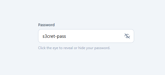
Screenshot of the Password Show/Hide Toggle snippet rendered live

A password show/hide toggle is one of the most-searched form snippets because nearly every login, signup (often beside a password strength meter), and reset-password form needs one — letting users reveal what they typed dramatically reduces password-entry errors and failed logins. This snippet is a complete, accessible implementation: a password field with an eye icon inside it that toggles the field between hidden and visible, swaps between an "eye" and "eye-off" icon, and keeps full keyboard and screen-reader support with aria-pressed and aria-label.

How the reveal works: swapping the input type

The entire reveal is one line of logic: switch the input's type between "password" and "text". When type="password", the browser masks the characters as dots; when type="text", it shows them in plain text. The togglePw function reads the current type, flips it, and the browser instantly re-renders the value masked or unmasked. There is no separate "shadow" field and no manual character masking — you let the native input do the work, which means autofill, password managers, and the value itself all keep working correctly through the toggle.

Positioning the eye button inside the field

The eye toggle sits *inside* the input on the right. This is done by wrapping the input and button in a position: relative container (.pw-field), giving the input right padding (padding-right: 46px) so typed text never runs under the icon, and absolutely positioning the button at right: 6px; top: 50%; transform: translateY(-50%) to center it vertically. The button is a real <button type="button"> — crucially type="button" so it does not submit the form when clicked, a bug that catches many implementations. It has its own hover state (color + soft background) so it reads as interactive.

Two icons, one shown at a time

The button contains two inline SVGs: an open .eye and a crossed-out .eye-off. Rather than redraw an icon in JavaScript, the snippet keeps both in the DOM and shows the right one with CSS driven by the button's aria-pressed state: .toggle[aria-pressed="true"] .eye { display: none } and .toggle[aria-pressed="true"] .eye-off { display: block }. So when the password is visible (aria-pressed="true"), the crossed-out eye shows ("click to hide"); when hidden, the open eye shows ("click to reveal"). Using inline SVG keeps the icons crisp at any size and lets them inherit currentColor for hover and theming.

Accessibility done properly

Password toggles are a frequent accessibility miss, so this snippet wires up the correct semantics. The button is a toggle, so it uses aria-pressed ("false" when the password is hidden, "true" when shown) — screen readers announce it as a toggle button and its state. The aria-label updates between "Show password" and "Hide password" so the button always describes the action it will perform. The visible label is associated with the input via for/id. After toggling, the script calls input.focus() so the caret stays in the field and the user can keep typing without interruption. Because it is a native button, it is keyboard-focusable and activates on Enter/Space.

Why reveal-on-demand instead of always-visible

Showing the password by default is a privacy risk (shoulder surfing), and hiding it always causes typos. The toggle is the right balance: masked by default, revealable on demand. A common UX refinement is to reveal only while the button is held down (mousedown/mouseup) rather than as a sticky toggle, which is even more private; the click-toggle in this snippet is the most familiar pattern and the easiest to use on touch devices. Either way, never store or log the plain value when revealing — the input type change is purely visual.

The input focus state

The field has a clear focus treatment — border-color: #6366f1 plus a soft box-shadow ring — so keyboard users and form-fillers can see which field is active. The right padding reserves space for the icon at every state, so the layout never shifts when the icon swaps. A small hint line under the field explains the control, which is helpful on signup forms.

Customizing the toggle

Re-theme by changing the input focus color, the button hover color, and the icon stroke (it uses currentColor). To move the icon to the left, flip the padding and the button's position. To implement press-and-hold reveal, replace the onclick with onmousedown/ontouchstart to show and onmouseup/onmouseleave to hide. To add a caps-lock warning (a common companion feature), listen for keyup and check event.getModifierState('CapsLock'). Because the field is a normal input with one tiny handler, it slots into any login, signup, reset, or change-password form.

Step by step

How to Use

  1. 1
    Copy the fieldCopy the .pw-field wrapper with its <input type="password"> and the .toggle button containing both eye SVGs.
  2. 2
    Keep type="button"The toggle must be type="button" so clicking it never submits the form. The input keeps right padding so text clears the icon.
  3. 3
    Wire the handlertogglePw flips the input type between password and text and updates aria-pressed and aria-label. Keep input.focus() so typing is not interrupted.
  4. 4
    Re-theme itChange the input focus color, the button hover color, and the SVG stroke (currentColor) to match your form.
  5. 5
    Optional: hold-to-revealSwap the onclick for mousedown/mouseup (and touch events) if you prefer to reveal only while the button is pressed.
  6. 6
    Export in your formatClick "HTML" for a standalone file, "JSX" for a React component, or "Tailwind" for a React + Tailwind version.

Real-world uses

Common Use Cases

Login and signup forms
The standard show/hide control on every password field — fewer typos means fewer failed logins and frustrated users.
Password reset & change forms
Let users confirm their new password is correct before submitting, reducing reset loops and support tickets.
Accessible toggle button
Learn the correct aria-pressed pattern and label updates so the reveal control is announced properly by screen readers.
Learn the type-swap technique
See how switching input.type between password and text is the simplest, most reliable way to mask and reveal a value.
Reusable password input
Add the icon-in-field pattern to your design system so every password input across the app behaves consistently.
Privacy-aware reveal
Masked by default, revealable on demand — and easily upgraded to hold-to-reveal for extra shoulder-surfing protection.

Got questions?

Frequently Asked Questions

Toggle the input's type attribute between "password" (masked dots) and "text" (plain text). A small click handler reads the current type, flips it, and the browser instantly re-renders the value. No separate field or manual masking is needed — the native input does the work, preserving autofill and password managers.

Inside a <form>, a <button> without a type defaults to type="submit", so clicking the eye would submit the form. Setting type="button" makes it a plain control that only runs the toggle handler.

It uses aria-pressed to expose the on/off state ("true" when the password is visible) so screen readers announce it as a toggle button, and aria-label updates between "Show password" and "Hide password" to describe the next action. The button is a native, keyboard-operable <button>.

Keep both inline SVGs in the button and show one at a time with CSS driven by aria-pressed: .toggle[aria-pressed="true"] .eye { display:none } and .eye-off { display:block }. This avoids redrawing icons in JavaScript and keeps them crisp.

Yes. Replace the onclick with mousedown/touchstart to set type="text" and mouseup/mouseleave/touchend to set it back to "password". Hold-to-reveal is more private than a sticky toggle since the password is never left visible.

Yes. Click "JSX" for a React component or "Tailwind" for a React + Tailwind version. In React, hold a "visible" boolean in useState, set the input type from it, and toggle it in onClick while updating aria-pressed and the label — the same structure, declaratively.

Password Show/Hide Toggle — Export as HTML, React, Vue, Angular & Tailwind

HTML
<!DOCTYPE html>
<html lang="en">
<head>
  <meta charset="UTF-8" />
  <meta name="viewport" content="width=device-width, initial-scale=1.0" />
  <title>Password Show/Hide Toggle</title>
  <style>
    * { box-sizing: border-box; margin: 0; padding: 0; }
    body {
      font-family: system-ui, sans-serif;
      background: #f1f5f9;
      min-height: 100vh;
      display: flex; align-items: flex-start; justify-content: center;
      padding-top: 90px;
    }
    
    .login { width: 100%; max-width: 320px; }
    label { display: block; font-size: 13px; font-weight: 600; color: #475569; margin-bottom: 7px; }
    
    .pw-field { position: relative; }
    
    .pw-field input {
      width: 100%;
      padding: 12px 46px 12px 14px;
      font-size: 15px; font-family: inherit;
      border: 1.5px solid #cbd5e1;
      border-radius: 10px;
      outline: none;
      transition: border-color 0.15s, box-shadow 0.15s;
      letter-spacing: 0.02em;
    }
    .pw-field input:focus { border-color: #6366f1; box-shadow: 0 0 0 3px rgba(99,102,241,0.15); }
    
    .toggle {
      position: absolute;
      right: 6px; top: 50%; transform: translateY(-50%);
      width: 34px; height: 34px;
      display: grid; place-items: center;
      background: none; border: none; cursor: pointer;
      border-radius: 8px;
      color: #64748b;
      transition: color 0.15s, background 0.15s;
    }
    .toggle:hover { color: #6366f1; background: #f1f5f9; }
    .toggle svg {
      width: 20px; height: 20px;
      fill: none; stroke: currentColor; stroke-width: 2;
      stroke-linecap: round; stroke-linejoin: round;
    }
    
    /* Show one icon at a time, driven by aria-pressed */
    .toggle .eye-off { display: none; }
    .toggle[aria-pressed="true"] .eye { display: none; }
    .toggle[aria-pressed="true"] .eye-off { display: block; }
    
    .hint { font-size: 12px; color: #94a3b8; margin-top: 8px; }
  </style>
</head>
<body>
  <form class="login">
    <label for="pw">Password</label>
    <div class="pw-field">
      <input id="pw" type="password" value="s3cret-pass" placeholder="Enter password">
      <button type="button" class="toggle" onclick="togglePw(this)" aria-label="Show password" aria-pressed="false">
        <svg class="eye" viewBox="0 0 24 24">
          <path d="M2 12s3.5-7 10-7 10 7 10 7-3.5 7-10 7-10-7-10-7z"/>
          <circle cx="12" cy="12" r="3"/>
        </svg>
        <svg class="eye-off" viewBox="0 0 24 24">
          <path d="M2 12s3.5-7 10-7a9.7 9.7 0 0 1 5 1.3M22 12s-3.5 7-10 7a9.7 9.7 0 0 1-5-1.3"/>
          <path d="M9.9 9.9a3 3 0 0 0 4.2 4.2"/>
          <line x1="3" y1="3" x2="21" y2="21"/>
        </svg>
      </button>
    </div>
    <p class="hint">Click the eye to reveal or hide your password.</p>
  </form>
  <script>
    function togglePw(btn) {
      const input = btn.closest('.pw-field').querySelector('input');
      const shown = input.type === 'text';
      input.type = shown ? 'password' : 'text';
      btn.setAttribute('aria-pressed', String(!shown));
      btn.setAttribute('aria-label', shown ? 'Show password' : 'Hide password');
      // Keep the caret in the field so typing isn't interrupted
      input.focus();
    }
    
    // Prevent the demo form from reloading the page on submit
    document.querySelector('.login')?.addEventListener('submit', e => e.preventDefault());
  </script>
</body>
</html>
Tailwind
<!DOCTYPE html>
<html lang="en">
<head>
  <meta charset="UTF-8" />
  <meta name="viewport" content="width=device-width, initial-scale=1.0" />
  <title>Password Show/Hide Toggle</title>
  <!-- Tailwind CSS v3+ — arbitrary value classes (e.g. bg-[#0f172a]) are valid -->
  <script src="https://cdn.tailwindcss.com"></script>
  <style>
    * {
      box-sizing: border-box; margin: 0; padding: 0;
    }

    body {
      font-family: system-ui, sans-serif;
      background: #f1f5f9;
      min-height: 100vh;
      display: flex; align-items: flex-start; justify-content: center;
      padding-top: 90px;
    }

    label {
      display: block; font-size: 13px; font-weight: 600; color: #475569; margin-bottom: 7px;
    }

    .pw-field input {
      width: 100%;
      padding: 12px 46px 12px 14px;
      font-size: 15px; font-family: inherit;
      border: 1.5px solid #cbd5e1;
      border-radius: 10px;
      outline: none;
      transition: border-color 0.15s, box-shadow 0.15s;
      letter-spacing: 0.02em;
    }

    .pw-field input:focus {
      border-color: #6366f1; box-shadow: 0 0 0 3px rgba(99,102,241,0.15);
    }

    .toggle svg {
      width: 20px; height: 20px;
      fill: none; stroke: currentColor; stroke-width: 2;
      stroke-linecap: round; stroke-linejoin: round;
    }

    .toggle .eye-off {
      display: none;
    }

    .toggle[aria-pressed="true"] .eye {
      display: none;
    }

    .toggle[aria-pressed="true"] .eye-off {
      display: block;
    }
  </style>
</head>
<body>
  <form class="login w-full max-w-xs">
    <label for="pw">Password</label>
    <div class="pw-field relative">
      <input id="pw" type="password" value="s3cret-pass" placeholder="Enter password">
      <button type="button" class="toggle absolute right-1.5 top-1/2 [transform:translateY(-50%)] w-[34px] h-[34px] grid [place-items:center] bg-transparent border-0 cursor-pointer rounded-lg text-[#64748b] [transition:color_0.15s,_background_0.15s] hover:text-[#6366f1] hover:bg-[#f1f5f9]" onclick="togglePw(this)" aria-label="Show password" aria-pressed="false">
        <svg class="eye" viewBox="0 0 24 24">
          <path d="M2 12s3.5-7 10-7 10 7 10 7-3.5 7-10 7-10-7-10-7z"/>
          <circle cx="12" cy="12" r="3"/>
        </svg>
        <svg class="eye-off" viewBox="0 0 24 24">
          <path d="M2 12s3.5-7 10-7a9.7 9.7 0 0 1 5 1.3M22 12s-3.5 7-10 7a9.7 9.7 0 0 1-5-1.3"/>
          <path d="M9.9 9.9a3 3 0 0 0 4.2 4.2"/>
          <line x1="3" y1="3" x2="21" y2="21"/>
        </svg>
      </button>
    </div>
    <p class="text-xs text-[#94a3b8] mt-2">Click the eye to reveal or hide your password.</p>
  </form>
  <script>
    function togglePw(btn) {
      const input = btn.closest('.pw-field').querySelector('input');
      const shown = input.type === 'text';
      input.type = shown ? 'password' : 'text';
      btn.setAttribute('aria-pressed', String(!shown));
      btn.setAttribute('aria-label', shown ? 'Show password' : 'Hide password');
      // Keep the caret in the field so typing isn't interrupted
      input.focus();
    }
    
    // Prevent the demo form from reloading the page on submit
    document.querySelector('.login')?.addEventListener('submit', e => e.preventDefault());
  </script>
</body>
</html>
React
import React, { useEffect } from 'react';

// CSS — optionally move to PasswordShowHideToggle.module.css
const css = `
* { box-sizing: border-box; margin: 0; padding: 0; }
body {
  font-family: system-ui, sans-serif;
  background: #f1f5f9;
  min-height: 100vh;
  display: flex; align-items: flex-start; justify-content: center;
  padding-top: 90px;
}

.login { width: 100%; max-width: 320px; }
label { display: block; font-size: 13px; font-weight: 600; color: #475569; margin-bottom: 7px; }

.pw-field { position: relative; }

.pw-field input {
  width: 100%;
  padding: 12px 46px 12px 14px;
  font-size: 15px; font-family: inherit;
  border: 1.5px solid #cbd5e1;
  border-radius: 10px;
  outline: none;
  transition: border-color 0.15s, box-shadow 0.15s;
  letter-spacing: 0.02em;
}
.pw-field input:focus { border-color: #6366f1; box-shadow: 0 0 0 3px rgba(99,102,241,0.15); }

.toggle {
  position: absolute;
  right: 6px; top: 50%; transform: translateY(-50%);
  width: 34px; height: 34px;
  display: grid; place-items: center;
  background: none; border: none; cursor: pointer;
  border-radius: 8px;
  color: #64748b;
  transition: color 0.15s, background 0.15s;
}
.toggle:hover { color: #6366f1; background: #f1f5f9; }
.toggle svg {
  width: 20px; height: 20px;
  fill: none; stroke: currentColor; stroke-width: 2;
  stroke-linecap: round; stroke-linejoin: round;
}

/* Show one icon at a time, driven by aria-pressed */
.toggle .eye-off { display: none; }
.toggle[aria-pressed="true"] .eye { display: none; }
.toggle[aria-pressed="true"] .eye-off { display: block; }

.hint { font-size: 12px; color: #94a3b8; margin-top: 8px; }
`;

export default function PasswordShowHideToggle() {
  // Auto-generated escape hatch: the original snippet's vanilla JS runs once
  // after mount and queries the rendered DOM. For idiomatic React, lift this
  // into state + handlers.
  useEffect(() => {
    const _listeners = [];
    const _originalAddEventListener = EventTarget.prototype.addEventListener;
    EventTarget.prototype.addEventListener = function(type, listener, options) {
      _listeners.push({ target: this, type, listener, options });
      return _originalAddEventListener.call(this, type, listener, options);
    };
    function togglePw(btn) {
      const input = btn.closest('.pw-field').querySelector('input');
      const shown = input.type === 'text';
      input.type = shown ? 'password' : 'text';
      btn.setAttribute('aria-pressed', String(!shown));
      btn.setAttribute('aria-label', shown ? 'Show password' : 'Hide password');
      // Keep the caret in the field so typing isn't interrupted
      input.focus();
    }
    
    // Prevent the demo form from reloading the page on submit
    document.querySelector('.login')?.addEventListener('submit', e => e.preventDefault());
    // Cleanup: restore addEventListener and remove all listeners
    return () => {
      EventTarget.prototype.addEventListener = _originalAddEventListener;
      for (const { target, type, listener, options } of _listeners) {
        target.removeEventListener(type, listener, options);
      }
    };

    // Expose handlers used by inline JSX events to the global scope
    if (typeof togglePw === 'function') window.togglePw = togglePw;
  }, []);

  return (
    <>
      <style>{css}</style>
      <form className="login">
        <label htmlFor="pw">Password</label>
        <div className="pw-field">
          <input id="pw" type="password" value="s3cret-pass" placeholder="Enter password" />
          <button type="button" className="toggle" onClick={(event) => { togglePw(event.currentTarget) }} aria-label="Show password" aria-pressed="false">
            <svg className="eye" viewBox="0 0 24 24">
              <path d="M2 12s3.5-7 10-7 10 7 10 7-3.5 7-10 7-10-7-10-7z"/>
              <circle cx="12" cy="12" r="3"/>
            </svg>
            <svg className="eye-off" viewBox="0 0 24 24">
              <path d="M2 12s3.5-7 10-7a9.7 9.7 0 0 1 5 1.3M22 12s-3.5 7-10 7a9.7 9.7 0 0 1-5-1.3"/>
              <path d="M9.9 9.9a3 3 0 0 0 4.2 4.2"/>
              <line x1="3" y1="3" x2="21" y2="21"/>
            </svg>
          </button>
        </div>
        <p className="hint">Click the eye to reveal or hide your password.</p>
      </form>
    </>
  );
}
React + Tailwind
import React, { useEffect } from 'react';
// Requires Tailwind CSS v3+ — https://tailwindcss.com/docs/installation
// Arbitrary value classes (e.g. bg-[#0f172a]) are valid Tailwind v3+

export default function PasswordShowHideToggle() {
  // Auto-generated escape hatch: the original snippet's vanilla JS runs once
  // after mount and queries the rendered DOM. For idiomatic React, lift this
  // into state + handlers.
  useEffect(() => {
    const _listeners = [];
    const _originalAddEventListener = EventTarget.prototype.addEventListener;
    EventTarget.prototype.addEventListener = function(type, listener, options) {
      _listeners.push({ target: this, type, listener, options });
      return _originalAddEventListener.call(this, type, listener, options);
    };
    function togglePw(btn) {
      const input = btn.closest('.pw-field').querySelector('input');
      const shown = input.type === 'text';
      input.type = shown ? 'password' : 'text';
      btn.setAttribute('aria-pressed', String(!shown));
      btn.setAttribute('aria-label', shown ? 'Show password' : 'Hide password');
      // Keep the caret in the field so typing isn't interrupted
      input.focus();
    }
    
    // Prevent the demo form from reloading the page on submit
    document.querySelector('.login')?.addEventListener('submit', e => e.preventDefault());
    // Cleanup: restore addEventListener and remove all listeners
    return () => {
      EventTarget.prototype.addEventListener = _originalAddEventListener;
      for (const { target, type, listener, options } of _listeners) {
        target.removeEventListener(type, listener, options);
      }
    };

    // Expose handlers used by inline JSX events to the global scope
    if (typeof togglePw === 'function') window.togglePw = togglePw;
  }, []);

  return (
    <>
      <style>{`
* {
  box-sizing: border-box; margin: 0; padding: 0;
}

body {
  font-family: system-ui, sans-serif;
  background: #f1f5f9;
  min-height: 100vh;
  display: flex; align-items: flex-start; justify-content: center;
  padding-top: 90px;
}

label {
  display: block; font-size: 13px; font-weight: 600; color: #475569; margin-bottom: 7px;
}

.pw-field input {
  width: 100%;
  padding: 12px 46px 12px 14px;
  font-size: 15px; font-family: inherit;
  border: 1.5px solid #cbd5e1;
  border-radius: 10px;
  outline: none;
  transition: border-color 0.15s, box-shadow 0.15s;
  letter-spacing: 0.02em;
}

.pw-field input:focus {
  border-color: #6366f1; box-shadow: 0 0 0 3px rgba(99,102,241,0.15);
}

.toggle svg {
  width: 20px; height: 20px;
  fill: none; stroke: currentColor; stroke-width: 2;
  stroke-linecap: round; stroke-linejoin: round;
}

.toggle .eye-off {
  display: none;
}

.toggle[aria-pressed="true"] .eye {
  display: none;
}

.toggle[aria-pressed="true"] .eye-off {
  display: block;
}
      `}</style>
      <form className="login w-full max-w-xs">
        <label htmlFor="pw">Password</label>
        <div className="pw-field relative">
          <input id="pw" type="password" value="s3cret-pass" placeholder="Enter password" />
          <button type="button" className="toggle absolute right-1.5 top-1/2 [transform:translateY(-50%)] w-[34px] h-[34px] grid [place-items:center] bg-transparent border-0 cursor-pointer rounded-lg text-[#64748b] [transition:color_0.15s,_background_0.15s] hover:text-[#6366f1] hover:bg-[#f1f5f9]" onClick={(event) => { togglePw(event.currentTarget) }} aria-label="Show password" aria-pressed="false">
            <svg className="eye" viewBox="0 0 24 24">
              <path d="M2 12s3.5-7 10-7 10 7 10 7-3.5 7-10 7-10-7-10-7z"/>
              <circle cx="12" cy="12" r="3"/>
            </svg>
            <svg className="eye-off" viewBox="0 0 24 24">
              <path d="M2 12s3.5-7 10-7a9.7 9.7 0 0 1 5 1.3M22 12s-3.5 7-10 7a9.7 9.7 0 0 1-5-1.3"/>
              <path d="M9.9 9.9a3 3 0 0 0 4.2 4.2"/>
              <line x1="3" y1="3" x2="21" y2="21"/>
            </svg>
          </button>
        </div>
        <p className="text-xs text-[#94a3b8] mt-2">Click the eye to reveal or hide your password.</p>
      </form>
    </>
  );
}
Vue
<template>
  <form class="login">
    <label for="pw">Password</label>
    <div class="pw-field">
      <input id="pw" type="password" value="s3cret-pass" placeholder="Enter password">
      <button type="button" class="toggle" @click="togglePw($event.currentTarget)" aria-label="Show password" aria-pressed="false">
        <svg class="eye" viewBox="0 0 24 24">
          <path d="M2 12s3.5-7 10-7 10 7 10 7-3.5 7-10 7-10-7-10-7z"/>
          <circle cx="12" cy="12" r="3"/>
        </svg>
        <svg class="eye-off" viewBox="0 0 24 24">
          <path d="M2 12s3.5-7 10-7a9.7 9.7 0 0 1 5 1.3M22 12s-3.5 7-10 7a9.7 9.7 0 0 1-5-1.3"/>
          <path d="M9.9 9.9a3 3 0 0 0 4.2 4.2"/>
          <line x1="3" y1="3" x2="21" y2="21"/>
        </svg>
      </button>
    </div>
    <p class="hint">Click the eye to reveal or hide your password.</p>
  </form>
</template>

<script setup>
import { onMounted } from 'vue';

function togglePw(btn) {
  const input = btn.closest('.pw-field').querySelector('input');
  const shown = input.type === 'text';
  input.type = shown ? 'password' : 'text';
  btn.setAttribute('aria-pressed', String(!shown));
  btn.setAttribute('aria-label', shown ? 'Show password' : 'Hide password');
  // Keep the caret in the field so typing isn't interrupted
  input.focus();
}

onMounted(() => {
  // Prevent the demo form from reloading the page on submit
  document.querySelector('.login')?.addEventListener('submit', e => e.preventDefault());
});
</script>

<style scoped>
* { box-sizing: border-box; margin: 0; padding: 0; }
body {
  font-family: system-ui, sans-serif;
  background: #f1f5f9;
  min-height: 100vh;
  display: flex; align-items: flex-start; justify-content: center;
  padding-top: 90px;
}

.login { width: 100%; max-width: 320px; }
label { display: block; font-size: 13px; font-weight: 600; color: #475569; margin-bottom: 7px; }

.pw-field { position: relative; }

.pw-field input {
  width: 100%;
  padding: 12px 46px 12px 14px;
  font-size: 15px; font-family: inherit;
  border: 1.5px solid #cbd5e1;
  border-radius: 10px;
  outline: none;
  transition: border-color 0.15s, box-shadow 0.15s;
  letter-spacing: 0.02em;
}
.pw-field input:focus { border-color: #6366f1; box-shadow: 0 0 0 3px rgba(99,102,241,0.15); }

.toggle {
  position: absolute;
  right: 6px; top: 50%; transform: translateY(-50%);
  width: 34px; height: 34px;
  display: grid; place-items: center;
  background: none; border: none; cursor: pointer;
  border-radius: 8px;
  color: #64748b;
  transition: color 0.15s, background 0.15s;
}
.toggle:hover { color: #6366f1; background: #f1f5f9; }
.toggle svg {
  width: 20px; height: 20px;
  fill: none; stroke: currentColor; stroke-width: 2;
  stroke-linecap: round; stroke-linejoin: round;
}

/* Show one icon at a time, driven by aria-pressed */
.toggle .eye-off { display: none; }
.toggle[aria-pressed="true"] .eye { display: none; }
.toggle[aria-pressed="true"] .eye-off { display: block; }

.hint { font-size: 12px; color: #94a3b8; margin-top: 8px; }
</style>
Angular
// @ts-nocheck
// Note: vanilla JS DOM manipulation is preserved as-is inside ngAfterViewInit().
// For idiomatic Angular, replace document.getElementById() with @ViewChild() refs
// and move state into component properties with two-way binding.
import { Component, AfterViewInit, ViewEncapsulation } from '@angular/core';
import { CommonModule } from '@angular/common';

@Component({
  selector: 'app-password-show-hide-toggle',
  standalone: true,
  imports: [CommonModule],
  encapsulation: ViewEncapsulation.None,
  template: `
    <form class="login">
      <label for="pw">Password</label>
      <div class="pw-field">
        <input id="pw" type="password" value="s3cret-pass" placeholder="Enter password">
        <button type="button" class="toggle" (click)="togglePw($event.currentTarget)" aria-label="Show password" aria-pressed="false">
          <svg class="eye" viewBox="0 0 24 24">
            <path d="M2 12s3.5-7 10-7 10 7 10 7-3.5 7-10 7-10-7-10-7z"/>
            <circle cx="12" cy="12" r="3"/>
          </svg>
          <svg class="eye-off" viewBox="0 0 24 24">
            <path d="M2 12s3.5-7 10-7a9.7 9.7 0 0 1 5 1.3M22 12s-3.5 7-10 7a9.7 9.7 0 0 1-5-1.3"/>
            <path d="M9.9 9.9a3 3 0 0 0 4.2 4.2"/>
            <line x1="3" y1="3" x2="21" y2="21"/>
          </svg>
        </button>
      </div>
      <p class="hint">Click the eye to reveal or hide your password.</p>
    </form>
  `,
  styles: [`
    * { box-sizing: border-box; margin: 0; padding: 0; }
    body {
      font-family: system-ui, sans-serif;
      background: #f1f5f9;
      min-height: 100vh;
      display: flex; align-items: flex-start; justify-content: center;
      padding-top: 90px;
    }
    
    .login { width: 100%; max-width: 320px; }
    label { display: block; font-size: 13px; font-weight: 600; color: #475569; margin-bottom: 7px; }
    
    .pw-field { position: relative; }
    
    .pw-field input {
      width: 100%;
      padding: 12px 46px 12px 14px;
      font-size: 15px; font-family: inherit;
      border: 1.5px solid #cbd5e1;
      border-radius: 10px;
      outline: none;
      transition: border-color 0.15s, box-shadow 0.15s;
      letter-spacing: 0.02em;
    }
    .pw-field input:focus { border-color: #6366f1; box-shadow: 0 0 0 3px rgba(99,102,241,0.15); }
    
    .toggle {
      position: absolute;
      right: 6px; top: 50%; transform: translateY(-50%);
      width: 34px; height: 34px;
      display: grid; place-items: center;
      background: none; border: none; cursor: pointer;
      border-radius: 8px;
      color: #64748b;
      transition: color 0.15s, background 0.15s;
    }
    .toggle:hover { color: #6366f1; background: #f1f5f9; }
    .toggle svg {
      width: 20px; height: 20px;
      fill: none; stroke: currentColor; stroke-width: 2;
      stroke-linecap: round; stroke-linejoin: round;
    }
    
    /* Show one icon at a time, driven by aria-pressed */
    .toggle .eye-off { display: none; }
    .toggle[aria-pressed="true"] .eye { display: none; }
    .toggle[aria-pressed="true"] .eye-off { display: block; }
    
    .hint { font-size: 12px; color: #94a3b8; margin-top: 8px; }
  `]
})
export class PasswordShowHideToggleComponent implements AfterViewInit {
  ngAfterViewInit(): void {
    function togglePw(btn) {
      const input = btn.closest('.pw-field').querySelector('input');
      const shown = input.type === 'text';
      input.type = shown ? 'password' : 'text';
      btn.setAttribute('aria-pressed', String(!shown));
      btn.setAttribute('aria-label', shown ? 'Show password' : 'Hide password');
      // Keep the caret in the field so typing isn't interrupted
      input.focus();
    }
    
    // Prevent the demo form from reloading the page on submit
    document.querySelector('.login')?.addEventListener('submit', e => e.preventDefault());

    // Bind inline-handler functions to the component so the template can call them
    Object.assign(this, { togglePw });
  }
}