Learn Coding Visually
Learn to code with interactive, live-preview playgrounds — HTML, CSS, JavaScript, React & more.
 HTML Playground42 lessons · Click-based · Live preview
 CSS PlaygroundLearn CSS with a live editor
 JavaScript Playground60 lessons · DOM · Async · Canvas
 React PlaygroundLearn React with a live code editor
 GSAP PlaygroundLearn GSAP animation interactively
 SVG Playground44 lessons · shapes · paths · animation
 SCSS Playground45 lessons · Sass modules · tokens
 Tailwind PlaygroundLearn Tailwind CSS with a live editor
 Bootstrap 5 Playground50 lessons · live preview
Social Login Buttons — OAuth Sign In HTML CSS JS
Social Login Buttons · Buttons · Plain HTML, CSS & JS · Live preview
What's included
Features
About this UI Snippet
Social Login Buttons — Branded OAuth Sign-In with Loading States
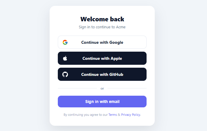
"Continue with Google" is now the fastest, most-used way people sign in — social login removes the password step entirely and can dramatically lift signup conversion. But the buttons have to look *right*: each provider has brand guidelines for its logo, colors, and wording, and a generic gray button erodes the trust the provider's brand is supposed to lend. This snippet builds a proper social-login button set in plain HTML, CSS, and vanilla JavaScript: official-style logos, correct light/dark treatments, a loading spinner per button, and an email fallback with a terms line.
Brand-correct buttons, not generic ones
Each provider gets its own treatment: Google on a white button with its multicolor "G" mark, Apple and GitHub on dark buttons with white logos — matching each company's sign-in brand guidelines, which exist precisely so the button is instantly recognizable. The logos are inline SVGs (no image requests, crisp at any size), absolutely positioned at the left so the label stays optically centered regardless of logo width. "Continue with [Provider]" is the recommended, conversion-tested wording — clearer than "Login" or "Sign up" because it works for both new and returning users without committing to either.
A loading state per button
OAuth flows involve a redirect or popup that takes a moment to start, so each button shows a spinner the instant it's clicked — its label fades to transparent and a border-spinner appears centered, with the button becoming non-interactive to prevent double-clicks. This immediate feedback is important: without it, a user who clicks and sees nothing happen for a second will click again, potentially opening two auth flows. The spinner color adapts to the button (gray on light, white on dark).
The email fallback and divider
Social login should never be the *only* option — some users don't have or won't use a Google/Apple/GitHub account, and some organizations block them. A clear "or" divider separates the social buttons from a primary "Sign in with email" button, so the email path is always available and visually distinct. This is both a usability and an accessibility requirement: forcing social-only login excludes a real segment of users.
Terms and privacy at the point of action
A small terms-and-privacy line sits below the buttons, because the moment of account creation is exactly where consent belongs — linking the terms here (rather than burying them) is both good practice and, in many jurisdictions, a legal expectation for the signup flow. It's styled as quiet supporting text so it informs without competing with the actions.
Where the real auth goes
The click handler is where you start the provider's OAuth flow — a redirect to your /auth/google endpoint, or a call to your auth SDK's signInWithPopup / signInWithRedirect. The demo simulates the redirect delay and logs the provider; swapping in real auth is a one-line change per provider. The provider name lives in a data-provider attribute so one delegated handler covers every button, and adding a provider (Microsoft, Facebook, X) is a new button plus its logo — no new logic.
Build with AI
Build, Understand, Optimize, and Extend It With AI
You don't have to trace the loading-state mechanics by hand. Paste this snippet's HTML, CSS, and JS into an AI coding assistant like Claude and ask it to explain exactly how the single delegated click listener on .slb-list reads data-provider off the clicked button to know which OAuth flow to start, or why the loading class fades the label to transparent while keeping the button's original width instead of swapping in a spinner-only layout. The same assistant can help optimize it, for instance checking whether the setTimeout simulation should be replaced with an AbortController so a slow real redirect can be canceled if the user navigates away first. It is just as useful for extending the pattern: ask it to add a per-button error state if the OAuth popup is blocked or closed early, persist the last-used provider so it can be highlighted as "last used" on return visits, or wire the handler up to a real SDK like NextAuth.js or Supabase. Treat the code less like a finished artifact and more like a starting point for a conversation.
Prompt to recreate it
Copy this into your AI assistant of choice to build the effect from scratch, or as a jumping-off point for your own variant:
Build a branded "social login buttons" sign-in card in plain HTML, CSS, and JavaScript — no auth SDK, no libraries (the click handler should simulate what a real SDK call would do).

Requirements:
- A card with a heading, at least three OAuth provider buttons (e.g. Google, Apple, GitHub) each carrying a data-provider attribute, an inline SVG brand logo absolutely positioned at the left edge of the button so the text label stays optically centered regardless of logo width, and the label text reading "Continue with [Provider]".
- Follow each provider's real visual convention: light/white background for providers whose logo is multi-colored and needs a light background to read correctly, solid dark or black fill for providers whose brand uses a dark button treatment.
- Use one single delegated click listener attached to the button container (not one listener per button) that reads the data-provider attribute off whichever button was actually clicked via event delegation, adds a loading class to that specific button, and ignores further clicks on a button already in its loading state.
- The loading class must fade the button's text to transparent (not remove it, to preserve layout width) and show a centered spinning ring built from a CSS border with one transparent side, animated via a rotate keyframe. The spinner's color must adapt so it's visible on both the light and dark button variants.
- Below the provider buttons, an "or" divider built from a single flex container with ::before/::after pseudo-element lines, followed by a distinct, differently colored "Sign in with email" button as a fallback path, plus a small terms-and-privacy text line with real anchor links.
- After a simulated delay (standing in for the real redirect/popup delay), clear the loading state and log which provider's OAuth flow would have started, so the integration point for real auth code is obvious.
Want to tighten it up first? Run this prompt through the AI Prompt Studio to score it across 8 quality dimensions, catch anti-patterns, and tune the wording for Claude, ChatGPT, or Gemini before you paste it in.
Step by step
How to Use
- 1Paste HTML, CSS, and JSA sign-in card renders with branded Google, Apple, and GitHub buttons, a divider, and an email option.
- 2Click a providerThe button shows a loading spinner and becomes non-interactive while the (simulated) OAuth flow starts.
- 3Note the brandingGoogle is light with its color mark; Apple and GitHub are dark with white logos — matching brand guidelines.
- 4See the email fallbackAn "or" divider separates the social buttons from a primary "Sign in with email" path.
- 5Add or remove providersDuplicate a button with a data-provider and its SVG logo, or remove one — the delegated handler covers all.
- 6Wire up real OAuthIn the handler, redirect to your auth endpoint (/auth/google) or call your SDK's signInWithPopup for the clicked provider.
Real-world uses
Common Use Cases
Got questions?
Frequently Asked Questions
In the click handler, start the provider's flow: redirect to your backend's OAuth route (window.location = '/auth/' + provider) which then redirects to the provider and back, or call your auth SDK directly — Firebase signInWithPopup(new GoogleAuthProvider()), Auth0 loginWithRedirect({ connection: 'google' }), Supabase signInWithOAuth({ provider: 'github' }). The data-provider attribute identifies which to start. Keep the loading state until the redirect/popup takes over.
Google, Apple, and others publish sign-in button guidelines (logo, colors, wording, spacing) and in some cases require compliance to use their login. Beyond policy, a brand-correct button is instantly recognizable, which is the entire value of social login — users trust the familiar Google or Apple button far more than a generic styled one, so adhering to the guidelines directly affects conversion.
Yes, always. Some users don't have or won't use a given provider, corporate policies sometimes block them, and relying solely on a third party for auth is a single point of failure. A clear email fallback (and ideally more than one provider) keeps signup accessible to everyone — excluding email-only users measurably shrinks your addressable signups.
Add a loading class on first click that sets pointer-events: none and shows a spinner, and bail out of the handler if the button is already loading (as this snippet does). The button stays disabled until the redirect or popup takes over, so a second click can't fire a duplicate flow — important since OAuth redirects have a perceptible delay.
In React, render the providers from an array with .map(), hold a loading provider id in useState, and call your auth SDK in the onClick; in Vue, use v-for with a loading ref; in Angular, use *ngFor and a service method. The branding is pure CSS/SVG that ports unchanged — only the loading state and the SDK call move into the framework.