Learn Coding Visually
Learn to code with interactive, live-preview playgrounds — HTML, CSS, JavaScript, React & more.
 HTML Playground42 lessons · Click-based · Live preview
 CSS PlaygroundLearn CSS with a live editor
 JavaScript Playground60 lessons · DOM · Async · Canvas
 React PlaygroundLearn React with a live code editor
 GSAP PlaygroundLearn GSAP animation interactively
 SVG Playground44 lessons · shapes · paths · animation
 SCSS Playground45 lessons · Sass modules · tokens
 Tailwind PlaygroundLearn Tailwind CSS with a live editor
 Bootstrap 5 Playground50 lessons · live preview
Social Login Buttons — Free HTML CSS Snippet
Social Login Buttons · Buttons · Plain HTML & CSS · Live preview
What's included
Features
About this UI Snippet
Social Login Buttons — OAuth Button Layout, OR Divider & Email Fallback
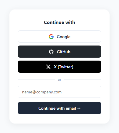
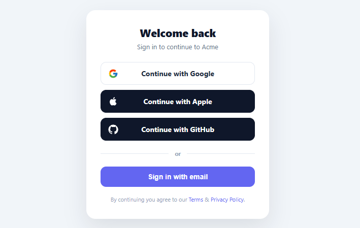
Social login buttons are the standard entry point on almost every modern sign-up and login page. Offering Google, GitHub, and X (Twitter) OAuth alongside an email fallback (or a magic link) reduces friction — users choose the authentication method they trust and already have open. This snippet provides the complete UI for this pattern: three OAuth buttons, an "or" divider, an email input, and a primary CTA button.
The OAuth button styles
Google and other providers have strict visual identity guidelines for OAuth buttons. The generic .btn style uses a white background with a light border and dark text — appropriate for provider buttons where the provider logo (SVG) carries the brand identity. .btn.github and .btn.twitter use dark filled backgrounds as these providers expect dark button treatments. All buttons are full-width (justify-content: center) so they stack cleanly in the narrow card layout.
The OR divider
The .divider element uses display: flex; align-items: center; gap: 10px. The lines on either side are created with ::before and ::after pseudo-elements: content: ''; flex: 1; height: 1px; background: #e2e8f0. The flex: 1 makes both lines take equal space. This produces a horizontal rule with a centred "or" label — no extra HTML elements needed.
The email fallback
The email input uses the same border: 1.5px solid #e2e8f0 and focus ring as the Floating Label and Search Box snippets for visual consistency. The submit button below it uses a dark #1e293b fill to distinguish it from the social provider buttons above — one visual hierarchy for OAuth, a different one for the email path.
Why offer both OAuth and email
OAuth reduces friction for returning users with accounts at major providers. Email/password is necessary for users without those accounts or who prefer not to link them. Offering both maximises conversion across all user segments.
Brand colour sourcing
Each social platform publishes official brand colours in their media guidelines. Google: #4285F4 (blue), GitHub: #24292e (dark), X: #000000, LinkedIn: #0077B5. These colours are used on the button hover and focus states. The resting state uses a neutral grey or white to avoid visual clutter when multiple social buttons appear together.
The OR divider
The OR divider between social buttons and the email/password form uses ::before and ::after pseudo-elements on the label to create horizontal lines: .or-label { display: flex; align-items: center; gap: 12px; } .or-label::before, .or-label::after { content: ''; flex: 1; height: 1px; background: var(--border); }. This pattern avoids extra HTML divider elements.
Icon-only vs icon+label variants
For compact layouts (mobile app sign-up screens with limited vertical space), use icon-only buttons: 40×40px squares with just the platform icon, arranged in a horizontal row. For web sign-up forms with more space, use icon+label buttons for clarity — "Continue with Google" is more explicit than a G icon alone. This snippet provides the icon+label pattern; adapt to icon-only by removing the text and adjusting dimensions.
Build with AI
Build, Understand, Optimize, and Extend It With AI
You don't have to work out the divider trick or the button hierarchy by hand. Paste this snippet's HTML and CSS into an AI coding assistant like Claude and ask it to explain exactly how the OR divider draws its two lines from a single element using flex: 1 on ::before and ::after pseudo-elements with no extra markup, or why the Google button stays white with a bordered outline while GitHub and X use solid dark fills. The same assistant can help you optimize it, for example checking whether the repeated border and transition declarations across .btn variants could be consolidated with CSS custom properties per provider. It is just as useful for extending the pattern: ask it to add a loading spinner state to each OAuth button while a redirect is in flight, generate an icon-only compact variant for mobile at 40 by 40 pixels, or wire the buttons to real provider SDKs like NextAuth.js or Supabase auth. Treat the code less like a finished artifact and more like a starting point for a conversation.
Prompt to recreate it
Copy this into your AI assistant of choice to build the effect from scratch, or as a jumping-off point for your own variant:
Build a "social login" button stack with an OR divider and email fallback in plain HTML and CSS — no JavaScript required for the layout itself, no libraries.

Requirements:
- A vertical stack of full-width OAuth buttons (Google, GitHub, and X/Twitter at minimum), each containing an inline SVG brand icon plus a text label, laid out with flexbox and centered content.
- Follow each provider's real visual convention: the Google button uses a white background with a light border and dark text (since the multi-colored logo carries the brand identity), while GitHub and X buttons use solid dark or black fill backgrounds with white text and no border, matching their official button treatments.
- Build the "or" divider using a single container element with a text label inside, and two lines created purely with ::before and ::after pseudo-elements set to flex: 1 and a 1px height background — no extra div elements for the lines, and the two generated lines must automatically consume equal remaining space on each side of the label regardless of container width.
- Below the divider, include an email input field with a focus-visible border-color change, and a separate full-width submit button styled with a solid dark fill that is visually distinct from the OAuth buttons above it, establishing two different hierarchies: one for federated login, one for the email path.
- Ensure hover states exist for every button (a subtle background shift for the light Google-style button, a slightly darker fill for the dark-background buttons) and that all buttons are keyboard-focusable in natural tab order.
Want to tighten it up first? Run this prompt through the AI Prompt Studio to score it across 8 quality dimensions, catch anti-patterns, and tune the wording for Claude, ChatGPT, or Gemini before you paste it in.
Source Code
<div class="demo">
  <p class="label">Continue with</p>
  <div class="btns">
    <button class="btn google">
      <svg width="18" height="18" viewBox="0 0 24 24"><path fill="#4285F4" d="M22.56 12.25c0-.78-.07-1.53-.2-2.25H12v4.26h5.92c-.26 1.37-1.04 2.53-2.21 3.31v2.77h3.57c2.08-1.92 3.28-4.74 3.28-8.09z"/><path fill="#34A853" d="M12 23c2.97 0 5.46-.98 7.28-2.66l-3.57-2.77c-.98.66-2.23 1.06-3.71 1.06-2.86 0-5.29-1.93-6.16-4.53H2.18v2.84C3.99 20.53 7.7 23 12 23z"/><path fill="#FBBC05" d="M5.84 14.09c-.22-.66-.35-1.36-.35-2.09s.13-1.43.35-2.09V7.07H2.18C1.43 8.55 1 10.22 1 12s.43 3.45 1.18 4.93l2.85-2.22.81-.62z"/><path fill="#EA4335" d="M12 5.38c1.62 0 3.06.56 4.21 1.64l3.15-3.15C17.45 2.09 14.97 1 12 1 7.7 1 3.99 3.47 2.18 7.07l3.66 2.84c.87-2.6 3.3-4.53 6.16-4.53z"/></svg>
      Google
    </button>
    <button class="btn github">
      <svg width="18" height="18" viewBox="0 0 24 24" fill="currentColor"><path d="M12 2C6.477 2 2 6.484 2 12.017c0 4.425 2.865 8.18 6.839 9.504.5.092.682-.217.682-.483 0-.237-.008-.868-.013-1.703-2.782.605-3.369-1.343-3.369-1.343-.454-1.158-1.11-1.466-1.11-1.466-.908-.62.069-.608.069-.608 1.003.07 1.531 1.032 1.531 1.032.892 1.53 2.341 1.088 2.91.832.092-.647.35-1.088.636-1.338-2.22-.253-4.555-1.113-4.555-4.951 0-1.093.39-1.988 1.029-2.688-.103-.253-.446-1.272.098-2.65 0 0 .84-.27 2.75 1.026A9.564 9.564 0 0 1 12 6.844a9.59 9.59 0 0 1 2.504.337c1.909-1.296 2.747-1.027 2.747-1.027.546 1.379.202 2.398.1 2.651.64.7 1.028 1.595 1.028 2.688 0 3.848-2.339 4.695-4.566 4.943.359.309.678.92.678 1.855 0 1.338-.012 2.419-.012 2.747 0 .268.18.58.688.482A10.02 10.02 0 0 0 22 12.017C22 6.484 17.522 2 12 2z"/></svg>
      GitHub
    </button>
    <button class="btn twitter">
      <svg width="18" height="18" viewBox="0 0 24 24" fill="currentColor"><path d="M18.244 2.25h3.308l-7.227 8.26 8.502 11.24H16.17l-4.714-6.231-5.401 6.231H2.748l7.73-8.835L1.254 2.25H8.08l4.259 5.63zm-1.161 17.52h1.833L7.084 4.126H5.117z"/></svg>
      X (Twitter)
    </button>
  </div>
  <div class="divider"><span>or</span></div>
  <input class="input" type="email" placeholder="name@company.com" />
  <button class="btn-email">Continue with email →</button>
</div>
* { box-sizing: border-box; margin: 0; padding: 0; }
body { font-family: system-ui, sans-serif; background: #f8fafc; display: flex; align-items: center; justify-content: center; min-height: 100vh; padding: 24px; }
.demo { background: #fff; border-radius: 18px; padding: 32px 28px; width: 340px; box-shadow: 0 4px 24px rgba(0,0,0,0.07); display: flex; flex-direction: column; gap: 14px; }
.label { text-align: center; font-size: 16px; font-weight: 700; color: #1e293b; margin-bottom: 4px; }
.btns { display: flex; flex-direction: column; gap: 10px; }
.btn { display: flex; align-items: center; justify-content: center; gap: 10px; padding: 10px 16px; font-size: 14px; font-weight: 600; border-radius: 8px; cursor: pointer; font-family: inherit; border: 1.5px solid #e2e8f0; background: #fff; color: #1e293b; transition: background 0.12s, border-color 0.12s; }
.btn:hover { background: #f8fafc; border-color: #cbd5e1; }
.btn.github { background: #24292e; color: #fff; border-color: transparent; }
.btn.github:hover { background: #1a1f24; }
.btn.twitter { background: #000; color: #fff; border-color: transparent; }
.btn.twitter:hover { background: #1a1a1a; }
.divider { display: flex; align-items: center; gap: 10px; color: #94a3b8; font-size: 12px; }
.divider::before, .divider::after { content: ''; flex: 1; height: 1px; background: #e2e8f0; }
.input { padding: 10px 14px; font-size: 14px; font-family: inherit; border: 1.5px solid #e2e8f0; border-radius: 8px; outline: none; color: #1e293b; transition: border-color 0.15s; }
.input:focus { border-color: #6366f1; }
.btn-email { padding: 11px; background: #1e293b; color: #fff; border: none; border-radius: 8px; font-size: 14px; font-weight: 600; cursor: pointer; font-family: inherit; transition: background 0.15s; }
.btn-email:hover { background: #0f172a; }Step by step
How to Use
- 1Load the snippetClick "Social Login Buttons" in the sidebar. The preview shows the full card: three OAuth buttons, OR divider, email input, and submit button.
- 2Update the card headingIn the HTML panel, change the .label text from "Sign in" to "Create account" or "Welcome back" to match the page context.
- 3Add or remove OAuth providersRemove any .btn you don't need. To add a new provider, copy a .btn div and update the SVG icon, brand colour, and label text.
- 4Wire OAuth buttons to your backendAdd onclick handlers or href attributes to each OAuth button pointing to your OAuth redirect URL.
- 5Change the divider labelUpdate the "or continue with email" text inside the .divider element if you want different copy.
- 6Export in your formatClick "HTML" for a standalone file, "JSX" for a React component, or "Tailwind" for a React + Tailwind version.
Real-world uses
Common Use Cases
Got questions?
Frequently Asked Questions
The .divider element has display: flex; align-items: center; gap: 10px. ::before and ::after pseudo-elements each have content: ""; flex: 1; height: 1px; background: #e2e8f0. The flex: 1 makes both lines take equal remaining space after the text label, centering it automatically.
Change each .btn button to an <a> tag with href pointing to your OAuth redirect URL — for example href="/auth/google", href="/auth/github". Or add onclick handlers that call your OAuth initiation function. The visual layout is independent of the auth mechanism.
Copy a .btn div and update the SVG to the provider logo, the label text, and add a class like .btn.linkedin. Set background, color, and hover styles for the new provider in the CSS panel.
Google requires specific button text ("Sign in with Google", "Continue with Google") and recommends using the official Google Identity Services button rather than a custom HTML button. GitHub has no strict visual requirements. For production, use the official Google Sign-In library for the Google button and a custom button for GitHub and X.
Yes. Click "JSX" to download a React component. Replace the button onClick handlers with your OAuth library calls — for example, signIn("google") from NextAuth.js or supabase.auth.signInWithOAuth({ provider: "github" }). The CSS and layout work unchanged.
Remove the outer .demo wrapper and use the card HTML directly inside your modal content. Remove the box-shadow from .demo and adjust the border-radius if the modal has its own. The card is self-contained and works in any container.