Learn Coding Visually
Learn to code with interactive, live-preview playgrounds — HTML, CSS, JavaScript, React & more.
 HTML Playground42 lessons · Click-based · Live preview
 CSS PlaygroundLearn CSS with a live editor
 JavaScript Playground60 lessons · DOM · Async · Canvas
 React PlaygroundLearn React with a live code editor
 GSAP PlaygroundLearn GSAP animation interactively
 SVG Playground44 lessons · shapes · paths · animation
 SCSS Playground45 lessons · Sass modules · tokens
 Tailwind PlaygroundLearn Tailwind CSS with a live editor
 Bootstrap 5 Playground50 lessons · live preview
UI Click Sound Toggle — Free HTML CSS JS Snippet
UI Click Sound Toggle · Buttons · Plain HTML, CSS & JS · Live preview
What's included
Features
About this UI Snippet
UI Click Sound Toggle — Synthesized Feedback Sounds With an On/Off Switch
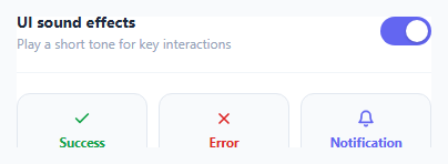
Many apps play short feedback tones for success, error, or notification events, but always ship them as separate mp3 files. This snippet generates all three sounds live with the Web Audio API — no audio assets at all — and gates them behind a single settings-style toggle switch, the same pattern used in real product settings panels for "UI sound effects."
Synthesizing each sound
A shared playTone(freq, startTime, duration, type) helper creates a fresh OscillatorNode and GainNode for every tone. The gain envelope ramps quickly up to volume with linearRampToValueAtTime and then decays with exponentialRampToValueAtTime, giving each tone a natural pluck rather than an abrupt on/off click. Success plays two ascending notes (a rising interval), error plays a single low sawtooth buzz, and notification plays a two-note descending chime — three distinct sonic identities built from the same primitive.
The toggle gates playback, not generation
The switch only sets a soundEnabled boolean; the demo button click handlers check that flag before calling any of the play functions. This mirrors how a real settings toggle should work — the sound logic exists independently of the toggle, and the toggle is simply a gate in front of it.
One shared AudioContext, lazily created
getCtx() creates the AudioContext once on first use and reuses it for every subsequent tone, since AudioContexts are relatively expensive to construct and browsers limit how many can exist. Each tone still gets its own oscillator and gain node so overlapping sounds don't interfere with each other.
Build with AI
Build, Understand, Optimize, and Extend It With AI
Hand this snippet's HTML, CSS, and JavaScript to an AI coding assistant like Claude and ask it to adapt "UI Click Sound Toggle" to your project — restyle it to match your design system, wire it up to real data instead of the static example, or port it to the framework you're building in.
Prompt to recreate it
Copy this into your AI assistant of choice to build the effect from scratch, or as a jumping-off point for your own variant:
Build a buttons component called "UI Click Sound Toggle" using plain HTML, CSS, and vanilla JavaScript — no framework, no build step.

Requirements:
- Match the structure and behavior of the "UI Click Sound Toggle" snippet from the UI Snippets Library.
- Keep the markup semantic and the styling self-contained (no external dependencies beyond what the original snippet uses).
- Keep the JavaScript vanilla, with no framework runtime required.
- Make it easy to restyle via CSS custom properties or class overrides so it can be dropped into a real project.
Want to tighten it up first? Run this prompt through the AI Prompt Studio to score it across 8 quality dimensions, catch anti-patterns, and tune the wording for Claude, ChatGPT, or Gemini before you paste it in.
Source Code
<div class="cs-card">
  <div class="cs-row">
    <div class="cs-row-text">
      <span class="cs-row-title">UI sound effects</span>
      <span class="cs-row-sub">Play a short tone for key interactions</span>
    </div>
    <button class="cs-switch" id="csSwitch" role="switch" aria-checked="true">
      <span class="cs-switch-knob"></span>
    </button>
  </div>

  <div class="cs-demo-grid">
    <button class="cs-demo-btn cs-demo-success" id="csSuccessBtn">
      <svg width="16" height="16" viewBox="0 0 24 24" fill="none" stroke="currentColor" stroke-width="2.5" stroke-linecap="round" stroke-linejoin="round"><path d="M20 6L9 17l-5-5"/></svg>
      Success
    </button>
    <button class="cs-demo-btn cs-demo-error" id="csErrorBtn">
      <svg width="16" height="16" viewBox="0 0 24 24" fill="none" stroke="currentColor" stroke-width="2.5" stroke-linecap="round" stroke-linejoin="round"><path d="M18 6L6 18M6 6l12 12"/></svg>
      Error
    </button>
    <button class="cs-demo-btn cs-demo-notify" id="csNotifyBtn">
      <svg width="16" height="16" viewBox="0 0 24 24" fill="none" stroke="currentColor" stroke-width="2.5" stroke-linecap="round" stroke-linejoin="round"><path d="M18 8a6 6 0 10-12 0c0 7-3 9-3 9h18s-3-2-3-9M13.73 21a2 2 0 01-3.46 0"/></svg>
      Notification
    </button>
  </div>
</div>*{box-sizing:border-box}
body{font-family:system-ui,-apple-system,sans-serif;background:#f8fafc;min-height:100vh;display:flex;align-items:center;justify-content:center;padding:24px}
.cs-card{font-family:system-ui,-apple-system,sans-serif;background:#fff;color:#1e293b;border:1px solid #e2e8f0;border-radius:18px;padding:22px;max-width:420px;width:100%;margin:0 auto;box-shadow:0 12px 30px rgba(30,41,59,0.06)}
.cs-row{display:flex;align-items:center;justify-content:space-between;gap:16px;padding-bottom:18px;margin-bottom:18px;border-bottom:1px solid #f1f5f9}
.cs-row-text{display:flex;flex-direction:column;gap:2px}
.cs-row-title{font-size:14px;font-weight:700}
.cs-row-sub{font-size:12px;color:#94a3b8}
.cs-switch{width:46px;height:26px;border-radius:999px;background:#6366f1;border:none;position:relative;cursor:pointer;flex-shrink:0;padding:0;transition:background .2s}
.cs-switch[aria-checked="false"]{background:#cbd5e1}
.cs-switch-knob{position:absolute;top:3px;left:3px;width:20px;height:20px;border-radius:50%;background:#fff;transition:transform .2s;box-shadow:0 1px 3px rgba(0,0,0,.2)}
.cs-switch[aria-checked="true"] .cs-switch-knob{transform:translateX(20px)}
.cs-demo-grid{display:grid;grid-template-columns:repeat(3,1fr);gap:10px}
.cs-demo-btn{display:flex;flex-direction:column;align-items:center;gap:6px;padding:14px 8px;border-radius:12px;border:1px solid #e2e8f0;background:#f8fafc;font-size:11.5px;font-weight:700;cursor:pointer;font-family:inherit;color:#334155;transition:transform .1s, background .15s}
.cs-demo-btn:active{transform:scale(.95)}
.cs-demo-success{color:#16a34a}
.cs-demo-success:hover{background:#f0fdf4}
.cs-demo-error{color:#dc2626}
.cs-demo-error:hover{background:#fef2f2}
.cs-demo-notify{color:#6366f1}
.cs-demo-notify:hover{background:#eef2ff}var switchBtn = document.getElementById('csSwitch');
var successBtn = document.getElementById('csSuccessBtn');
var errorBtn = document.getElementById('csErrorBtn');
var notifyBtn = document.getElementById('csNotifyBtn');
var soundEnabled = true;
var audioCtx = null;
function getCtx() {
if (!audioCtx) {
audioCtx = new (window.AudioContext || window.webkitAudioContext)();
}
return audioCtx;
}
function playTone(freq, startTime, duration, type) {
var ctx = getCtx();
var osc = ctx.createOscillator();
var gain = ctx.createGain();
osc.type = type || 'sine';
osc.frequency.value = freq;
var t = ctx.currentTime + startTime;
gain.gain.setValueAtTime(0, t);
gain.gain.linearRampToValueAtTime(0.25, t + 0.01);
gain.gain.exponentialRampToValueAtTime(0.0001, t + duration);
osc.connect(gain);
gain.connect(ctx.destination);
osc.start(t);
osc.stop(t + duration + 0.02);
}
function playSuccess() {
// Rising two-tone tone for success
playTone(523.25, 0, 0.12, 'sine');
playTone(783.99, 0.1, 0.18, 'sine');
}
function playError() {
// Low buzzy tone for error
playTone(140, 0, 0.28, 'sawtooth');
}
function playNotification() {
// Two-note chime
playTone(880, 0, 0.14, 'triangle');
playTone(660, 0.14, 0.18, 'triangle');
}
switchBtn.addEventListener('click', function () {
soundEnabled = !soundEnabled;
switchBtn.setAttribute('aria-checked', String(soundEnabled));
});
successBtn.addEventListener('click', function () {
if (soundEnabled) playSuccess();
});
errorBtn.addEventListener('click', function () {
if (soundEnabled) playError();
});
notifyBtn.addEventListener('click', function () {
if (soundEnabled) playNotification();
});Step by step
How to Use
- 1Load the snippetClick "UI Click Sound Toggle" in the sidebar to load its HTML, CSS, and JS into the editor panels. The preview updates instantly.
- 2Edit the codeModify any panel — HTML, CSS, or JS. The preview refreshes as you type. Use Reset in each panel header to restore the original.
- 3Preview on devicesClick the Mobile (375px), Tablet (768px), or Desktop buttons in the preview header to check responsiveness.
- 4Export in your formatClick "HTML" to download a standalone file, "JSX" for a React component, "Tailwind" for a React + Tailwind CSS component, "Tailwind HTML" for a standalone HTML file with Tailwind CDN, "Vue" for a Vue 3 SFC with <template>/<script setup>/<style scoped>, or "Angular" for a standalone Angular .component.ts file. "Copy all" copies the full code to clipboard.
- 5Save your versionClick "Save as", type a name, and press Enter. Your snippet saves to IndexedDB and appears in the Saved tab.
Real-world uses
Common Use Cases
Got questions?
Frequently Asked Questions
No. Every tone is synthesized live using AudioContext, OscillatorNode, and GainNode — there are no mp3 or wav assets anywhere in this snippet.
Each uses a different oscillator waveform type (sine for success, sawtooth for error, triangle for notification), different frequencies, and in the case of success and notification, two sequentially-timed notes instead of one.
The toggle only guards whether a new tone is triggered on the next button click — it does not need to interrupt an in-progress tone because each tone is intentionally very short (under 300ms).