You Might Also Like
Learn Coding Visually
Learn to code with interactive, live-preview playgrounds — HTML, CSS, JavaScript, React & more.
 HTML Playground42 lessons · Click-based · Live preview
 CSS PlaygroundLearn CSS with a live editor
 JavaScript Playground60 lessons · DOM · Async · Canvas
 React PlaygroundLearn React with a live code editor
 GSAP PlaygroundLearn GSAP animation interactively
 SVG Playground44 lessons · shapes · paths · animation
 SCSS Playground45 lessons · Sass modules · tokens
 Tailwind PlaygroundLearn Tailwind CSS with a live editor
 Bootstrap 5 Playground50 lessons · live preview
Grid / List View Toggle — Free HTML CSS JS Layout Switcher Snippet
Grid / List View Toggle · Layouts · Plain HTML, CSS & JS · Live preview
What's included
Features
About this UI Snippet
Grid / List View Toggle — HTML, CSS & JavaScript Layout Switcher
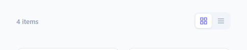
Product listings, file browsers, and search results commonly let users choose between a visual grid layout and a denser list layout. This snippet implements that switch with a single class swap on the shared container — the same card markup renders completely differently depending on whether .grid-view or .list-view is applied, with no JavaScript re-rendering of the actual items.
How one class controls two layouts
Every item uses identical markup: a .item-card containing a .item-thumb and an .item-info block. The *container* (#itemContainer) carries either .grid-view or .list-view. CSS descendant selectors like .item-container.grid-view .item-card { flex-direction: column } versus .item-container.list-view .item-card { flex-direction: row } change how each identical card lays out its own children, and the container itself switches between display: grid (grid mode) and display: flex; flex-direction: column (list mode). Because only the container's class changes, setView(view) never touches the individual item elements — no cloning, no re-rendering, no risk of losing scroll position or event listeners bound to specific cards.
How the thumbnail resizes between modes
In grid mode, the thumbnail is full width with a fixed aspect-ratio: 1.4 so every card's image area is proportional regardless of card width. In list mode, the thumbnail shrinks to a fixed 64px square and the card's flex-direction switches to row, turning what was a vertical stack (image on top, text below) into a horizontal row (small thumbnail on the left, text filling the rest) — again purely through the container-level class controlling which descendant selectors apply.
How the toggle buttons stay in sync
setView toggles the .active class and the aria-pressed attribute on both buttons together, so exactly one is always shown as active and screen readers correctly announce a toggle-button-group pattern (role="group" on the wrapper, aria-pressed per button) rather than an ambiguous pair of plain buttons.
Build with AI
Build, Understand, Optimize, and Extend It With AI
Ask an AI assistant to explain why this pattern only ever changes one class on the container rather than manipulating individual item elements, and what advantages that has for preserving scroll position, event listeners, and animation state compared to re-rendering the item list on every toggle. It's also a useful prompt for adding a smooth cross-fade or layout transition between the two modes using the View Transitions API or a manual opacity crossfade, since the base version switches instantly with no animation.
Prompt to recreate it
Copy this into your AI assistant of choice to build the effect from scratch, or as a jumping-off point for your own variant:
Build a "grid / list view toggle" in plain HTML, CSS, and vanilla JavaScript that switches a collection of item cards between a grid layout and a stacked list layout using only a single container class change — the individual card markup must never be re-created or re-rendered.

Requirements:
- A toolbar with two toggle buttons (grid icon, list icon) inside a wrapper with role="group" and an aria-label, where each button reports its state via aria-pressed and exactly one is shown as active at a time.
- A shared container holding several identical item cards (thumbnail + title + description + price), where the container itself carries either a "grid-view" or "list-view" class.
- CSS descendant selectors scoped to the container's active class must control the card's flex-direction and thumbnail sizing — grid mode should show a vertical card with a full-width thumbnail in a CSS grid layout, list mode should show a horizontal card with a small fixed-size thumbnail in a vertically stacked flex layout.
- One JavaScript function, setView(mode), that removes both view classes from the container, adds the requested one, and updates both toggle buttons' active class and aria-pressed attribute together.
- No cloning, re-rendering, or recreating of the item card elements when switching views — only the container's class should change.
Want to tighten it up first? Run this prompt through the AI Prompt Studio to score it across 8 quality dimensions, catch anti-patterns, and tune the wording for Claude, ChatGPT, or Gemini before you paste it in.
Step by step
How to Use
- 1Load the snippetClick "Grid / List View Toggle" in the sidebar Library tab to load the item collection.
- 2Switch viewsClick the grid and list icons in the toolbar in the preview to see the layout swap instantly.
- 3Swap in real contentReplace the .item-thumb gradients with real <img> tags and update the title/description/price text.
- 4Persist the chosen viewStore the selected view in localStorage inside setView and restore it on page load.
- 5Add a third view modeAdd a new CSS class like .compact-view with its own descendant rules, and extend setView to accept and apply it.
- 6Export and saveExport as HTML/JSX/Tailwind or click "Save as" to reuse this toggle in a real product or file listing page.
Real-world uses
Common Use Cases
Got questions?
Frequently Asked Questions
Every card uses identical HTML markup regardless of the active view. Only the container's class changes between .grid-view and .list-view, and CSS descendant selectors scoped to that class control how each card's children are laid out — no JavaScript ever touches the individual item elements.
The .item-thumb rule is overridden separately for grid mode (full width, fixed aspect-ratio) and list mode (fixed 64px square), both scoped under .item-container.grid-view and .item-container.list-view respectively.
setView toggles the .active class and the aria-pressed attribute on both buttons in the same call, so exactly one button always shows the active/raised styling and screen readers hear the correct pressed state for both.
Yes — save the view name to localStorage inside setView, and on page load read that value back and call setView with it before the user interacts with the toggle.
Add a new class (e.g. .compact-view) with its own container and descendant CSS rules, add a third toggle button, and update setView to remove all view classes before adding whichever one was selected.
No — it is a single class swap driven by one small JavaScript function. It works equally well as a static HTML/CSS/JS component or embedded inside a React/Vue component's render output.
Yes — the wrapping div has role="group" with an aria-label describing its purpose, and each button reports its own pressed state via aria-pressed, which is the standard pattern for a mutually-exclusive toggle button group.