You Might Also Like
Learn Coding Visually
Learn to code with interactive, live-preview playgrounds — HTML, CSS, JavaScript, React & more.
 HTML Playground42 lessons · Click-based · Live preview
 CSS PlaygroundLearn CSS with a live editor
 JavaScript Playground60 lessons · DOM · Async · Canvas
 React PlaygroundLearn React with a live code editor
 GSAP PlaygroundLearn GSAP animation interactively
 SVG Playground44 lessons · shapes · paths · animation
 SCSS Playground45 lessons · Sass modules · tokens
 Tailwind PlaygroundLearn Tailwind CSS with a live editor
 Bootstrap 5 Playground50 lessons · live preview
Collapsible Sidebar — Free HTML CSS JS Icon-Only Toggle Sidebar Snippet
Collapsible Sidebar · Layouts · Plain HTML, CSS & JS · Live preview
What's included
Features
About this UI Snippet
Collapsible Sidebar — HTML, CSS & JavaScript Icon Rail Toggle
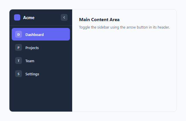
Dashboards and admin panels almost always need a navigation sidebar, and power users almost always want the option to shrink it down once they've learned the icons and want more room for content. This snippet implements the classic "icon-only rail" collapse pattern used by tools like VS Code and Notion, built with a single boolean class toggle and a CSS width transition.
How the width animation works
The .sidebar has an explicit width: 220px and a transition: width 0.25s ease. Toggling the .collapsed class swaps that to width: 64px — just enough room for the icon column. Because both states are explicit pixel widths (not auto), the browser can smoothly animate between them; animating to/from width: auto is not reliably transitionable in CSS, which is a common trap when building this pattern from scratch.
How labels disappear without causing layout jumps
Simply hiding the .nav-label and .logo-text elements with display: none would make them disappear instantly, out of sync with the slower width animation, which looks broken. Instead, both fade via opacity (a separate, faster 0.15s transition) *and* collapse via width: 0; overflow: hidden, so the text visually fades away first and its space collapses in sync with the sidebar's own shrink, rather than the text abruptly vanishing or wrapping awkwardly mid-animation.
How the toggle button flips
The collapse button's chevron icon is rotated 180 degrees via transform: rotate(180deg) when .collapsed is active, which turns a "point left" icon into a "point right" icon using the same SVG — no separate icon asset needed for the two directions.
Accessibility handling
toggleSidebar() updates both aria-expanded and aria-label on the toggle button every time it's clicked, so assistive technology always announces the sidebar's current state and the action the button will perform next ("Expand sidebar" vs. "Collapse sidebar") rather than a static, potentially stale label.
Build with AI
Build, Understand, Optimize, and Extend It With AI
Give this snippet to an AI assistant and ask it to explain precisely why animating width requires two explicit pixel values rather than width: auto on either end — this trips up nearly every first attempt at a collapsible sidebar. It's also a good prompt for adding a tooltip that appears on hover over each icon while the sidebar is collapsed (since the text label is invisible then), or for wiring localStorage persistence so a returning user's collapse preference is remembered automatically.
Prompt to recreate it
Copy this into your AI assistant of choice to build the effect from scratch, or as a jumping-off point for your own variant:
Build a "collapsible sidebar" navigation shell in plain HTML, CSS, and vanilla JavaScript.

Requirements:
- A sidebar with an explicit pixel width in its default (expanded) state and a smaller explicit pixel width in a .collapsed state, animated purely with a CSS transition on the width property — do not use width: auto anywhere in the transitioning states.
- Each navigation item must show both an icon and a text label in the expanded state. In the collapsed state, only the icon remains fully visible; the label must fade out via opacity and collapse its own width so no extra empty space is left behind, without abruptly disappearing out of sync with the sidebar's own width transition.
- A single toggle button in the sidebar header that calls one function to toggle the .collapsed class, and that visually flips its own icon (e.g. rotate a chevron 180 degrees) to indicate the opposite action is now available.
- The toggle button must update its aria-expanded and aria-label attributes every time it is clicked so screen reader users always hear the sidebar's current state and the action the button performs next.
- The overall layout must be a flex app shell with the sidebar beside a main content area that fills remaining space.
Want to tighten it up first? Run this prompt through the AI Prompt Studio to score it across 8 quality dimensions, catch anti-patterns, and tune the wording for Claude, ChatGPT, or Gemini before you paste it in.
Step by step
How to Use
- 1Load the snippetClick "Collapsible Sidebar" in the sidebar Library tab to load the app shell layout.
- 2Toggle the sidebarClick the arrow button in the sidebar header in the preview to collapse and expand it.
- 3Adjust the widthsChange the 220px and 64px values on .sidebar and .sidebar.collapsed in the CSS panel to fit your icon size.
- 4Add navigation itemsCopy a .nav-item anchor in the HTML panel and update its icon letter/label text.
- 5Persist the collapsed stateStore the collapsed boolean in localStorage inside toggleSidebar and read it back on page load to remember the user's preference.
- 6Export and saveExport as HTML/JSX/Tailwind or click "Save as" to reuse this shell across projects.
Real-world uses
Common Use Cases
Got questions?
Frequently Asked Questions
CSS transitions cannot reliably animate to or from width: auto because the browser cannot interpolate an unknown target size. Using explicit values like 220px and 64px on both states lets the transition animate smoothly between two known numbers.
display: none changes instantly with no animation, which would make the text disappear abruptly out of sync with the slower sidebar width transition. Fading opacity first, then collapsing width, keeps the whole collapse feeling like one cohesive animation.
Inside toggleSidebar, save the new collapsed state to localStorage (e.g. localStorage.setItem('sidebarCollapsed', collapsed)). On page load, read that value and apply the .collapsed class immediately, before the user interacts with the toggle.
Copy an existing .nav-item anchor element inside .nav-list, update its icon letter (or swap in an SVG) and its .nav-label text, and update the href to point at the real route.
Yes — add a media query or a resize listener that adds the .collapsed class automatically below a chosen viewport width, while still letting the user manually toggle it back if there is room.
Rotating a single chevron SVG 180 degrees produces the mirrored "point the other way" icon without needing a second SVG asset or an icon font, keeping the markup smaller and the two states visually consistent.
Yes — the icon tiles remain fully sized and clickable in the collapsed state; only the text label collapses. Consider adding a title attribute or tooltip on each icon so users can identify items by hovering while collapsed.