


Learn Coding Visually
Learn to code with interactive, live-preview playgrounds — HTML, CSS, JavaScript, React & more.
 HTML Playground42 lessons · Click-based · Live preview
 CSS PlaygroundLearn CSS with a live editor
 JavaScript Playground60 lessons · DOM · Async · Canvas
 React PlaygroundLearn React with a live code editor
 GSAP PlaygroundLearn GSAP animation interactively
 SVG Playground44 lessons · shapes · paths · animation
 SCSS Playground45 lessons · Sass modules · tokens
 Tailwind PlaygroundLearn Tailwind CSS with a live editor
 Bootstrap 5 Playground50 lessons · live preview
Floating Label Input — Free Pure CSS Form Snippet
Floating Label Input · Forms · Plain HTML & CSS · Live preview
What's included
Features
About this UI Snippet
Floating Label Input — Pure CSS with :placeholder-shown and Sibling Combinator
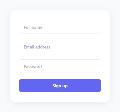
The floating label is a form pattern — pair it with a search box, custom select, and the rest of an auth login card — where the label sits inside the input field like placeholder text when empty, then animates upward and shrinks when the user focuses or types. It keeps forms visually clean — no label cluttering the space above each field — while maintaining context throughout the interaction. Placeholder text disappears the moment you start typing; a floating label never does.
This snippet achieves the full effect with pure HTML and CSS — zero JavaScript required. The technique uses two CSS pseudo-classes and the general sibling combinator.
The placeholder=" " trick
Each input has placeholder=" " — a single space character. This is invisible to users but is meaningful to CSS: :placeholder-shown is true when a visible placeholder is shown. An empty placeholder="" is never shown so the selector would never apply. A single space satisfies the condition, making :placeholder-shown true when the field is empty and false when the user has typed.
The CSS selectors
Two selectors float the label: input:focus ~ label (user is actively in the field) and input:not(:placeholder-shown) ~ label (field has a value, even if not focused). The ~ is the general sibling combinator — it selects any matching sibling that appears *after* the specified element. Since the <label> comes after the <input> in the HTML, input:focus ~ label selects the label that follows a focused input. This is the standard CSS-only approach for focus-based sibling styling.
Why the label needs a white background
The label floats up to top: 0, which places it on the input's top border. Without a white background, the border line shows through the label text. background: #fff; padding: 0 2px gives the label a small white background that visually cuts through the border, creating the appearance that the label is sitting on the border frame.
The label DOM order requirement
For the ~ sibling combinator to work, the <label> must appear *after* the <input> in the HTML — the opposite of the traditional form structure. Each label has a for attribute matching its input's id for accessibility, so screen readers still associate them correctly despite the reversed order.
Handling browser autofill
Chrome and Safari autofill inputs by applying a yellow or blue background tint. The label does not float in response to autofill unless you add: input:-webkit-autofill ~ label { top: 0; font-size: 11px; color: #6366f1; font-weight: 600; }. This keeps the label floated when the browser fills the field automatically.
Adding a validation error state
Add .error to a .field div and style .field.error input { border-color: #dc2626; } and .field.error label { color: #dc2626; }. Toggle the class with JavaScript on validation failure. The label floated state is unaffected — only the colour changes.
Build with AI
Build, Understand, Optimize, and Extend It With AI
You don't have to puzzle out why this works with zero JavaScript on your own. Paste this snippet's HTML and CSS into an AI coding assistant like Claude and ask it to explain exactly why placeholder=" " (a single space) is required for the colon-placeholder-shown selector to ever fire, and why the label element has to come after the input in the markup for the sibling combinator to reach it. The same assistant can help you reason about edge cases — ask what happens with browser autofill, which can fill a field without ever un-showing the placeholder in some browsers, and whether the webkit-autofill selector this snippet's about section mentions is still necessary in current browsers. It's also a good way to extend the pattern: have it add a shake animation and red error state that doesn't fight with the floated label's color, add a character counter that floats alongside the label, or convert the same technique to a textarea with a taller resting position. Treat the code less like a finished artifact and more like a starting point for a conversation.
Prompt to recreate it
Copy this into your AI assistant of choice to build the effect from scratch, or as a jumping-off point for your own variant:
Build a floating-label text input pattern using only HTML and CSS — no JavaScript at all, and it must work purely from native pseudo-classes and a sibling combinator.

Requirements:
- Each field is a wrapper div containing an input and, immediately after it in the DOM (not before), a label — the label must follow the input in markup order because the effect depends on a general sibling combinator that only selects elements coming after the reference element.
- Every input must be given a placeholder consisting of exactly one space character, not an empty string, specifically because the colon-placeholder-shown pseudo-class only ever matches when a placeholder is being visibly shown, and an empty placeholder is never shown.
- The label must rest vertically centered over the input at normal size and a muted color by default, and must float to sit above the input's top edge at a smaller size and an accent color under two conditions expressed purely in CSS: when the input has focus, and when the input does not have a visible placeholder shown (meaning it currently holds typed text) — so the label stays floated after the user types and blurs, not just while focused.
- The label needs a small opaque background color matching the page/card background and a touch of horizontal padding, so that when it floats up to sit directly on the input's top border, the border line does not visually cut through the label text.
- Despite the reversed DOM order, each label must still carry a for attribute matching its input's id, preserving click-to-focus behavior and correct screen-reader association.
- Build at least three fields (e.g. name, email, password) using the identical pattern, plus a submit button, to prove the technique generalizes across input types without any per-field JavaScript.
Want to tighten it up first? Run this prompt through the AI Prompt Studio to score it across 8 quality dimensions, catch anti-patterns, and tune the wording for Claude, ChatGPT, or Gemini before you paste it in.
Source Code
<form class="form">
  <div class="field">
    <input type="text" id="name" placeholder=" " />
    <label for="name">Full name</label>
  </div>
  <div class="field">
    <input type="email" id="email" placeholder=" " />
    <label for="email">Email address</label>
  </div>
  <div class="field">
    <input type="password" id="pass" placeholder=" " />
    <label for="pass">Password</label>
  </div>
  <button type="button" class="btn">Sign up</button>
</form>
* { box-sizing: border-box; margin: 0; padding: 0; }
body { font-family: system-ui, sans-serif; background: #f8fafc; display: flex; align-items: center; justify-content: center; min-height: 100vh; padding: 20px; }
.form {
background: #fff;
border-radius: 16px;
padding: 32px 28px;
width: 320px;
display: flex;
flex-direction: column;
gap: 20px;
box-shadow: 0 4px 24px rgba(0,0,0,0.07);
}
.field {
position: relative;
}
.field input {
width: 100%;
padding: 16px 14px 6px;
font-size: 14px;
font-family: inherit;
border: 1.5px solid #e2e8f0;
border-radius: 8px;
outline: none;
background: #fff;
color: #1e293b;
transition: border-color 0.15s;
}
.field input:focus { border-color: #6366f1; }
.field label {
position: absolute;
left: 14px;
top: 50%;
transform: translateY(-50%);
font-size: 14px;
color: #94a3b8;
pointer-events: none;
transition: all 0.15s;
background: #fff;
padding: 0 2px;
}
.field input:not(:placeholder-shown) ~ label,
.field input:focus ~ label {
top: 0;
font-size: 11px;
color: #6366f1;
font-weight: 600;
}
.btn {
padding: 11px;
background: #6366f1;
color: #fff;
border: none;
border-radius: 8px;
font-size: 14px;
font-weight: 600;
cursor: pointer;
font-family: inherit;
transition: background 0.15s;
}
.btn:hover { background: #4f46e5; }Step by step
How to Use
- 1Click into each field in the previewClick the Full name, Email, and Password fields to see the label float upward and change colour. Type to confirm the label stays in the up position when you tab away.
- 2Update the field labelsIn the HTML panel, change the label text. Keep the for attribute on each label matching the id on its input — this preserves the click-to-focus behaviour and screen reader association.
- 3Change the accent colourFind #6366f1 in the CSS and replace all instances with your brand colour. This updates the focused border, floating label colour, and submit button together.
- 4Add more fieldsCopy a .field div (input + label pair). Give the new input a unique id and update the label for attribute to match. The CSS applies automatically.
- 5Add validation error stylingAdd .error to a .field div and add CSS rules for .field.error input and .field.error label with red colours. Toggle the class with JavaScript on submit.
- 6Export in your formatClick "HTML" for a standalone file, "JSX" for a React component, or "Tailwind" for a React + Tailwind version.
Real-world uses
Common Use Cases
Got questions?
Frequently Asked Questions
Two CSS pseudo-classes drive it: :focus (user is in the field) and :placeholder-shown (field is empty). The ~ sibling combinator applies the float styles to the label that follows a focused or filled input. When the field is filled, :placeholder-shown becomes false because the space placeholder is hidden by the typed text, so the floated styles stay applied even after blur.
:placeholder-shown is only true when a visible placeholder is being shown. An empty placeholder="" is never visible, so the selector is always false. A single space character satisfies the condition — it is invisible to users but makes :placeholder-shown correctly track whether the field is empty or filled.
The CSS sibling combinator ~ only selects elements that come after the specified element in the DOM. input:focus ~ label requires the label to follow the input. Each label still has a for attribute matching the input id, so screen readers announce the label when the input is focused and clicking the label still focuses the input.
Chrome and Safari fill inputs automatically but the :placeholder-shown selector may not update in time. Add input:-webkit-autofill ~ label { top: 0; font-size: 11px; color: #6366f1; font-weight: 600; } to the CSS panel. This keeps the label floated when the browser auto-fills the field.
Yes. Replace the input element with a textarea and keep placeholder=" ". Adjust the label top value to align with the start of the taller textarea rather than the vertical centre. The :placeholder-shown and sibling selector logic works identically.
Yes. Click "JSX" to download a React component. In React, the :placeholder-shown approach works unchanged. Alternatively, manage the floated state with useState — set a boolean on onFocus/onBlur/onChange and apply the float class conditionally. This gives you more control over the animation and error states.