Source Code
<div class="demo">
  <div class="phone-frame">
    <header class="topbar">
      <span class="brand">Acme</span>
      <input type="checkbox" id="menuToggle" class="menu-toggle" />
      <label for="menuToggle" class="hamburger" aria-label="Toggle navigation menu">
        <span class="bar bar1"></span>
        <span class="bar bar2"></span>
        <span class="bar bar3"></span>
      </label>
      <nav class="nav-panel">
        <a href="#" class="nav-link">Home</a>
        <a href="#" class="nav-link">Products</a>
        <a href="#" class="nav-link">Pricing</a>
        <a href="#" class="nav-link">About</a>
        <a href="#" class="nav-link">Contact</a>
      </nav>
      <label for="menuToggle" class="overlay"></label>
    </header>
    <main class="page-body">
      <p>Page content sits here. Toggle the menu using the hamburger icon — no JavaScript is involved at any point.</p>
    </main>
  </div>
</div>
* { box-sizing: border-box; margin: 0; padding: 0; }
body { font-family: system-ui, sans-serif; background: #f1f5f9; display: flex; align-items: center; justify-content: center; min-height: 100vh; padding: 24px; }
.demo { width: 100%; max-width: 640px; }
.phone-frame { position: relative; width: 100%; max-width: 420px; margin: 0 auto; height: 560px; background: #fff; border-radius: 16px; overflow: hidden; box-shadow: 0 10px 40px rgba(15,23,42,0.15); border: 1px solid #e2e8f0; }
.topbar { position: relative; display: flex; align-items: center; justify-content: space-between; padding: 14px 18px; background: #111827; z-index: 10; }
.brand { color: #fff; font-weight: 700; font-size: 16px; letter-spacing: 0.02em; }
.menu-toggle { position: absolute; opacity: 0; pointer-events: none; }
.hamburger { position: relative; z-index: 30; display: flex; flex-direction: column; justify-content: center; gap: 5px; width: 32px; height: 32px; cursor: pointer; padding: 6px; border-radius: 6px; }
.hamburger:focus-visible, .menu-toggle:focus-visible + .hamburger { outline: 2px solid #818cf8; outline-offset: 2px; }
.bar { display: block; width: 20px; height: 2px; background: #fff; border-radius: 2px; transition: transform 0.3s ease, opacity 0.2s ease; }
/* Morph bars into an X when the hidden checkbox is checked */
.menu-toggle:checked ~ .hamburger .bar1 { transform: translateY(7px) rotate(45deg); }
.menu-toggle:checked ~ .hamburger .bar2 { opacity: 0; transform: scaleX(0); }
.menu-toggle:checked ~ .hamburger .bar3 { transform: translateY(-7px) rotate(-45deg); }
.nav-panel { position: absolute; top: 0; right: 0; height: 560px; width: 240px; background: #1f2937; display: flex; flex-direction: column; gap: 4px; padding: 84px 20px 20px; transform: translateX(100%); transition: transform 0.32s cubic-bezier(0.4, 0, 0.2, 1); z-index: 20; }
.menu-toggle:checked ~ .nav-panel { transform: translateX(0); }
.nav-link { color: #e5e7eb; text-decoration: none; font-size: 14px; font-weight: 500; padding: 12px 10px; border-radius: 8px; transition: background 0.15s; }
.nav-link:hover, .nav-link:focus-visible { background: rgba(255,255,255,0.08); }
.overlay { position: fixed; inset: 0; background: rgba(0,0,0,0.35); opacity: 0; pointer-events: none; transition: opacity 0.25s ease; z-index: 15; }
.menu-toggle:checked ~ .overlay { opacity: 1; pointer-events: auto; }
.page-body { padding: 24px 20px; color: #475569; font-size: 14px; line-height: 1.6; }Learn Coding Visually
Learn to code with interactive, live-preview playgrounds — HTML, CSS, JavaScript, React & more.
 HTML Playground42 lessons · Click-based · Live preview
 CSS PlaygroundLearn CSS with a live editor
 JavaScript Playground60 lessons · DOM · Async · Canvas
 React PlaygroundLearn React with a live code editor
 GSAP PlaygroundLearn GSAP animation interactively
 SVG Playground44 lessons · shapes · paths · animation
 SCSS Playground45 lessons · Sass modules · tokens
 Tailwind PlaygroundLearn Tailwind CSS with a live editor
 Bootstrap 5 Playground50 lessons · live preview
CSS Only Hamburger Menu — Checkbox Hack, No JavaScript Required
Hamburger Menu — CSS Only Checkbox Hack (No JavaScript) · Navigation · Plain HTML & CSS · Live preview
What's included
Features
About this UI Snippet
Hamburger Menu Built on the Checkbox Hack — Zero JavaScript
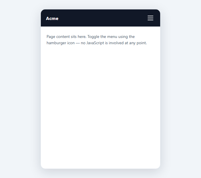
The "checkbox hack" is the foundational technique for building interactive CSS-only components: a hidden native <input type="checkbox"> holds a boolean UI state (open/closed), a <label for="..."> toggles that state on click without any script, and CSS sibling combinators (~ and +) read the checkbox's :checked pseudo-class to style everything downstream of it in the DOM.
Why a checkbox and not a button
A checkbox is the only common form control whose boolean state is exposed to CSS through a pseudo-class the browser maintains for free — :checked. A <button> has no equivalent persistent state selector in CSS; toggling its appearance or a sibling's requires JavaScript to add/remove a class. By binding the visible hamburger icon to a <label for="menuToggle">, clicking or tapping the label fires the browser's native "activate the associated control" behavior, which toggles the checkbox exactly like clicking the checkbox itself — this is standard HTML form behavior, not a hack in itself; the "hack" is only in *repurposing* that toggle as a UI state machine.
Sibling combinators do the routing
The markup order matters: the checkbox comes first, and every element whose appearance depends on the menu state — .hamburger, .nav-panel, .overlay — is a general sibling (~) that follows it in the same parent. .menu-toggle:checked ~ .nav-panel reads as "when the checkbox with class menu-toggle is checked, style any later sibling with class nav-panel." CSS has no parent selector and no way to reach backward or sideways outside this sibling chain, which is why the checkbox must be a direct sibling ancestor of everything it drives — it cannot be nested inside the element it's supposed to control if that element also needs to be a sibling target for others.
Hiding the checkbox without breaking it
The checkbox is hidden with opacity: 0 and pointer-events: none rather than display: none. A display: none input is still functionally checkable via its label, but some assistive technology and older focus-management logic treat display-none form controls inconsistently; opacity: 0 keeps the element in the accessibility tree and focusable via the label's native association, while making it visually invisible. position: absolute removes it from document flow so it doesn't take up space.
The bars-to-X morph
Each of the three bars is an independent <span> with its own transform. On :checked, the top bar translates down 7px and rotates 45deg, the bottom bar translates up 7px and rotates -45deg, and the middle bar scales to zero width while fading out. Because all three transforms are driven by the same single :checked state through three separate sibling selectors (.bar1, .bar2, .bar3), the animation is perfectly synchronized without a single line of JavaScript coordinating them — the browser's CSS transition engine runs all three in parallel.
The full-screen overlay
.overlay is a second <label for="menuToggle"> covering the viewport with position: fixed; inset: 0. Tapping anywhere outside the open nav panel — a click on the overlay — also toggles the same checkbox back to unchecked, because it's the same for association. This gives "click outside to close" behavior, a UX expectation for slide-in menus, entirely through native label semantics rather than a document-level click listener.
Where this actually matters: no-JS environments
This pattern isn't a novelty — it's the only viable way to ship an interactive hamburger menu in contexts that strip <script> tags outright: sanitized user-generated HTML (forum signatures, wiki pages), many CMS "raw HTML" content blocks, iframe sandboxes without allow-scripts, HTML email (where scripts are stripped or blocked by every major mail client), and AMP pages, which explicitly forbid custom JavaScript. In every one of these, a JS-based hamburger menu simply does not run; this one does, because the browser's own form-control state machine is doing the work.
Keyboard accessibility
The label receives :focus-visible styling via the adjacent selector .menu-toggle:focus-visible + .hamburger, and because the checkbox itself remains keyboard-focusable and toggled with Space/Enter through standard form semantics, Tab and Space alone are enough to open the menu without touching a mouse — no tabindex trickery or manual key handling required.
Build with AI
Build, Understand, Optimize, and Extend It With AI
Ask an AI assistant to trace exactly how the sibling combinator chain routes the single :checked state to three separate consumers (the bars, the nav panel, and the overlay) — understanding that chain is the key to adapting this pattern to any other open/close UI. It's also worth asking for a left-slide variant, a version with a second breakpoint that only activates the checkbox hack below a certain viewport width (leaving a normal horizontal nav above it), and a discussion of why display:none would have broken the label-to-checkbox focus relationship if used instead of opacity:0.
Prompt to recreate it
Copy this into your AI assistant of choice to build the effect from scratch, or as a jumping-off point for your own variant:
Build a mobile hamburger navigation menu using only HTML and CSS — no JavaScript, no onclick attributes, no <script> tags of any kind.

Requirements:
- Use the checkbox hack: a hidden <input type="checkbox"> as the single source of open/closed state, toggled exclusively via <label for="..."> elements (the visible hamburger icon and a full-screen overlay).
- The hamburger icon must be three separate bar elements that morph into an X shape using CSS transforms (rotate and translate) driven purely by the checkbox's :checked pseudo-class through sibling combinators (~ or +).
- A slide-in nav panel containing at least five links must translate on/off screen based on the same checkbox state, with a smooth CSS transition.
- Include a full-viewport overlay, also a label bound to the same checkbox, so clicking outside the open panel closes it.
- Hide the checkbox using opacity and pointer-events rather than display:none, so it remains keyboard-focusable and its label association stays fully functional.
- Ensure the hamburger label shows a visible :focus-visible outline for keyboard users, and that Tab + Space/Enter alone can open and close the menu.
Want to tighten it up first? Run this prompt through the AI Prompt Studio to score it across 8 quality dimensions, catch anti-patterns, and tune the wording for Claude, ChatGPT, or Gemini before you paste it in.
Step by step
How to Use
- 1Place the checkbox before its label and panelThe hidden <input type="checkbox"> must appear in the DOM before the .hamburger label and .nav-panel it controls, since CSS sibling selectors only look forward.
- 2Match the id and for attributeThe checkbox's id (menuToggle) must match the for attribute on both the .hamburger label and the .overlay label so both toggle the same state.
- 3Add nav links inside .nav-panelPopulate .nav-panel with as many <a class="nav-link"> items as needed — the slide-in width and padding adapt automatically.
- 4Adjust the slide directionChange nav-panel's translateX(100%) to translateX(-100%) and right:0 to left:0 to slide in from the left instead.
- 5Tune the morph timingEdit the transition durations on .bar and .nav-panel independently to make the icon morph and panel slide feel synchronized or staggered.
Real-world uses
Common Use Cases
Got questions?
Frequently Asked Questions
Yes — that is precisely the scenario this pattern is built for. Since no JavaScript executes at any point, a strict script-src 'none' CSP has no effect on this menu's functionality.
Yes, as long as each checkbox has a unique id and its label(s) reference that unique id via for. Reusing the same id across multiple menus will cause all of them to open together.
Native checkboxes do not auto-uncheck on a sibling link click without JS. A common CSS-only workaround is styling nav-panel to close on any outside interaction via the overlay; if you need close-on-navigate, that specific behavior does require a small script or relying on the page navigation itself unloading the DOM.
It is functionally accessible here because the input remains in the layout and keyboard/focus flow; for content that must be read but never visually or spatially present, a dedicated .sr-only clip-path pattern is more correct, but for a checkbox that is legitimately just invisible and label-driven, opacity:0 with pointer-events:none is standard.
Yes — the same HTML/CSS structure works unchanged as a React component; you would just be trading the checkbox's native :checked state for React state if you ever need JS-driven behavior like closing on route change, but the CSS-only version needs none of that.