
Export Data Modal with Format and Field Picker
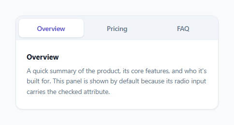
Tab Switcher — CSS Only Radio Hack (No JavaScript)
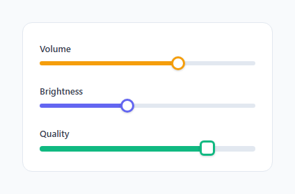
Styled Range Slider — CSS Only Vendor Pseudo-Elements (No JavaScript)
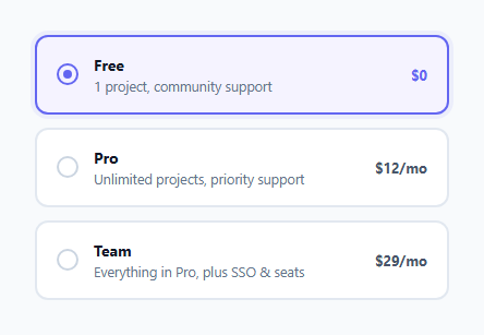
Styled Radio Buttons — CSS Only Plan Selector (No JavaScript)

Star Rating — CSS Only Radio Hack (No JavaScript)
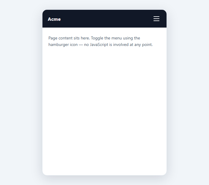
Hamburger Menu — CSS Only Checkbox Hack (No JavaScript)
Learn Coding Visually
Learn to code with interactive, live-preview playgrounds — HTML, CSS, JavaScript, React & more.
 HTML Playground42 lessons · Click-based · Live preview
 CSS PlaygroundLearn CSS with a live editor
 JavaScript Playground60 lessons · DOM · Async · Canvas
 React PlaygroundLearn React with a live code editor
 GSAP PlaygroundLearn GSAP animation interactively
 SVG Playground44 lessons · shapes · paths · animation
 SCSS Playground45 lessons · Sass modules · tokens
 Tailwind PlaygroundLearn Tailwind CSS with a live editor
 Bootstrap 5 Playground50 lessons · live preview
CSS Only Accordion — Checkbox Hack with grid-template-rows, No JS
Accordion — CSS Only Checkbox Hack (No JavaScript) · Misc · Plain HTML & CSS · Live preview
What's included
Features
About this UI Snippet
CSS-Only Accordion — Checkbox Hack Plus the grid-template-rows Animation Trick
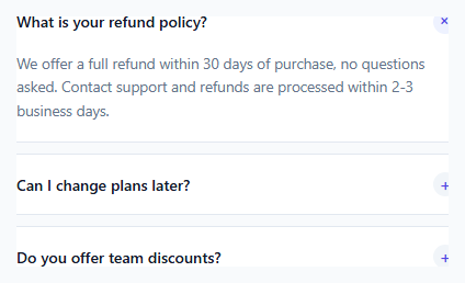
Accordions built with the checkbox hack are common, but most older implementations animate max-height to a large fixed pixel value as a stand-in for "auto" — because CSS transitions cannot interpolate to/from auto directly. This snippet uses a newer, more correct technique: animating grid-template-rows between 0fr and 1fr, which sidesteps the fixed-height guessing problem entirely.
Why max-height: <bignum>px is a bad transition target
The old trick sets max-height: 0 when closed and max-height: 500px (or some other large guess) when open, transitioning between them. Two problems: if the real content is taller than the guessed value, it gets clipped; if it's much shorter, the closing animation has a long dead tail where nothing visible is happening while max-height keeps shrinking past the content's actual height, making the animation feel unevenly paced.
Why grid-template-rows: 0fr → 1fr solves it exactly
Fractional (fr) grid track sizes are directly animatable, and unlike max-height, a single-row grid's 1fr track always sizes itself to exactly the content's natural (intrinsic) height — never more, never less, and with no pixel value hardcoded anywhere. .acc-panel is set to grid-template-rows: 0fr (a zero-height row) when closed and grid-template-rows: 1fr when the sibling checkbox is :checked, and the browser animates the row's computed height across that range using the content's real intrinsic size as the endpoint — solving the "animate to auto" problem CSS has otherwise never had a good answer for.
Why .acc-content still needs overflow: hidden
A CSS grid row that's shrinking still contains its child at full height unless something clips it; .acc-content { overflow: hidden } is what makes the *visual* content clip as the row's computed height shrinks toward zero during the transition, rather than the text simply overflowing the collapsing row and staying visible. min-height: 0 on the same element prevents the grid item's default sizing behavior (which can otherwise refuse to shrink below its content's minimum intrinsic size) from fighting the animation.
Checkbox hack fundamentals, reused from elsewhere in this batch
Each panel's open/closed state is a single hidden <input type="checkbox">, with a <label for="..."> as the clickable header — clicking anywhere on the header row toggles the checkbox via native label-association, no click listener required. .acc-toggle:checked ~ .acc-panel reveals the panel using the general sibling combinator, and because each accordion item's checkbox is independent (unlike the star-rating or tab-switcher's shared name), every panel in this accordion opens and closes independently — this is a multi-open accordion, not a single-open one, by design of not sharing a name attribute across items.
The rotating plus-to-cross icon
.acc-icon is a plain "+" character rotated 135 degrees on :checked, which visually turns a plus sign into an "×" without swapping any icon assets or duplicating markup — the same character, just rotated, driven by the same sibling selector already doing the panel reveal.
Where this earns its keep
FAQ accordions are extremely common inside CMS-authored support pages, product documentation generated from Markdown, and embedded widgets on third-party sites — several of the exact contexts that strip <script> tags. Because both the toggle logic and the height animation here are pure CSS (grid layout plus a checkbox pseudo-class), this accordion opens, closes, and animates smoothly in all of those environments without any JavaScript runtime being available at all.
Build with AI
Build, Understand, Optimize, and Extend It With AI
Ask an AI assistant to explain precisely why grid-template-rows: 0fr to 1fr can animate to the content's real intrinsic height while max-height cannot animate to auto — this is a genuinely subtle piece of CSS grid behavior worth understanding deeply. It's also worth asking for a single-open (radio-based) variant, and for a version that adds a subtle content fade-in using @starting-style so the text doesn't just abruptly appear once the row has expanded enough to reveal it.
Prompt to recreate it
Copy this into your AI assistant of choice to build the effect from scratch, or as a jumping-off point for your own variant:
Build a multi-panel FAQ accordion using only HTML and CSS — no JavaScript, no onclick attributes, no <script> tags — where each panel opens and closes independently of the others.

Requirements:
- Use one hidden <input type="checkbox"> per accordion item (no shared name attribute, so multiple panels can be open simultaneously) with a <label> as the clickable header.
- Animate each panel's open/close transition using CSS grid's grid-template-rows property, transitioning between 0fr and 1fr, so the panel always expands to exactly its content's natural height with no hardcoded max-height guess and no clipped or overly-long animation.
- The panel's inner content wrapper must use overflow:hidden and min-height:0 so the grid-row-collapse animation visually clips the text as it closes.
- Include a toggle icon (e.g. a plus sign) that rotates via a CSS transform into an "x" shape when its panel is open, without swapping to a different icon or duplicating markup.
- Include at least three accordion items, one open by default via the checked attribute.
- Ensure the header shows a visible focus outline when its checkbox receives keyboard focus.
Want to tighten it up first? Run this prompt through the AI Prompt Studio to score it across 8 quality dimensions, catch anti-patterns, and tune the wording for Claude, ChatGPT, or Gemini before you paste it in.
Source Code
<div class="demo">
  <div class="accordion">
    <div class="acc-item">
      <input type="checkbox" id="acc1" class="acc-toggle" checked />
      <label for="acc1" class="acc-header">
        <span>What is your refund policy?</span>
        <span class="acc-icon">+</span>
      </label>
      <div class="acc-panel">
        <div class="acc-content">
          <p>We offer a full refund within 30 days of purchase, no questions asked. Contact support and refunds are processed within 2-3 business days.</p>
        </div>
      </div>
    </div>
    <div class="acc-item">
      <input type="checkbox" id="acc2" class="acc-toggle" />
      <label for="acc2" class="acc-header">
        <span>Can I change plans later?</span>
        <span class="acc-icon">+</span>
      </label>
      <div class="acc-panel">
        <div class="acc-content">
          <p>Yes, you can upgrade or downgrade at any time from account settings. Upgrades apply immediately; downgrades apply at the next billing cycle.</p>
        </div>
      </div>
    </div>
    <div class="acc-item">
      <input type="checkbox" id="acc3" class="acc-toggle" />
      <label for="acc3" class="acc-header">
        <span>Do you offer team discounts?</span>
        <span class="acc-icon">+</span>
      </label>
      <div class="acc-panel">
        <div class="acc-content">
          <p>Teams of 10 or more get a 20% discount automatically applied at checkout when using a shared team billing account.</p>
        </div>
      </div>
    </div>
  </div>
</div>
* { box-sizing: border-box; margin: 0; padding: 0; }
body { font-family: system-ui, sans-serif; background: #f8fafc; display: flex; align-items: center; justify-content: center; min-height: 100vh; padding: 24px; }
.accordion { width: 440px; max-width: 100%; display: flex; flex-direction: column; gap: 10px; }
.acc-item { background: #fff; border: 1px solid #e2e8f0; border-radius: 12px; overflow: hidden; }
.acc-toggle { position: absolute; opacity: 0; pointer-events: none; }
.acc-header { display: flex; align-items: center; justify-content: space-between; gap: 12px; padding: 16px 18px; cursor: pointer; font-size: 14px; font-weight: 600; color: #111827; }
.acc-toggle:focus-visible + .acc-header { outline: 2px solid #6366f1; outline-offset: -2px; }
.acc-icon { flex-shrink: 0; width: 22px; height: 22px; display: flex; align-items: center; justify-content: center; border-radius: 50%; background: #f1f5f9; color: #4f46e5; font-size: 16px; line-height: 1; transition: transform 0.25s ease, background 0.2s ease; }
.acc-toggle:checked + .acc-header .acc-icon { transform: rotate(135deg); background: #eef2ff; }
/* grid-template-rows animates from 0fr to 1fr, which is how a "height: auto"
value can be transitioned smoothly without JS measuring scrollHeight */
.acc-panel { display: grid; grid-template-rows: 0fr; transition: grid-template-rows 0.28s ease; }
.acc-toggle:checked ~ .acc-panel { grid-template-rows: 1fr; }
.acc-content { overflow: hidden; min-height: 0; }
.acc-content p { padding: 0 18px 18px; font-size: 13.5px; color: #64748b; line-height: 1.6; }Step by step
How to Use
- 1Give each panel its own unique checkbox idDo not share the name attribute across items — independent (unnamed or uniquely-named) checkboxes let every panel open and close independently.
- 2Keep the checkbox, header, and panel as direct siblingsThe .acc-toggle:checked ~ .acc-panel rule requires the checkbox to appear before the panel as a sibling within the same .acc-item.
- 3Wrap panel text in .acc-content, not directly in .acc-panelThe overflow:hidden and padding belong on the inner .acc-content div so the outer .acc-panel grid row can animate its height cleanly to zero.
- 4Add or remove .acc-item blocks freelyEach accordion item is self-contained — copy the checkbox/label/panel trio to add more FAQ entries.
- 5Pre-open an item by defaultAdd the checked attribute to any .acc-toggle checkbox to have that panel expanded on first render.
Real-world uses
Common Use Cases
Got questions?
Frequently Asked Questions
Yes — fractional grid track animation works in all current evergreen browsers (Chrome, Firefox, Safari, Edge). It is newer than max-height tricks but has been broadly supported for several years at this point, making it safe for most production use.
Yes, by design — each checkbox here is independent with no shared name, so opening one panel does not close others. To make it single-open (only one panel expanded at a time), convert the checkboxes to radios sharing one name attribute instead, similar to the tab-switcher snippet.
Native <details> is simpler and is covered by a separate snippet in this batch — it needs no checkbox at all. The checkbox-hack version here is useful when you need more control over the toggle icon and panel animation styling than <details> currently allows without extra CSS workarounds.
overflow:hidden clips the content visually as the grid row shrinks toward zero height; min-height:0 overrides the grid item's default refusal to shrink below its content's intrinsic minimum size, which would otherwise prevent the row from fully collapsing.
Give every .acc-toggle the same name attribute and change their type from checkbox to radio — the same native mutual-exclusivity used by this batch's tab-switcher and star-rating snippets applies here too.