Source Code
<div class="demo">
  <div class="tabs">
    <input type="radio" name="tabs" id="tab1" class="tab-input" checked />
    <input type="radio" name="tabs" id="tab2" class="tab-input" />
    <input type="radio" name="tabs" id="tab3" class="tab-input" />

    <div class="tab-list" role="tablist">
      <label for="tab1" class="tab-label">Overview</label>
      <label for="tab2" class="tab-label">Pricing</label>
      <label for="tab3" class="tab-label">FAQ</label>
      <span class="tab-indicator"></span>
    </div>

    <div class="panel panel1">
      <h3>Overview</h3>
      <p>A quick summary of the product, its core features, and who it's built for. This panel is shown by default because its radio input carries the checked attribute.</p>
    </div>
    <div class="panel panel2">
      <h3>Pricing</h3>
      <p>Three simple plans: Free, Pro, and Team. Every plan includes unlimited projects and community support, with Pro and Team adding priority support and SSO.</p>
    </div>
    <div class="panel panel3">
      <h3>FAQ</h3>
      <p>Common questions about billing, cancellation, and data export are answered here, all switched with zero JavaScript.</p>
    </div>
  </div>
</div>
* { box-sizing: border-box; margin: 0; padding: 0; }
body { font-family: system-ui, sans-serif; background: #f8fafc; display: flex; align-items: center; justify-content: center; min-height: 100vh; padding: 24px; }
.tabs { width: 420px; max-width: 100%; background: #fff; border: 1px solid #e2e8f0; border-radius: 14px; overflow: hidden; box-shadow: 0 1px 3px rgba(15,23,42,0.06); }
.tab-input { position: absolute; opacity: 0; pointer-events: none; }
.tab-list { position: relative; display: grid; grid-template-columns: repeat(3, 1fr); background: #f1f5f9; padding: 6px; gap: 4px; }
.tab-label { position: relative; z-index: 2; text-align: center; padding: 10px 8px; border-radius: 8px; font-size: 13.5px; font-weight: 600; color: #64748b; cursor: pointer; transition: color 0.2s ease; }
.tab-input:focus-visible + .tab-label,
.tab-label:has(+ .tab-input:focus-visible) { outline: 2px solid #818cf8; outline-offset: 2px; }
/* Sliding indicator behind the active label, positioned per checked radio */
.tab-indicator { position: absolute; top: 6px; left: 6px; height: calc(100% - 12px); width: calc(33.333% - 5.333px); background: #fff; border-radius: 8px; box-shadow: 0 1px 3px rgba(15,23,42,0.12); transition: transform 0.25s cubic-bezier(0.4, 0, 0.2, 1); z-index: 1; }
#tab1:checked ~ .tab-list .tab-indicator { transform: translateX(0); }
#tab2:checked ~ .tab-list .tab-indicator { transform: translateX(calc(100% + 6px)); }
#tab3:checked ~ .tab-list .tab-indicator { transform: translateX(calc(200% + 12px)); }
#tab1:checked ~ .tab-list label[for="tab1"],
#tab2:checked ~ .tab-list label[for="tab2"],
#tab3:checked ~ .tab-list label[for="tab3"] { color: #4f46e5; }
.panel { display: none; padding: 24px 22px 26px; animation: fadeIn 0.25s ease; }
.panel h3 { font-size: 15px; color: #111827; margin-bottom: 8px; }
.panel p { font-size: 13.5px; color: #64748b; line-height: 1.6; }
@keyframes fadeIn { from { opacity: 0; transform: translateY(4px); } to { opacity: 1; transform: translateY(0); } }
#tab1:checked ~ .panel1,
#tab2:checked ~ .panel2,
#tab3:checked ~ .panel3 { display: block; }Learn Coding Visually
Learn to code with interactive, live-preview playgrounds — HTML, CSS, JavaScript, React & more.
 HTML Playground42 lessons · Click-based · Live preview
 CSS PlaygroundLearn CSS with a live editor
 JavaScript Playground60 lessons · DOM · Async · Canvas
 React PlaygroundLearn React with a live code editor
 GSAP PlaygroundLearn GSAP animation interactively
 SVG Playground44 lessons · shapes · paths · animation
 SCSS Playground45 lessons · Sass modules · tokens
 Tailwind PlaygroundLearn Tailwind CSS with a live editor
 Bootstrap 5 Playground50 lessons · live preview
CSS Only Tab Switcher — Radio Button Hack, No JavaScript
Tab Switcher — CSS Only Radio Hack (No JavaScript) · Navigation · Plain HTML & CSS · Live preview
What's included
Features
About this UI Snippet
Tab Switcher Built on the Radio Input Hack — Zero JavaScript
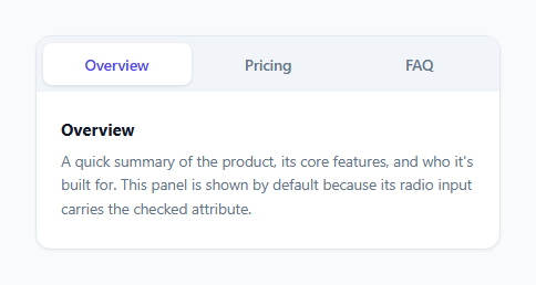
Tabs are, structurally, a single-choice input: exactly one panel is visible at a time, which maps directly onto <input type="radio">'s native "only one option in a group can be checked" behavior. This snippet uses that mapping directly instead of simulating it with JavaScript.
Why radio, not checkbox
A checkbox hack works well for independent booleans (open/closed), but tabs are mutually exclusive — selecting one must deselect the others. Grouping several <input type="radio" name="tabs"> elements under the same name attribute gives the browser this mutual-exclusivity behavior for free: checking one radio in the group automatically unchecks every other radio sharing that name, with no JavaScript coordinating it. This is exactly the guarantee tabs need, which is why the radio hack — not the checkbox hack — is the correct primitive here.
Routing state to panels with sibling selectors
Each panel (.panel1, .panel2, .panel3) sits as a general sibling after all three radios and the .tab-list in the DOM. The rule #tab1:checked ~ .panel1 { display: block } reads as "when the radio with id tab1 is checked, show the sibling with class panel1." Because only one radio in the named group can be checked at a time, exactly one of the three ~ .panelN rules ever matches, which is what guarantees exactly one panel is visible — the same guarantee a JS tab implementation enforces manually by toggling classes, except here it falls out of native form semantics.
The sliding indicator without measuring anything
The active-tab background pill is a single absolutely-positioned .tab-indicator element, not a background color on each label. Its width is a fixed calc(33.333% - 5.333px) (accounting for the grid gaps), and each #tabN:checked ~ .tab-list .tab-indicator rule sets a different transform: translateX() value corresponding to that tab's grid column. Because transform is used instead of animating left, the indicator slides using a GPU-accelerated compositor property rather than triggering layout on every frame, and because all three possible positions are pre-computed as static calc() expressions, no JavaScript measurement of the clicked label's actual pixel position is ever needed — the layout is a fixed 3-column grid, so the three positions are knowable in advance.
Label as the click target, not the panel
Every <label for="tabN"> is bound to its radio via the for/id pair, so clicking anywhere on the visible tab button activates the correct radio through standard label-to-form-control association — the same mechanism a real <button> click would use, just routed through a hidden native input instead of a JS event handler.
Keyboard behavior comes from the browser, not from added code
Radio groups have long-standing native keyboard behavior: Tab moves focus into the group (landing on the checked radio, or the first one if none is checked), and the Arrow keys move the checked state between radios in the same name group. This snippet gets that keyboard-driven tab switching automatically, without a single keydown listener — something a from-scratch JS tab implementation has to deliberately reimplement (usually incorrectly) to match native role="tablist" behavior.
Where JavaScript genuinely cannot run
Tab interfaces are common in generated documentation (code-example tabs for different languages) and in CMS-authored marketing pages — both frequently rendered through pipelines (Markdown-to-HTML converters, sanitizing CMS renderers) that strip <script> tags for security. Because this tab switcher's entire state machine is native radio-input behavior plus CSS sibling selectors, it continues to function unchanged in exactly those stripped-script contexts, where a JS-driven tab component would render as static markup with no way to switch panels at all.
Build with AI
Build, Understand, Optimize, and Extend It With AI
Ask an AI assistant to walk through why grouping the radios under a shared name attribute is the key mechanism that guarantees exactly one panel is ever visible, and why that guarantee doesn't hold if you accidentally give two radios different name values. It's also a good prompt for adding a :target-based variant that syncs the active tab to a URL fragment for deep-linking, or for extending the sliding indicator math to a variable, rather than fixed, number of tabs using CSS custom properties and the sibling-index counting trick.
Prompt to recreate it
Copy this into your AI assistant of choice to build the effect from scratch, or as a jumping-off point for your own variant:
Build a tabbed interface with at least three tabs using only HTML and CSS — no JavaScript, no onclick attributes, no <script> tags.

Requirements:
- Use hidden native <input type="radio"> elements, all sharing the same name attribute, as the sole source of which tab is active — rely on the browser's native radio-group mutual exclusivity rather than any manually toggled class.
- Each tab must be a <label> bound via for/id to its radio, acting as the clickable tab button.
- Each content panel must be shown or hidden using only a CSS sibling combinator selector keyed on that panel's corresponding radio's :checked state, ensuring exactly one panel is visible at any time.
- Include a sliding active-tab background indicator that moves to the correct position using CSS transform and transition, with the position for each tab pre-computed in CSS rather than measured at runtime.
- One radio must be checked by default so a panel is visible on first load.
- Ensure keyboard users can switch tabs using only Tab and Arrow keys via the radio group's native behavior, and that the currently focused tab shows a visible focus outline.
Want to tighten it up first? Run this prompt through the AI Prompt Studio to score it across 8 quality dimensions, catch anti-patterns, and tune the wording for Claude, ChatGPT, or Gemini before you paste it in.
Step by step
How to Use
- 1Give all tab radios the same nameAll <input type="radio"> tab controls must share name="tabs" so the browser enforces that only one can be checked at a time.
- 2Match each label's for to its radio idlabel[for="tab1"] must reference the id of its corresponding radio exactly, or clicking the label will not select that tab.
- 3Keep radios before the panels in markup orderThe #tabN:checked ~ .panelN sibling selector only looks forward in the DOM, so radios and .tab-list must appear before all .panel elements.
- 4Set one radio as checked by defaultAdd the checked attribute to exactly one radio input so a panel is visible on first render instead of showing nothing.
- 5Adjust indicator math for a different tab countUpdate the grid-template-columns count and each #tabN:checked translateX() percentage if you add or remove tabs.
Real-world uses
Common Use Cases
Got questions?
Frequently Asked Questions
Not with radio inputs alone, since :checked state isn't tied to the URL. For URL-fragment-driven tabs, use the :target pseudo-class pattern instead (see the accordion or a dedicated :target-based tabs variant), which does read the URL hash directly.
transform: translateX() is handled by the compositor and does not trigger layout recalculation on every animation frame, unlike animating left, making the slide smoother and cheaper, especially on lower-powered devices.
As many as you add radio inputs, labels, and panels for — just remember to update the .tab-indicator width calc() and each #tabN:checked translateX() value to match the new column count and index.
The :has()-based focus rule is a progressive enhancement; the adjacent-sibling :focus-visible + .tab-label rule alongside it already covers the common case, so a browser without :has() support simply loses one redundant selector, not the whole focus indicator.
Yes — the same radio-group markup works unmodified as a component; if you need JS-driven behavior like syncing the active tab to a route, swap the native :checked state for a controlled radio group bound to component state.