You Might Also Like
Learn Coding Visually
Learn to code with interactive, live-preview playgrounds — HTML, CSS, JavaScript, React & more.
 HTML Playground42 lessons · Click-based · Live preview
 CSS PlaygroundLearn CSS with a live editor
 JavaScript Playground60 lessons · DOM · Async · Canvas
 React PlaygroundLearn React with a live code editor
 GSAP PlaygroundLearn GSAP animation interactively
 SVG Playground44 lessons · shapes · paths · animation
 SCSS Playground45 lessons · Sass modules · tokens
 Tailwind PlaygroundLearn Tailwind CSS with a live editor
 Bootstrap 5 Playground50 lessons · live preview
Mood Picker — Emoji Face Satisfaction Selector
Mood Picker · Forms · Plain HTML, CSS & JS · Live preview
What's included
Features
About this UI Snippet
Mood Picker — SVG Smiley-Face Satisfaction Rating with Hover Preview
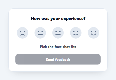
A mood picker asks "how was it?" with a row of faces from frowning to grinning — a friendlier, more immediate rating than stars for satisfaction surveys, support closeouts, and check-ins. This snippet builds one with crisp inline-SVG faces, a hover preview, click-to-commit, and keyboard support, in plain HTML, CSS, and vanilla JavaScript with no emoji fonts or images.
Faces drawn in SVG, not emoji
Each face is an inline <svg> with two eyes and a single <path> mouth. The mouth's curve encodes the mood: a downward Q quadratic curve for sad, a flat L line for neutral, and an upward curve for happy. Drawing them in SVG instead of using emoji characters means they render identically on every OS (no "emoji looks different on Windows vs Mac" problem), scale crisply at any size, and recolour with CSS — the selected face turns warm amber via a class, with no extra assets.
Preview vs commit
Like a good rating control, hovering or focusing a face previews that mood — lifting it, colouring it, and showing its label ("Okay", "Great") — without changing the saved value. Clicking commits: it stores the score, enables the submit button, and becomes the state the row returns to when the pointer leaves. This separation lets users scan the options without accidentally locking in a choice.
Accessible by construction
The row is a role="radiogroup" and each face is a <button role="radio"> with an aria-label ("Good") and aria-checked tracking the committed value. Arrow keys move between faces and set the mood, matching the radio-group keyboard model, and a focus ring keeps keyboard users oriented. Screen-reader users hear a clear label for each option rather than an ambiguous picture.
Form-ready feedback loop
The submit button stays disabled until a face is chosen, preventing empty responses, and the label doubles as live confirmation ("Thanks for the feedback!"). The committed value is a number 1–5 you can post to your backend or map to an NPS-style bucket. Because the logic is tiny and the faces are pure markup, you can add a comment box, change the count to three faces, or swap the palette in minutes.
Tactile motion
Faces lift and scale on hover with a short transition, giving the control a playful, responsive feel that suits the friendly tone of a mood survey. Everything is a few dozen lines of CSS — a clean, dependency-free reference for emoji-style satisfaction pickers.
Build with AI
Build, Understand, Optimize, and Extend It With AI
Rather than tracing the preview-versus-commit split by hand, paste this snippet's HTML, CSS, and JS into an AI coding assistant like Claude and ask it to explain exactly how the paint() function's aria-checked logic stays correct even while a different face is being hovered for preview, and why the mouth is a single quadratic path per face instead of five separate curve elements. The same assistant can help optimize it, for instance checking whether the mouseleave handler on mp-faces correctly restores the committed face in every edge case, or whether the arrow-key navigation should wrap around at the ends of the row instead of clamping. It's also handy for extending the picker: ask it to add a follow-up comment textarea that only appears after a mood is committed, animate the mouth path morphing between moods instead of swapping discrete SVGs, or persist the last choice so a returning user sees their prior rating pre-selected. Treat the code less like a finished artifact and more like a starting point for a conversation.
Prompt to recreate it
Copy this into your AI assistant of choice to build the effect from scratch, or as a jumping-off point for your own variant:
Build an accessible "mood picker" satisfaction control in plain HTML, CSS, and JavaScript using only inline SVG faces — no emoji characters, no icon library.

Requirements:
- A row of five buttons, each containing an inline SVG face: two circular eyes and a single path element for the mouth, where the mouth's curve direction encodes the mood (a downward quadratic curve for the saddest face, a flat line for neutral, an upward quadratic curve for the happiest, with the middle two faces interpolating between those extremes).
- The row must have role="radiogroup" and each button must have role="radio", a distinct aria-label describing its mood in words (not just a number), and an aria-checked attribute reflecting only the currently committed choice, not whatever is being hovered.
- Hovering or keyboard-focusing a face must visually preview that mood (lift/scale it, recolor it, update a status line with its label) without changing the committed value; moving the mouse away (or blurring, for keyboard) must revert the preview back to whatever was last actually committed, or to a neutral prompt if nothing has been committed yet.
- Clicking a face (or pressing Enter/Space on a focused one) must commit that value, update aria-checked across all the faces, and enable a submit button that starts disabled.
- Left and right arrow keys, while a face is focused, must move focus to the adjacent face and commit that face's mood immediately, matching the standard radio-group keyboard interaction pattern.
- On submit, prevent the default form submission and show an inline confirmation message instead of navigating away.
Want to tighten it up first? Run this prompt through the AI Prompt Studio to score it across 8 quality dimensions, catch anti-patterns, and tune the wording for Claude, ChatGPT, or Gemini before you paste it in.
Step by step
How to Use
- 1Paste HTML, CSS, and JSA row of five SVG faces renders with a disabled submit button.
- 2Hover a faceIt lifts and the label shows its mood, without committing.
- 3Click to chooseClicking sets the mood, enables submit, and highlights the face.
- 4Use the keyboardTab to the row and use Left/Right arrows to move and select.
- 5Read the valueThe committed value is 1–5 (data-value); post or map it as you like.
- 6CustomiseChange to three faces, recolour, or add a comment field.
Real-world uses
Common Use Cases
Got questions?
Frequently Asked Questions
Emoji render differently on every platform — the same character looks distinct on Windows, macOS, Android, and iOS, so your survey loses visual consistency. Inline SVG faces look identical everywhere, scale crisply to any size, and recolour with CSS (the selected face turns amber), all without bundling image files. You also get full control over the exact expression via the mouth path.
Each face has a data-value from 1 (awful) to 5 (great), and the committed choice is held in a current variable. Read it on submit to post a number to your backend, or map it to buckets — for example treat 4 and 5 as promoters. The control also exposes a readable label per face for confirmations.
Yes. The row is a radiogroup, each face is a button with role="radio", an aria-label, and aria-checked, and arrow keys move and set the mood like a native radio group. A focus-visible ring shows the active face, and screen readers announce a clear word ("Good") instead of an image, so it is usable without sight or a mouse.
Yes — remove two of the button blocks and keep data-value sequential (1, 2, 3). The script reads whatever faces are present and the arrow-key navigation adapts automatically, so no JavaScript changes are needed. Three faces (sad/neutral/happy) is common for lightweight one-tap sentiment.
Keep the SVG markup and move the state into your component: track committed and hovered values, render the highlight class from them, and bind mouseenter/focus/click/keydown handlers. Replace the submit gating with a disabled prop driven by state, and post the numeric value in your submit handler. Tailwind users swap the classes for utilities and toggle the amber fill with a conditional class.