You Might Also Like
Learn Coding Visually
Learn to code with interactive, live-preview playgrounds — HTML, CSS, JavaScript, React & more.
 HTML Playground42 lessons · Click-based · Live preview
 CSS PlaygroundLearn CSS with a live editor
 JavaScript Playground60 lessons · DOM · Async · Canvas
 React PlaygroundLearn React with a live code editor
 GSAP PlaygroundLearn GSAP animation interactively
 SVG Playground44 lessons · shapes · paths · animation
 SCSS Playground45 lessons · Sass modules · tokens
 Tailwind PlaygroundLearn Tailwind CSS with a live editor
 Bootstrap 5 Playground50 lessons · live preview
Color Contrast Checker — WCAG AA/AAA Ratio Tool
Color Contrast Checker · Forms · Plain HTML, CSS & JS · Live preview
What's included
Features
About this UI Snippet
Color Contrast Checker — WCAG Contrast Ratio with AA/AAA Pass-Fail
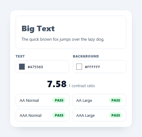
A color contrast checker measures whether text is legible against its background using the WCAG contrast formula, then shows whether it passes AA and AAA at normal and large sizes. It's the tool every designer and developer needs to keep interfaces accessible. This snippet computes the real WCAG ratio in the browser and previews it live, in plain HTML, CSS, and vanilla JavaScript.
The real WCAG math
Contrast isn't a naive RGB difference — it's based on relative luminance. The script converts each colour to linearised sRGB (applying the c <= 0.03928 ? c/12.92 : ((c+0.055)/1.055)^2.4 transfer function per channel), weights the channels 0.2126 / 0.7152 / 0.0722, and computes the ratio as (L_lighter + 0.05) / (L_darker + 0.05). That's the exact WCAG 2.x definition, so the number you see matches what an audit tool or accessibility checker reports.
Pass/fail at a glance
The four thresholds are evaluated and shown as PASS/FAIL pills: AA Normal needs 4.5:1, AA Large needs 3:1, AAA Normal needs 7:1, and AAA Large needs 4.5:1. "Large" means roughly 18px bold or 24px regular and up. Seeing all four at once tells you not just whether a pairing works, but for which text sizes — so you can confidently use a borderline colour for headings while avoiding it for body copy.
Dual input, always in sync
Each colour has a native <input type="color"> swatch and a hex text field, kept in sync both ways: pick from the OS colour picker and the hex updates; type a hex (3- or 6-digit, with or without #) and the swatch updates. A small clampHex validator normalises shorthand like #fff to #ffffff and ignores invalid input, so the preview never breaks mid-typing.
Live preview
The preview panel renders real big and small text in the chosen colours, so you judge legibility with your eyes as well as the number — the two together catch problems a ratio alone can miss, like a technically-passing pair that still feels muddy. Every change recomputes instantly with no button to press.
Self-contained and portable
The luminance and ratio functions are pure and dependency-free — you can lift them straight into a design-system linter, a Figma plugin, or a build-time check. The whole checker is a compact, framework-agnostic reference for doing WCAG contrast correctly instead of eyeballing it.
Build with AI
Build, Understand, Optimize, and Extend It With AI
You don't have to eyeball whether this snippet's math matches the WCAG spec exactly. Paste the HTML, CSS, and JS into an AI coding assistant like Claude and ask it to walk through why the luminance function applies that particular piecewise transfer curve to each channel before weighting them 0.2126/0.7152/0.0722, instead of just averaging RGB values. The same assistant can help optimize it — for instance checking whether recomputing luminance for both colors on every keystroke is wasteful, or whether the clampHex validator could reject bad input earlier to avoid needless re-renders. It is just as useful for extending the tool: ask it to add APCA contrast scoring alongside the WCAG ratio, support a third "against" color for a three-way palette check, or flag the nearest passing color automatically when a pair fails. Treat the code less like a finished artifact and more like a starting point for a conversation.
Prompt to recreate it
Copy this into your AI assistant of choice to build the effect from scratch, or as a jumping-off point for your own variant:
Build a color contrast checker in plain HTML, CSS, and JavaScript that computes the real WCAG 2.x contrast ratio — no color libraries, no approximations.

Requirements:
- Two color inputs (text and background), each pairing a native input type="color" swatch with a synced hex text field that accepts 3- or 6-digit hex with or without a leading hash.
- A pure function that converts a hex color to RGB, then to relative luminance using the WCAG transfer function per channel (c/12.92 below the 0.03928 threshold, otherwise ((c+0.055)/1.055) raised to the 2.4 power), weighted 0.2126 red, 0.7152 green, 0.0722 blue.
- A ratio function computing (lighter luminance + 0.05) / (darker luminance + 0.05) from the two luminance values, matching the official WCAG formula exactly.
- Display the numeric ratio live, updating on every input change with no submit button.
- Four pass/fail indicators evaluated from the same ratio: AA Normal at 4.5:1, AA Large at 3:1, AAA Normal at 7:1, and AAA Large at 4.5:1, each rendered as a clearly distinct pass or fail state.
- A live preview area rendering real sample text (a heading and a paragraph) in the exact chosen foreground and background colors so users can visually sanity-check legibility alongside the numeric ratio.
- Keep the luminance and ratio functions as standalone, dependency-free functions that could be copy-pasted into a separate linter or build script.
Want to tighten it up first? Run this prompt through the AI Prompt Studio to score it across 8 quality dimensions, catch anti-patterns, and tune the wording for Claude, ChatGPT, or Gemini before you paste it in.
Step by step
How to Use
- 1Paste HTML, CSS, and JSA contrast checker renders with a live text preview and pass/fail grid.
- 2Choose colorsUse the swatch picker or type a hex for text and background.
- 3Read the ratioThe big number is the exact WCAG contrast ratio, updated live.
- 4Check the levelsThe four pills show AA/AAA pass or fail for normal and large text.
- 5Judge the previewThe sample text renders in your colors so you can sanity-check legibility.
- 6Reuse the mathLift the luminance/ratio functions into a linter or design tool.
Real-world uses
Common Use Cases
Got questions?
Frequently Asked Questions
It uses the WCAG 2.x formula: each color is converted to relative luminance by linearising its sRGB channels and weighting them 0.2126 (R), 0.7152 (G), 0.0722 (B), then the ratio is (lighter + 0.05) / (darker + 0.05). This is the same math accessibility auditors use, so the number matches official checkers — it is not a simple RGB or brightness difference.
They are WCAG conformance levels. AA requires 4.5:1 for normal text and 3:1 for large text; AAA is stricter at 7:1 normal and 4.5:1 large. "Large" is about 18px bold or 24px regular and up. AA is the common legal/target baseline; AAA is an enhanced level. The grid shows all four so you know exactly which sizes a color pair is safe for.
The ratio is objective but does not capture everything — a pair can pass yet still feel muddy, or you may want to see how a borderline color reads at real sizes. Rendering actual big and small text in the chosen colors lets you confirm legibility with your eyes, catching issues a single number can hide.
Yes. The luminance(rgb) and ratio(fg, bg) functions are pure and have no dependencies, so you can copy them into a design-system linter, a CI check that fails on low-contrast tokens, a Figma plugin, or a Storybook addon. They take hex/RGB and return the WCAG ratio directly.
Keep the luminance and ratio helpers as plain functions and hold the two colors in state (useState/ref/component fields). Compute the ratio and pass/fail flags as derived values on each change, and bind them to the preview style and the pill classes. Two-way bind the color and hex inputs to the same state. In Tailwind, swap the classes for utilities; the math is unchanged.