Source Code
<div class="cmt-demo" id="cmtDemo">
  <div class="cmt-bar">
    <span class="cmt-logo">◆ Acme</span>
    <div class="cmt-switch" role="radiogroup" aria-label="Color theme">
      <button type="button" class="cmt-opt" data-mode="light" aria-label="Light">
        <svg viewBox="0 0 24 24" fill="none" stroke="currentColor" stroke-width="2" stroke-linecap="round"><circle cx="12" cy="12" r="4"/><path d="M12 2v2M12 20v2M4.9 4.9l1.4 1.4M17.7 17.7l1.4 1.4M2 12h2M20 12h2M4.9 19.1l1.4-1.4M17.7 6.3l1.4-1.4"/></svg>
      </button>
      <button type="button" class="cmt-opt" data-mode="system" aria-label="System">
        <svg viewBox="0 0 24 24" fill="none" stroke="currentColor" stroke-width="2" stroke-linecap="round" stroke-linejoin="round"><rect x="2" y="3" width="20" height="14" rx="2"/><path d="M8 21h8M12 17v4"/></svg>
      </button>
      <button type="button" class="cmt-opt" data-mode="dark" aria-label="Dark">
        <svg viewBox="0 0 24 24" fill="none" stroke="currentColor" stroke-width="2" stroke-linecap="round" stroke-linejoin="round"><path d="M21 12.8A9 9 0 1 1 11.2 3a7 7 0 0 0 9.8 9.8z"/></svg>
      </button>
      <span class="cmt-thumb" id="cmtThumb"></span>
    </div>
  </div>

  <div class="cmt-content">
    <h3>Good morning</h3>
    <p>This panel previews your theme. Pick Light, Dark, or System — System follows your device setting automatically.</p>
    <div class="cmt-chips"><span>Live preview</span><span class="cmt-state" id="cmtState">System · dark</span></div>
  </div>
</div>*{box-sizing:border-box;margin:0;padding:0}
body{font-family:system-ui,-apple-system,sans-serif;background:#e2e8f0;min-height:100vh;display:flex;align-items:center;justify-content:center;padding:24px}
/* Theme tokens — :root is light, [data-theme=dark] overrides. */
.cmt-demo{--bg:#ffffff;--bg2:#f1f5f9;--text:#0f172a;--text2:#64748b;--border:#e2e8f0;--accent:#6366f1;
width:100%;max-width:420px;background:var(--bg);border:1px solid var(--border);border-radius:18px;overflow:hidden;
box-shadow:0 18px 44px rgba(15,23,42,.14);transition:background .3s,border-color .3s,color .3s}
.cmt-demo[data-theme="dark"]{--bg:#0f172a;--bg2:#1e293b;--text:#f1f5f9;--text2:#94a3b8;--border:#1e293b;--accent:#818cf8}
.cmt-bar{display:flex;align-items:center;justify-content:space-between;padding:14px 18px;border-bottom:1px solid var(--border)}
.cmt-logo{font-size:14px;font-weight:800;color:var(--text)}
.cmt-switch{position:relative;display:inline-flex;background:var(--bg2);border-radius:999px;padding:3px}
.cmt-opt{position:relative;z-index:1;width:34px;height:30px;border:none;background:none;color:var(--text2);cursor:pointer;display:flex;align-items:center;justify-content:center;transition:color .2s}
.cmt-opt svg{width:16px;height:16px}
.cmt-opt.active{color:var(--accent)}
.cmt-thumb{position:absolute;top:3px;left:3px;width:34px;height:30px;background:var(--bg);border-radius:999px;box-shadow:0 1px 4px rgba(15,23,42,.18);transition:transform .25s cubic-bezier(.34,1.3,.64,1)}
.cmt-content{padding:22px 18px}
.cmt-content h3{font-size:20px;font-weight:800;color:var(--text);margin-bottom:8px}
.cmt-content p{font-size:13px;color:var(--text2);line-height:1.6;margin-bottom:16px}
.cmt-chips{display:flex;align-items:center;justify-content:space-between;font-size:11.5px}
.cmt-chips span{color:var(--text2);font-weight:600}
.cmt-state{background:var(--bg2);color:var(--text);padding:4px 10px;border-radius:999px;font-weight:700}var MODES = ['light', 'system', 'dark'];
var demo = document.getElementById('cmtDemo');
var thumb = document.getElementById('cmtThumb');
var stateEl = document.getElementById('cmtState');
var media = window.matchMedia('(prefers-color-scheme: dark)');
// In a real app, persist to localStorage and apply to <html>. This scoped demo
// applies the theme to the .cmt-demo container instead so the page stays neutral.
var mode = 'system';
function resolved(m) {
return m === 'system' ? (media.matches ? 'dark' : 'light') : m;
}
function apply() {
var theme = resolved(mode);
demo.setAttribute('data-theme', theme);
// Move the sliding thumb to the active option.
var idx = MODES.indexOf(mode);
thumb.style.transform = 'translateX(' + (idx * 34) + 'px)';
document.querySelectorAll('.cmt-opt').forEach(function (b) {
b.classList.toggle('active', b.dataset.mode === mode);
});
stateEl.textContent = mode === 'system' ? 'System · ' + theme : mode.charAt(0).toUpperCase() + mode.slice(1);
// A real app would also: localStorage.setItem('theme', mode);
}
document.querySelector('.cmt-switch').addEventListener('click', function (e) {
var btn = e.target.closest('.cmt-opt');
if (!btn) return;
mode = btn.dataset.mode;
apply();
});
// When in System mode, react live to the OS theme changing.
media.addEventListener('change', function () { if (mode === 'system') apply(); });
apply();Learn Coding Visually
Learn to code with interactive, live-preview playgrounds — HTML, CSS, JavaScript, React & more.
 HTML Playground42 lessons · Click-based · Live preview
 CSS PlaygroundLearn CSS with a live editor
 JavaScript Playground60 lessons · DOM · Async · Canvas
 React PlaygroundLearn React with a live code editor
 GSAP PlaygroundLearn GSAP animation interactively
 SVG Playground44 lessons · shapes · paths · animation
 SCSS Playground45 lessons · Sass modules · tokens
 Tailwind PlaygroundLearn Tailwind CSS with a live editor
 Bootstrap 5 Playground50 lessons · live preview
Color Mode Toggle — Light/Dark/System Switch UI
Color Mode Toggle · Buttons · Plain HTML, CSS & JS · Live preview
What's included
Features
About this UI Snippet
Color Mode Toggle — Three-Way Light / Dark / System Theme Switch
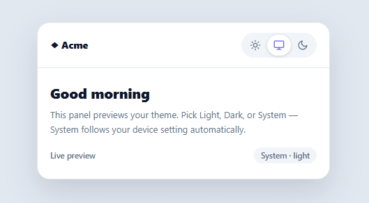
A two-state dark-mode toggle forces a choice the user shouldn't have to make: it ignores that their device already has a light/dark preference that changes with time of day. The modern pattern is a three-way switch — Light, Dark, and System — where System defers to the OS setting and updates live when it changes. This snippet builds that segmented theme control in plain HTML, CSS, and vanilla JavaScript, with a sliding thumb, CSS-variable theming, and correct System behavior.
Why "System" is the important option
"System" (sometimes "Auto") is what most users actually want as a default: it follows the device's prefers-color-scheme, so the site is light during the day and dark at night without anyone touching a setting. The key behavior is that System isn't a snapshot — it's a *live* binding. This snippet listens to the matchMedia('(prefers-color-scheme: dark)') change event and re-applies the theme whenever the OS flips, but only while the user is in System mode. Pick Light or Dark explicitly and you override the OS; pick System and you hand control back to it. Getting this live-follow behavior right is what separates a real three-way toggle from one that just has a third button.
Theming with CSS custom properties
The whole component themes through CSS variables. :root-equivalent tokens on the container (--bg, --text, --border, --accent) define the light theme, and a [data-theme="dark"] selector overrides them for dark. Every element references the variables, so switching themes is a single attribute change on one element — no per-element class toggling. A transition on the color properties makes the switch a smooth crossfade rather than an abrupt flip. This is the standard, scalable way to theme a site: define tokens once, flip one attribute.
The sliding thumb
The three options sit in a pill, and a thumb slides beneath the active one using transform: translateX() (the index times the option width), with a slight spring easing. Animating transform keeps the motion GPU-cheap and smooth, and the active icon tints to the accent color so the selection is clear from both the thumb position and the color. A small status chip echoes the current mode and, in System mode, the resolved theme ("System · dark") so the user can see what System currently maps to.
Scoped demo vs. real app
This demo applies the theme to its own container (.cmt-demo) so the surrounding page stays neutral — but in a real app you'd set data-theme on <html> and persist the choice to localStorage, then read it back on load (ideally in a tiny inline script in the <head>, before first paint, to avoid a flash of the wrong theme). The code comments mark exactly where those two lines go. The resolution logic — mode → resolved theme — is identical whether you scope it to a container or the whole document.
Accessible and keyboard-ready
The switch is a role="radiogroup" of icon buttons, each with an aria-label (Light / System / Dark), so it's operable and announced correctly. Building it from real buttons means keyboard focus and activation work without custom handling, and the visual selection never relies on color alone — the thumb position is a second, redundant indicator.
Build with AI
Build, Understand, Optimize, and Extend It With AI
You don't have to puzzle out the System-mode logic by re-reading it several times. Paste this snippet's HTML, CSS, and JS into an AI coding assistant like Claude and ask it to explain exactly how the resolved function decides between light and dark when mode is "system", and why the matchMedia change listener checks the current mode before reapplying the theme. The same assistant is useful for optimizing it — for instance asking whether toggling one data-theme attribute plus CSS variables really is cheaper than swapping classes across many elements, especially at scale. It is also a good way to extend the control: ask it to add a fourth "high contrast" mode, animate the icon swap instead of just the color tint, or wire in the localStorage persistence and pre-paint inline script that the comments describe but don't implement. Treat the code less like a finished artifact and more like a starting point for a conversation.
Prompt to recreate it
Copy this into your AI assistant of choice to build the effect from scratch, or as a jumping-off point for your own variant:
Build a three-way light/dark/system theme toggle in plain HTML, CSS, and JavaScript — no frameworks, no theming libraries.

Requirements:
- Three icon buttons in a segmented control (sun, monitor, moon) representing Light, System, and Dark, built with role="radiogroup" and per-button aria-label attributes so it is operable and announced correctly without custom ARIA scripting.
- A sliding thumb element positioned absolutely behind the active button, moved purely with a CSS transform: translateX() calculated from the selected option's index times its width, animated with an easing transition.
- Theme values must be defined as CSS custom properties on a container element for light mode, fully overridden by a single [data-theme="dark"] attribute selector for dark mode — every themed element must reference the variables, not hardcoded colors, so a theme switch is exactly one attribute change.
- A resolved(mode) function where "light" and "dark" pass through unchanged but "system" is resolved by checking window.matchMedia('(prefers-color-scheme: dark)').matches at call time.
- Subscribe to that matchMedia query's change event, and when it fires, only re-apply the theme if the currently selected mode is still "system" — explicit Light or Dark selections must never be overridden by an OS theme change.
- A status readout that shows the raw mode when it's Light or Dark, but shows both the mode and the resolved theme when in System mode (e.g. "System - dark").
- Add color-property transitions so switching themes crossfades smoothly rather than snapping instantly.
Want to tighten it up first? Run this prompt through the AI Prompt Studio to score it across 8 quality dimensions, catch anti-patterns, and tune the wording for Claude, ChatGPT, or Gemini before you paste it in.
Step by step
How to Use
- 1Paste HTML, CSS, and JSA themed preview panel renders with a Light / System / Dark switch; the thumb starts on System.
- 2Pick a modeClick Light or Dark to set the theme explicitly; the panel crossfades and the thumb slides to your choice.
- 3Use SystemChoose System to follow your device's setting — the status chip shows what it currently resolves to ("System · dark").
- 4Change your OS themeWhile in System mode, flip your operating system's appearance — the panel updates live without a click.
- 5Apply to your whole siteSet data-theme on <html> instead of the demo container and define your token variables on :root and [data-theme="dark"].
- 6Persist the choiceSave the mode to localStorage on change and read it back in a head inline script before first paint to avoid a theme flash.
Real-world uses
Common Use Cases
Got questions?
Frequently Asked Questions
Define your token variables on :root (light) and a html[data-theme="dark"] selector (dark overrides), set data-theme on document.documentElement instead of the demo container, and have every component reference the variables. Switching then re-themes the entire page from one attribute change.
Read the saved mode from localStorage and set data-theme on <html> in a tiny synchronous inline <script> in the <head>, before any CSS or content paints — this applies the correct theme before first render. Doing it in a deferred script or after hydration causes a visible flash (FOUC) of the default theme first.
"Dark" is an explicit override that stays dark regardless of the OS. "System" defers to the device's prefers-color-scheme and changes live when the OS does — so a System user on a device that switches to dark at sunset gets dark automatically, while a Dark user is always dark. Persisting the mode (light/dark/system), not just the resolved theme, preserves this distinction.
On every change, localStorage.setItem('theme', mode) storing the mode value ('light' | 'dark' | 'system'). On load, read it back, default to 'system' if absent, and apply. Store the mode rather than the resolved theme so a System user keeps following the OS rather than being pinned to whatever it resolved to last time.
In React, hold the mode in useState (initialized from localStorage), apply data-theme in a useEffect, and subscribe to the matchMedia change event for System; in Vue, use ref() with onMounted/watch; in Angular, use a service with a BehaviorSubject and Renderer2. The resolution logic (mode → theme) and the matchMedia listener port unchanged.