

Learn Coding Visually
Learn to code with interactive, live-preview playgrounds — HTML, CSS, JavaScript, React & more.
 HTML Playground42 lessons · Click-based · Live preview
 CSS PlaygroundLearn CSS with a live editor
 JavaScript Playground60 lessons · DOM · Async · Canvas
 React PlaygroundLearn React with a live code editor
 GSAP PlaygroundLearn GSAP animation interactively
 SVG Playground44 lessons · shapes · paths · animation
 SCSS Playground45 lessons · Sass modules · tokens
 Tailwind PlaygroundLearn Tailwind CSS with a live editor
 Bootstrap 5 Playground50 lessons · live preview
Color Theme Switcher — Free HTML CSS JS Snippet
Color Theme Switcher · Navigation · Plain HTML, CSS & JS · Live preview
What's included
Features
About this UI Snippet
Color Theme Switcher — CSS Custom Properties, 6 Accent Themes, Dark Mode Toggle & localStorage Persistence
When you visit a modern web app and it offers a dark mode or accent color picker, you immediately feel that the product respects your preferences. Users today expect theme customization for real reasons: high-contrast dark mode reduces eye strain during long sessions, accent color choices reinforce personal identity and brand trust, and accessibility requirements like WCAG demand sufficient contrast in every palette you ship. If your app only offers a single hard-coded color scheme, a growing segment of your users — especially those on OLED displays or with photosensitivity — will leave for a product that adapts to them. This color theme switcher HTML CSS JS snippet gives you a complete, production-ready starting point: 6 curated accent themes, a dark/light mode toggle, and a live preview panel, all driven by CSS custom properties and vanilla JavaScript with zero dependencies.
How CSS custom properties power the theming system
The entire system rests on six CSS variables declared on :root: --accent, --accent-dim, --bg, --surface, --text, and --text2. Every colored element — buttons, badges, borders, dots, code highlights — reads from these tokens rather than hardcoded hex values. When applyTheme() calls document.documentElement.style.setProperty('--accent', value) via setProperty(), the browser triggers a single recalculation pass that updates every element consuming that variable simultaneously. There is no class-toggling on hundreds of individual nodes, no stylesheet swapping, and no forced reflow. The cascade handles propagation instantly. You can pair this with a dark mode toggle for standalone mode switching or a color picker input to let users define fully custom accent values.
The 6 preset themes and the THEMES object
The THEMES object maps six named keys — Indigo, Rose, Emerald, Amber, Sky, and Violet — to a configuration record containing accent (the primary hex), accentDim (a transparent rgba tint used for hover backgrounds and chip fills), lightBg and darkBg (the page-level background for each mode), and lightSurface and darkSurface (the card/panel background). The dark variants are deep tinted backgrounds — for example, Indigo dark uses #0f1629 rather than a generic #1a1a1a — so each dark mode variant feels harmonious with its accent rather than a generic night mode. Adding a seventh theme is a single object addition; the buildSwatches() function iterates Object.entries(THEMES) and generates a swatch button automatically. Explore the theme palette generator and color swatch snippets to design and preview palettes before adding them here.
Dark/light mode toggle and the isDark flag
The isDark boolean is the second parameter of applyTheme(themeName, isDark). When setMode('dark') is called, it flips isDark to true and immediately re-applies the current theme using the dark background pair. The function then writes both values to localStorage independently — cts-theme stores the theme name and cts-dark stores '1' or '0'. Separating them lets users change theme and mode independently without either overwriting the other. Because loadPreference() runs before the first call to applyTheme(), the correct combination is applied before any elements paint, eliminating the white flash that plagues naive localStorage approaches. If no stored preference exists, you can fall back to prefers-color-scheme to honor the OS setting automatically (see the FAQ below).
The live preview panel — settings gear, swatches, and demo card
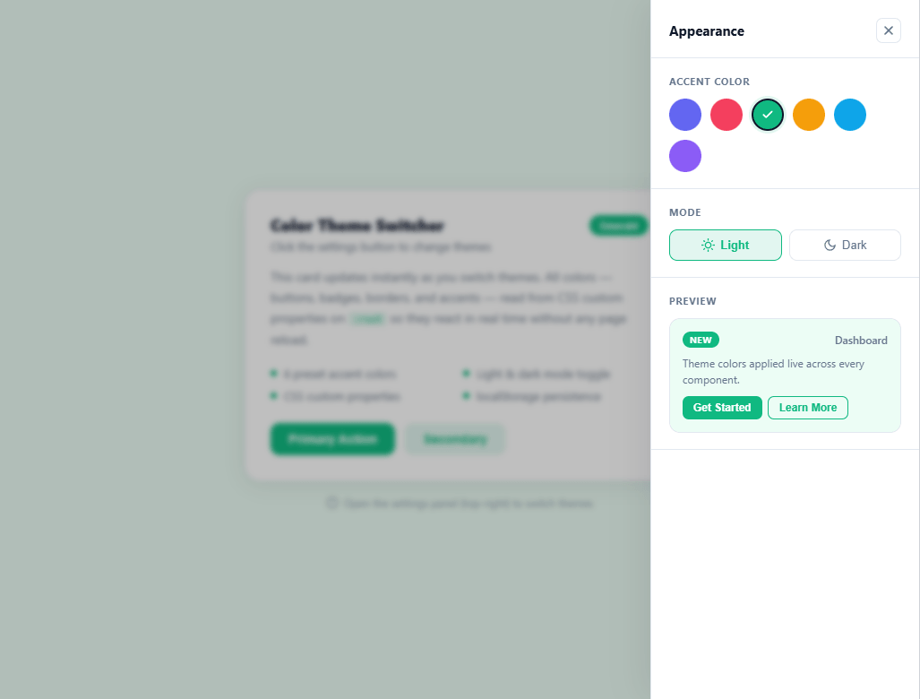
The theme settings panel slides in from the right edge using transform: translateX(100%) as its closed state and translateX(0) on the .open class. A cubic-bezier(0.4,0,0.2,1) easing curve — the same used by Material Design's standard transitions — makes the panel feel fast out of the gate and settle smoothly into place. Inside the panel, the swatch section renders six circular <button> elements colored with each theme's accent value. An SVG checkmark with opacity: 0 sits inside each swatch and becomes visible via the .active class when that theme is selected. Below the swatches, a mini preview card shows a badge, a primary button, and a ghost button all consuming the live CSS variables — so every change is visible before closing the panel. A gear icon button in the top-right of the main canvas opens the panel; it rotates 30 degrees on hover as a tactile affordance. You can see a similar full-page composition in the dashboard layout snippet.
Extending with custom themes and integrating into React or Next.js
To add a custom theme, append a key to the THEMES object with your desired accent, accentDim, lightBg, darkBg, lightSurface, and darkSurface values. The swatch and settings panel update automatically. In a React app, lift currentTheme and isDark into useState, call applyTheme() inside a useEffect that depends on both values, and place savePreference() in the same effect. For global access across routes, wrap the state in a React context so any component can read or update the theme without prop drilling. In Next.js specifically, use a suppressHydrationWarning attribute on <html> and apply the CSS variables via an inline <style> tag rendered server-side from a cookie value to eliminate the localStorage hydration flash entirely for authenticated sessions.
Build with AI
Build, Understand, Optimize, and Extend It With AI
You don't have to trace through all twelve theme-and-mode combinations by hand. Paste this snippet's HTML, CSS, and JS into an AI coding assistant like Claude and ask it to explain exactly why applyTheme writes every value with root.style.setProperty instead of swapping a class on the body, and why loadPreference is called before the first applyTheme rather than after. The same assistant can help optimize it — for instance asking whether recomputing and reapplying all eight custom properties on every single mode toggle is wasteful when only the background and surface pair actually changes. It's also a good way to extend the system: ask it to add a seventh theme with matching light and dark surface tones, sync the choice to a user's account instead of just localStorage, or add a live prefers-color-scheme listener for first-time visitors who haven't set a preference yet. Treat the code less like a finished artifact and more like a starting point for a conversation.
Prompt to recreate it
Copy this into your AI assistant of choice to build the effect from scratch, or as a jumping-off point for your own variant:
Build a color theme switcher in plain HTML, CSS, and JavaScript that combines multiple named accent themes with an independent light/dark mode — no theming library, no frameworks.

Requirements:
- A THEMES object keyed by theme name, where each entry holds an accent color, a dimmed/tinted variant of that accent for hover backgrounds, and separate light-mode and dark-mode background and surface colors tuned to harmonize with that specific accent (not one generic dark gray shared by every theme).
- All themed elements (buttons, badges, borders, dots, card surfaces) must read exclusively from CSS custom properties declared on :root — never a hardcoded hex value in any component rule.
- A single applyTheme(themeName, isDark) function that is the only place allowed to call element.style.setProperty on the root element, updating every token (accent, accent-dim, background, surface, text colors, border, shadow) in one pass so the whole interface re-themes from one function call.
- Generate the theme swatch buttons dynamically by iterating the THEMES object's entries, rather than hardcoding a button per theme in markup, so adding a new theme requires only a new object entry.
- Persist the selected theme name and the dark/light flag to localStorage as two independent keys (not combined into one value), and read both back before the very first applyTheme call runs on page load so there is no flash of the default theme.
- A settings panel that slides in from the screen edge using a transform-based open/closed state (not display toggling, so the transition animates), containing the theme swatches, a light/dark mode toggle, and a small live preview card (badge, primary button, ghost button) that reflects every change immediately.
- Support closing the panel via a backdrop click, an explicit close button, and the Escape key.
Want to tighten it up first? Run this prompt through the AI Prompt Studio to score it across 8 quality dimensions, catch anti-patterns, and tune the wording for Claude, ChatGPT, or Gemini before you paste it in.
Source Code
<div class="demo-page" id="demo-page">
<!-- Settings toggle button -->
<button class="settings-btn" id="settings-btn" aria-label="Open theme settings" title="Theme Settings">
<svg width="20" height="20" viewBox="0 0 24 24" fill="none" stroke="currentColor" stroke-width="2" stroke-linecap="round" stroke-linejoin="round">
<circle cx="12" cy="12" r="3"/>
<path d="M19.4 15a1.65 1.65 0 0 0 .33 1.82l.06.06a2 2 0 0 1-2.83 2.83l-.06-.06a1.65 1.65 0 0 0-1.82-.33 1.65 1.65 0 0 0-1 1.51V21a2 2 0 0 1-4 0v-.09A1.65 1.65 0 0 0 9 19.4a1.65 1.65 0 0 0-1.82.33l-.06.06a2 2 0 0 1-2.83-2.83l.06-.06A1.65 1.65 0 0 0 4.68 15a1.65 1.65 0 0 0-1.51-1H3a2 2 0 0 1 0-4h.09A1.65 1.65 0 0 0 4.6 9a1.65 1.65 0 0 0-.33-1.82l-.06-.06a2 2 0 0 1 2.83-2.83l.06.06A1.65 1.65 0 0 0 9 4.68a1.65 1.65 0 0 0 1-1.51V3a2 2 0 0 1 4 0v.09a1.65 1.65 0 0 0 1 1.51 1.65 1.65 0 0 0 1.82-.33l.06-.06a2 2 0 0 1 2.83 2.83l-.06.06A1.65 1.65 0 0 0 19.4 9a1.65 1.65 0 0 0 1.51 1H21a2 2 0 0 1 0 4h-.09a1.65 1.65 0 0 0-1.51 1z"/>
</svg>
</button>
<!-- Theme panel -->
<div class="panel-backdrop" id="panel-backdrop"></div>
<div class="theme-panel" id="theme-panel" role="dialog" aria-label="Theme settings" aria-modal="true">
<div class="panel-header">
<span class="panel-title">Appearance</span>
<button class="close-btn" id="close-btn" aria-label="Close">
<svg width="16" height="16" viewBox="0 0 24 24" fill="none" stroke="currentColor" stroke-width="2.5" stroke-linecap="round"><line x1="18" y1="6" x2="6" y2="18"/><line x1="6" y1="6" x2="18" y2="18"/></svg>
</button>
</div>
<div class="panel-section">
<p class="section-label">Accent Color</p>
<div class="swatches" id="swatches"></div>
</div>
<div class="panel-section">
<p class="section-label">Mode</p>
<div class="mode-toggle">
<button class="mode-btn" id="mode-light" title="Light mode">
<svg width="15" height="15" viewBox="0 0 24 24" fill="none" stroke="currentColor" stroke-width="2" stroke-linecap="round"><circle cx="12" cy="12" r="5"/><line x1="12" y1="1" x2="12" y2="3"/><line x1="12" y1="21" x2="12" y2="23"/><line x1="4.22" y1="4.22" x2="5.64" y2="5.64"/><line x1="18.36" y1="18.36" x2="19.78" y2="19.78"/><line x1="1" y1="12" x2="3" y2="12"/><line x1="21" y1="12" x2="23" y2="12"/><line x1="4.22" y1="19.78" x2="5.64" y2="18.36"/><line x1="18.36" y1="5.64" x2="19.78" y2="4.22"/></svg>
Light
</button>
<button class="mode-btn" id="mode-dark" title="Dark mode">
<svg width="15" height="15" viewBox="0 0 24 24" fill="none" stroke="currentColor" stroke-width="2" stroke-linecap="round"><path d="M21 12.79A9 9 0 1 1 11.21 3 7 7 0 0 0 21 12.79z"/></svg>
Dark
</button>
</div>
</div>
<div class="panel-section">
<p class="section-label">Preview</p>
<div class="preview-card">
<div class="preview-top">
<span class="preview-badge">New</span>
<span class="preview-text-sm">Dashboard</span>
</div>
<p class="preview-body">Theme colors applied live across every component.</p>
<div class="preview-actions">
<button class="preview-btn-primary">Get Started</button>
<button class="preview-btn-ghost">Learn More</button>
</div>
</div>
</div>
</div>
<!-- Demo content -->
<div class="demo-content">
<div class="demo-card">
<div class="demo-card-header">
<div class="demo-header-text">
<h2 class="demo-title">Color Theme Switcher</h2>
<p class="demo-subtitle">Click the settings button to change themes</p>
</div>
<span class="demo-badge" id="demo-badge">Indigo</span>
</div>
<p class="demo-body">This card updates instantly as you switch themes. All colors — buttons, badges, borders, and accents — read from CSS custom properties on <code>:root</code> so they react in real time without any page reload.</p>
<div class="demo-features">
<div class="feature-item">
<div class="feature-dot"></div>
<span>6 preset accent colors</span>
</div>
<div class="feature-item">
<div class="feature-dot"></div>
<span>Light & dark mode toggle</span>
</div>
<div class="feature-item">
<div class="feature-dot"></div>
<span>CSS custom properties</span>
</div>
<div class="feature-item">
<div class="feature-dot"></div>
<span>localStorage persistence</span>
</div>
</div>
<div class="demo-actions">
<button class="btn-primary">Primary Action</button>
<button class="btn-secondary">Secondary</button>
</div>
</div>
<div class="hint-text">
<svg width="14" height="14" viewBox="0 0 24 24" fill="none" stroke="currentColor" stroke-width="2" stroke-linecap="round"><circle cx="12" cy="12" r="10"/><line x1="12" y1="8" x2="12" y2="12"/><line x1="12" y1="16" x2="12.01" y2="16"/></svg>
Open the settings panel (top-right) to switch themes
</div>
</div>
</div>* { box-sizing: border-box; margin: 0; padding: 0; }
:root {
--accent: #6366f1;
--accent-dim: rgba(99,102,241,0.12);
--bg: #f1f5f9;
--surface: #ffffff;
--text: #0f172a;
--text2: #64748b;
--border: #e2e8f0;
--shadow: rgba(0,0,0,0.08);
}
body {
font-family: system-ui, -apple-system, sans-serif;
background: var(--bg);
min-height: 100vh;
transition: background 0.3s, color 0.3s;
}
/* — Demo page — */
.demo-page {
min-height: 100vh;
background: var(--bg);
display: flex;
flex-direction: column;
align-items: center;
justify-content: center;
padding: 24px;
position: relative;
transition: background 0.3s;
}
/* — Settings button — */
.settings-btn {
position: fixed;
top: 20px;
right: 20px;
width: 44px;
height: 44px;
border-radius: 12px;
border: 1.5px solid var(--border);
background: var(--surface);
color: var(--text2);
cursor: pointer;
display: flex;
align-items: center;
justify-content: center;
box-shadow: 0 2px 12px var(--shadow);
transition: all 0.2s;
z-index: 200;
}
.settings-btn:hover {
border-color: var(--accent);
color: var(--accent);
transform: rotate(30deg);
}
/* — Panel backdrop — */
.panel-backdrop {
position: fixed;
inset: 0;
background: rgba(0,0,0,0.25);
backdrop-filter: blur(3px);
z-index: 299;
opacity: 0;
pointer-events: none;
transition: opacity 0.25s;
}
.panel-backdrop.open {
opacity: 1;
pointer-events: all;
}
/* — Theme panel — */
.theme-panel {
position: fixed;
top: 0;
right: 0;
height: 100%;
width: 300px;
background: var(--surface);
border-left: 1px solid var(--border);
box-shadow: -8px 0 40px var(--shadow);
z-index: 300;
display: flex;
flex-direction: column;
gap: 0;
transform: translateX(100%);
transition: transform 0.3s cubic-bezier(0.4,0,0.2,1), background 0.3s, border-color 0.3s;
overflow-y: auto;
}
.theme-panel.open {
transform: translateX(0);
}
.panel-header {
display: flex;
align-items: center;
justify-content: space-between;
padding: 20px 20px 16px;
border-bottom: 1px solid var(--border);
}
.panel-title {
font-size: 15px;
font-weight: 700;
color: var(--text);
}
.close-btn {
width: 28px;
height: 28px;
border-radius: 7px;
border: 1px solid var(--border);
background: transparent;
color: var(--text2);
cursor: pointer;
display: flex;
align-items: center;
justify-content: center;
transition: all 0.15s;
}
.close-btn:hover {
background: var(--accent-dim);
color: var(--accent);
border-color: var(--accent);
}
.panel-section {
padding: 18px 20px;
border-bottom: 1px solid var(--border);
}
.section-label {
font-size: 11px;
font-weight: 700;
text-transform: uppercase;
letter-spacing: 0.07em;
color: var(--text2);
margin-bottom: 12px;
}
/* — Swatches — */
.swatches {
display: flex;
gap: 10px;
flex-wrap: wrap;
}
.swatch {
width: 36px;
height: 36px;
border-radius: 50%;
border: 2.5px solid transparent;
cursor: pointer;
display: flex;
align-items: center;
justify-content: center;
transition: transform 0.15s, border-color 0.15s, box-shadow 0.15s;
position: relative;
outline: none;
}
.swatch:hover { transform: scale(1.12); }
.swatch.active {
border-color: var(--text);
box-shadow: 0 0 0 3px var(--accent-dim);
}
.swatch .check {
opacity: 0;
transition: opacity 0.15s;
color: #fff;
}
.swatch.active .check { opacity: 1; }
/* — Mode toggle — */
.mode-toggle {
display: flex;
gap: 8px;
}
.mode-btn {
flex: 1;
display: flex;
align-items: center;
justify-content: center;
gap: 6px;
padding: 9px 12px;
border-radius: 9px;
border: 1.5px solid var(--border);
background: transparent;
color: var(--text2);
font-size: 13px;
font-weight: 500;
cursor: pointer;
transition: all 0.15s;
}
.mode-btn:hover {
border-color: var(--accent);
color: var(--accent);
}
.mode-btn.active {
background: var(--accent-dim);
border-color: var(--accent);
color: var(--accent);
font-weight: 700;
}
/* — Preview card — */
.preview-card {
background: var(--bg);
border: 1px solid var(--border);
border-radius: 12px;
padding: 14px;
transition: background 0.3s, border-color 0.3s;
}
.preview-top {
display: flex;
align-items: center;
justify-content: space-between;
margin-bottom: 8px;
}
.preview-badge {
background: var(--accent);
color: #fff;
font-size: 10px;
font-weight: 700;
padding: 2px 8px;
border-radius: 20px;
letter-spacing: 0.04em;
text-transform: uppercase;
transition: background 0.3s;
}
.preview-text-sm {
font-size: 12px;
color: var(--text2);
font-weight: 500;
}
.preview-body {
font-size: 12px;
color: var(--text2);
line-height: 1.5;
margin-bottom: 10px;
}
.preview-actions {
display: flex;
gap: 6px;
}
.preview-btn-primary {
background: var(--accent);
color: #fff;
border: none;
border-radius: 7px;
padding: 6px 12px;
font-size: 12px;
font-weight: 600;
cursor: pointer;
transition: background 0.3s, opacity 0.15s;
}
.preview-btn-primary:hover { opacity: 0.88; }
.preview-btn-ghost {
background: transparent;
color: var(--accent);
border: 1.5px solid var(--accent);
border-radius: 7px;
padding: 5px 12px;
font-size: 12px;
font-weight: 600;
cursor: pointer;
transition: background 0.15s, color 0.3s, border-color 0.3s;
}
.preview-btn-ghost:hover {
background: var(--accent-dim);
}
/* — Demo card — */
.demo-content {
width: 100%;
max-width: 480px;
display: flex;
flex-direction: column;
gap: 16px;
align-items: center;
}
.demo-card {
width: 100%;
background: var(--surface);
border: 1px solid var(--border);
border-radius: 18px;
padding: 28px;
box-shadow: 0 4px 24px var(--shadow);
transition: background 0.3s, border-color 0.3s, box-shadow 0.3s;
}
.demo-card-header {
display: flex;
align-items: flex-start;
justify-content: space-between;
margin-bottom: 14px;
gap: 12px;
}
.demo-title {
font-size: 18px;
font-weight: 800;
color: var(--text);
line-height: 1.25;
margin-bottom: 4px;
transition: color 0.3s;
}
.demo-subtitle {
font-size: 13px;
color: var(--text2);
transition: color 0.3s;
}
.demo-badge {
background: var(--accent);
color: #fff;
font-size: 11px;
font-weight: 700;
padding: 4px 12px;
border-radius: 20px;
white-space: nowrap;
transition: background 0.3s;
flex-shrink: 0;
}
.demo-body {
font-size: 14px;
line-height: 1.65;
color: var(--text2);
margin-bottom: 18px;
transition: color 0.3s;
}
.demo-body code {
background: var(--accent-dim);
color: var(--accent);
padding: 1px 5px;
border-radius: 4px;
font-size: 12px;
font-family: ui-monospace, monospace;
transition: background 0.3s, color 0.3s;
}
.demo-features {
display: grid;
grid-template-columns: 1fr 1fr;
gap: 8px;
margin-bottom: 22px;
}
.feature-item {
display: flex;
align-items: center;
gap: 8px;
font-size: 13px;
color: var(--text2);
transition: color 0.3s;
}
.feature-dot {
width: 7px;
height: 7px;
border-radius: 50%;
background: var(--accent);
flex-shrink: 0;
transition: background 0.3s;
}
.demo-actions {
display: flex;
gap: 10px;
}
.btn-primary {
background: var(--accent);
color: #fff;
border: none;
border-radius: 10px;
padding: 10px 20px;
font-size: 14px;
font-weight: 600;
cursor: pointer;
transition: background 0.3s, opacity 0.15s;
}
.btn-primary:hover { opacity: 0.88; }
.btn-secondary {
background: var(--accent-dim);
color: var(--accent);
border: 1.5px solid transparent;
border-radius: 10px;
padding: 9px 20px;
font-size: 14px;
font-weight: 600;
cursor: pointer;
transition: background 0.3s, color 0.3s, border-color 0.15s;
}
.btn-secondary:hover {
border-color: var(--accent);
}
/* — Hint — */
.hint-text {
display: flex;
align-items: center;
gap: 6px;
font-size: 12px;
color: var(--text2);
opacity: 0.7;
transition: color 0.3s;
}const THEMES = {
indigo: { accent: '#6366f1', accentDim: 'rgba(99,102,241,0.12)', lightBg: '#f1f5f9', darkBg: '#0f1629', lightSurface: '#ffffff', darkSurface: '#1e2340', label: 'Indigo' },
rose: { accent: '#f43f5e', accentDim: 'rgba(244,63,94,0.12)', lightBg: '#fff1f2', darkBg: '#1a0a0d', lightSurface: '#ffffff', darkSurface: '#2a1018', label: 'Rose' },
emerald: { accent: '#10b981', accentDim: 'rgba(16,185,129,0.12)', lightBg: '#ecfdf5', darkBg: '#071a10', lightSurface: '#ffffff', darkSurface: '#0f2a1c', label: 'Emerald' },
amber: { accent: '#f59e0b', accentDim: 'rgba(245,158,11,0.12)', lightBg: '#fffbeb', darkBg: '#1a1200', lightSurface: '#ffffff', darkSurface: '#261b00', label: 'Amber' },
sky: { accent: '#0ea5e9', accentDim: 'rgba(14,165,233,0.12)', lightBg: '#f0f9ff', darkBg: '#07131a', lightSurface: '#ffffff', darkSurface: '#0d2030', label: 'Sky' },
violet: { accent: '#8b5cf6', accentDim: 'rgba(139,92,246,0.12)', lightBg: '#f5f3ff', darkBg: '#130d24', lightSurface: '#ffffff', darkSurface: '#1d1538', label: 'Violet' },
};
let currentTheme = 'indigo';
let isDark = false;
let panelOpen = false;
function applyTheme(themeName, dark) {
const t = THEMES[themeName];
if (!t) return;
const root = document.documentElement;
root.style.setProperty('--accent', t.accent);
root.style.setProperty('--accent-dim', t.accentDim);
root.style.setProperty('--bg', dark ? t.darkBg : t.lightBg);
root.style.setProperty('--surface', dark ? t.darkSurface : t.lightSurface);
root.style.setProperty('--text', dark ? '#f1f5f9' : '#0f172a');
root.style.setProperty('--text2', dark ? '#94a3b8' : '#64748b');
root.style.setProperty('--border', dark ? 'rgba(255,255,255,0.1)' : '#e2e8f0');
root.style.setProperty('--shadow', dark ? 'rgba(0,0,0,0.4)' : 'rgba(0,0,0,0.08)');
// Update demo badge label
const demoBadge = document.getElementById('demo-badge');
if (demoBadge) demoBadge.textContent = t.label;
// Update swatch active states
document.querySelectorAll('.swatch').forEach(el => {
el.classList.toggle('active', el.dataset.theme === themeName);
});
// Update mode button active states
document.getElementById('mode-light').classList.toggle('active', !dark);
document.getElementById('mode-dark').classList.toggle('active', dark);
}
function savePreference() {
try {
localStorage.setItem('cts-theme', currentTheme);
localStorage.setItem('cts-dark', isDark ? '1' : '0');
} catch(e) {}
}
function loadPreference() {
try {
const t = localStorage.getItem('cts-theme');
const d = localStorage.getItem('cts-dark');
if (t && THEMES[t]) currentTheme = t;
if (d !== null) isDark = d === '1';
} catch(e) {}
}
function setTheme(name) {
currentTheme = name;
applyTheme(currentTheme, isDark);
savePreference();
}
function setMode(mode) {
isDark = mode === 'dark';
applyTheme(currentTheme, isDark);
savePreference();
}
function togglePanel() {
panelOpen = !panelOpen;
document.getElementById('theme-panel').classList.toggle('open', panelOpen);
document.getElementById('panel-backdrop').classList.toggle('open', panelOpen);
}
function closePanel() {
panelOpen = false;
document.getElementById('theme-panel').classList.remove('open');
document.getElementById('panel-backdrop').classList.remove('open');
}
function buildSwatches() {
const container = document.getElementById('swatches');
Object.entries(THEMES).forEach(([key, t]) => {
const btn = document.createElement('button');
btn.className = 'swatch' + (key === currentTheme ? ' active' : '');
btn.dataset.theme = key;
btn.style.background = t.accent;
btn.title = t.label;
btn.setAttribute('aria-label', t.label + ' theme');
btn.innerHTML = `<svg class="check" width="14" height="14" viewBox="0 0 24 24" fill="none" stroke="currentColor" stroke-width="3" stroke-linecap="round" stroke-linejoin="round"><polyline points="20 6 9 17 4 12"/></svg>`;
btn.onclick = () => setTheme(key);
container.appendChild(btn);
});
}
// Init
loadPreference();
buildSwatches();
applyTheme(currentTheme, isDark);
document.getElementById('settings-btn').addEventListener('click', togglePanel);
document.getElementById('panel-backdrop').addEventListener('click', closePanel);
document.getElementById('close-btn').addEventListener('click', closePanel);
document.getElementById('mode-light').addEventListener('click', () => setMode('light'));
document.getElementById('mode-dark').addEventListener('click', () => setMode('dark'));
document.addEventListener('keydown', e => {
if (e.key === 'Escape' && panelOpen) closePanel();
});Step by step
How to Use
- 1Open the settings panel with the gear buttonClick the gear icon in the top-right corner of the demo. The settings panel slides in from the right with a smooth cubic-bezier animation and a translucent backdrop dims the content behind it. Close the panel at any time by clicking the backdrop, pressing Escape, or clicking the X button inside the panel header.
- 2Pick an accent color from the swatch circlesSix circular swatch buttons appear in the Accent Color section — Indigo, Rose, Emerald, Amber, Sky, and Violet. Click any swatch to apply that theme. A checkmark SVG appears on the active swatch and the entire demo updates instantly: the badge, buttons, feature dots, and borders all switch to the new accent color via CSS custom properties on document.documentElement.
- 3Toggle between light and dark modeClick Light or Dark in the Mode section. The applyTheme() function switches --bg and --surface to the theme's lightBg/darkBg or lightSurface/darkSurface pair. Dark variants use deep tinted backgrounds matched to each accent — Indigo dark is #0f1629, Emerald dark is #071a10 — so the dark mode feels color-coordinated rather than generic. Text, border, and shadow tokens also flip.
- 4Watch the live preview card update in real timeThe mini preview card at the bottom of the settings panel reflects every change you make before you close the panel. It contains a colored badge, a primary button, and a ghost button — all reading from the current CSS variables — so you can evaluate exactly how a theme looks on interactive elements before committing.
- 5Reload the page — your preferences are saved automaticallyEvery theme and mode change is written to localStorage under “cts-theme” and “cts-dark”. On the next page load, loadPreference() reads these values before applyTheme() runs, so the correct theme is applied before any elements paint. There is no flash of the default indigo theme. To reset to defaults, clear localStorage for the page origin.
- 6Add your own custom themes to the THEMES objectOpen the JS tab and add a new key to the THEMES object: provide accent (hex), accentDim (rgba with ~0.12 alpha), lightBg, darkBg, lightSurface, and darkSurface. The buildSwatches() function iterates Object.entries(THEMES) on init and generates a new swatch button automatically. No other code changes are required. For Next.js or React integration, lift the state into useState and call applyTheme() inside a useEffect to keep the DOM in sync.
Real-world uses
Common Use Cases
Got questions?
Frequently Asked Questions
In loadPreference(), after reading localStorage, add a fallback for first-time visitors: if (localStorage.getItem(“cts-dark”) === null) { isDark = window.matchMedia(“(prefers-color-scheme: dark)”).matches; }. This reads the OS preference via prefers-color-scheme before the user has set their own choice. To respond to live OS changes (e.g. macOS auto-switching at sunset), add window.matchMedia(“(prefers-color-scheme: dark)”).addEventListener(“change”, e => { if (!localStorage.getItem(“cts-dark”)) { isDark = e.matches; applyTheme(currentTheme, isDark); } }). The guard ensures the OS listener does not override an explicit user preference stored in localStorage.
The localStorage approach works for unauthenticated users but causes a flash on hydration because React renders on the server before the client reads localStorage. To eliminate it: (1) write the theme to a cookie on every change instead of (or in addition to) localStorage; (2) read the cookie in your Next.js layout server component and inject an inline <style> tag into <head> with the resolved CSS variable values before any component renders; (3) add suppressHydrationWarning to the <html> element to silence the hydration mismatch warning that comes from server/client color differences. For authenticated users, store the preference in the database and read it during server-side rendering so the correct theme arrives with the initial HTML payload.
Open the JS panel and add a new entry to the THEMES object. The key becomes the theme identifier. Provide: accent (a hex color, e.g. “#e11d48”), accentDim (the same color as rgba with 0.12 alpha for hover tints), lightBg (the page background in light mode), darkBg (the page background in dark mode), lightSurface (card/panel background in light mode), darkSurface (card/panel background in dark mode), and label (display name shown in the demo badge). The buildSwatches() function calls Object.entries(THEMES) at init time, so your new swatch circle appears automatically without any other code changes. For React, update the THEMES constant file and the swatch map re-renders on the next render cycle.
Each accent color in this snippet is chosen so that white text on the accent background meets WCAG AA (4.5:1 contrast ratio for normal text, 3:1 for large text). To verify a custom accent, compute the relative luminance of both colors using the sRGB formula and apply (L1 + 0.05) / (L2 + 0.05). For dark mode surfaces, the deep tinted backgrounds (e.g. #1e2340 for Indigo dark) have luminance values low enough that the accent color still passes against them. Run every accent/surface combination through the WebAIM Contrast Checker or use the browser DevTools accessibility panel before shipping. If a custom accent fails on a light surface, increase its saturation or darken it slightly rather than changing the surface color, which would affect all themes.