More Navigation Snippets
Front-End Coding Playgrounds
Learn to code with interactive, live-preview playgrounds — HTML, CSS, JavaScript, React & more.
 HTML Playground42 lessons · Click-based · Live preview
 CSS PlaygroundLearn CSS with a live editor
 JavaScript Playground60 lessons · DOM · Async · Canvas
 React PlaygroundLearn React with a live code editor
 GSAP PlaygroundLearn GSAP animation interactively
 SVG Playground44 lessons · shapes · paths · animation
 SCSS Playground45 lessons · Sass modules · tokens
 Tailwind PlaygroundLearn Tailwind CSS with a live editor
 Bootstrap 5 Playground50 lessons · live preview
Side Drawer — Free HTML CSS JS Slide Panel Snippet
Side Drawer · Navigation · Plain HTML, CSS & JS · Live preview
What's included
Features
About this UI Snippet
Side Drawer — translateX Slide-In, Overlay Backdrop & Three Close Mechanisms
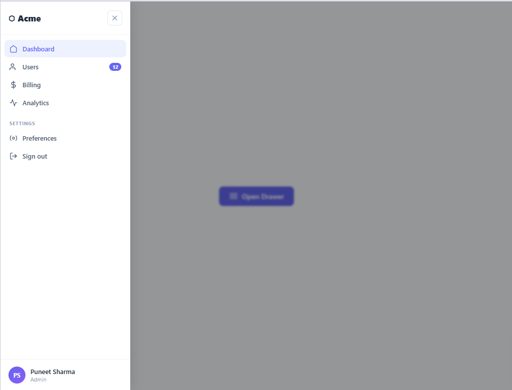
A side drawer (also called a slide-over or off-canvas panel) slides in from the edge of the screen to show secondary content — filters, settings, navigation, or form details — without navigating away from the current page. Used in mobile navigation, filter panels, and settings sheets — see also the dual nav-and-settings drawer.
The slide-in animation
The drawer has position: fixed; right: 0; top: 0; bottom: 0; transform: translateX(100%) by default — positioned off the right edge of the screen. Adding .open transitions to translateX(0) with transition: transform 0.3s ease. This slides the drawer in from the right.
Three close mechanisms
The X button calls closeDrawer(). The overlay background has onclick="closeDrawer()". A keydown listener closes on Escape. All three call the same function that removes .open from the drawer and .show from the overlay.
The overlay
The overlay is a fixed full-screen div with a semi-transparent background. It shows behind the drawer and blocks interaction with the main content. The opacity transition (0 to 0.5) creates the dimming effect.
The translateX slide animation
Left drawers start at transform: translateX(-100%) — fully off-screen to the left. Adding .open transitions to translateX(0). The cubic-bezier spring curve (fast start, slow settle) creates the feel of a native mobile sheet opening. The CSS transition handles both open and close — removing .open reverses the animation automatically.
Backdrop and z-index layering
The backdrop is position: fixed; inset: 0 with a z-index below the drawer. When .open is applied, the backdrop fades in with opacity and gains pointer-events: all so clicks on it close the drawer. This click-backdrop-to-close is expected behaviour on all mobile UIs.
Push vs overlay mode
This snippet implements overlay mode — the drawer slides over the content with a backdrop. For push mode (content shifts right when drawer opens), add transition: margin-left 0.3s to the main content and set margin-left: 280px when the drawer opens. Overlay communicates temporary context; push communicates a persistent workspace panel.
Focus management for accessibility
When the drawer opens, move focus to the first focusable element inside: drawer.querySelector('a, button, input').focus(). On close, return focus to the element that triggered the open. This prevents keyboard users from losing their position on the page behind the drawer.
The translateX slide animation
Left drawers start at transform: translateX(-100%) — fully off-screen to the left. Adding .open transitions to translateX(0). The cubic-bezier spring curve (fast start, slow settle) creates the feel of a native mobile sheet opening. The CSS transition handles both open and close — removing .open reverses the animation automatically.
Backdrop and z-index layering
The backdrop is position: fixed; inset: 0 with a z-index below the drawer. When .open is applied, the backdrop fades in with opacity and gains pointer-events: all so clicks on it close the drawer. This click-backdrop-to-close is expected behaviour on all mobile UIs.
Push vs overlay mode
This snippet implements overlay mode — the drawer slides over the content with a backdrop. For push mode (content shifts right when drawer opens), add transition: margin-left 0.3s to the main content and set margin-left: 280px when the drawer opens. Overlay communicates temporary context; push communicates a persistent workspace panel.
Focus management for accessibility
When the drawer opens, move focus to the first focusable element inside: drawer.querySelector('a, button, input').focus(). On close, return focus to the element that triggered the open. This prevents keyboard users from losing their position on the page behind the drawer.
Build with AI
Build, Understand, Optimize, and Extend It With AI
You don't need to trace the transform and overlay coordination by hand. Paste this snippet's HTML, CSS, and JS into an AI coding assistant like Claude and ask it to explain exactly why the drawer starts at translateX(-100%) instead of using display none for its closed state, or how the overlay's pointer-events toggle prevents it from silently blocking clicks when it's supposed to be invisible. The same assistant can help optimize it, for example checking whether a proper focus trap is missing (it currently is) and what the minimal fix looks like for keyboard users tabbing past the drawer's edges. It's also useful for extending the feature: ask it to add a real focus trap that cycles Tab within the open drawer, lock body scroll while it's open, or convert it into a push layout that shifts page content instead of overlaying it. Treat the code less like a finished artifact and more like a starting point for a conversation.
Prompt to recreate it
Copy this into your AI assistant of choice to build the effect from scratch, or as a jumping-off point for your own variant:
Build a slide-in side drawer with an overlay backdrop in plain HTML, CSS, and JavaScript, no framework, no libraries.

Requirements:
- The drawer panel must be position fixed, spanning the full viewport height, sitting off-screen by default using a transform (translateX at plus or minus 100%, not display none or visibility hidden), with a CSS transition on transform only.
- Adding a single open class must be the only thing that changes the drawer's transform to translateX(0) and reveals a full-screen overlay behind it, so opening and closing are symmetric (removing the class must reverse the same transition automatically, not require a separate closing animation).
- The overlay must be a separate fixed, full-screen semi-transparent element with a lower z-index than the drawer, using an opacity transition combined with toggling pointer-events between none and all, so it never blocks clicks while invisible.
- Implement exactly three ways to close the drawer, all calling the same single close function: a close button inside the drawer, clicking the overlay itself, and pressing the Escape key anywhere on the page.
- The drawer's navigation items must be real anchor elements with icons and text labels, including at least one visually distinct "active" nav item and one item with a numeric badge.
- As a documented extension in a code comment, describe how to add a focus trap (moving focus to the first focusable element inside the drawer on open, cycling Tab within it while open, and restoring focus to the trigger element on close) since the base implementation does not include one.
Step by step
How to Use
- 1Click Open drawerClick the button to slide the drawer in from the right. Click the overlay, the × button, or press ESC to close.
- 2Update drawer contentIn the HTML panel, change the drawer heading, description, and any form fields or links inside.
- 3Change drawer widthUpdate width: 320px on .drawer in the CSS panel.
- 4Change slide directionChange translateX(100%) to translateX(-100%) for a left-side drawer, and update right: 0 to left: 0.
- 5Connect close to form submissionCall closeDrawer() after a successful form submit or action completion.
- 6Export in your formatClick "HTML" for a standalone file, "JSX" for a React component, or "Tailwind" for a React + Tailwind version.
Real-world uses
Common Use Cases
Got questions?
Frequently Asked Questions
The drawer has position: fixed; right: 0; transform: translateX(100%) by default — positioned at the right edge but shifted 100% of its own width off-screen. Adding .open transitions to translateX(0) with transition: transform 0.3s ease.
Change right: 0 to left: 0 on .drawer. Change translateX(100%) to translateX(-100%). Change the transform-origin if needed. Everything else is identical.
In openDrawer(), add document.body.style.overflow = "hidden". In closeDrawer(), restore it: document.body.style.overflow = "".
On openDrawer(), get all focusable elements in the drawer: const focusable = drawer.querySelectorAll("button, input, a"). Focus the first one. Add a keydown Tab handler that cycles within the drawer.
Yes. Click "JSX" for a React component. Manage isOpen in useState. Apply the CSS class conditionally: className={isOpen ? "drawer open" : "drawer"}. Use useEffect to add/remove the ESC keydown listener.
Add a CSS animation to the drawer content that triggers when .open is applied: .drawer.open .drawer-content { animation: slideUp 0.3s ease 0.1s both }. The 0.1s delay starts the content animation after the drawer begins sliding in.