Source Code
<div class="demo">
  <button class="tip" data-tip="Save your work">Save</button>
  <button class="tip tip-right" data-tip="Copy to clipboard">Copy</button>
  <button class="tip tip-bottom" data-tip="Share with team">Share</button>
  <button class="tip tip-left" data-tip="Delete permanently">Delete</button>
</div>
* { box-sizing: border-box; margin: 0; padding: 0; }
body { font-family: system-ui, sans-serif; background: #f8fafc; display: flex; align-items: center; justify-content: center; min-height: 100vh; }
.demo { display: flex; gap: 16px; flex-wrap: wrap; justify-content: center; padding: 60px 20px; }
.tip {
position: relative;
padding: 9px 18px;
font-size: 13px;
font-weight: 600;
border: 1.5px solid #e2e8f0;
background: #fff;
border-radius: 8px;
cursor: pointer;
color: #475569;
font-family: inherit;
transition: border-color 0.15s, color 0.15s;
}
.tip:hover { border-color: #6366f1; color: #6366f1; }
.tip::after {
content: attr(data-tip);
position: absolute;
bottom: calc(100% + 8px);
left: 50%;
transform: translateX(-50%) translateY(4px);
white-space: nowrap;
background: #1e293b;
color: #f1f5f9;
font-size: 12px;
font-weight: 500;
padding: 5px 10px;
border-radius: 6px;
pointer-events: none;
opacity: 0;
transition: opacity 0.15s, transform 0.15s;
}
.tip:hover::after { opacity: 1; transform: translateX(-50%) translateY(0); }
.tip-right::after { bottom: auto; left: calc(100% + 8px); top: 50%; transform: translateY(-50%) translateX(-4px); }
.tip-right:hover::after { transform: translateY(-50%) translateX(0); }
.tip-bottom::after { bottom: auto; top: calc(100% + 8px); transform: translateX(-50%) translateY(-4px); }
.tip-bottom:hover::after { transform: translateX(-50%) translateY(0); }
.tip-left::after { bottom: auto; right: calc(100% + 8px); left: auto; top: 50%; transform: translateY(-50%) translateX(4px); }
.tip-left:hover::after { transform: translateY(-50%) translateX(0); }Learn Coding Visually
Learn to code with interactive, live-preview playgrounds — HTML, CSS, JavaScript, React & more.
 HTML Playground42 lessons · Click-based · Live preview
 CSS PlaygroundLearn CSS with a live editor
 JavaScript Playground60 lessons · DOM · Async · Canvas
 React PlaygroundLearn React with a live code editor
 GSAP PlaygroundLearn GSAP animation interactively
 SVG Playground44 lessons · shapes · paths · animation
 SCSS Playground45 lessons · Sass modules · tokens
 Tailwind PlaygroundLearn Tailwind CSS with a live editor
 Bootstrap 5 Playground50 lessons · live preview
CSS Tooltip — Free HTML CSS Snippet, 4 Directions
CSS Tooltip · Navigation · Plain HTML & CSS · Live preview
What's included
Features
About this UI Snippet
CSS Tooltip — data-tip Attribute, ::after Pseudo-Element & Four Directions
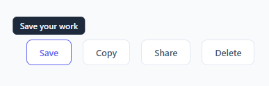
A tooltip shows a short label when the user hovers over an element — typically a button, icon, or truncated text. For click-triggered panels with richer content, use a popover instead. This snippet implements tooltips in four directions using a single CSS technique: the ::after pseudo-element with content: attr(data-tip).
The data attribute approach
Each tooltip trigger has a data-tip="Your tooltip text" attribute in the HTML. The CSS rule .tip::after { content: attr(data-tip) } reads this attribute and renders it as the pseudo-element content. This means you never need to write a separate HTML element for each tooltip — just add one HTML attribute and the CSS handles the rest. To change the tooltip text, only the HTML attribute changes.
How the pseudo-element tooltip works
.tip::after is position: absolute with pointer-events: none (so it does not interfere with mouse events). It starts with opacity: 0 and transform: translateX(-50%) translateY(4px) — invisible and slightly offset downward. On .tip:hover::after, opacity transitions to 1 and transform moves back to translateY(0). The 4px offset creates a subtle upward slide combined with the fade, giving the tooltip a polished appearance.
The four directions
The default tooltip appears above the element: bottom: calc(100% + 8px) places it 8px above. The .tip-right modifier places it to the right: left: calc(100% + 8px). .tip-bottom appears below: top: calc(100% + 8px). .tip-left appears to the left: right: calc(100% + 8px). Each direction also adjusts the transform origin and slide direction to match.
Adding a tooltip to any element
To add a tooltip to any existing element, add position: relative to it (if not already set) and the three tooltip CSS rules (::after, :hover::after, and any direction modifier). Then add data-tip="Your text" to the HTML. No JavaScript or additional HTML elements needed.
Accessibility limitations
CSS-only tooltips are not keyboard accessible by default — they only show on :hover. Screen readers do not announce ::after content. For an accessible tooltip, use the title attribute (read by screen readers) alongside this CSS, or implement it with role="tooltip" and aria-describedby in JavaScript.
The content: attr() trick
CSS tooltips use content: attr(data-tip) on the ::after pseudo-element. This reads the data-tip attribute value directly from HTML and injects it as the tooltip text without any JavaScript. Adding a tooltip requires only: (1) data-tip="Your tooltip text" on the element, (2) the tooltip CSS class applied. No event listeners, no DOM manipulation.
Four directions with transforms
Each direction variant positions the tooltip differently: top uses bottom: 100%; left: 50%; transform: translateX(-50%). Bottom uses top: 100%. Left uses right: 100%; top: 50%; transform: translateY(-50%). Right uses left: 100%. The arrow (::before) is an 8×8px rotated square matching the tooltip background. The translateX/Y centering ensures the tooltip is centred on the element regardless of text length.
Accessibility limitations
CSS-only tooltips are not accessible — they only show on hover, making them invisible to keyboard users and touch device users. For accessible tooltips, use role="tooltip" and aria-describedby on the trigger element pointing to the tooltip's ID. Show the tooltip on both :hover and :focus-visible. For touch support, add a click-to-show mechanism.
Build with AI
Build, Understand, Optimize, and Extend It With AI
You don't have to test every direction variant by hand to see the one CSS trick that makes all four work from a single technique. Paste this snippet's HTML, CSS, and JS into an AI coding assistant like Claude and ask it to explain exactly how the content attr data-tip function eliminates the need for a separate tooltip element per trigger, and why pointer-events none on the pseudo-element specifically prevents the flicker that would otherwise happen as the cursor approaches the tooltip. The same assistant can help optimize it — for instance asking whether the fixed calc-based offsets would need adjusting for tooltips on elements of very different sizes, or whether there's a cleaner way to keep top/bottom variants centered without repeating the same translateX centering rule four times. It's also useful for extending the pattern: ask it to make the tooltip keyboard-accessible by also showing on focus-visible, add a small triangular arrow pointing at the trigger using another pseudo-element, or auto-flip a tooltip's direction when it would overflow the viewport edge. Treat the code less like a finished artifact and more like a starting point for a conversation.
Prompt to recreate it
Copy this into your AI assistant of choice to build the effect from scratch, or as a jumping-off point for your own variant:
Build a CSS-only tooltip system in plain HTML and CSS with zero JavaScript, supporting four placement directions from a single reusable technique — no tooltip library.

Requirements:
- Every tooltip's text must come from reading a data attribute on the trigger element via the CSS content function referencing that attribute (not from a separate hardcoded HTML element per tooltip), so adding a tooltip to a new element only ever requires adding one data attribute and one class.
- The tooltip bubble itself must be generated entirely as a pseudo-element on the trigger, absolutely positioned relative to the trigger (which must be position relative), starting fully transparent and slightly offset in the direction it will animate from, then transitioning to fully opaque and un-offset when the trigger is hovered.
- The pseudo-element must have pointer-events disabled so that even when it's visually positioned close to or under the cursor's path, it can never itself trigger a mouseout on the real element or intercept clicks.
- Implement four separate placement variants (above, below, left of, and right of the trigger) as modifier classes, each repositioning the pseudo-element using the appropriate combination of top/bottom/left/right and a centering transform, while keeping the same hover-reveal transition logic shared across all four.
- Use a consistent fixed gap (via a calc expression) between the trigger and the tooltip in every direction so the visual distance from element to tooltip is uniform regardless of which side it's on.
- Explicitly note as a limitation (and do not attempt to fully solve within pure CSS) that this pattern shows only on hover and is not read by screen readers, since pseudo-element content is not exposed to assistive technology.
Want to tighten it up first? Run this prompt through the AI Prompt Studio to score it across 8 quality dimensions, catch anti-patterns, and tune the wording for Claude, ChatGPT, or Gemini before you paste it in.
Step by step
How to Use
- 1Hover over each button in the previewHover over Save, Copy, Share, and Delete to see the tooltip appear in each of the four directions with a fade-slide animation.
- 2Update the tooltip textIn the HTML panel, change the data-tip="..." attribute value on any element. The ::after pseudo-element reads it automatically.
- 3Change the tooltip directionAdd or change the modifier class: .tip-right, .tip-bottom, or .tip-left. Default (no modifier) is top. Mix directions freely on different elements.
- 4Add a tooltip to any elementAdd position: relative to your element, add the three tooltip CSS rules, and add data-tip="Your text" to the HTML. No extra markup needed.
- 5Change the tooltip coloursUpdate background: #1e293b (tooltip bg) and color: #f1f5f9 (tooltip text) in the .tip::after CSS rule to match your design.
- 6Export in your formatClick "HTML" for a standalone file, "JSX" for a React component, or "Tailwind" for a React + Tailwind version.
Real-world uses
Common Use Cases
Got questions?
Frequently Asked Questions
The CSS rule .tip::after { content: attr(data-tip) } reads the data-tip HTML attribute and renders it as the pseudo-element content. attr() is a CSS function that retrieves attribute values. To change the tooltip text, only the HTML attribute needs to change — no CSS or JavaScript required.
Add position: relative to your element CSS. Copy the .tip::after and .tip:hover::after rules from the CSS panel and rename .tip to your element selector. Add data-tip="Your tooltip text" to the HTML element. No extra markup needed.
Without pointer-events: none, the tooltip bubble would intercept mouse events. When the user moves the mouse towards the tooltip, the hover state on the trigger would end, causing the tooltip to flicker or disappear. pointer-events: none makes the tooltip invisible to mouse events.
The default tooltip appears above the element. Add .tip-right for right, .tip-bottom for below, or .tip-left for left. Each modifier changes the absolute positioning and the slide direction of the translate transform. Mix directions freely across different elements.
CSS-only tooltips are not fully accessible. They only appear on :hover (not on keyboard focus) and screen readers do not announce ::after pseudo-element content. For accessibility, also add a title attribute to the element (read by screen readers), or implement a JavaScript tooltip with role="tooltip" and aria-describedby.
Yes. Click "JSX" to download a React component. The data-tip attribute works identically in JSX: data-tip="Your text". The CSS approach works in React without modification. For a more React-idiomatic solution, use a Tooltip component that manages visibility with useState and renders a portal element.