Source Code
<div class="demo">

  <div class="row">
    <span class="label">Click trigger</span>
    <div class="pop-wrap">
      <button class="trigger" id="t1" onclick="toggle('p1','t1')">
        Click me
        <svg width="12" height="12" viewBox="0 0 24 24" fill="none" stroke="currentColor" stroke-width="2.5"><polyline points="6 9 12 15 18 9"/></svg>
      </button>
      <div class="popover bottom" id="p1">
        <div class="pop-arrow"></div>
        <div class="pop-head">Quick actions</div>
        <div class="pop-body">
          <button class="pop-item" onclick="close('p1')"><svg width="13" height="13" viewBox="0 0 24 24" fill="none" stroke="currentColor" stroke-width="2.2"><path d="M11 4H4a2 2 0 0 0-2 2v14a2 2 0 0 0 2 2h14a2 2 0 0 0 2-2v-7"/><path d="M18.5 2.5a2.12 2.12 0 0 1 3 3L12 15l-4 1 1-4 9.5-9.5z"/></svg>Edit</button>
          <button class="pop-item" onclick="close('p1')"><svg width="13" height="13" viewBox="0 0 24 24" fill="none" stroke="currentColor" stroke-width="2.2"><rect x="9" y="9" width="13" height="13" rx="2"/><path d="M5 15H4a2 2 0 0 1-2-2V4a2 2 0 0 1 2-2h9a2 2 0 0 1 2 2v1"/></svg>Duplicate</button>
          <div class="pop-divider"></div>
          <button class="pop-item danger" onclick="close('p1')"><svg width="13" height="13" viewBox="0 0 24 24" fill="none" stroke="currentColor" stroke-width="2.2"><polyline points="3 6 5 6 21 6"/><path d="M19 6l-1 14H6L5 6"/><path d="M10 11v6M14 11v6"/><path d="M9 6V4h6v2"/></svg>Delete</button>
        </div>
      </div>
    </div>
  </div>

  <div class="row">
    <span class="label">Info popover</span>
    <div class="pop-wrap">
      <button class="trigger info-trigger" id="t2" onclick="toggle('p2','t2')">
        <svg width="14" height="14" viewBox="0 0 24 24" fill="none" stroke="currentColor" stroke-width="2.5"><circle cx="12" cy="12" r="10"/><line x1="12" y1="8" x2="12" y2="12"/><line x1="12" y1="16" x2="12.01" y2="16"/></svg>
        What is this?
      </button>
      <div class="popover top" id="p2">
        <div class="pop-arrow"></div>
        <div class="pop-head">API rate limits</div>
        <div class="pop-info">Your plan allows 1,000 requests per minute. Exceeding this limit returns a 429 Too Many Requests error. <a href="#">View docs →</a></div>
      </div>
    </div>
  </div>

  <div class="row">
    <span class="label">Right popover</span>
    <div class="pop-wrap">
      <button class="trigger" id="t3" onclick="toggle('p3','t3')">Open right →</button>
      <div class="popover right" id="p3">
        <div class="pop-arrow"></div>
        <div class="pop-head">Keyboard shortcuts</div>
        <div class="pop-body">
          <div class="shortcut-row"><kbd>Ctrl</kbd><kbd>K</kbd><span>Open search</span></div>
          <div class="shortcut-row"><kbd>Ctrl</kbd><kbd>S</kbd><span>Save changes</span></div>
          <div class="shortcut-row"><kbd>Esc</kbd><span>Cancel / Close</span></div>
        </div>
      </div>
    </div>
  </div>

</div>
* { box-sizing: border-box; margin: 0; padding: 0; }
body { font-family: system-ui, sans-serif; background: #f8fafc; min-height: 100vh; display: flex; align-items: center; justify-content: center; padding: 40px 24px; }
.demo { display: flex; flex-direction: column; gap: 32px; }
.row { display: flex; align-items: center; gap: 24px; }
.label { font-size: 12px; font-weight: 600; color: #94a3b8; width: 100px; flex-shrink: 0; }
.trigger { display: inline-flex; align-items: center; gap: 5px; background: #fff; border: 1.5px solid #e2e8f0; border-radius: 9px; padding: 8px 14px; font-size: 13px; font-weight: 600; color: #374151; cursor: pointer; transition: all 0.12s; }
.trigger:hover, .trigger.open { border-color: #6366f1; color: #6366f1; }
.info-trigger { border-style: dashed; color: #6366f1; border-color: #c4b5fd; background: rgba(99,102,241,0.04); }
/* Popover container */
.pop-wrap { position: relative; }
.popover { position: absolute; background: #fff; border: 1px solid #e2e8f0; border-radius: 12px; box-shadow: 0 8px 32px rgba(0,0,0,0.1); padding: 6px 0; min-width: 180px; z-index: 100; opacity: 0; pointer-events: none; transform: scale(0.96); transform-origin: top left; transition: opacity 0.15s, transform 0.15s; }
.popover.open { opacity: 1; pointer-events: all; transform: scale(1); }
/* Positions */
.popover.bottom { top: calc(100% + 10px); left: 0; transform-origin: top left; }
.popover.top { bottom: calc(100% + 10px); left: 0; transform-origin: bottom left; }
.popover.right { left: calc(100% + 10px); top: 0; transform-origin: top left; }
/* Arrow */
.pop-arrow { position: absolute; width: 8px; height: 8px; background: #fff; border: 1px solid #e2e8f0; }
.popover.bottom .pop-arrow { top: -5px; left: 16px; transform: rotate(45deg); border-bottom: none; border-right: none; }
.popover.top .pop-arrow { bottom: -5px; left: 16px; transform: rotate(45deg); border-top: none; border-left: none; }
.popover.right .pop-arrow { left: -5px; top: 14px; transform: rotate(45deg); border-right: none; border-top: none; }
.pop-head { font-size: 11px; font-weight: 700; letter-spacing: 0.5px; text-transform: uppercase; color: #94a3b8; padding: 8px 14px 4px; }
.pop-body { display: flex; flex-direction: column; gap: 1px; padding: 0 4px 4px; }
.pop-item { display: flex; align-items: center; gap: 8px; background: transparent; border: none; border-radius: 8px; padding: 8px 10px; font-size: 13px; font-weight: 500; color: #374151; cursor: pointer; width: 100%; text-align: left; transition: background 0.12s; }
.pop-item:hover { background: #f8fafc; }
.pop-item.danger { color: #dc2626; }
.pop-item.danger:hover { background: #fef2f2; }
.pop-divider { height: 1px; background: #f1f5f9; margin: 4px 10px; }
.pop-info { font-size: 13px; color: #475569; line-height: 1.6; padding: 0 14px 10px; max-width: 240px; }
.pop-info a { color: #6366f1; font-weight: 600; text-decoration: none; }
.shortcut-row { display: flex; align-items: center; gap: 6px; padding: 6px 10px; font-size: 13px; color: #475569; }
.shortcut-row span { margin-left: auto; font-size: 12px; }
kbd { background: #f1f5f9; border: 1px solid #e2e8f0; border-radius: 5px; padding: 2px 6px; font-size: 11px; font-family: monospace; color: #374151; }const openPopovers = new Set();
function toggle(id, triggerId) {
if (openPopovers.has(id)) {
close(id);
} else {
// Close others
[...openPopovers].forEach(close);
open(id, triggerId);
}
}
function open(id, triggerId) {
document.getElementById(id).classList.add('open');
if (triggerId) document.getElementById(triggerId).classList.add('open');
openPopovers.add(id);
}
function close(id) {
const pop = document.getElementById(id);
if (pop) pop.classList.remove('open');
openPopovers.delete(id);
// Remove open class from trigger
document.querySelectorAll('.trigger.open').forEach(t => {
if (!t.id || t.id === 'T'.toLowerCase()) t.classList.remove('open');
});
document.querySelectorAll('.trigger').forEach(t => t.classList.remove('open'));
}
// Click outside closes all popovers
document.addEventListener('click', e => {
if (!e.target.closest('.pop-wrap')) [...openPopovers].forEach(close);
});
document.addEventListener('keydown', e => { if (e.key === 'Escape') [...openPopovers].forEach(close); });Learn Coding Visually
Learn to code with interactive, live-preview playgrounds — HTML, CSS, JavaScript, React & more.
 HTML Playground42 lessons · Click-based · Live preview
 CSS PlaygroundLearn CSS with a live editor
 JavaScript Playground60 lessons · DOM · Async · Canvas
 React PlaygroundLearn React with a live code editor
 GSAP PlaygroundLearn GSAP animation interactively
 SVG Playground44 lessons · shapes · paths · animation
 SCSS Playground45 lessons · Sass modules · tokens
 Tailwind PlaygroundLearn Tailwind CSS with a live editor
 Bootstrap 5 Playground50 lessons · live preview
Popover — Free HTML CSS JS Snippet, 3 Positions
Popover · Modals · Plain HTML, CSS & JS · Live preview
What's included
Features
About this UI Snippet
Popover — Action Menu, Info Panel & Keyboard Shortcuts with 3 Positions, Arrow & Click-Outside
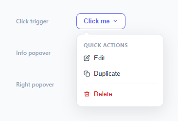
A popover is a floating panel that appears adjacent to a trigger element when clicked, showing contextual actions, information, or secondary content without navigating away. It is more persistent than a tooltip (which shows on hover) and less disruptive than a modal. This snippet provides three popover variants in three positions: an action menu with divider and danger item (below), an information panel with a link (above), and a keyboard shortcuts list (right) — all with CSS animation, directional arrows, click-outside close, and ESC support.
The position system
Three CSS classes — .bottom, .top, and .right — position the popover relative to its trigger. .bottom uses top: calc(100% + 10px) and left: 0. .top uses bottom: calc(100% + 10px). .right uses left: calc(100% + 10px). The 10px gap leaves room for the arrow. transform-origin is set per direction so the scale animation originates from the correct edge of the popover.
The directional arrow
Each position variant has a matching .pop-arrow CSS rule that positions and rotates an 8×8px div. The div has background: #fff and border on two sides — the sides that form the outward-pointing corner. For .bottom, the arrow is positioned at top: -5px with border-bottom and border-right removed so only the top-left corner is visible. Rotating 45 degrees makes it point upward toward the trigger.
The open/close animation
Popovers use opacity: 0 + pointer-events: none + transform: scale(0.96) as the closed state. Adding .open switches to opacity: 1 + pointer-events: all + transform: scale(1). The CSS transition: opacity 0.15s, transform 0.15s animates both simultaneously. The transform-origin direction-matching ensures the popover scales outward from the trigger edge.
Click-outside and ESC close
A document click listener checks e.target.closest(".pop-wrap") — if the click was outside any .pop-wrap container, all open popovers close. ESC calls close() for all open popovers. Both listeners are attached once to the document and work for any number of popovers on the page.
The action menu pattern
The action popover demonstrates the standard three-item action menu pattern: Edit, Duplicate (utility actions in default colour), divider, Delete (destructive action in red with danger class). This exact pattern is used in Notion, Linear, GitHub, and most SaaS interfaces for row and card actions.
Build with AI
Build, Understand, Optimize, and Extend It With AI
You don't have to work out the arrow geometry or the click-outside detection by hand. Paste this snippet's HTML, CSS, and JS into an AI coding assistant like Claude and ask it to explain exactly how removing two of the four borders on the small rotated square in pop-arrow produces a directional triangle-like corner for each of the three position variants, and how the openPopovers Set combined with the document-level click listener's closest check ensures exactly one popover stays open at a time. The same assistant can help optimize it, for example checking whether the current close function's querySelectorAll over every trigger is more work than necessary versus tracking the currently-open trigger directly. It's also useful for extending the effect: ask it to add a fourth "left" position variant following the same arrow pattern, make the popover reposition itself automatically when it would overflow the viewport edge, or add a nested submenu popover that opens from within another popover. Treat the code less like a finished artifact and more like a starting point for a conversation.
Prompt to recreate it
Copy this into your AI assistant of choice to build the effect from scratch, or as a jumping-off point for your own variant:
Build a floating popover component in plain HTML, CSS, and vanilla JavaScript that supports at least three directional positions (below, above, and to the right of its trigger) — no libraries, no positioning library like Popper.

Requirements:
- Each popover lives inside a position: relative wrapper alongside its trigger button, and the popover panel itself uses position: absolute with one of three modifier classes controlling whether it appears below (top: 100% plus a gap), above (bottom: 100% plus a gap), or to the right (left: 100% plus a gap) of the trigger, with a matching transform-origin for each direction so a scale-in animation grows from the correct corner.
- A small square "arrow" element for each popover that is rotated 45 degrees and has exactly two of its four borders removed (matching the direction it needs to point) so it reads as a directional triangle pointing back at the trigger, positioned and colored to blend seamlessly with the popover panel's edge.
- Clicking a trigger toggles its associated popover open or closed using an opacity/transform-based CSS transition (not display toggling) so the open state can animate in and out smoothly, and clicking any other trigger while one popover is open must close the first one before opening the new one — only one popover open at a time.
- A single document-level click listener that closes every currently open popover whenever the click target is not inside any popover-and-trigger wrapper (checked via the closest DOM method), and a single document-level keydown listener that closes every open popover when the Escape key is pressed.
- Populate the popovers with at least three different content patterns: an action menu with a divider and a distinct "danger" styled destructive action, an informational panel with a paragraph and a link, and a list of keyboard shortcuts using kbd elements.
Want to tighten it up first? Run this prompt through the AI Prompt Studio to score it across 8 quality dimensions, catch anti-patterns, and tune the wording for Claude, ChatGPT, or Gemini before you paste it in.
Step by step
How to Use
- 1Click any trigger to open the popoverClick the trigger button to open the attached popover. Click the same button or anywhere outside the popover to close it. Press ESC to close all open popovers. Only one popover can be open at a time.
- 2Choose the position classApply .bottom, .top, or .right to the .popover div depending on where the popover should appear relative to the trigger. The arrow direction and transform-origin update automatically from the position class.
- 3Add your action itemsDuplicate .pop-item buttons inside .pop-body for each action. Add class="danger" for destructive actions (red text, red hover background). Add a .pop-divider div between groups of related actions.
- 4Add click-outside detection to new popoversThe document click listener automatically closes any popover not inside a .pop-wrap. New popovers work without additional event listener code — just give them a unique id and matching trigger button.
- 5Use for tooltips with rich contentReplace .pop-body with .pop-info for a paragraph-style info popover. Add links, code snippets, or images inside .pop-info. The popover expands to fit content — set max-width: 280px to constrain very long text.
- 6Export in your formatClick "HTML" for a standalone file, "JSX" for a React component using useState for open state and useEffect for click-outside detection, or "Tailwind" for a Tailwind CSS version.
Real-world uses
Common Use Cases
Got questions?
Frequently Asked Questions
The arrow is an 8×8px div with background: #fff and border on all four sides initially. For .bottom, the top two borders (top and left) are visible by removing border-bottom and border-right, then rotating 45deg — this creates a corner pointing upward. For .top, the bottom two borders are removed. For .right, the right and top borders are removed. The arrow is absolutely positioned at the edge closest to the trigger: top: -5px for .bottom, bottom: -5px for .top, left: -5px for .right. The -5px is half the 8px height/width, centering the arrow on the popover edge.
A click listener on document fires for every click. It checks e.target.closest(".pop-wrap") — the closest() method walks up the DOM tree from the clicked element to find a .pop-wrap ancestor. If no .pop-wrap is found (the click was outside all popovers and their triggers), closest() returns null and all open popovers close. If a .pop-wrap is found, the click was inside a popover or on a trigger, so existing popovers stay open. The toggle() function handles opening the correct popover for each trigger click.
Add a .left position variant: .popover.left { right: calc(100% + 10px); top: 0; transform-origin: top right; }. Arrow CSS: .popover.left .pop-arrow { right: -5px; top: 14px; transform: rotate(45deg); border-left: none; border-bottom: none; }. Use class="popover left" on the popover div and add the left trigger button with onclick="toggle('pId','tId')".
Click "JSX" to download. Manage openId state with useState<string|null>(null). Toggle: setOpenId(prev => prev === id ? null : id). Apply open class conditionally: className={"popover bottom" + (openId === "p1" ? " open" : "")}. For click-outside, use useEffect to add a document click listener and check if e.target.closest(".pop-wrap") is null — if so, setOpenId(null). Return a cleanup from the useEffect: return () => document.removeEventListener("click", handler).