You Might Also Like
Learn Coding Visually
Learn to code with interactive, live-preview playgrounds — HTML, CSS, JavaScript, React & more.
 HTML Playground42 lessons · Click-based · Live preview
 CSS PlaygroundLearn CSS with a live editor
 JavaScript Playground60 lessons · DOM · Async · Canvas
 React PlaygroundLearn React with a live code editor
 GSAP PlaygroundLearn GSAP animation interactively
 SVG Playground44 lessons · shapes · paths · animation
 SCSS Playground45 lessons · Sass modules · tokens
 Tailwind PlaygroundLearn Tailwind CSS with a live editor
 Bootstrap 5 Playground50 lessons · live preview
Expanding FAB — Free HTML CSS JS Snippet
Expanding FAB · Buttons · Plain HTML, CSS & JS · Live preview
What's included
Features
About this UI Snippet
Expanding FAB — Staggered Sub-Actions, Tooltip Labels, Rotate Icon & Blur Backdrop
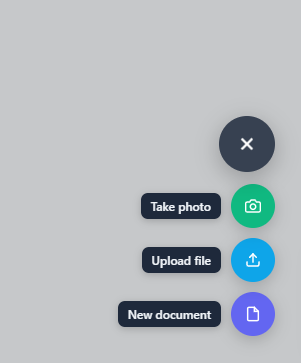
A Floating Action Button (FAB) is the primary action button pattern in Material Design and most mobile-first web interfaces. The expanding FAB variant reveals multiple sub-actions when clicked — each secondary button slides up with a staggered delay, revealing contextual options without cluttering the main UI. For a radial-arc layout instead of a vertical stack, see the floating action button. This snippet provides a complete expanding FAB: a main button with a + icon that rotates to × on open, three sub-action buttons with staggered slide-up animations, tooltip labels, a blurred backdrop, and Escape key close.
The staggered animation
Each .fab-action-item has a CSS custom property --i (1, 2, or 3). In the .open state, transition-delay: calc((var(--i) - 1) × 0.05s) creates a staggered entrance: item 1 at 0ms, item 2 at 50ms, item 3 at 100ms. The transform goes from translateY(16px) scale(0.9) to translateY(0) scale(1). For the close animation, the delays reverse because transition-delay applies to the exit state too — the topmost item (--i: 3) closes first.
The + to × icon rotation
The main FAB icon uses transform: rotate(45deg) when .open is applied. The + character rotated 45° becomes a × shape — no icon swap needed. The cubic-bezier(0.34, 1.56, 0.64, 1) spring curve gives the rotation an overshoot bounce.
The blurred backdrop
When the FAB opens, a fixed-position backdrop covers the page. It fades from transparent to rgba(0,0,0,0.2) and applies backdrop-filter: blur(2px) — a subtle blur that visually separates the open FAB from the page content. Clicking the backdrop calls closeFab(). The pointer-events toggle prevents the backdrop from intercepting clicks when closed.
Sub-action tooltips
Each sub-action has a tooltip span that appears to the left of the button. The tooltips show on initial render but become visible only when the action item is visible (opacity: 1 in the open state). No JavaScript hover logic needed — the tooltip opacity is driven by the parent item's opacity.
Accessibility
The main FAB button has aria-expanded toggling with open state and aria-label="Open actions". Each sub-action button has aria-label describing its action. ESC key closes the FAB via document keydown listener.
Positioning and safe area handling
The FAB uses position: fixed; bottom: 28px; right: 28px. On iOS Safari, the home indicator area can overlap the FAB. Use CSS environment variables: bottom: calc(28px + env(safe-area-inset-bottom)) to push the FAB above the safe area. This is important for mobile web apps that users install as PWAs on their home screen.
Build with AI
Build, Understand, Optimize, and Extend It With AI
You don't have to work out the stagger math in your head. Paste this snippet's HTML, CSS, and JS into an AI coding assistant like Claude and ask it to explain exactly how the --i custom property combines with the calc-based transition-delay to produce the bottom-to-top staggered reveal, and why that same delay formula also affects the closing animation's order. The same assistant can help optimize it — ask whether the backdrop's backdrop-filter blur could hurt performance on lower-end mobile devices and what a graceful fallback would look like, and whether the fixed 44px sub-action buttons are large enough to meet touch target size guidelines. It's also useful for extending the FAB: ask it to support a dynamic number of sub-actions generated from a data array instead of hardcoded markup, add a long-press gesture that opens the menu on mobile, or make the whole thing keyboard-navigable with arrow keys between the sub-actions once open. Treat the code less like a finished artifact and more like a starting point for a conversation.
Prompt to recreate it
Copy this into your AI assistant of choice to build the effect from scratch, or as a jumping-off point for your own variant:
Build an expanding floating action button (FAB) in plain HTML, CSS, and JavaScript using CSS custom properties for staggered timing — no library.

Requirements:
- A circular main button fixed to a corner of the viewport, containing a plus-shaped icon built from two crossed line elements (not a font icon or image), that rotates 45 degrees via CSS transform when an "open" state class is applied so the plus visually becomes an X without swapping any markup.
- Several circular sub-action buttons stacked above the main button in a column, each carrying a numeric CSS custom property representing its order in the stack.
- Sub-action buttons must be hidden by default via zero opacity, a downward-and-shrunk transform, and pointer-events none; when the container's "open" class is applied, each button must animate to full opacity, its natural transform, and pointer-events enabled, with a transition-delay computed from its custom property so the buttons reveal in a staggered bottom-to-top sequence rather than all at once.
- Each sub-action button must have its own tooltip label element that appears alongside it, an aria-label describing its specific action, and its own distinct background color.
- A backdrop element separate from the button stack must fade in behind everything when the FAB opens, using backdrop-filter blur plus a semi-transparent dark background, and must be clickable to close the FAB; it must not intercept clicks at all while closed.
- Clicking a sub-action button must close the FAB and show a temporary toast notification confirming which action was triggered.
- Pressing Escape while the FAB is open must close it, and the main button must expose its expanded/collapsed state via aria-expanded.
Want to tighten it up first? Run this prompt through the AI Prompt Studio to score it across 8 quality dimensions, catch anti-patterns, and tune the wording for Claude, ChatGPT, or Gemini before you paste it in.
Step by step
How to Use
- 1Click the + FAB button to expand sub-actionsThree sub-action buttons slide up with staggered timing. The + icon rotates to ×. A blurred backdrop appears. Click any sub-action to trigger its action, or click the × or backdrop to close.
- 2Update the sub-action icons and coloursEdit each .fab-sub button's inline style="background:#colour" and swap the inner SVG icon paths. Each sub-action gets its own colour — use brand colours or semantic colours (blue for upload, green for photo, etc.).
- 3Update the tooltip labelsEdit the .fab-tooltip span text inside each .fab-action-item div. Keep labels short (1-3 words) so they fit next to the button without wrapping.
- 4Add more sub-action buttonsDuplicate a .fab-action-item div, increment its --i value, update the button colour, icon, aria-label, and tooltip. Add the new action to the fabAction() switch statement.
- 5Change the FAB positionUpdate bottom and right on .fab-wrap to reposition. For top-right, change flex-direction to column (not column-reverse) so actions expand downward. For left-side FAB, set left: 28px and remove right.
- 6Export in your formatClick "HTML" for a standalone file, "JSX" for a React component using useState for open state, or "Tailwind" for a React + Tailwind CSS version.
Real-world uses
Common Use Cases
Got questions?
Frequently Asked Questions
Each .fab-action-item has a style="--i:N" attribute where N is 1, 2, or 3. In CSS: .fab-actions.open .fab-action-item { transition-delay: calc((var(--i) - 1) * 0.05s); }. This gives item 1 a 0ms delay, item 2 a 50ms delay, and item 3 a 100ms delay. The items reveal from bottom to top (--i: 1 is nearest the FAB). For the close animation, remove the transition-delay rule from the .open state so all items close at the same speed.
Change .fab-main from a circle (border-radius: 50%; width/height: 56px) to a pill shape: border-radius: 28px; padding: 0 20px; width: auto; height: 56px. Add a text span inside: <button class="fab-main">+ <span>Create</span></button>. When open, the text can change to "Close" or disappear (display: none on .open) to make room for the × icon. Adjust the box-shadow accordingly.
Add padding-bottom: 100px to the main page content container so content does not hide behind the FAB at the bottom of scroll. Alternatively, make the FAB scrollable with the page instead of fixed: change position: fixed to position: sticky with appropriate margin. For critical content directly above the FAB, add bottom: 100px to that element.
Click "JSX" to download. Manage isOpen with useState(false). Pass isOpen to the main button, actions container, and backdrop via className. For sub-actions, use a CSS Module or Tailwind class that applies the transition-delay based on index: className={isOpen ? "fab-action-item open" : "fab-action-item"} with inline style={{ transitionDelay: isOpen ? index * 0.05 + "s" : "0s" }}.