You Might Also Like
Learn Coding Visually
Learn to code with interactive, live-preview playgrounds — HTML, CSS, JavaScript, React & more.
 HTML Playground42 lessons · Click-based · Live preview
 CSS PlaygroundLearn CSS with a live editor
 JavaScript Playground60 lessons · DOM · Async · Canvas
 React PlaygroundLearn React with a live code editor
 GSAP PlaygroundLearn GSAP animation interactively
 SVG Playground44 lessons · shapes · paths · animation
 SCSS Playground45 lessons · Sass modules · tokens
 Tailwind PlaygroundLearn Tailwind CSS with a live editor
 Bootstrap 5 Playground50 lessons · live preview
Split Button with Dropdown — HTML CSS JS Snippet
Split Action Button with Dropdown · Buttons · Plain HTML, CSS & JS · Live preview
What's included
Features
About this UI Snippet
Split Action Button — Primary Action, Dropdown Arrow & Outside-Click Close
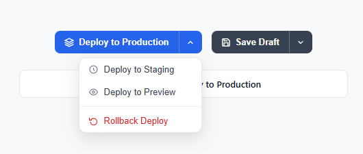
A split button combines a primary action button with a small dropdown trigger on the right side, separated by a subtle divider. The left half executes the default action immediately on click; the right chevron opens a menu of alternative actions. This pattern appears in deployment dashboards, content management systems, and anywhere a clear primary action exists alongside occasional secondary variants.
HTML structure
The .split-btn container uses display: inline-flex and position: relative — inline-flex so the two child buttons sit side by side without gaps, and relative to anchor the absolutely-positioned dropdown. The .main-action button receives border-radius: 8px 0 0 8px (rounded left only) and .arrow-btn receives border-radius: 0 8px 8px 0 (rounded right only). There is no wrapper with overflow: hidden because that would clip the dropdown panel.
The divider trick
The visual split between the two halves is border-left: 1px solid rgba(255,255,255,0.25) on the arrow button. Because both buttons share the same background color, a fully opaque white border would look harsh. Reducing the alpha to 25% creates a gentle inset appearance that reads as a separator without looking bolted on. This is the same technique used by GitHub's branch dropdown and Vercel's deploy button.
Dropdown animation
display: none / display: block toggling via a class is combined with a CSS @keyframes dropIn animation. When the .open class is added, the animation runs: opacity 0 → 1 and translateY -6px → 0 over 150ms. The slight upward offset on entry gives a sense that the panel is emerging from below the button rather than appearing from nowhere. Removal of the .open class hides the dropdown instantly — adding a separate exit animation would require JavaScript timing to delay the display change.
JavaScript: single-open and outside-click
toggleDropdown(id) first sweeps all open dropdowns closed, then opens the target if it was previously closed. This single-open guarantee is important when multiple split buttons share the same page. The document.addEventListener('click') handler uses e.target.closest('.split-btn') — if the click origin is not inside any split button, all dropdowns close. This covers clicking page content, other buttons, or empty space.
Accessibility
The arrow button carries aria-expanded="false" initially. JavaScript flips it to "true" when the dropdown opens. This attribute is also the CSS hook for rotating the chevron icon: .arrow-btn[aria-expanded="true"] svg { transform: rotate(180deg) }. The dropdown has role="menu" and items have role="menuitem", which assistive technologies announce as a menu. aria-label on the arrow button ("More deploy options") clarifies its purpose since it contains only an icon.
Danger/destructive action pattern
The .drop-danger class sets color and icon tint to red-600 (#dc2626) and the hover state to red-50 (#fef2f2). A .drop-divider (a 1px border-top) visually separates destructive actions at the bottom of the menu — the same convention used by macOS contextual menus and VS Code's command palette.
Variants and theming
The secondary gray variant only overrides background on both button halves — all structural CSS stays the same. This shows that theming is a single-line change per color scheme. To support dark mode, replace the hardcoded hex values with CSS custom properties: var(--btn-bg), var(--dropdown-bg), var(--dropdown-border).
React integration
In React, the component accepts primaryLabel, onPrimary, and actions (array of {label, icon, onClick, danger}). Open state is useState(false). The document click listener goes in useEffect(() => { const h = e => { ... }; document.addEventListener('click', h); return () => document.removeEventListener('click', h); }, []). The cleanup return prevents memory leaks when the component unmounts.
Vue 3 integration
Use ref(false) for isOpen and an onMounted / onUnmounted pair for the document listener. The template uses v-for on the actions array and :class="{ open: isOpen }" on the dropdown div. Pass the danger flag as :class="{ 'drop-danger': action.danger }".
Split buttons are semantically superior to two separate buttons for primary/secondary because they communicate hierarchy — the wide left portion draws the eye to the default action, while the narrow right chevron signals optionality without cluttering the interface. Users who always use the default action never need to interact with the dropdown at all. See also the dropdown menu snippet for standalone menus, the expanding FAB snippet for a touch-first radial alternative, and the button group snippet for equal-weight segmented controls.
Build with AI
Build, Understand, Optimize, and Extend It With AI
You don't need to trace the single-open and outside-click logic by hand. Paste this snippet's HTML, CSS, and JS into an AI coding assistant like Claude and ask it to explain exactly how toggleDropdown sweeps every other open dropdown closed before opening its target, or why the document-level click listener uses closest('.split-btn') rather than checking the dropdown element directly. The same assistant can help optimize it, for example checking whether the low-opacity white border trick used for the internal divider would still read correctly against a light background variant, or whether the dropdown's fixed right-anchored position could overflow off-screen on a narrow viewport. It's also useful for extending the feature: ask it to add arrow-key navigation between menu items once the dropdown is open, auto-flip the dropdown to the left edge when it would overflow the viewport, or wire each action to a real confirmation step for the destructive rollback item. Treat the code less like a finished artifact and more like a starting point for a conversation.
Prompt to recreate it
Copy this into your AI assistant of choice to build the effect from scratch, or as a jumping-off point for your own variant:
Build a split action button with a primary action and a dropdown of secondary actions in plain HTML, CSS, and JavaScript, no framework, no libraries.

Requirements:
- Each split button must be one inline-flex container with position relative, holding a wide primary button (rounded only on its left corners) and a narrow arrow button (rounded only on its right corners) directly beside it, visually separated by a low-opacity border rather than a hard divider line.
- The dropdown menu must be absolutely positioned relative to the split button container, hidden by default, and revealed by toggling a class that also triggers a CSS keyframe entrance animation combining an opacity fade and a small upward-to-resting translateY move.
- Support multiple independent split buttons on the same page. A single toggle function must close every other currently-open dropdown before opening the one that was clicked, so only one dropdown can be open at any time across the whole page.
- Add a single document-level click listener that checks whether the click's target is inside any split button container using the closest method; if it is not, close every open dropdown. This must not interfere with clicks on the buttons or menu items themselves.
- Clicking the arrow button must toggle its aria-expanded attribute between "true" and "false", and that attribute must be the CSS hook used to rotate the chevron icon 180 degrees — the rotation must not be driven by a separate class.
- The dropdown menu must use role="menu" on its container and role="menuitem" on each action button, and one destructive action (visually distinct in a warning color, separated from the other items by a thin divider) must be included to demonstrate a dangerous-action pattern.
- Clicking the primary action or any dropdown item must close all open dropdowns and report which action was triggered (for example, writing it to a status area) before anything else happens.
Want to tighten it up first? Run this prompt through the AI Prompt Studio to score it across 8 quality dimensions, catch anti-patterns, and tune the wording for Claude, ChatGPT, or Gemini before you paste it in.
Step by step
How to Use
- 1Copy the HTML wrapperEach split button needs a .split-btn div containing .main-action, .arrow-btn, and a .dropdown div with .drop-item children.
- 2Assign unique dropdown IDsGive each .dropdown a unique id and pass it to onclick="toggleDropdown('yourId')" on the corresponding arrow button.
- 3Add the CSSPaste the CSS. Change background hex values in .main-action and .arrow-btn to match your brand. Layout and animation CSS needs no changes.
- 4Include the JavaScriptAdd the three JS functions. They handle all split buttons on the page via document-level delegation.
- 5Mark destructive itemsAdd class="drop-item drop-danger" for rollback/delete actions and insert a .drop-divider before them.
Real-world uses
Common Use Cases
Got questions?
Frequently Asked Questions
Create a SplitButton component with props primaryLabel, onPrimary, and actions array. Use useState for open state and useEffect with document click listener for outside-close, returning cleanup.
Yes — listen for ArrowDown/ArrowUp on the arrow-btn and move focus between .drop-item buttons. Set tabindex="-1" on items so they can receive programmatic focus.
Detect overflow with getBoundingClientRect() after opening, then switch from right: 0 to left: 0 if the right edge exceeds window.innerWidth.
Yes — the .drop-item uses display: flex with gap, so simply insert an SVG or img before the text label. Icons are already in the demo code.
Open the Export menu (or the Test Exports preview) in the snippet toolbar. It generates a plain React component, a React + Tailwind version where the button and dropdown styles become utility classes, a Vue 3 single-file component, and an Angular standalone component. Each converter preserves the markup, the dropdown open/close behaviour, and the aria-expanded state, so the split button works identically across React, Vue, and Angular. Keep the open state in component state and pass the menu items in as a prop or input, wiring each item action to its own handler rather than the demo alert.