Source Code
<div class="demo">
  <div class="group">
    <button class="btn primary">Primary</button>
    <button class="btn secondary">Secondary</button>
    <button class="btn ghost">Ghost</button>
    <button class="btn danger">Delete</button>
  </div>
  <div class="group">
    <button class="btn sm primary">Small</button>
    <button class="btn sm secondary">Small</button>
  </div>
  <div class="group">
    <button class="btn icon primary">
      <svg width="14" height="14" viewBox="0 0 24 24" fill="none" stroke="currentColor" stroke-width="2.5" stroke-linecap="round"><line x1="12" y1="5" x2="12" y2="19"/><line x1="5" y1="12" x2="19" y2="12"/></svg>
      Add Item
    </button>
    <button class="btn icon ghost" disabled>Disabled</button>
  </div>
</div>
* { box-sizing: border-box; margin: 0; padding: 0; }
body { font-family: system-ui, sans-serif; background: #f8fafc; display: flex; align-items: center; justify-content: center; min-height: 100vh; padding: 20px; }
.demo { display: flex; flex-direction: column; gap: 16px; }
.group { display: flex; flex-wrap: wrap; gap: 8px; align-items: center; }
.btn {
display: inline-flex;
align-items: center;
gap: 6px;
padding: 9px 18px;
font-size: 14px;
font-weight: 600;
border-radius: 8px;
border: 1.5px solid transparent;
cursor: pointer;
transition: all 0.15s;
font-family: inherit;
}
.btn.sm { padding: 6px 12px; font-size: 12px; }
.btn.primary { background: #6366f1; color: #fff; border-color: #6366f1; }
.btn.primary:hover { background: #4f46e5; border-color: #4f46e5; }
.btn.secondary { background: #f1f5f9; color: #475569; border-color: #e2e8f0; }
.btn.secondary:hover { background: #e2e8f0; color: #1e293b; }
.btn.ghost { background: transparent; color: #6366f1; border-color: #6366f1; }
.btn.ghost:hover { background: rgba(99,102,241,0.08); }
.btn.danger { background: #fff; color: #dc2626; border-color: #fca5a5; }
.btn.danger:hover { background: #fef2f2; border-color: #dc2626; }
.btn:disabled { opacity: 0.45; cursor: not-allowed; }Learn Coding Visually
Learn to code with interactive, live-preview playgrounds — HTML, CSS, JavaScript, React & more.
 HTML Playground42 lessons · Click-based · Live preview
 CSS PlaygroundLearn CSS with a live editor
 JavaScript Playground60 lessons · DOM · Async · Canvas
 React PlaygroundLearn React with a live code editor
 GSAP PlaygroundLearn GSAP animation interactively
 SVG Playground44 lessons · shapes · paths · animation
 SCSS Playground45 lessons · Sass modules · tokens
 Tailwind PlaygroundLearn Tailwind CSS with a live editor
 Bootstrap 5 Playground50 lessons · live preview
Button Group — Free HTML CSS Snippet, 4 Button Variants
Button Group · Buttons · Plain HTML & CSS · Live preview
What's included
Features
About this UI Snippet
Button Group — CSS Button Variants: Primary, Secondary, Ghost, Danger & Icon
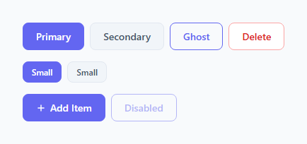
Buttons are the most-used interactive element in any web interface. Every form, toolbar, modal, and checkout flow needs them. But inconsistent button styles across a project create visual noise and confuse users about which action is primary. A well-defined set of button variants — each with a clear visual hierarchy and purpose — is one of the first things a design system establishes.
This snippet gives you a complete button set in plain HTML and CSS — no JavaScript required. Four semantic variants, a size modifier, an icon+text button, and a disabled state, all built from a single .btn base class.
The base class pattern
All buttons share a .btn base class with common properties: display: inline-flex, align-items: center, gap: 6px for icon spacing, padding, font size, font weight, border-radius, and a border: 1.5px solid transparent that reserves space for the border without displacing layout. Each variant class then only overrides the three values that differ: background, color, and border-color. This keeps the CSS lean and makes adding new variants simple.
The four variants and when to use each
The Primary button (.btn.primary) has a solid filled background in the brand accent colour. Use it for the single most important action on a screen — "Save", "Submit", "Get started". There should only be one primary button per page section.
The Secondary button (.btn.secondary) has a light grey fill and a subtle border. Use it for supporting actions that sit beside a primary — "Cancel", "Back", "Learn more". It is visually recessive but clearly still a button.
The Ghost button (.btn.ghost) has no fill — transparent background with an accent-coloured border and text. On hover it gets a very faint tinted fill (rgba(99,102,241,0.08)). Use it for tertiary actions, filter toggles, or when you need a button that does not compete with the primary but is more prominent than a text link.
The Danger button (.btn.danger) has a white background with a red text colour and a light red border. On hover the background tints red and the border darkens. Use it for destructive actions — "Delete", "Remove", "Revoke". The red signals caution without being an aggressive solid fill.
The size modifier
.btn.sm reduces padding and font size. Combine it with any variant: .btn.sm.primary, .btn.sm.ghost. Use small buttons in compact toolbars, table row actions, or anywhere vertical space is tight.
The icon button
.btn.icon uses display: inline-flex and gap: 6px to align an SVG icon beside the label. The SVG uses stroke="currentColor" so it inherits the button text colour automatically — no separate colour declaration needed. To use an icon-only button, remove the text label and set equal padding, then add an aria-label for accessibility.
The disabled state
.btn:disabled uses opacity: 0.45 and cursor: not-allowed. The 45% opacity uniformly fades any variant without needing separate disabled rules for each. Always use the HTML disabled attribute rather than a CSS class alone — the attribute also prevents click events and keyboard focus.
Saving your customised version
After editing, click "Save as" in the editor header, type a name, and press Enter. Saves to IndexedDB and appears in the Saved tab.
Build with AI
Build, Understand, Optimize, and Extend It With AI
You don't have to compare every variant's three overridden properties by hand to see the underlying design-system pattern. Paste this snippet's HTML and CSS into an AI coding assistant like Claude and ask it to explain exactly why the base .btn class declares a 1.5px solid transparent border rather than no border at all, and why that specific detail matters when a variant class later sets a real border-color. The same assistant can help optimize it — asking whether the hardcoded accent hex value repeated across the primary and ghost variants should become a single CSS custom property so a rebrand touches one line instead of several, or whether the disabled state's opacity approach could unintentionally reduce contrast below accessible thresholds for the danger variant's already-light red border. It's also useful for extending the set: ask it to add a large size modifier, an icon-only variant with a proper aria-label pattern, or a loading state with a spinner that doesn't shift the button's width. Treat the code less like a finished artifact and more like a starting point for a conversation.
Prompt to recreate it
Copy this into your AI assistant of choice to build the effect from scratch, or as a jumping-off point for your own variant:
Build a button component system in plain HTML and CSS only, no JavaScript, using a base-class-plus-modifier pattern — no per-button one-off style rules.

Requirements:
- One shared base class applied to every button that defines all properties common to every variant: inline-flex layout with a gap for icon-plus-text alignment, padding, font-size, font-weight, border-radius, cursor, a transition, and critically a border that is already 1.5px solid but fully transparent by default (not border: none), so that variants which need a visible border can add only a border-color without any border-width layout shift.
- Exactly four semantic variant classes that each override only background, text color, and border-color relative to the base: a solid filled "primary" variant for the single most important action, a light neutral-fill "secondary" variant for supporting actions, a transparent-background "ghost" variant with a colored border and text that gets a faint tinted background only on hover, and a white-background "danger" variant with red text and a light red border that darkens on hover.
- A separate, independently combinable size modifier class that only overrides padding and font-size, so it can be stacked with any of the four variant classes without duplicating variant-specific rules.
- An icon-plus-label button pattern where an inline SVG icon uses stroke="currentColor" so it automatically inherits whatever text color the applied variant sets, requiring no separate icon color rule per variant.
- A disabled state driven by the real HTML disabled attribute (not just a CSS class) that uniformly reduces opacity and changes the cursor across all four variants using a single shared rule, without needing a separate disabled override written per variant.
Want to tighten it up first? Run this prompt through the AI Prompt Studio to score it across 8 quality dimensions, catch anti-patterns, and tune the wording for Claude, ChatGPT, or Gemini before you paste it in.
Step by step
How to Use
- 1Load the snippetClick "Button Group" in the sidebar. The preview shows all four variants, small size modifier, icon button, and disabled state.
- 2Pick the variants you needIn the HTML panel, keep only the buttons your project needs. Each button is a single element with two classes: .btn and the variant class.
- 3Change the accent colourIn the CSS panel, find #6366f1 and replace all instances with your brand colour. Updates primary, ghost, and hover states in one change.
- 4Adjust sizingUpdate padding and font-size on .btn for the default size, and .btn.sm for the small size. Add a .btn.lg modifier with larger values if needed.
- 5Add an icon to any buttonPaste an SVG inside a button element alongside the label text. The inline-flex + gap layout aligns them automatically. Use stroke="currentColor" so the icon inherits the text colour.
- 6Export in your formatClick "HTML" for a standalone file, "JSX" for a React component, or "Tailwind" for a React + Tailwind CSS version.
Real-world uses
Common Use Cases
Got questions?
Frequently Asked Questions
Four variants: Primary (solid fill, for the most important action), Secondary (light grey, for supporting actions), Ghost (transparent with outline, for tertiary actions), and Danger (white with red text, for destructive actions like Delete). Plus a small size modifier (.btn.sm) and a disabled state.
All buttons share a .btn class with padding, font, border-radius, and a transparent border. Variant classes (.primary, .secondary, .ghost, .danger) only override background, color, and border-color. Size modifiers (.sm) only override padding and font-size. This keeps the CSS lean and makes new variants trivial to add.
Place an SVG element inside the button alongside the text label. The .btn base uses display: inline-flex and gap: 6px, so the icon and text align automatically. Set stroke="currentColor" on the SVG so it inherits the button text colour without an extra CSS rule. For icon-only buttons, remove the label and add aria-label for accessibility.
The :disabled pseudo-class applies opacity: 0.45 and cursor: not-allowed. The 45% opacity uniformly fades any variant without needing a separate disabled rule per variant. Always use the HTML disabled attribute — it also blocks click events and keyboard focus, which a CSS class alone cannot do.
Find #6366f1 in the CSS panel and do a search-and-replace with your brand hex. This updates the primary button fill, ghost border and text, and hover states in one pass. For a more maintainable approach, replace the hardcoded values with a CSS custom property: :root { --accent: #yourcolor } and reference var(--accent) throughout.
Yes. Click "JSX" to download a React component or "Tailwind" for a Tailwind version. In React, create a Button component that accepts variant and size props and maps them to the corresponding class names. In Tailwind, the primary button maps roughly to bg-indigo-500 hover:bg-indigo-700 text-white font-semibold rounded-lg px-4 py-2.