More Forms Snippets
Front-End Coding Playgrounds
Learn to code with interactive, live-preview playgrounds — HTML, CSS, JavaScript, React & more.
 HTML Playground42 lessons · Click-based · Live preview
 CSS PlaygroundLearn CSS with a live editor
 JavaScript Playground60 lessons · DOM · Async · Canvas
 React PlaygroundLearn React with a live code editor
 GSAP PlaygroundLearn GSAP animation interactively
 SVG Playground44 lessons · shapes · paths · animation
 SCSS Playground45 lessons · Sass modules · tokens
 Tailwind PlaygroundLearn Tailwind CSS with a live editor
 Bootstrap 5 Playground50 lessons · live preview
Segmented Control — Free HTML CSS JS Snippet
Segmented Control · Forms · Plain HTML, CSS & JS · Live preview
What's included
Features
About this UI Snippet
Segmented Control — Sliding Pill Indicator & Multiple Independent Instances
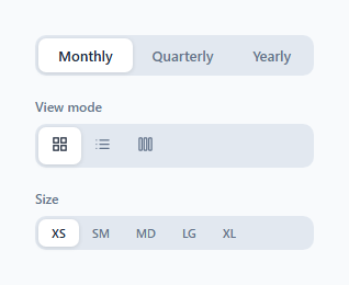
A segmented control is an iOS-style button group where one option is always selected and the active option is indicated by a sliding pill background. Used in view toggles (compare the tab bar), filter selectors, and settings groups.
The sliding pill
The same technique as the Animated Tabs snippet: pick(btn, segId) reads btn.offsetLeft and btn.offsetWidth and applies them to the indicator element's style.left and style.width. CSS transition: left 0.2s, width 0.2s animates the slide. The pill correctly adapts to different button label lengths.
Multiple independent instances
The segId parameter scopes the operation to a specific segmented control element. This allows multiple independent controls on the same page without event conflicts — each has its own indicator and active state.
Data binding
Each button has a data-value attribute that can be read after selection: document.querySelector('#my-seg .seg-btn.active').dataset.value returns the selected option.
The sliding pill indicator
The active indicator is a .pill div using position: absolute. On each button click, moveIndicator(btn) reads btn.offsetLeft and btn.offsetWidth — the actual pixel position and size of the clicked segment from the DOM. It then sets pill.style.left and pill.style.width to these values. CSS transition: left 0.2s, width 0.2s animates the pill sliding and resizing between segments. Since values are read at click time, the control handles any segment label length automatically with no CSS configuration.
Keyboard accessibility
The buttons are standard button elements — keyboard-accessible by default. For arrow key navigation matching native iOS segmented control behaviour, add a keydown listener: ArrowRight focuses and clicks the next segment; ArrowLeft focuses and clicks the previous. Tab moves between control groups; arrow keys move within a group.
Common production use cases
The segmented control works best for 2–4 mutually exclusive options that fit on one line. Common uses: List/Grid view toggle, Day/Week/Month time range picker, Bar/Line/Pie chart switcher, Ascending/Descending sort direction. Wire the active segment to a state variable and conditionally render the matching view component below.
The sliding pill indicator
The active indicator is a .pill div using position: absolute. On each button click, moveIndicator(btn) reads btn.offsetLeft and btn.offsetWidth — the actual pixel position and size of the clicked segment from the DOM. It then sets pill.style.left and pill.style.width to these values. CSS transition: left 0.2s, width 0.2s animates the pill sliding and resizing between segments. Since values are read at click time, the control handles any segment label length automatically with no CSS configuration.
Keyboard accessibility
The buttons are standard button elements — keyboard-accessible by default. For arrow key navigation matching native iOS segmented control behaviour, add a keydown listener: ArrowRight focuses and clicks the next segment; ArrowLeft focuses and clicks the previous. Tab moves between control groups; arrow keys move within a group.
Common production use cases
The segmented control works best for 2–4 mutually exclusive options that fit on one line. Common uses: List/Grid view toggle, Day/Week/Month time range picker, Bar/Line/Pie chart switcher, Ascending/Descending sort direction. Wire the active segment to a state variable and conditionally render the matching view component below.
Build with AI
Build, Understand, Optimize, and Extend It With AI
You don't need to work out the pill-positioning math by hand. Paste this snippet's HTML, CSS, and JS into an AI coding assistant like Claude and ask it to explain exactly how pick() turns a clicked button's getBoundingClientRect into the indicator's left and width styles, or why segId scoping is what lets three independent segmented controls share one pick() function without interfering with each other. The same assistant is useful for optimizing it too, for instance checking whether recalculating getBoundingClientRect on every resize event across all three controls could be debounced for a page with many segmented controls. It's just as handy for extending the behavior: ask it to add arrow-key navigation between segments, persist the selected segment per control in localStorage, or animate the indicator with a slight overshoot easing instead of the current cubic-bezier. Treat the code less like a finished artifact and more like a starting point for a conversation.
Prompt to recreate it
Copy this into your AI assistant of choice to build the effect from scratch, or as a jumping-off point for your own variant:
Build an iOS-style segmented control with a sliding pill indicator in plain HTML, CSS, and JavaScript, no framework, no libraries.

Requirements:
- Support multiple independent segmented control instances on the same page, each identified by its own container id, without any control's state leaking into another's.
- Each control must have exactly one absolutely-positioned indicator element that visually sits behind the buttons and slides beneath whichever one is active.
- On click, read the clicked button's position and width relative to its own container using getBoundingClientRect (comparing the button's rect to its container's rect, not offsetLeft alone), and set the indicator's left and width inline styles to those values.
- Animate the indicator's left and width changes with a CSS transition (not a JS animation loop), so the pill glides and resizes smoothly between segments of different label widths.
- On page load, initialize each control's indicator position to match whichever button already has the active class, without requiring a click first.
- Add a window resize listener that recalculates and re-applies every control's indicator position, so the pill does not drift out of alignment if the layout reflows.
- Support at least three variations of the same control on one page: a plain text segmented control, an icon-only segmented control, and a small-size segmented control with five options, all driven by the same reusable function.
Step by step
How to Use
- 1Click each segment optionClick any option in each of the three demo controls. The pill indicator slides smoothly to the clicked option.
- 2Update option labelsIn the HTML panel, change the button text inside each .seg-btn. The indicator auto-adapts to different label widths.
- 3Add a fourth optionAdd another .seg-btn button inside the .seg-wrap. The JS picks it up via querySelectorAll automatically.
- 4Read the selected valueAdd data-value attributes to each button. Read the selection: document.querySelector("#seg1 .seg-btn.active").dataset.value.
- 5Change indicator colourUpdate background: #fff on .seg-indicator in the CSS panel to match your brand.
- 6Export in your formatClick "HTML" for a standalone file, "JSX" for a React component, or "Tailwind" for a React + Tailwind version.
Real-world uses
Common Use Cases
Got questions?
Frequently Asked Questions
pick() reads btn.offsetLeft (position within the container) and btn.offsetWidth (button size). It sets indicator.style.left and .width to these pixel values. CSS transition: left 0.2s, width 0.2s animates between positions.
pick(btn, segId) scopes querySelectorAll and getElementById to document.getElementById(segId). This limits the active state changes to one control without affecting others on the same page.
After selection: const value = document.querySelector("#" + segId + " .seg-btn.active").dataset.value. Set a data-value attribute on each button matching the option value.
Add tabindex="0" to each button and a keydown handler that activates on Enter or Space. Add role="radiogroup" to the container and role="radio" aria-checked to each button.
Yes. Click "JSX" for a React component. Use useState for the active value. Apply active class based on value comparison. Use useRef on the indicator and active button to update indicator position in useEffect after value changes.
Segmented controls always show all options inline and are used for mutually exclusive choices within the same context. Tabs switch between different content panels. Segmented controls are more compact and suited for 2-5 options.