
Learn Coding Visually
Learn to code with interactive, live-preview playgrounds — HTML, CSS, JavaScript, React & more.
 HTML Playground42 lessons · Click-based · Live preview
 CSS PlaygroundLearn CSS with a live editor
 JavaScript Playground60 lessons · DOM · Async · Canvas
 React PlaygroundLearn React with a live code editor
 GSAP PlaygroundLearn GSAP animation interactively
 SVG Playground44 lessons · shapes · paths · animation
 SCSS Playground45 lessons · Sass modules · tokens
 Tailwind PlaygroundLearn Tailwind CSS with a live editor
 Bootstrap 5 Playground50 lessons · live preview
Toggle Switch — Free Pure CSS Checkbox Snippet
Toggle Switch · Forms · Plain HTML & CSS · Live preview
What's included
Features
About this UI Snippet
Toggle Switch — Pure CSS Using Hidden Checkbox and :checked Sibling Combinator
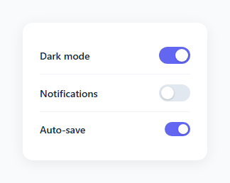
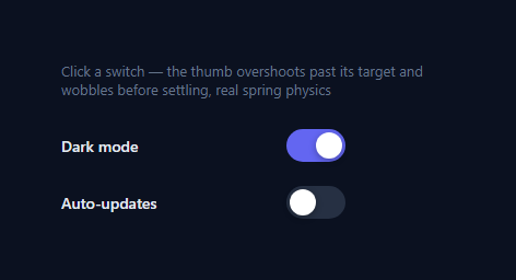
A toggle switch communicates a binary on/off state more clearly than a custom checkbox. Checkboxes are associated with selecting items in a list; toggles are associated with enabling or disabling a single setting (as in a settings panel or dark mode toggle). Users understand the metaphor immediately because it matches physical switches — a light switch, a phone silent mode button. This snippet implements a full, accessible toggle switch with pure CSS and no JavaScript.
The hidden checkbox technique
The HTML structure wraps everything inside a <label> element. Inside the label: a <div class="toggle"> containing a hidden <input type="checkbox"> and a <span class="track">. The input is hidden with opacity: 0; width: 0; height: 0; position: absolute — it stays in the DOM and receives focus and keyboard events, but has no visible size. Since the input is inside the label, clicking anywhere on the visible track element clicks the label, which toggles the underlying checkbox. No JavaScript click handler needed.
The :checked sibling combinator
input:checked ~ .track selects the .track element when its preceding sibling input is in the checked state. When the user clicks, the browser toggles the checkbox, which triggers the CSS selector. The track background transitions to #6366f1 (the accent colour). The knob moves via input:checked ~ .track::after { transform: translateX(20px) }.
The knob travel calculation
The default track is 44px wide, the knob is 18px, and padding is 3px on each side. Available travel: 44 - 18 - 3 - 3 = 20px. The small variant (36×20px track, 14px knob): 36 - 14 - 3 - 3 = 16px travel.
Accessibility
The hidden checkbox is in the accessibility tree. Screen readers announce the label text when focused. The toggle responds to Space bar (standard checkbox behaviour). For full ARIA compliance, add role="switch" to the label and aria-checked="true/false" — update the attribute via JavaScript on change.
Reading and reacting to state in JavaScript
input.checked returns the boolean state. input.addEventListener('change', e => console.log(e.target.checked)) fires on every toggle. In React, bind the checked value to state and the onChange handler to setState.
The hidden checkbox pattern
The toggle uses a visually hidden input[type="checkbox"] associated with a label via for/id. Clicking the label clicks the checkbox. The :checked pseudo-class applies the "on" visual state via the sibling combinator: input:checked + .slider. This pattern makes the toggle keyboard-accessible by default (Tab to focus, Space to toggle) and semantically correct (the checkbox value is included in form submissions).
The CSS slider and knob
The .slider is a 44×24px rounded rectangle with a coloured background (grey for off, accent for on). The .knob is an 18×18px white circle with a box-shadow. In the off state, left: 3px positions it left. In the :checked + .slider .knob state, left: 23px (44 - 18 - 3) positions it right. CSS transition: left 0.15s, background 0.15s animates both simultaneously.
Labelling the state
For clarity, add visible text labels: "Off / On" or "Disabled / Enabled" alongside the toggle. Use aria-label="Enable notifications" on the checkbox for screen readers that only announce the toggle state. Do not rely on colour alone to communicate the on/off state — the knob position must also differ.
Build with AI
Build, Understand, Optimize, and Extend It With AI
Ask an AI coding assistant like Claude to explain exactly why the checkbox has to be a sibling of .track rather than a parent or child for the input:checked ~ .track selector to work, and to walk through the knob-travel arithmetic (44 minus 18 minus 3 minus 3) so you understand why changing the track or knob size without updating the translateX value breaks the animation. It's a good prompt for an accessibility review too — ask specifically what role="switch" and aria-checked would add on top of the existing native checkbox semantics, and when that extra ARIA is actually necessary versus redundant. For extending it, ask for a three-state indeterminate toggle, a labeled "On/Off" text variant next to the knob, or a version that shows a brief loading spinner in the knob while an async settings save is in flight. Treat the code less like a finished artifact and more like a starting point for a conversation.
Prompt to recreate it
Copy this into your AI assistant of choice to build the effect from scratch, or as a jumping-off point for your own variant:
Build an iOS-style toggle switch in plain HTML and CSS with zero JavaScript, using only a hidden checkbox and the CSS sibling combinator.

Requirements:
- Wrap the entire toggle in a label element so clicking anywhere on the visible track (not just a tiny native checkbox) toggles the state.
- Hide the actual input type="checkbox" visually (zero size, zero opacity) without removing it from the document or the accessibility tree — it must still receive Tab focus and respond to the Space key exactly like a normal checkbox.
- Style a sibling span as the visible track: a rounded rectangle with a circular knob positioned via a pseudo-element, using the checkbox's :checked state combined with the general sibling combinator (~) to change the track's background color and translate the knob to the opposite side — no JavaScript click handler of any kind.
- Calculate the knob's travel distance precisely from the track width, knob width, and padding on each side, and use that exact pixel value in the translateX for the checked state so the knob lands flush against the opposite edge with no gap or overlap.
- Provide a second, smaller size variant via an additional modifier class that scales down the track and knob dimensions and uses its own correctly recalculated travel distance.
- Confirm the toggle is fully operable with only a keyboard (Tab to focus, Space to flip) and that the checkbox's checked state is what a form submission would actually see — the whole component's state must live in the native checkbox, not in any external class or attribute.
Want to tighten it up first? Run this prompt through the AI Prompt Studio to score it across 8 quality dimensions, catch anti-patterns, and tune the wording for Claude, ChatGPT, or Gemini before you paste it in.
Source Code
<div class="demo">
  <label class="row">
    <span>Dark mode</span>
    <div class="toggle">
      <input type="checkbox" checked>
      <span class="track"></span>
    </div>
  </label>
  <label class="row">
    <span>Notifications</span>
    <div class="toggle">
      <input type="checkbox">
      <span class="track"></span>
    </div>
  </label>
  <label class="row">
    <span>Auto-save</span>
    <div class="toggle sm">
      <input type="checkbox" checked>
      <span class="track"></span>
    </div>
  </label>
</div>
* { box-sizing: border-box; margin: 0; padding: 0; }
body { font-family: system-ui, sans-serif; background: #f8fafc; display: flex; align-items: center; justify-content: center; min-height: 100vh; padding: 20px; }
.demo {
background: #fff;
border-radius: 14px;
padding: 20px 24px;
display: flex;
flex-direction: column;
gap: 0;
box-shadow: 0 4px 20px rgba(0,0,0,0.07);
min-width: 260px;
}
.row {
display: flex;
align-items: center;
justify-content: space-between;
padding: 14px 0;
font-size: 14px;
font-weight: 500;
color: #1e293b;
cursor: pointer;
border-bottom: 1px solid #f1f5f9;
}
.row:last-child { border-bottom: none; }
.toggle { position: relative; flex-shrink: 0; }
.toggle input { opacity: 0; width: 0; height: 0; position: absolute; }
.track {
display: block;
width: 44px;
height: 24px;
background: #e2e8f0;
border-radius: 24px;
position: relative;
transition: background 0.2s;
cursor: pointer;
}
.track::after {
content: '';
position: absolute;
width: 18px;
height: 18px;
border-radius: 50%;
background: #fff;
top: 3px;
left: 3px;
transition: transform 0.2s;
box-shadow: 0 1px 3px rgba(0,0,0,0.2);
}
input:checked ~ .track { background: #6366f1; }
input:checked ~ .track::after { transform: translateX(20px); }
.toggle.sm .track { width: 36px; height: 20px; }
.toggle.sm .track::after { width: 14px; height: 14px; }
.toggle.sm input:checked ~ .track::after { transform: translateX(16px); }Step by step
How to Use
- 1Click each toggle in the previewClick the Dark mode, Notifications, and Auto-save rows. The knob slides and the track changes colour independently for each toggle.
- 2Update the setting labelsIn the HTML panel, change the row label text to your own setting names. The toggle behaviour is unaffected by the label text.
- 3Set default on/off statesAdd the checked attribute to any input to have it start in the on position: <input type="checkbox" checked>.
- 4Change the accent colourFind #6366f1 in the CSS and replace with your brand colour. This updates the checked track background.
- 5Use the small variantAdd the sm class to any .toggle div: <div class="toggle sm">. The knob and track scale down automatically.
- 6Export in your formatClick "HTML" for a standalone file, "JSX" for a React component, or "Tailwind" for a React + Tailwind version.
Real-world uses
Common Use Cases
Got questions?
Frequently Asked Questions
A hidden input[type="checkbox"] is inside the label. Clicking the label — including the visible track — checks the input. CSS uses input:checked ~ .track to change the track colour and input:checked ~ .track::after to slide the knob. The browser handles the checked state natively.
Travel = track width - knob width - left padding - right padding. For the default: 44 - 18 - 3 - 3 = 20px. For the small variant: 36 - 14 - 3 - 3 = 16px. If you change any of these values, update the translateX value to match.
Yes. The hidden input receives Tab focus (you can see the focus ring on the track). Space toggles it — standard browser behaviour for checkboxes. Screen readers announce the label text. For full switch semantics, add role="switch" to the wrapping label and toggle aria-checked via JavaScript on the change event.
input.checked returns true or false. Add input.addEventListener("change", e => { if (e.target.checked) { /* on */ } else { /* off */ } }) to react to changes. To read initial state on page load, check input.checked directly.
Add the disabled attribute to the input element. Add CSS: .toggle input:disabled ~ .track { opacity: 0.4; cursor: not-allowed; pointer-events: none; } to visually indicate the disabled state.
Yes. Click "JSX" to download a React component. Replace the hidden input with a controlled checkbox: bind checked={isOn} and onChange={() => setIsOn(!isOn)}. The CSS works unchanged — React toggles the checked attribute and the CSS selector responds.