You Might Also Like
Learn Coding Visually
Learn to code with interactive, live-preview playgrounds — HTML, CSS, JavaScript, React & more.
 HTML Playground42 lessons · Click-based · Live preview
 CSS PlaygroundLearn CSS with a live editor
 JavaScript Playground60 lessons · DOM · Async · Canvas
 React PlaygroundLearn React with a live code editor
 GSAP PlaygroundLearn GSAP animation interactively
 SVG Playground44 lessons · shapes · paths · animation
 SCSS Playground45 lessons · Sass modules · tokens
 Tailwind PlaygroundLearn Tailwind CSS with a live editor
 Bootstrap 5 Playground50 lessons · live preview
High Contrast Mode Toggle — Free Accessible UI Theme Switch
High Contrast Mode Toggle · Buttons · Plain HTML, CSS & JS · Live preview
What's included
Features
About this UI Snippet
High Contrast Mode Toggle — A Real Accessibility Theme, Not Just Inverted Colors
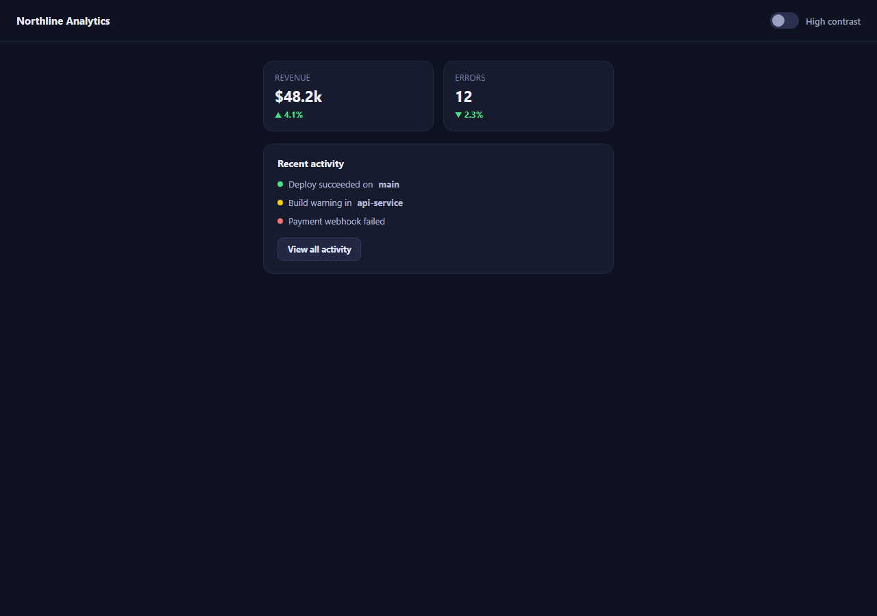
Dark-mode toggles are everywhere; genuine high-contrast toggles are rarer, and the two are not the same feature. A dark theme optimizes for comfort in low light. A high-contrast theme optimizes for legibility — for users with low vision, certain color-vision deficiencies, or anyone in bright glare — by widening every ratio, thickening borders that would otherwise be a faint 1px line, and making sure status is never communicated by color alone. This snippet builds a working toggle that flips a small dashboard between the two, using the same "one attribute on the root" architecture as a dark-mode switch, applied to a genuinely different design goal.
One data attribute drives everything
Clicking the toggle sets data-contrast="high" (or "normal") on #demoRoot, and every override lives in CSS selectors scoped under .demo-root[data-contrast="high"]. The JavaScript never touches a color value directly — it only flips the attribute, the same separation of concerns used in the dark mode toggle and color mode toggle snippets. That separation matters here specifically because it keeps every contrast decision in one auditable place instead of scattered across component-level JS logic.
What actually changes, and why
Borders go from a subtle 1px translucent line to a solid 2px white border, because a barely-visible card edge is exactly the kind of detail low-vision users lose first. Backgrounds and text collapse to pure black and white rather than the dark theme's softened grays, pushing contrast ratios toward WCAG's stricter AAA target of 7:1 for body text rather than the AA minimum of 4.5:1. Status dots that relied on green/yellow/red alone gain text labels ("OK", "UP", "DOWN") in high-contrast mode, because color-coding without a redundant cue fails WCAG 1.4.1 (Use of Color) for anyone who can't reliably distinguish the hues, not just users who are fully colorblind.
Respecting the OS-level signal too
Beyond the manual toggle, the JS checks window.matchMedia('(prefers-contrast: more)') on load, so a user who has already told their operating system they want more contrast gets it automatically here too, without hunting for an in-app switch — mirroring how a reduced-motion toggle checks prefers-reduced-motion. A saved localStorage preference takes priority over the OS default on repeat visits.
Where this belongs
Any dashboard, admin panel, or data-dense interface benefits from an explicit high-contrast option, since low-vision users are disproportionately concentrated in exactly those data-heavy, small-text contexts. Pair it with a text size adjuster and a color contrast checker for a fuller accessibility toolbar, or with focus-visible styling so keyboard focus rings also widen under high contrast, as this snippet's toggle button itself does.
Build with AI
Build, Understand, Optimize, and Extend It With AI
Paste this snippet's HTML, CSS, and JS into an AI coding assistant like Claude and ask it to explain why a high-contrast theme is a distinct accessibility feature from dark mode, not just an inverted color scheme — the assistant can walk through the specific WCAG success criteria (contrast ratios, use of color) that motivate each override in the CSS. It's also useful for auditing your own theme system: ask it to check whether your dashboard's status indicators rely on color alone, or whether your border and divider styles would survive being thickened to 2px without breaking any layouts. You can ask it to extend this pattern with a contrast-ratio calculator that live-checks your chosen colors against WCAG AA/AAA thresholds, or to wire the prefers-contrast media query check into a React context provider. Treat it as a working reference for a feature many teams claim to support without ever really testing.
Prompt to recreate it
Copy this into your AI assistant of choice to build the effect from scratch, or as a jumping-off point for your own variant:
Build a high-contrast accessibility mode toggle for a small dashboard UI in plain HTML, CSS, and JavaScript.

Requirements:
- A single data attribute (e.g. data-contrast="normal" | "high") on a root wrapper element that every visual override is scoped under in CSS — do not write JavaScript that sets colors directly.
- A normal theme with a typical dark UI: soft borders, muted grays, color-coded status indicators (e.g. green/yellow/red dots for ok/warning/error).
- A high-contrast theme, toggled by the same attribute, that: uses pure black and white rather than muted grays, thickens all card and container borders to at least 2px and always-visible (never a faint 1px line), adds a redundant text or symbol cue next to every color-coded status indicator so status is never conveyed by color alone, and widens the keyboard focus outline.
- A visually accessible toggle switch with aria-pressed reflecting its state, not just a CSS class with no ARIA semantics.
- On load, check window.matchMedia('(prefers-contrast: more)') and enable high-contrast automatically if the user's OS requests it and no saved preference exists yet.
- Persist the user's explicit choice in localStorage so it survives a page reload, falling back gracefully if localStorage is unavailable.
Want to tighten it up first? Run this prompt through the AI Prompt Studio to score it across 8 quality dimensions, catch anti-patterns, and tune the wording for Claude, ChatGPT, or Gemini before you paste it in.
Step by step
How to Use
- 1Toggle "High contrast"The whole dashboard flips to a black-and-white, thick-bordered theme.
- 2Compare the stat cardsBorders go from a faint line to a solid 2px outline in the high-contrast state.
- 3Look at the status dotsIn high contrast, "OK" text is added next to the dot — status is never color-only.
- 4Reload the previewYour choice persists via localStorage, same as a saved dark-mode preference.
- 5Check your OS contrast settingIf your OS has "increase contrast" enabled, the toggle starts on automatically.
- 6Inspect data-contrastEvery override lives under [data-contrast="high"] on the root element in CSS.
Real-world uses
Common Use Cases
Got questions?
Frequently Asked Questions
No. Dark mode is primarily a comfort preference for low-light viewing and typically uses softened, muted colors. A high-contrast theme is an accessibility feature aimed at legibility — it pushes text/background ratios higher, thickens borders, and removes any reliance on subtle color differences, regardless of whether the base theme is light or dark.
It sets a single data-contrast attribute on the root element and lets CSS selectors scoped to [data-contrast="high"] own every visual override. The JavaScript never assigns a color directly — it only flips the attribute — so every contrast decision lives in one place in the stylesheet and stays easy to audit or extend.
WCAG 1.4.1 (Use of Color) requires that color never be the only way information is conveyed, because colorblind users and some low-vision users cannot reliably distinguish hues. The status dots already rely on color in the normal theme; the high-contrast theme adds a redundant text cue so the same information reaches users who cannot pick up on color alone.
Yes — on load, the script checks window.matchMedia("(prefers-contrast: more)") and turns the toggle on automatically if the user has that OS accessibility setting enabled and hasn't already saved an explicit preference of their own, similar to how a reduced-motion toggle checks prefers-reduced-motion.
Yes — swap the boolean data-contrast value for a small enum (normal / high / high-inverted, for example) and add corresponding CSS blocks keyed to each value. The toggle button would become a small select or segmented control instead of a switch, but the single-attribute architecture stays exactly the same.