You Might Also Like
Learn Coding Visually
Learn to code with interactive, live-preview playgrounds — HTML, CSS, JavaScript, React & more.
 HTML Playground42 lessons · Click-based · Live preview
 CSS PlaygroundLearn CSS with a live editor
 JavaScript Playground60 lessons · DOM · Async · Canvas
 React PlaygroundLearn React with a live code editor
 GSAP PlaygroundLearn GSAP animation interactively
 SVG Playground44 lessons · shapes · paths · animation
 SCSS Playground45 lessons · Sass modules · tokens
 Tailwind PlaygroundLearn Tailwind CSS with a live editor
 Bootstrap 5 Playground50 lessons · live preview
Dyslexia-Friendly Reading Mode — Free Accessible Text Toggle
Dyslexia-Friendly Reading Mode · Buttons · Plain HTML, CSS & JS · Live preview
What's included
Features
About this UI Snippet
Dyslexia-Friendly Reading Mode — Spacing and Rhythm, Not a Miracle Font
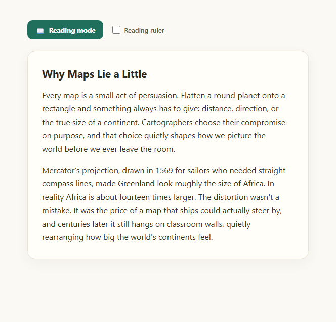
A lot of "dyslexia-friendly" web features overpromise: they bundle a single paid or free typeface and imply it alone fixes reading difficulty. The research on any specific commercial typeface curing dyslexia is genuinely inconclusive, and this snippet is deliberately honest about that. What it does instead is apply the levers with the more consistently documented benefit for many readers — generous letter-spacing, wider word-spacing, taller line-height, and a plain, uncluttered web-safe sans-serif stack — plus an optional reading ruler that tracks the cursor vertically to help the eye hold its place on a line.
What actually changes in reading mode
Toggling reading mode adds a class that sets letter-spacing: 0.035em, word-spacing: 0.18em, and line-height: 2 on the article, and swaps the font stack to Verdana, Tahoma, 'Trebuchet MS', Arial, sans-serif — widely available system fonts chosen for even letter shapes and a lack of tight kerning, not a licensed "dyslexia font." Increased spacing between letters and words reduces the visual crowding that makes adjacent characters harder to distinguish, and the taller line-height gives the eye more room to return to the correct line after a saccade, which is one of the more common friction points readers describe.
The reading ruler
A thin horizontal band, built once and toggled with a checkbox, follows the mouse's vertical position across the page via a single mousemove listener, giving the reader a visual anchor for "which line am I on" without the eye needing to hold that position from memory. It's pointer-events: none, so it never blocks clicks or text selection underneath it — a common bug in naive ruler implementations that intercept the very content they're meant to help read.
Complementary, not a replacement, for other tools
This kind of in-page reading mode is a lightweight, always-available complement to — not a replacement for — assistive technology like screen readers or dedicated reading-support software; it helps a broader set of readers, including many without a diagnosed reading difference, who simply find generously spaced text easier to parse on a screen. Pair it with a text size adjuster so users can also scale type up, or a reading mode toggle that strips a page down to its core content, and consider a text-to-speech button as an audio alternative for the same paragraph.
Honest framing matters
Ship this as one option among several rather than as a cure-all badge — the goal is giving readers real, adjustable control over spacing and rhythm, the same spirit as a high-contrast mode toggle giving control over color and border weight. Both are about configurability, not a single "correct" accessible default forced on everyone.
Build with AI
Build, Understand, Optimize, and Extend It With AI
Paste this snippet's HTML, CSS, and JS into an AI coding assistant like Claude and ask it why the demo intentionally avoids branding itself around a specific "dyslexia font" and instead focuses on spacing and line-height — it's a good prompt for understanding what the actual accessibility research does and doesn't support, so you can make an informed choice for your own product rather than copying a marketing claim. You can also ask the assistant to convert the fixed spacing values into user-adjustable sliders bound to CSS custom properties, or to persist the chosen settings in localStorage across visits. It's worth asking it to review the reading ruler's mousemove handler for performance on long pages, and whether it should be throttled. Treat this as a starting point for a genuinely configurable reading-accessibility feature, not a finished one-size-fits-all preset.
Prompt to recreate it
Copy this into your AI assistant of choice to build the effect from scratch, or as a jumping-off point for your own variant:
Build a "reading mode" toggle in plain HTML, CSS, and JavaScript aimed at readers who find dense text hard to parse, including many with dyslexia.

Requirements:
- Do NOT claim or bundle a specific "dyslexia font" — instead use a plain, widely available web-safe sans-serif font stack (e.g. Verdana, Tahoma, Trebuchet MS, Arial) as the legible alternative typeface.
- A toggle button that adds a class to a wrapper element, and under that class, increase letter-spacing and word-spacing noticeably, increase line-height significantly (roughly double single-spacing), and switch to the plain font stack — all via CSS transitions, without altering the underlying HTML content.
- The toggle button must expose its on/off state via aria-pressed for assistive technology.
- Add a separate checkbox that enables an optional "reading ruler": a translucent horizontal band, created once and reused, that follows the mouse cursor's vertical position down the page via a single mousemove listener attached only while the ruler is enabled (detach it when disabled).
- The ruler must use pointer-events: none so it never blocks clicks, text selection, or any interaction with the content underneath it.
- Include realistic body paragraph content to demonstrate the spacing change clearly, and make sure toggling reading mode off restores the original typography exactly.
Want to tighten it up first? Run this prompt through the AI Prompt Studio to score it across 8 quality dimensions, catch anti-patterns, and tune the wording for Claude, ChatGPT, or Gemini before you paste it in.
Step by step
How to Use
- 1Click "Reading mode"Letter-spacing, word-spacing, and line-height all widen; the font switches to a plain sans stack.
- 2Compare the two statesToggle it off and back on to see exactly how much spacing changes.
- 3Check "Reading ruler"A translucent band appears and follows your mouse vertically down the page.
- 4Move the mouse over the textThe ruler tracks the pointer, helping isolate a single line at a time.
- 5Uncheck the rulerThe mousemove listener detaches; the band disappears.
- 6Adjust the values for your contentTune letter-spacing, word-spacing, and line-height to your own typography.
Real-world uses
Common Use Cases
Got questions?
Frequently Asked Questions
No — deliberately not. The evidence that any single commercial or free "dyslexia typeface" meaningfully improves reading for people with dyslexia is inconclusive and contested in the research. This snippet instead uses a plain, widely available web-safe sans stack (Verdana, Tahoma, Trebuchet MS, Arial) and focuses its actual effort on spacing and line-height, which have more consistent reported benefit for many readers.
Three CSS properties on the article: letter-spacing increases to 0.035em, word-spacing increases to 0.18em, and line-height increases to 2, alongside the plain font-stack swap. Together these reduce letter-crowding and give the eye more vertical room to correctly find the next line, both commonly cited sources of reading friction.
A single fixed-position div is created once and appended to the body. A mousemove listener, attached only while the ruler checkbox is checked, updates the ruler's top offset to track the cursor's vertical position. The ruler has pointer-events: none so it never intercepts clicks, text selection, or other interaction with the content beneath it.
No — it's a lightweight, always-available reading preference, not a replacement for dedicated assistive technology. It can genuinely help many readers, with or without a diagnosed reading difference, who find generously spaced text easier to parse, but it should be offered alongside, not instead of, tools like a screen reader or a text-to-speech option.
Yes — swap the fixed CSS values for CSS custom properties (e.g. --letter-spacing, --line-height) driven by a slider input instead of a checkbox, so readers can dial in their own preferred amount rather than accepting one fixed "reading mode" preset.