You Might Also Like
Learn Coding Visually
Learn to code with interactive, live-preview playgrounds — HTML, CSS, JavaScript, React & more.
 HTML Playground42 lessons · Click-based · Live preview
 CSS PlaygroundLearn CSS with a live editor
 JavaScript Playground60 lessons · DOM · Async · Canvas
 React PlaygroundLearn React with a live code editor
 GSAP PlaygroundLearn GSAP animation interactively
 SVG Playground44 lessons · shapes · paths · animation
 SCSS Playground45 lessons · Sass modules · tokens
 Tailwind PlaygroundLearn Tailwind CSS with a live editor
 Bootstrap 5 Playground50 lessons · live preview
Distraction-Free Reading Mode Toggle — HTML CSS JS Snippet
Distraction-Free Reading Mode Toggle · Layouts · Plain HTML, CSS & JS · Live preview
What's included
Features
About this UI Snippet
Distraction-Free Reading Mode Toggle — Animated Grid Layout Switching Between Normal and Reading Views
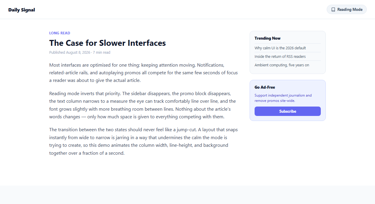
Every long-form content page fights the same underlying tension: the business needs sidebars, promo blocks, and related-content rails to drive engagement and revenue, while the reader just wants to read. A reading mode toggle resolves that tension without forcing a permanent tradeoff — the promotional layout stays the default, but a single click hands control back to the reader whenever they actually want to focus. This snippet implements a complete, animated reading mode toggle: click the button in the header and the sidebar and promo block disappear, the text column narrows to an optimal reading measure, line-height and font-size increase slightly, and the page background shifts to a warmer off-white — all transitioning smoothly rather than snapping instantly.
Why the transition is animated, not instant
An abrupt layout jump-cut — sidebar vanishing and column width changing in a single frame — is genuinely disorienting. The eye has to re-locate where it was reading, and a sudden width change during that split second breaks the reader's flow far more than the mode change was meant to help it. This snippet instead applies transition: grid-template-columns 0.4s ease, gap 0.4s ease, max-width 0.4s ease on the .layout-grid container, so the CSS Grid engine animates the sidebar's column track from 260px down to 0px and the gap from 40px to 0 continuously, while .article-col p transitions its own font-size and line-height in parallel. The background colour of .page-wrap cross-fades from white to a warm off-white (#faf6ee) over the same 0.4s window using a plain background transition, so every visual change lands together as one coherent motion rather than several uncoordinated snaps.
Why grid-template-columns is the right property to animate
CSS Grid track sizes are technically discrete values, but modern browsers interpolate grid-template-columns smoothly when both the before and after values are animatable lengths, which is exactly the technique this snippet relies on: the sidebar column goes from 260px to 0px rather than the sidebar simply being removed from the DOM or hidden with display: none mid-transition. Pairing that with opacity and pointer-events: none on .side-col lets the sidebar's content fade out visually at the same time its track collapses, so by the time the column reaches zero width there is nothing left partially visible to look broken or clipped.
The optimal reading measure: why 65 to 75 characters per line
Typography research consistently converges on roughly 65 to 75 characters per line — commonly written as 65-75ch in CSS — as the width at which the eye can track from the end of one line to the start of the next without losing its place, especially over long stretches of reading. This snippet sets max-width: 70ch on paragraph text specifically inside .layout-grid.reading, alongside a larger font-size: 18px (up from 16px) and a roomier line-height: 1.9 (up from 1.65). None of these values apply in the normal view, where the wider two-column layout is expected to carry more visual density.
Why this matters for 2026 calm UI design
Calm UI — interfaces that reduce cognitive load rather than compete for attention — has become a defining expectation for any product built around sustained reading or focus, not just a niche accessibility feature. Giving readers an explicit, persistent, one-click way to strip a page down to just its content respects their attention without forcing the publisher to give up the promotional layout as a permanent default. Because the toggle state is saved to localStorage under the key reading-mode, a reader who prefers the distraction-free view gets it automatically on every subsequent article, and the animated transition keeps the switch between the two states feeling considered rather than abrupt.
Build with AI
Build, Understand, Optimize, and Extend It With AI
Paste this snippet's HTML, CSS, and JS into an AI coding assistant like Claude and ask it to explain exactly how grid-template-columns, gap, and the paragraph font-size/line-height transitions are kept in sync on the same 0.4s duration so the whole layout change reads as one motion instead of several separate snaps. It's a good prompt to also ask the assistant to add an aria-hidden toggle on the sidebar for screen reader correctness, since opacity and pointer-events alone hide it visually and from interaction but not from assistive technology. You could additionally ask it to wire prefers-reduced-motion so the transition duration drops to near-zero for users who have that OS-level preference set, or to extract the reading-measure and line-height values into CSS custom properties so a design system can tune them without touching the transition logic itself.
Prompt to recreate it
Copy this into your AI assistant of choice to build the effect from scratch, or as a jumping-off point for your own variant:
Build a distraction-free reading mode toggle in plain HTML, CSS, and JavaScript for an article page that normally shows a sidebar with widgets and a promotional block next to the article text.

Requirements:
- A toggle button in the page header that switches between a "normal" view (sidebar visible, full-width two-column CSS Grid layout, tighter line-height) and a "reading" view (sidebar hidden, content column narrowed, looser line-height, slightly larger font-size).
- The content column's max-width in reading mode must clamp to roughly 65-75 characters per line (for example max-width: 70ch), which is the range typography research treats as the optimal reading measure.
- The transition between the two states must be animated, not an instant jump-cut — animate the CSS Grid column track (grid-template-columns), the gap, the paragraph font-size and line-height, and the page background color together over the same duration and easing so the whole change reads as one coordinated motion.
- The sidebar must both visually fade out (opacity) and stop being interactive (pointer-events: none) as its grid track collapses toward zero width, rather than disappearing abruptly mid-animation.
- The page background should shift to a slightly warmer, lower-contrast tone in reading mode to reduce eye strain, cross-fading rather than switching instantly.
- The toggle button must expose its state via aria-pressed and update its visible label (for example "Reading Mode" vs "Normal View") so the current state is clear to both sighted and assistive-technology users.
- Persist the chosen mode to localStorage so it is automatically reapplied the next time the page loads.
Want to tighten it up first? Run this prompt through the AI Prompt Studio to score it across 8 quality dimensions, catch anti-patterns, and tune the wording for Claude, ChatGPT, or Gemini before you paste it in.
Step by step
How to Use
- 1Click "Reading Mode" in the headerThe button toggles between "Reading Mode" and "Normal View" labels. Watch the sidebar (trending widget and subscribe promo) fade and collapse away while the article column narrows and re-centers, all animating together rather than jumping instantly.
- 2Notice the typography changesIn reading mode, body paragraphs grow from 16px to 18px, line-height increases from 1.65 to 1.9, and the max-width clamps to 70ch — the CSS Grid track and font transitions are wired to fire over the same 0.4s window in the CSS panel so nothing lands out of sync.
- 3Notice the warmer backgroundThe .page-wrap background cross-fades from white to a warm off-white (#faf6ee) when reading mode is active, a subtle cue commonly used by e-readers and reading apps to reduce eye strain during long sessions compared to stark white.
- 4Reload to see the persisted preferenceToggle reading mode on, then reload the demo. setReadingMode() reads localStorage.getItem("reading-mode") on load and applies the saved state immediately, so a reader's preference carries over to their next article rather than resetting every visit.
- 5Inspect the animated grid-template-columnsIn the CSS panel, .layout-grid uses grid-template-columns: minmax(0, 1fr) 260px normally, switching to minmax(0, 1fr) 0px in .reading. Because both values are transitionable lengths, the browser animates the sidebar track width smoothly instead of it vanishing in one frame.
- 6Export and wire to real article contentClick HTML or JSX to export, then replace the sample paragraphs with your CMS-rendered article body inside .article-col, and your real sidebar widgets inside .side-col. Keep the aria-pressed attribute in sync with the JS toggle so assistive technology announces the current state correctly.
Real-world uses
Common Use Cases
Got questions?
Frequently Asked Questions
Yes, in all modern browsers, as long as both the starting and ending values are compatible lengths — this snippet transitions between minmax(0, 1fr) 260px and minmax(0, 1fr) 0px, both of which are interpolatable. Browsers will smoothly animate the track size between the two rather than snapping. Grid layouts using keyword values like auto or fr-only tracks on both sides of the transition may not interpolate as smoothly, so keeping at least one side expressed in a fixed unit like px is the safer approach for animation.
Typography and reading-comprehension research consistently finds that lines much shorter than about 45 characters force the eye to make too many line breaks per sentence, while lines longer than roughly 75-90 characters make it easy to lose the correct line when the eye returns to the left margin, especially at high reading speeds. The 65-75ch range, set here via max-width: 70ch, balances both failure modes and is the range used by most dedicated reading apps and typography-focused editorial sites.
A subtle warm shift (this snippet uses #faf6ee) is a common and well-tested choice because pure white at high brightness can cause eye strain during extended reading, and a slightly warmer, lower-contrast background reduces that without sacrificing legibility. It is optional, though — some users and brands prefer to keep white and rely on the narrower measure and larger type alone; the background transition can simply be removed if it does not fit your product's visual identity.
This snippet already does that: setReadingMode() is called with the value read from localStorage.getItem("reading-mode") on every load, so once a user toggles reading mode on, it is applied automatically on their next visit without them needing to click the button again. For a server-rendered app, you can go further and read the same preference server-side from a cookie to avoid any flash of the normal layout before JavaScript runs.
Used correctly it does not: opacity: 0 combined with pointer-events: none removes the sidebar from click and hover interaction and visually hides it, but the elements technically remain in the DOM and tab order unless you also remove them or set aria-hidden. For a fully robust implementation, add aria-hidden="true" to the sidebar when reading mode is active (and remove it when reading mode is off) so screen reader users do not encounter now-irrelevant widgets while tabbing through the narrowed reading view.