You Might Also Like
Learn Coding Visually
Learn to code with interactive, live-preview playgrounds — HTML, CSS, JavaScript, React & more.
 HTML Playground42 lessons · Click-based · Live preview
 CSS PlaygroundLearn CSS with a live editor
 JavaScript Playground60 lessons · DOM · Async · Canvas
 React PlaygroundLearn React with a live code editor
 GSAP PlaygroundLearn GSAP animation interactively
 SVG Playground44 lessons · shapes · paths · animation
 SCSS Playground45 lessons · Sass modules · tokens
 Tailwind PlaygroundLearn Tailwind CSS with a live editor
 Bootstrap 5 Playground50 lessons · live preview
CSS Grid Template Areas Visualizer — Free Layout Snippet
CSS Grid Template Areas Visualizer · Layouts · Plain HTML, CSS & JS · Live preview
What's included
Features
About this UI Snippet
CSS Grid Template Areas — Visual Named-Area Layout Builder and the grid-template-areas Syntax
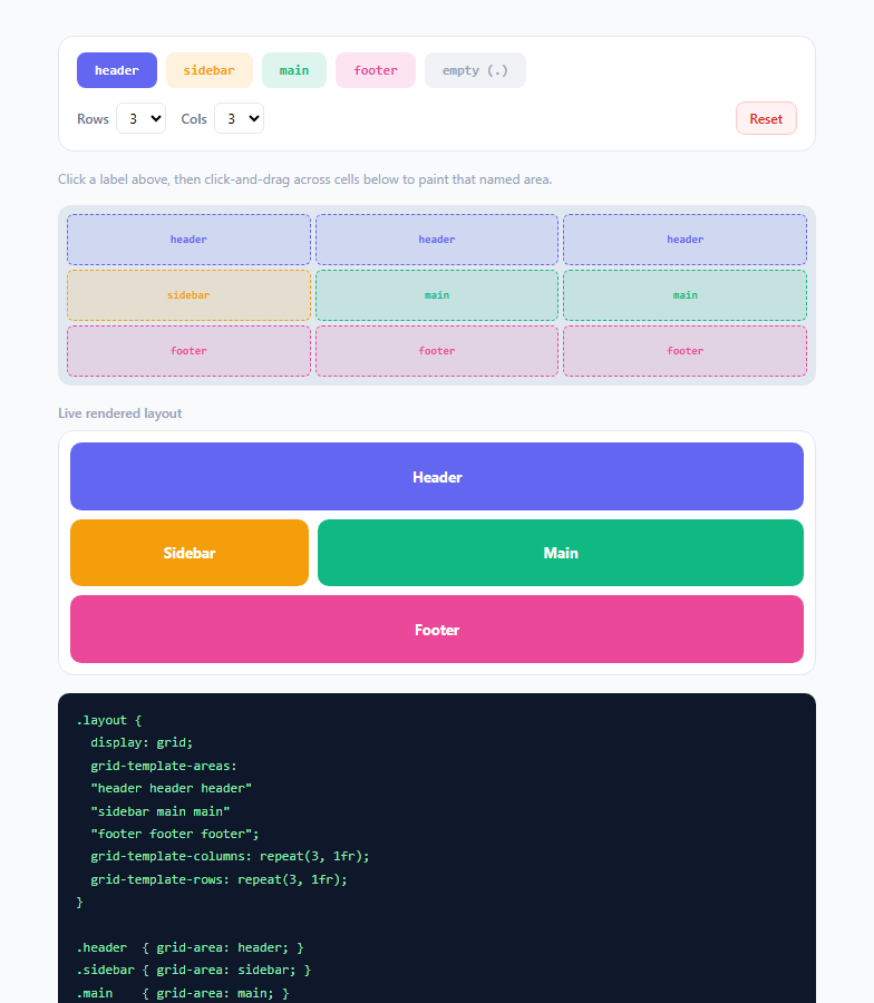
CSS Grid offers several ways to place items into a grid — explicit row/column line numbers, the grid-column/grid-row shorthand, or automatic placement — but the most human-readable of them all is grid-template-areas. It lets you literally draw your page layout as ASCII art inside your CSS, naming regions like header, sidebar, main, and footer, then assign each grid item to one of those names with a single grid-area declaration. This snippet turns that textual syntax into an interactive visual builder: paint cells with named areas, and watch both the rendered layout and the exact generated CSS string update together in real time.
The syntax: a grid of quoted strings
grid-template-areas takes one quoted string per grid row, with each string containing space-separated area names for that row's columns — e.g. "header header" "sidebar main" "footer footer" describes a 3-row, 2-column grid where the header spans both columns, the sidebar and main content sit side by side, and the footer spans the full width again. Every string must have the same number of space-separated tokens (representing equal column counts), and a cell can be marked with a single period . to leave it explicitly empty. This demo's renderCode() function builds exactly this string from a 2D array of area names, joining each row's tokens with spaces and wrapping each row in quotes — precisely mirroring what you'd hand-write in a stylesheet.
Why non-rectangular spans are the interesting part
The real power of named areas is that a single name can occupy a non-rectangular-looking token pattern in the ASCII grid as long as the actual occupied cells form a rectangle — repeating header across two columns in one row makes it span both columns as one grid item. This is fundamentally different from manually computing grid-column: 1 / 3 line numbers; the area name IS the placement instruction, self-documenting the intent directly in the CSS. The browser's grid layout algorithm validates that each named area's cells form a valid rectangle at parse time — an invalid, non-rectangular shape (like an L-shape) is simply ignored as invalid syntax.
Connecting the template to actual elements
Once grid-template-areas is declared on the container, each child element opts into a named region with a single line: .header { grid-area: header; }. This is dramatically more readable in a real stylesheet than remembering which numbered line range corresponds to the header versus the sidebar, especially as a layout gains and loses regions across responsive breakpoints — a well-known pattern is redefining grid-template-areas entirely inside a @media query to restack a sidebar below the main content on narrow viewports, without touching any of the child elements' grid-area declarations at all.
How this demo's painter maps to the syntax
The paint grid in this demo is backed by a plain 2D JavaScript array (grid[y][x]), initialized by defaultGrid() to a sensible header/sidebar/main/footer starting layout. Clicking an area chip sets activeArea, and clicking-and-dragging across cells (using mousedown + mouseenter + a global mouseup listener to track the drag gesture) calls paint(x, y), which writes the active area name into that cell of the array. Every paint triggers a full re-render: the preview grid's gridTemplateAreas style property is set directly from the generated string, and a matching .preview-area element is created for each unique area name found in the grid, with el.style.gridArea = name placing it. This closes the loop — the same data structure drives the interactive painter, the live rendered preview, and the text output, so what you see is guaranteed to match what the generated CSS actually does.
Why this matters for 2025/2026 layout work
Even with subgrid and container queries expanding what Grid can do, named template areas remain the clearest way to express page-level and component-level layout intent to future maintainers, designers reading a CSS file, or an AI coding assistant trying to understand a layout's structure from source alone. Being able to visually prototype an area layout before committing it to a stylesheet — and see immediately whether a given ASCII pattern is even valid — removes a common trial-and-error step from building responsive, semantically named grid layouts.
Build with AI
Build, Understand, Optimize, and Extend It With AI
Paste this snippet into an AI coding assistant like Claude and ask it to explain exactly how the code panel's string gets built from the grid array, and what would happen (in real CSS) if two rows ended up with a different number of tokens — understanding that failure mode is one of the most common gotchas when hand-writing grid-template-areas. You could also ask it to add a responsive mode: painting a separate mobile pattern and generating a matching @media (max-width: 640px) block automatically, or to add validation that highlights cells in red if a named area's occupied cells don't form a valid rectangle. It's also a good candidate for a refactor conversation — ask whether representing the grid as a Map of area name to bounding box, instead of a raw 2D array, would make it easier to detect and prevent invalid non-rectangular shapes while painting.
Prompt to recreate it
Copy this into your AI assistant of choice to build the effect from scratch, or as a jumping-off point for your own variant:
Build an interactive visual builder for CSS grid-template-areas in plain HTML, CSS, and JavaScript — no frameworks or libraries.

Requirements:
- A row/column-configurable grid of clickable cells (adjustable via two selects, at least 2-4 rows and 2-4 columns) backed by a 2D JavaScript array holding a string area name (or "." for empty) per cell.
- A palette of selectable named areas (e.g. header, sidebar, main, footer) plus an explicit "empty" option, each with its own accent color; clicking one sets it as the active paint value.
- Click-and-drag painting across multiple cells in one gesture (mousedown to start, mouseenter per cell while dragging, and a document-level mouseup to stop), not just single-cell clicks.
- A live rendered preview elsewhere on the page that is an actual CSS grid with its grid-template-areas property set directly from the painted pattern (not simulated with absolute positioning), with one colored block per unique named area correctly placed via the grid-area property.
- A read-only text output showing the exact, correctly quoted, row-by-row grid-template-areas CSS string your pattern produces, plus a matching grid-area rule for each named area, formatted as it would appear in a real stylesheet.
- Sensible default seeded pattern on load and on any row/column count change, so the grid never starts in an invalid or confusing empty state.
- Explain, in a comment, what makes a set of painted cells for one area name "invalid" in real CSS (i.e. when it doesn't form a rectangle) even though this demo may not strictly enforce it.
Want to tighten it up first? Run this prompt through the AI Prompt Studio to score it across 8 quality dimensions, catch anti-patterns, and tune the wording for Claude, ChatGPT, or Gemini before you paste it in.
Step by step
How to Use
- 1Pick an area to paintClick one of the colored chips — header, sidebar, main, footer, or empty (.) — to set activeArea. The active chip is highlighted, and every subsequent cell you paint in the grid below will be assigned that name in the underlying grid[y][x] array.
- 2Click and drag across cellsClick a cell to paint it, or press and drag across multiple cells to paint them all in one gesture — the isPainting flag set on mousedown and cleared on a document-level mouseup, combined with mouseenter on each cell, is what makes the drag-paint gesture work smoothly.
- 3Watch the live preview updateThe "Live rendered layout" panel is a real CSS Grid with its grid-template-areas property set directly from your painted pattern via previewGrid.style.gridTemplateAreas, and one colored block per unique area name placed with grid-area — so you see the actual browser layout result, not a simulation.
- 4Read the generated CSS stringThe code panel shows the exact grid-template-areas value your pattern produces, correctly quoted row by row, plus the matching .header/.sidebar/.main/.footer { grid-area: ... } rules — copy this directly into your stylesheet.
- 5Change the row and column countUse the Rows and Cols selects to rebuild the grid at a different size (2 to 4 in each dimension) via buildPainter(), which reseeds a default header/sidebar/main/footer pattern sized to the new dimensions so you always start from something valid.
- 6Export and adapt to your own regionsClick JSX or Vue to export the pattern. In your project, replace the five demo area names with your own (e.g. nav, content, aside), keep the same paint-grid data structure, and swap the preview colors for your design system's palette.
Real-world uses
Common Use Cases
Got questions?
Frequently Asked Questions
The CSS is invalid and the entire grid-template-areas declaration is dropped by the browser, falling back to implicit grid placement — every quoted row string must contain the same number of space-separated area tokens. This demo prevents that class of error entirely, since every row of the underlying JS array always has exactly cols entries by construction, so any pattern you paint is guaranteed to serialize into valid, equal-width rows.
Yes — repeat the same area name across a rectangular block of cells in the pattern, in both the row and column directions, e.g. a 2x2 block of "main" tokens spanning two rows and two columns. The only constraint is that the occupied cells for a given name must form a rectangle; try painting a non-rectangular shape with one area name in this demo and you will see the preview's grid-area placement behave unpredictably, which mirrors how a real browser treats invalid area shapes.
Use a single period (.) as that cell's token instead of a name — this demo exposes it as the "empty (.)" chip. An empty cell participates in the grid's track sizing but has no element explicitly placed into it via grid-area, leaving a genuine gap in the layout, which is different from simply having fewer grid items than cells.
The standard pattern is to redeclare grid-template-areas (and often grid-template-columns) entirely inside a @media query, without touching any child element's grid-area rule. Since each element only references an area name, not a coordinate, redefining where that name sits in the pattern — for example collapsing a sidebar to sit below main content in a single-column mobile pattern — automatically restacks the layout with no other CSS changes needed.
Yes — grid-template-areas defines placement for the direct children of the grid container it is declared on, and is fully compatible with nested grids using display: grid or subgrid inside any named area's element. Combined with container query units as in the Container Query Units demo, a named area like main can itself become a query container so its internal content scales relative to the space that area actually receives after the outer grid's track sizing resolves.