You Might Also Like
Learn Coding Visually
Learn to code with interactive, live-preview playgrounds — HTML, CSS, JavaScript, React & more.
 HTML Playground42 lessons · Click-based · Live preview
 CSS PlaygroundLearn CSS with a live editor
 JavaScript Playground60 lessons · DOM · Async · Canvas
 React PlaygroundLearn React with a live code editor
 GSAP PlaygroundLearn GSAP animation interactively
 SVG Playground44 lessons · shapes · paths · animation
 SCSS Playground45 lessons · Sass modules · tokens
 Tailwind PlaygroundLearn Tailwind CSS with a live editor
 Bootstrap 5 Playground50 lessons · live preview
Container Query Units cqw/cqh/cqi — Free CSS Snippet
Container Query Units (cqw/cqh) Demo · Layouts · Plain HTML, CSS & JS · Live preview
What's included
Features
About this UI Snippet
CSS Container Query Units (cqw, cqh, cqi, cqmin, cqmax) — Component-Relative Sizing Explained
For years, responsive typography and spacing in CSS had exactly one relative axis to work with: the viewport. Units like vw, vh, and vmin let a value scale with the browser window, but they had no concept of the actual space available to the element using them. A card in a 240px sidebar and a card in a 1200px main column would compute the exact same vw-based font-size, because vw has no idea it's sitting inside a narrow container. Container query units fix this at the root: they are relative units that resolve against the size of the nearest ancestor established as a query container, not the browser viewport.
How a query container is established
An element becomes a query container by setting container-type on it — most commonly container-type: inline-size, which tracks only the element's inline dimension (width in a horizontal writing mode). You can optionally name it with container-name so nested queries can target a specific ancestor rather than the nearest one. In this demo, .resizable-container has container-type: inline-size; container-name: demo-card; applied, which is what makes every cq* unit used by its descendants resolve against *that box's* width rather than the window's.
The unit vocabulary: cqw, cqh, cqi, cqb, cqmin, cqmax
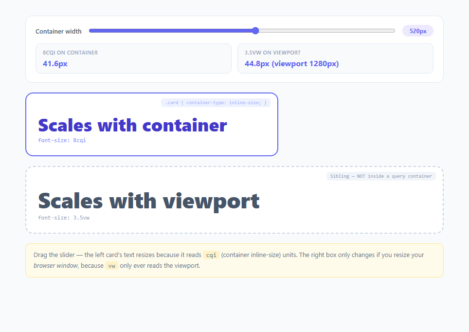
Once an ancestor is a query container, descendants can use cqw (1% of the container's width), cqh (1% of the container's height), cqi (1% of the inline-size — width in normal horizontal writing modes, so functionally identical to cqw in most layouts but writing-mode aware), cqb (1% of the block-size), cqmin (the smaller of cqi/cqb), and cqmax (the larger). This demo uses font-size: 8cqi on .cqi-text — meaning the heading is always exactly 8% of the container's current inline-size. Drag the width slider from 160px to 820px and watch the readout: at 520px the text computes to 41.6px (520 × 0.08); at 300px it drops to 24px. The math is linear and live because the browser recalculates cqi on every layout pass, the same way it recalculates vw.
Why the vw sibling doesn't move
The right-hand box in this demo uses font-size: 3.5vw and sits *outside* any query container. Resizing the left card's width has zero effect on it — vw only reads window.innerWidth, which the JS in this demo also displays via a resize listener for comparison. This side-by-side contrast is the core lesson: viewport units answer "how big is the browser window," while container query units answer "how big is *this specific box*, wherever it happens to be placed."
Why this matters for real component libraries in 2025/2026
Design systems increasingly ship components meant to be dropped into wildly different contexts — a product card might render in a 3-column grid, a narrow sidebar widget, or a full-width hero. Before container query units, achieving a self-scaling card required either JavaScript-driven ResizeObserver logic or brittle breakpoint-based media queries tied to the *page's* width rather than the *component's* width. Container query units, paired with the @container at-rule for conditional layout switches, let a single component author its own internal responsive behavior declaratively, in CSS alone, correctly scoped to wherever it's mounted — including inside CMS-driven pages, dashboard widgets, and email-client-style embedded panels where you don't control the outer page structure.
Browser support and pairing with clamp()
Container query units and container-type shipped in all major evergreen browsers (Chrome, Edge, Safari, Firefox) starting in 2023, and by 2025 they're safe for production use without fallbacks in virtually any modern browser target. A common refinement is wrapping a cq unit inside clamp(), e.g. font-size: clamp(1rem, 8cqi, 3rem), so the text still scales fluidly with the container but never shrinks below a legible floor or balloons past a sane ceiling — the same pattern used in the companion Fluid Typography with clamp() snippet, just swapping the middle argument's unit from vw to cqi.
Build with AI
Build, Understand, Optimize, and Extend It With AI
Paste this snippet into an AI coding assistant like Claude and ask it to trace exactly why the .cqi-text font-size changes when the slider moves but the .vw-text font-size doesn't — having it explain the browser's containment and unit-resolution algorithm step by step will make the cqw/vw distinction stick far better than reading about it. You could also ask it to add a third comparison box using cqmin so you can see how it behaves differently once the container's height and width diverge, or to refactor the numeric readouts to use the CSS Typed OM (element.computedStyleMap()) instead of manual JS math so the displayed value is guaranteed to match what the browser actually rendered. It's also a good target for a browser-support conversation — ask which container query features need fallbacks for any older browsers you still need to support.
Prompt to recreate it
Copy this into your AI assistant of choice to build the effect from scratch, or as a jumping-off point for your own variant:
Build an interactive HTML/CSS/JS demo that teaches the difference between CSS container query units (cqw/cqi) and viewport units (vw) by showing them side by side.

Requirements:
- A range slider that directly controls the pixel width of a container element via JavaScript (element.style.width), with the current width shown in a badge next to the slider.
- The container element must have container-type: inline-size (and a container-name) set in CSS, and must contain a text element styled with font-size using a cqi unit (e.g. 8cqi) so it visibly scales in real time as the slider moves.
- A second, visually distinct sibling box outside any query container, styled with a vw-based font-size (e.g. 3.5vw), that does NOT change when the slider moves — only when the actual browser window is resized.
- Two live numeric readouts: one computing and displaying the expected pixel value of the cqi text (container width times the percentage) and one displaying the current vw-based pixel value plus the current window.innerWidth, updated via a window resize listener.
- Clear visual/textual labeling on each box (e.g. a small tag reading "container-type: inline-size" vs "NOT inside a query container") so a viewer can tell at a glance which box is which without reading the CSS.
- An explanatory caption below both boxes stating in plain language why one box reacts to the slider and the other does not.
- No external libraries — vanilla CSS container queries and plain DOM APIs only.
Want to tighten it up first? Run this prompt through the AI Prompt Studio to score it across 8 quality dimensions, catch anti-patterns, and tune the wording for Claude, ChatGPT, or Gemini before you paste it in.
Step by step
How to Use
- 1Drag the width sliderThe slider directly sets the inline width of #resizable-container in JavaScript. Watch the "8cqi on container" readout update in lockstep — it is computed as container width times 0.08, matching exactly what the browser does internally when resolving font-size: 8cqi.
- 2Compare against the vw siblingThe dashed box below uses font-size: 3.5vw and lives outside any query container. Moving the slider never changes it, because vw only tracks window.innerWidth, shown live in the "3.5vw on viewport" readout via a window resize listener.
- 3Resize your actual browser windowTo see the vw box respond, resize the browser window itself (not the slider). This proves the two units read from genuinely different sources: cqi from the nearest container-type: inline-size ancestor, vw from the viewport.
- 4Inspect the container-type declarationOpen the CSS panel and find .resizable-container { container-type: inline-size; container-name: demo-card; }. This single declaration is what "activates" cqw/cqh/cqi units for every descendant — without it, cq* units fall back to behaving like small px values (0), so always confirm an ancestor establishes containment.
- 5Try swapping cqi for cqw or cqminIn .cqi-text, change font-size: 8cqi to 8cqw and observe it behaves identically here (because this container only varies in width). Then try cqmin(8cqi, 8cqb) conceptually — cqmin resolves to whichever of inline-size or block-size percentage is smaller, useful for square-ish avatar or icon containers.
- 6Export and adapt to your componentsClick JSX or Vue to export. In a real design system, apply container-type: inline-size to your card/widget wrapper component and use cqi-based font-size or padding on its internal typography so the component self-scales correctly whether it renders in a grid, sidebar, or modal — no JS ResizeObserver required.
Real-world uses
Common Use Cases
Got questions?
Frequently Asked Questions
cqw is always 1% of the container's width. cqi is 1% of the container's inline-size, which is writing-mode aware — in standard horizontal-tb documents (the vast majority of English/European-language sites) cqi and cqw resolve identically. In vertical writing modes (some Japanese/Chinese layouts), inline-size maps to the container's height instead, so cqi would track that dimension while cqw always tracks literal width. Use cqi for logical, internationalization-safe sizing and cqw only when you specifically mean physical width.
Container query units only resolve against an ancestor that has container-type set to inline-size, size, or normal with containment. If no ancestor establishes containment, cqi units are treated as invalid at compute time and typically fall back to 0 or the initial value for that property. Always confirm a parent element (not necessarily the direct parent — any ancestor) declares container-type: inline-size, as .resizable-container does in this demo.
Yes — cqw/cqh/cqi/cqb/cqmin/cqmax are standalone length units usable anywhere a length is valid (font-size, padding, gap, width), independent of whether you also write @container conditional rules. This demo uses only the unit, with no @container block at all, proving the units are useful purely for continuous fluid scaling even without breakpoint-style conditional CSS.
All major evergreen browsers — Chrome and Edge (105+), Safari (16+), and Firefox (110+) — have shipped full support for container-type and the full cq* unit set since 2023. As of 2025/2026 there is no meaningful browser gap for production use; the only caveat is that container-type: size (which also allows querying block-size) forces layout containment, which can affect intrinsic sizing of the container itself, so inline-size is the safer default for most components.
Yes — apply container-type: inline-size to the grid container or to individual grid item wrappers, then any cq* unit used inside that item resolves against its own box, not the whole grid or the viewport. This composes well with the Grid Template Areas Visualizer pattern, letting each named area size its internal content relative to the actual space that area receives after the grid track sizing algorithm runs.