You Might Also Like
Learn Coding Visually
Learn to code with interactive, live-preview playgrounds — HTML, CSS, JavaScript, React & more.
 HTML Playground42 lessons · Click-based · Live preview
 CSS PlaygroundLearn CSS with a live editor
 JavaScript Playground60 lessons · DOM · Async · Canvas
 React PlaygroundLearn React with a live code editor
 GSAP PlaygroundLearn GSAP animation interactively
 SVG Playground44 lessons · shapes · paths · animation
 SCSS Playground45 lessons · Sass modules · tokens
 Tailwind PlaygroundLearn Tailwind CSS with a live editor
 Bootstrap 5 Playground50 lessons · live preview
Native CSS Nesting Playground — & Selector Snippet
Native CSS Nesting Playground · Layouts · Plain HTML, CSS & JS · Live preview
What's included
Features
About this UI Snippet
Native CSS Nesting Playground — Writing Nested Selectors Without a Preprocessor
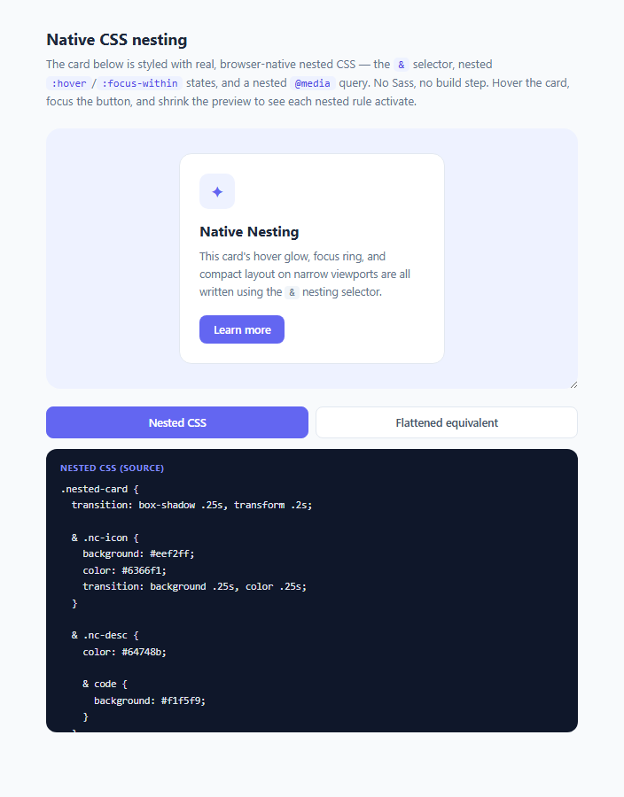
For over a decade, nesting selectors inside one another — writing .card { & .title { ... } } instead of repeating .card .title { ... } as a flat rule — was something you could only get through a CSS preprocessor like Sass or Less, which meant a build step, a compiler, and source maps just to keep related styles visually grouped in your source file. Native CSS Nesting, standardized by the CSS Nesting Module and shipped in Chrome/Edge 112+, Safari 16.5+, and Firefox 117+ (giving it full baseline browser support since mid-2023), brings this directly into the CSS language itself — no tooling required, no .scss file extension, just a .css file the browser parses natively.
How native CSS nesting works technically
Inside a rule block, you can nest another selector, and it will be interpreted relative to the parent selector. The explicit & symbol represents "the parent selector" and can be positioned anywhere in the nested selector — most commonly at the start (& .child) to mean descendant, or directly attached to a pseudo-class (&:hover) to mean "this same element, when hovered." When you nest a plain type or class selector without a leading & (like & .nc-icon or even just .nc-icon in some contexts), the browser implicitly treats it as a descendant combinator, equivalent to writing .nested-card .nc-icon as a flat rule. Crucially, nesting is not just a source-code convenience — it compiles down (conceptually, inside the browser's own CSS object model) to exactly the same flat, fully-qualified selectors that hand-written CSS would produce; there's no new specificity or matching model, just a more ergonomic way to author the same rules. You can nest indefinitely, including nesting pseudo-classes inside pseudo-classes, and — as of the same specification — nest at-rules like @media directly inside a selector block, which previously required breaking a component's styles across multiple, disconnected top-level @media blocks in a Sass or vanilla CSS file.
Why this matters for modern UI development in 2025/2026
The biggest practical win is co-location: everything relevant to .nested-card — its hover state, its child element styles, its own responsive behavior — lives inside one contiguous rule block instead of being scattered across the file as separate flat selectors that a reader has to mentally reassemble. This mirrors how component-scoped styling already works in JSX/CSS-in-JS and Vue single-file components, but now works in plain .css files with zero runtime or build overhead. It also removes a major reason many teams reached for Sass or PostCSS plugins in the first place — as native nesting support has matured, projects can increasingly drop the preprocessor step entirely for projects that only used it for nesting and variables (the latter now covered by native CSS custom properties), simplifying the build pipeline.
What this demo shows
The nested-card component's CSS uses four nesting patterns you'll use constantly: & .nc-icon for descendant selection, &:hover and &:focus-within for interactive pseudo-classes on the card itself, a doubly-nested & .nc-desc { & code { ... } } for a grandchild selector, and a nested @media (max-width: 300px) { & .nc-title { ... } } block for container-relative responsive tweaks — all inside one .nested-card { } block. The toggle below the preview lets you flip between that authored nested source and a hand-written flattened equivalent, so you can see exactly which flat selector each nested rule expands to conceptually — &:hover .nc-icon becomes .nested-card:hover .nc-icon, and the nested @media block becomes a standalone top-level @media block wrapping fully-qualified selectors.
Browser support and syntax caveats
Full native nesting support (including the more permissive syntax that doesn't always require a leading &) landed across evergreen browsers in 2023, so it's safe for most 2025/2026 production audiences. One easy mistake: nesting a bare type selector (like p { }) directly without & can be ambiguous with a declaration in older parsing rules, so many style guides still prefer always prefixing nested selectors with & for clarity, exactly as this demo does throughout.
Build with AI
Build, Understand, Optimize, and Extend It With AI
Paste this snippet's CSS into an AI coding assistant like Claude and ask it to walk through exactly how each nested rule — & .nc-icon, the doubly-nested & .nc-desc { & code { ... } }, &:hover, &:focus-within, and the nested @media block — resolves to the flattened equivalent shown in the second code panel, line by line. You could also ask it to convert an existing flat stylesheet from your own project into nested form, or to explain when native nesting can and can't fully replace a Sass file (for example, Sass mixins and control-flow directives have no native CSS equivalent). It's also a good prompt for browser-support strategy: ask it to write an @supports selector(&) feature-detection block with a sensible flat-CSS fallback path.
Prompt to recreate it
Copy this into your AI assistant of choice to build the effect from scratch, or as a jumping-off point for your own variant:
Build an interactive HTML/CSS/JS demo teaching native CSS nesting (the & selector) using an interactive card component, with a side-by-side view of the nested source versus its flattened equivalent.

Requirements:
- A single card component styled using genuine native CSS nesting syntax (not Sass, not a preprocessor) inside one top-level .card { } rule block, including: at least one nested child-element selector using &, a nested pseudo-class state like &:hover or &:focus-within, a doubly-nested selector reaching a grandchild element, and a nested @media query block for a responsive tweak — all physically inside the same outer rule.
- The card must be genuinely interactive in the live preview: hovering and focusing it (e.g. via Tab key or click) must visibly trigger the nested &:hover / &:focus-within styles, and the nested @media block's effect must be triggerable by resizing a container (a CSS resize: horizontal wrapper around the preview is an acceptable way to let the user trigger this manually).
- Two toggleable read-only code panels (or one panel with a toggle) showing: (1) the actual nested CSS source as text, and (2) a hand-written flattened equivalent using fully-qualified flat selectors that a developer would have had to write before nesting existed — both must be accurate representations of real, valid CSS.
- Keep the flattened panel's content in sync conceptually with the nested panel — every nested rule in panel 1 must have a corresponding flat rule in panel 2, so a learner can map each nested line to its flattened counterpart.
- Use a neutral palette with one accent color and smooth CSS transitions on the card's interactive states.
- No external libraries, no build step — the nesting must be authored as literal native CSS text that a modern browser parses directly.
Want to tighten it up first? Run this prompt through the AI Prompt Studio to score it across 8 quality dimensions, catch anti-patterns, and tune the wording for Claude, ChatGPT, or Gemini before you paste it in.
Step by step
How to Use
- 1Read the nested sourceThe "Nested CSS" code panel shows the actual authored CSS for .nested-card, including & .nc-icon, & .nc-desc { & code { ... } }, &:hover, &:focus-within, and a nested @media (max-width: 300px) block — all written inside one top-level rule.
- 2Interact with the live cardHover the card in the preview to trigger the &:hover rule (box-shadow lift and icon color invert), and click/Tab into it to trigger &:focus-within (the indigo focus ring), both defined natively inside .nested-card without a single separate top-level selector.
- 3Compare against the flattened equivalentClick "Flattened equivalent" to see a hand-written, non-nested version of the exact same rules — .nested-card:hover .nc-icon, .nested-card .nc-desc code, and so on — demonstrating that nesting is purely an authoring convenience with identical resolved behavior.
- 4Shrink the preview shellDrag the resize handle on the bottom-right corner of the light preview box (it uses CSS resize: horizontal) below 300px wide to trigger the nested @media (max-width: 300px) block, which reduces padding and stacks the button full-width.
- 5Compare doubly-nested selectorsNotice & .nc-desc contains a further-nested & code rule inside it — this compiles conceptually to .nested-card .nc-desc code, a two-level-deep flat selector, showing nesting can go arbitrarily deep just like Sass.
- 6Apply the pattern to your own componentsIn your own CSS files, wrap a component's child-element rules, pseudo-class states, and responsive breakpoints inside its own top-level selector block using &, keeping every rule relevant to that component visually co-located, then verify support with @supports selector(&) if you need a fallback strategy for older browsers.
Real-world uses
Common Use Cases
Got questions?
Frequently Asked Questions
No — native CSS nesting is parsed directly by the browser in Chrome/Edge 112+, Safari 16.5+, and Firefox 117+, all released by mid-2023. You can write & inside a plain .css file with no compiler, no source maps, and no build configuration, though older browsers outside that support window will ignore the nested rules entirely.
The & represents the parent selector at that point in the nest. &:hover means "this same element, in its hover state," while & .child means "a descendant matching .child inside this element" (equivalent to a plain descendant combinator when written as & .child or, in many cases, simply .child without &). You can also use & to build compound selectors like &.is-active for "this element when it also has the is-active class."
Functionally very similar for common cases, but native CSS nesting follows the official CSS Nesting Module specification rather than the Sass language, and its resolved specificity/selector matching is identical to writing the equivalent flat CSS by hand — there is no additional specificity boost from nesting itself. Some advanced Sass features (like mixins, functions, and Maps) have no native CSS nesting equivalent and still require a preprocessor or native CSS functions/custom properties as a substitute.
Yes — the CSS Nesting specification allows at-rules like @media, @supports, and @container to be nested directly inside a style rule, as shown in this demo's @media (max-width: 300px) { & .nc-title { ... } } block. This keeps a component's responsive overrides physically co-located with its base styles instead of requiring a separate top-level @media block elsewhere in the file.
Early native-nesting syntax discussions raised ambiguity concerns about bare nested type selectors (like nesting p { } directly, which could look like a custom property or declaration to some parsers) — many browsers and style guides settled on requiring or strongly preferring an explicit leading & for nested compound and descendant selectors. Prefixing consistently with & (as this demo does throughout) avoids any such ambiguity and matches the most common real-world nesting style guide recommendation.