You Might Also Like
Learn Coding Visually
Learn to code with interactive, live-preview playgrounds — HTML, CSS, JavaScript, React & more.
 HTML Playground42 lessons · Click-based · Live preview
 CSS PlaygroundLearn CSS with a live editor
 JavaScript Playground60 lessons · DOM · Async · Canvas
 React PlaygroundLearn React with a live code editor
 GSAP PlaygroundLearn GSAP animation interactively
 SVG Playground44 lessons · shapes · paths · animation
 SCSS Playground45 lessons · Sass modules · tokens
 Tailwind PlaygroundLearn Tailwind CSS with a live editor
 Bootstrap 5 Playground50 lessons · live preview
CSS Subgrid Demo — grid-template-rows: subgrid Snippet
CSS Subgrid Demo · Layouts · Plain HTML, CSS & JS · Live preview
What's included
Features
About this UI Snippet
CSS Subgrid Demo — Aligning Nested Grid Items to Their Parent's Tracks
CSS Grid solved most two-dimensional layout problems, but it had one long-standing gap: a grid item that was itself a grid container could not align its own rows or columns to its parent's tracks. If you built a row of product cards where each card internally used a 3-row grid (image, title, price), every card's internal rows sized independently, based only on that card's own content — so a card with a two-line title would get a taller title row than its neighbors, and the price row beneath it would no longer line up horizontally across the row. This is exactly the "ragged card grid" problem countless product listings, pricing tables, and dashboard tiles run into. The subgrid value for grid-template-columns and grid-template-rows, part of CSS Grid Level 2 and supported in Chrome/Edge 117+, Firefox 71+, and Safari 16+ (meaning full baseline support across evergreen browsers by 2023), closes this gap directly at the platform level.
How subgrid works technically
Normally, when you write display: grid on an element that is itself a grid item, its grid-template-columns and grid-template-rows define a brand-new, independent set of tracks scoped only to that element's own children — there is no relationship to the parent grid's tracks at all. Writing grid-template-rows: subgrid (or grid-template-columns: subgrid) instead tells the browser: "don't create new tracks — adopt the row (or column) tracks of the ancestor grid item that this element spans." The element must actually span multiple track lines of the parent for this to be meaningful, which is why this demo's .product-card uses grid-row: span 3 — it explicitly claims 3 of the parent grid's row tracks so that subgrid has real parent tracks to inherit. Once subgridded, each of the card's own grid items (the image, title, and price row) is positioned into the corresponding *parent* track, and — critically — the *sizing* of those tracks (how tall each row is) is now computed across all sibling cards simultaneously, not per-card. That's what makes titles, images, and price rows align perfectly across every card in the row, even when their content lengths differ.
Why this matters for modern UI development in 2025/2026
Card grids, comparison tables, and any repeated-component layout ("all these things must visually align even though their content differs in length") used to require either JavaScript row-height measurement/syncing (expensive, layout-thrashing, and fragile on resize), or a hacky flattened single-level grid where you gave up the semantic nesting of "card contains image, title, price" and instead put every image/title/price as siblings directly in the parent grid (breaking HTML semantics and complicating styling per-card). Subgrid lets you keep the natural nested markup — a .product-card component that is a self-contained, reusable unit — while still getting perfect cross-card alignment, purely through CSS. This is a meaningful capability for any team building a component library where a "Card" component needs to visually align with its siblings when repeated in a grid, without the Card component needing to know anything about its siblings.
What this demo shows
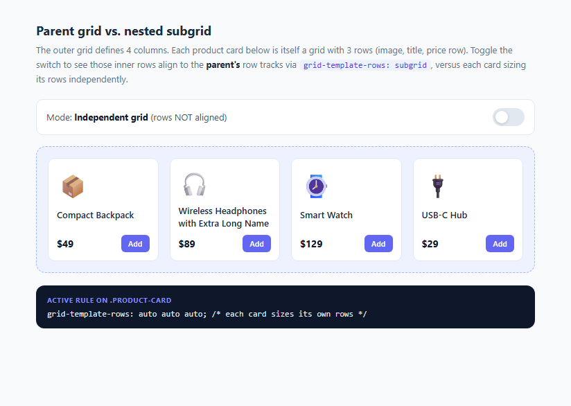
Toggle the switch to compare both states side by side using the same markup. In "Independent grid" mode, each card's grid-template-rows: auto auto auto sizes its own three rows purely from its own content, so the headphones card (with a longer title) has a taller title row than its neighbors, pushing its price row down and breaking alignment. Switch to subgrid mode, and the same cards adopt grid-template-rows: subgrid, which makes all four cards' rows size together — the parent grid computes one shared height per row track across every card that spans it, so every price row lands on the same horizontal line regardless of title length.
Browser support and fallback strategy
Subgrid support is solid across evergreen browsers today, but for any project needing to support older browser versions, feature-detect with @supports (grid-template-rows: subgrid) and provide an independent-grid fallback — visually imperfect alignment, but a functional layout.
Build with AI
Build, Understand, Optimize, and Extend It With AI
Paste this snippet's HTML and CSS into an AI coding assistant like Claude and ask it to explain exactly why grid-row: span 3 is required before grid-template-rows: subgrid has any effect, and to walk through how the browser computes shared row-track heights across sibling cards once subgrid is applied. You could also ask it to extend the demo to subgrid the column axis as well, or to add an @supports feature-detection fallback with a visibly different independent-grid layout for browsers that don't support subgrid. It's a good target for asking about practical migration: how would you retrofit an existing non-subgrid card grid component in a real codebase to use this technique without breaking existing markup?
Prompt to recreate it
Copy this into your AI assistant of choice to build the effect from scratch, or as a jumping-off point for your own variant:
Build an interactive HTML/CSS/JS demo comparing CSS subgrid to independent nested grids using a row of product cards.

Requirements:
- An outer parent element using display: grid with a fixed number of columns (e.g. 4, responsive down to 2 on smaller screens) containing several card items with deliberately varying content lengths (at least one card must have a noticeably longer title than the others, to expose misalignment).
- Each card is itself display: grid with 3 internal rows (an image/icon row, a title row, and a price-plus-button row) and uses grid-row: span 3 so it occupies 3 of the parent's row tracks.
- A toggle switch that adds/removes a modifier class on the parent grid, switching every card's own grid-template-rows between subgrid (aligned to parent tracks, computed jointly across all cards) and a normal independent auto auto auto (each card sized purely by its own content) — using real CSS subgrid syntax, not a simulated visual effect.
- In independent mode, the layout must visibly show rows failing to align across cards (e.g. price rows land at different vertical positions) so the problem subgrid solves is obvious; in subgrid mode, all rows must align perfectly across every card in the same grid row.
- A small text panel or label that updates to show the literal grid-template-rows value currently applied, so the mechanism is never hidden behind only a visual change.
- Keep the markup for individual cards identical in both modes — only a class on the parent grid should change, proving the alignment behavior is purely a CSS toggle, not different markup.
- Use a neutral palette with a single accent color and smooth transitions where changing state, and make the layout responsive at a reasonable breakpoint.
Want to tighten it up first? Run this prompt through the AI Prompt Studio to score it across 8 quality dimensions, catch anti-patterns, and tune the wording for Claude, ChatGPT, or Gemini before you paste it in.
Step by step
How to Use
- 1Compare the two modesThe demo loads in "Independent grid" mode by default. Notice the "Wireless Headphones with Extra Long Name" card has a taller title area than its siblings, which pushes its price row out of alignment with the other three cards.
- 2Flip the toggle to subgridClick the switch to enable subgrid mode. The .product-card rule grid-template-rows: subgrid is applied via the .subgrid-mode class on the parent, and every card's image, title, and price rows snap into alignment across the whole row — watch the price row line up perfectly.
- 3Inspect the span requirementEach .product-card has grid-row: span 3 in the CSS, which is required for subgrid to work — a subgridded element must span the parent tracks it wants to inherit. Try removing the span value in DevTools to see subgrid have nothing to align to.
- 4Read the live CSS panelThe dark panel at the bottom shows the exact grid-template-rows value currently active on .product-card, switching between subgrid and auto auto auto as you toggle, so you can see the literal CSS driving the alignment change.
- 5Resize the browser windowShrink the window to see the parent grid drop from 4 columns to 2 at the 640px breakpoint (grid-template-columns: repeat(2, 1fr)). Subgrid alignment recalculates per-row automatically as cards wrap into new rows.
- 6Apply subgrid to your own card gridsIn your own layout, give the parent display: grid with defined row tracks, make each card grid-row: span N, and set the card's own grid-template-rows: subgrid. Wrap the property in @supports (grid-template-rows: subgrid) { ... } to provide a graceful auto-row fallback for unsupported browsers.
Real-world uses
Common Use Cases
Got questions?
Frequently Asked Questions
A plain nested grid (display: grid on a grid item) creates entirely new, independent row and column tracks scoped to that element's own children — its sizing has no relationship to the parent grid. A subgrid (grid-template-rows: subgrid or grid-template-columns: subgrid) instead reuses the ancestor grid's existing tracks for the axis you specify, so sizing is computed jointly across all elements that share those tracks, which is what produces cross-sibling alignment.
Subgrid inherits tracks from whatever span of parent tracks the element itself occupies as a grid item. If a card only spans 1 row track by default, there is nothing for grid-template-rows: subgrid to meaningfully divide — you need to explicitly span the number of parent row tracks (3, in this demo: image, title, price) that you want the card's own children to align against.
Yes for practical purposes — subgrid has been supported in Firefox since version 71 (2019), Safari since 16 (2022), and Chrome/Edge since 117 (2023), giving it full coverage across evergreen browsers well before 2025. Projects needing to support older Chromium versions (116 and below) should wrap subgrid usage in an @supports (grid-template-rows: subgrid) feature query with an independent-grid fallback.
Yes — grid-template-columns: subgrid works identically for the column axis, and you can apply subgrid to both axes at once on the same element if it spans both parent row and column tracks. A common pattern is column-only subgrid for aligning form labels and inputs across repeated field groups, with normal independent row sizing.
By default, a subgridded axis inherits the parent's gap value for that axis unless you explicitly set a different gap on the subgrid itself, and named grid lines from the parent are also inherited and can be referenced by the subgridded element's own children. Alignment properties like justify-items and align-items are NOT automatically inherited and can still be set independently on the subgrid container.