Learn Coding Visually
Learn to code with interactive, live-preview playgrounds — HTML, CSS, JavaScript, React & more.
 HTML Playground42 lessons · Click-based · Live preview
 CSS PlaygroundLearn CSS with a live editor
 JavaScript Playground60 lessons · DOM · Async · Canvas
 React PlaygroundLearn React with a live code editor
 GSAP PlaygroundLearn GSAP animation interactively
 SVG Playground44 lessons · shapes · paths · animation
 SCSS Playground45 lessons · Sass modules · tokens
 Tailwind PlaygroundLearn Tailwind CSS with a live editor
 Bootstrap 5 Playground50 lessons · live preview
Flexbox Alignment Visualizer — Free HTML CSS JS Snippet
Flexbox Alignment Visualizer · Visualizers · Plain HTML, CSS & JS · Live preview
What's included
Features
About this UI Snippet
Flexbox Alignment Visualizer — Animated justify-content, align-items, flex-direction & flex-wrap Demo in Vanilla JS
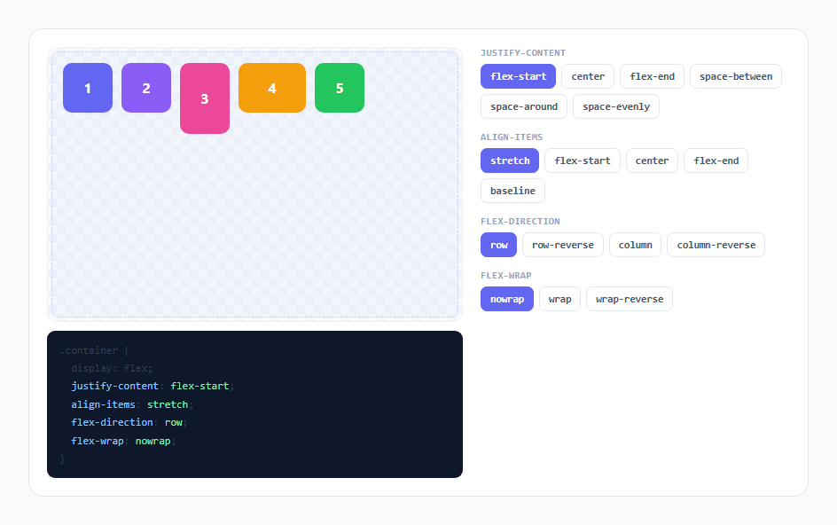
Flexbox's alignment properties are simple individually and confusing together, mostly because justify-content and align-items behave differently depending on flex-direction — the property that controls "horizontal spacing" swaps to controlling "vertical spacing" the moment you flip from row to column, and most static documentation diagrams only ever show one direction. This snippet lets you change all four properties live on a real flex container with five visibly distinct, differently-sized boxes, animating every reflow so you can watch the relationship between the values and the result rather than re-reading a table of definitions.
Real flex properties, not a simulated layout
The stage element (#stage) is an actual display: flex container. Every control in the panel is a button that, on click, writes directly to stage.style.justifyContent, stage.style.alignItems, stage.style.flexDirection, or stage.style.flexWrap — there is no separate rendering layer computing box positions manually. This matters pedagogically: what you see is exactly what the browser's flex layout algorithm produces for those exact property values, so the intuition transfers directly to a real stylesheet with zero translation.
Data-driven control rows, one function for all four properties
Rather than writing four separate button-generation blocks, buildRow(containerId, prop, options) is called once per property with an array of valid CSS values (JUSTIFY, ALIGN, DIRECTION, WRAP) and builds a row of toggle buttons from it. Every button's click handler calls the same setProp(prop, value, row), which updates the shared state object, toggles the .active class on the clicked button within its row, and calls render(). This means the four control groups share one code path end to end — adding a fifth property like align-content (relevant once wrapping is enabled) is one more array and one more buildRow call, not four new functions.
Why the boxes are deliberately different sizes
Boxes 3, 4, and 5 are given explicit non-default heights and widths (.b3 is taller, .b4 is wider, .b5 is shorter) instead of all five boxes being identical squares. This is intentional: align-items: stretch (the flexbox default) only becomes visually obvious when the boxes don't already share a height, and align-items: baseline only makes sense to look at when items are different sizes. A row of uniform squares would make several of the six justify-content values and several of the five align-items values look almost identical to each other, which defeats the entire point of the visualizer.
Genuine animation via CSS transitions on the boxes themselves
Each .box declares transition: transform 0.32s cubic-bezier(0.4,0,0.2,1), margin 0.32s cubic-bezier(0.4,0,0.2,1). Because the flex layout algorithm recalculates each box's final position as an internal transform/offset when justify-content, align-items, flex-direction, or flex-wrap changes, and modern browsers animate flex-driven position changes on the child elements smoothly as long as a transition is declared on the children (not the container, whose display and layout-mode properties are not smoothly animatable), the reflow between any two states plays as a fluid slide rather than an instant snap. This was verified directly rather than assumed: toggling flex-direction from row to column produces a full diagonal glide of every box to its new slot, not a jump-cut, because the child boxes — not the flex container — are what's carrying the transition.
The code readout is illustrative, not a generator
Beside the stage, a dark-background <pre>-style panel prints the current values of all four properties as real CSS syntax, color-coded (blue property names, green values) the way a syntax-highlighted editor would render them. This exists purely so the mapping between "the button I clicked" and "the CSS property name and value it corresponds to" is always visible without opening DevTools — it re-renders on every setProp call by rebuilding a template string, the same state object driving both the live layout and the readout text so the two can never fall out of sync.
Build with AI
Build, Understand, Optimize, and Extend It With AI
Hand this snippet's CSS and JavaScript to an AI assistant like Claude and ask it to explain precisely why the transition is declared on the child .box elements rather than on the #stage flex container — the distinction between what's smoothly animatable there is subtle and worth understanding before reusing the pattern. It's also worth asking for a plain-language walkthrough of how flex-direction changes which axis justify-content and align-items each control. Good extensions to request: an align-content control that only appears once flex-wrap is set to wrap, a gap slider, or a "reset to browser defaults" button.
Prompt to recreate it
Copy this into your AI assistant of choice to build the effect from scratch, or as a jumping-off point for your own variant:
Build an interactive flexbox alignment visualizer in plain HTML, CSS, and JavaScript, no frameworks or libraries.

Requirements:
- A real display: flex container holding five colored boxes of deliberately different widths and heights (not uniform squares), so alignment differences like stretch versus center are visually obvious.
- Button-based controls for justify-content (all six standard values), align-items (all five standard values), flex-direction (all four values), and flex-wrap (all three values), generated from plain arrays through one shared function rather than four separately hand-written blocks of buttons.
- Clicking any button updates that CSS property directly on the real flex container's inline style (not a simulated/manually-positioned layout) and toggles an active/highlighted state on the clicked button within its own row.
- CSS transitions declared on the child boxes (transform and margin, roughly 300ms with an ease-in-out curve) so every property change causes a smooth animated reflow rather than an instant snap — verify this actually animates, since transitions on the flex container itself will not smoothly animate the layout algorithm's own recalculation.
- A live, syntax-highlighted-looking read-only code panel below or beside the stage that prints the current justify-content, align-items, flex-direction, and flex-wrap values as real CSS syntax, re-rendering from the same state object driving the layout so it can never fall out of sync.
- Keep the code panel purely illustrative — it is a teaching aid showing the property-to-visual mapping, not a "generate and copy CSS for your project" utility.
Want to tighten it up first? Run this prompt through the AI Prompt Studio to score it across 8 quality dimensions, catch anti-patterns, and tune the wording for Claude, ChatGPT, or Gemini before you paste it in.
Source Code
<div class="wrap">
  <div class="stage-panel">
    <div class="stage-outer">
      <div class="stage" id="stage">
        <div class="box b1">1</div>
        <div class="box b2">2</div>
        <div class="box b3">3</div>
        <div class="box b4">4</div>
        <div class="box b5">5</div>
      </div>
    </div>
    <div class="code-readout" id="code-readout"></div>
  </div>

  <div class="controls">
    <div class="control-group">
      <div class="group-title">justify-content</div>
      <div class="btn-row" id="justify-row" data-prop="justifyContent"></div>
    </div>
    <div class="control-group">
      <div class="group-title">align-items</div>
      <div class="btn-row" id="align-row" data-prop="alignItems"></div>
    </div>
    <div class="control-group">
      <div class="group-title">flex-direction</div>
      <div class="btn-row" id="direction-row" data-prop="flexDirection"></div>
    </div>
    <div class="control-group">
      <div class="group-title">flex-wrap</div>
      <div class="btn-row" id="wrap-row" data-prop="flexWrap"></div>
    </div>
  </div>
</div>
* { box-sizing: border-box; margin: 0; padding: 0; }
body { font-family: system-ui, -apple-system, sans-serif; background: #f8fafc; min-height: 100vh; display: flex; align-items: center; justify-content: center; padding: 24px; }
.wrap { width: 100%; max-width: 880px; display: flex; gap: 20px; background: #fff; border: 1px solid #e2e8f0; border-radius: 16px; padding: 20px; flex-wrap: wrap; }
.stage-panel { flex: 1 1 380px; display: flex; flex-direction: column; gap: 10px; }
.stage-outer { background: repeating-conic-gradient(#f1f5f9 0% 25%, #f8fafc 0% 50%) 0 0 / 20px 20px; border: 1px solid #eef2f7; border-radius: 10px; padding: 4px; }
.stage { position: relative; height: 300px; display: flex; gap: 10px; padding: 12px; background: rgba(99,102,241,0.03); border: 1.5px dashed #c7d2fe; border-radius: 8px; overflow: auto; transition: none; }
.box { width: 56px; height: 56px; min-width: 56px; min-height: 56px; border-radius: 10px; display: flex; align-items: center; justify-content: center; color: #fff; font-weight: 700; font-size: 16px; transition: transform 0.32s cubic-bezier(0.4,0,0.2,1), margin 0.32s cubic-bezier(0.4,0,0.2,1); }
.b1 { background: #6366f1; }
.b2 { background: #8b5cf6; }
.b3 { background: #ec4899; height: 80px; }
.b4 { background: #f59e0b; width: 76px; }
.b5 { background: #22c55e; height: 40px; }
.code-readout { font-family: ui-monospace, 'SFMono-Regular', monospace; font-size: 12px; color: #334155; background: #0f172a; padding: 12px 14px; border-radius: 9px; line-height: 1.7; white-space: pre-wrap; }
.code-readout .prop { color: #93c5fd; }
.code-readout .value { color: #86efac; }
.controls { flex: 1 1 260px; display: flex; flex-direction: column; gap: 14px; }
.control-group { display: flex; flex-direction: column; gap: 6px; }
.group-title { font-size: 10.5px; font-weight: 700; color: #94a3b8; text-transform: uppercase; letter-spacing: 0.06em; font-family: ui-monospace, monospace; }
.btn-row { display: flex; flex-wrap: wrap; gap: 6px; }
.opt-btn { padding: 6px 10px; font-size: 11.5px; font-weight: 600; border: 1.5px solid #e2e8f0; border-radius: 7px; background: #fff; color: #475569; cursor: pointer; transition: background 0.15s, color 0.15s, border-color 0.15s; font-family: ui-monospace, monospace; }
.opt-btn:hover { border-color: #a5b4fc; }
.opt-btn.active { background: #6366f1; border-color: #6366f1; color: #fff; }const JUSTIFY = ['flex-start', 'center', 'flex-end', 'space-between', 'space-around', 'space-evenly'];
const ALIGN = ['stretch', 'flex-start', 'center', 'flex-end', 'baseline'];
const DIRECTION = ['row', 'row-reverse', 'column', 'column-reverse'];
const WRAP = ['nowrap', 'wrap', 'wrap-reverse'];
const state = {
justifyContent: 'flex-start',
alignItems: 'stretch',
flexDirection: 'row',
flexWrap: 'nowrap',
};
const PROP_CSS_NAME = {
justifyContent: 'justify-content',
alignItems: 'align-items',
flexDirection: 'flex-direction',
flexWrap: 'flex-wrap',
};
function buildRow(containerId, prop, options) {
const row = document.getElementById(containerId);
row.innerHTML = '';
options.forEach(opt => {
const btn = document.createElement('button');
btn.type = 'button';
btn.className = 'opt-btn' + (state[prop] === opt ? ' active' : '');
btn.textContent = opt;
btn.addEventListener('click', () => setProp(prop, opt, row));
row.appendChild(btn);
});
}
function setProp(prop, value, row) {
state[prop] = value;
Array.from(row.children).forEach(btn => btn.classList.toggle('active', btn.textContent === value));
render();
}
function render() {
const stage = document.getElementById('stage');
stage.style.justifyContent = state.justifyContent;
stage.style.alignItems = state.alignItems;
stage.style.flexDirection = state.flexDirection;
stage.style.flexWrap = state.flexWrap;
const readout = document.getElementById('code-readout');
readout.innerHTML =
'.container {\n' +
' display: flex;\n' +
' <span class="prop">justify-content</span>: <span class="value">' + state.justifyContent + '</span>;\n' +
' <span class="prop">align-items</span>: <span class="value">' + state.alignItems + '</span>;\n' +
' <span class="prop">flex-direction</span>: <span class="value">' + state.flexDirection + '</span>;\n' +
' <span class="prop">flex-wrap</span>: <span class="value">' + state.flexWrap + '</span>;\n' +
'}';
}
buildRow('justify-row', 'justifyContent', JUSTIFY);
buildRow('align-row', 'alignItems', ALIGN);
buildRow('direction-row', 'flexDirection', DIRECTION);
buildRow('wrap-row', 'flexWrap', WRAP);
render();Step by step
How to Use
- 1Click any justify-content valueThe five colored boxes animate along the main axis into their new positions — try space-between and space-evenly back to back to see the spacing distribution difference.
- 2Click any align-items valueBoxes reposition along the cross axis. Because the boxes have different heights and widths, stretch, center, flex-start, and flex-end each produce a visibly distinct result.
- 3Switch flex-direction from row to columnWatch the entire layout rotate: the axis that justify-content controls swaps with the axis align-items controls, and every box glides diagonally to its new slot rather than snapping.
- 4Read the live CSS code readout beneath the stageThe dark code panel updates instantly to show the exact justify-content, align-items, flex-direction, and flex-wrap values currently applied, styled like a syntax-highlighted snippet.
- 5Enable flex-wrap: wrap and shrink the stage or add more boxes mentallyWith wrap enabled, boxes that would overflow the main axis drop to a new line instead of shrinking or overflowing, which changes how justify-content and align-items behave across multiple rows.
- 6Combine flex-direction: column-reverse with a non-default align-items valueThis combination is the one developers get wrong most often in real layouts — use it here first, risk-free, to build the intuition before applying it to a real component.
Real-world uses
Common Use Cases
Got questions?
Frequently Asked Questions
Yes. Move the four property values (justifyContent, alignItems, flexDirection, flexWrap) into component state and bind the flex container's inline style (or a CSS class list) to that state. In React, this is a plain useState object updated on each button click with no useEffect needed, since there is no animation loop or timer to clean up — the smooth transition is pure CSS on the child elements. The same applies in Vue (a reactive ref bound to :style) and Angular ([ngStyle] bound to a component property) — none of the three frameworks need special unmount cleanup here because nothing is running outside of CSS transitions triggered by state changes.
Because several alignment values only look different from each other when the items being aligned are not already identical. align-items: stretch is invisible on boxes that already share a height; align-items: baseline is meaningless on boxes with no visible content baseline difference. Giving boxes 3, 4, and 5 distinct heights and widths makes every align-items value produce a visually distinct, correctly interpretable result.
justify-content always aligns items along the flex container's main axis, and align-items always aligns items along the cross axis — but flex-direction is what defines which physical axis (horizontal or vertical) is the main one. In row mode the main axis is horizontal, so justify-content spaces items left-to-right; switch to column and the main axis becomes vertical, so the exact same justify-content property now spaces items top-to-bottom. This swap is the single most common source of flexbox confusion, and toggling flex-direction here while watching which axis each control affects is the fastest way to internalize it.
It's illustrative rather than a code-generation utility — it exists purely to show the direct mapping between the button you clicked and the real CSS property/value it represents, updating live as a teaching aid alongside the animated layout. The actual CSS properties are always visible in this snippet's own stylesheet if you want the exact rule set to copy.
flex-wrap only takes effect when the items would overflow the main axis at their current size — with five 56px boxes in a wide stage, there is usually enough room for one row. To see wrapping in action, shrink your browser's preview width, or duplicate a couple of the box elements in the HTML to increase the total width past the container's.