You Might Also Like
Learn Coding Visually
Learn to code with interactive, live-preview playgrounds — HTML, CSS, JavaScript, React & more.
 HTML Playground42 lessons · Click-based · Live preview
 CSS PlaygroundLearn CSS with a live editor
 JavaScript Playground60 lessons · DOM · Async · Canvas
 React PlaygroundLearn React with a live code editor
 GSAP PlaygroundLearn GSAP animation interactively
 SVG Playground44 lessons · shapes · paths · animation
 SCSS Playground45 lessons · Sass modules · tokens
 Tailwind PlaygroundLearn Tailwind CSS with a live editor
 Bootstrap 5 Playground50 lessons · live preview
Design System Spacing Scale — Free Spacing Token Visualizer
Design System Spacing Scale · Layouts · Plain HTML, CSS & JS · Live preview
What's included
Features
About this UI Snippet
Design System Spacing Scale — A Proportional Reference for Spacing Tokens
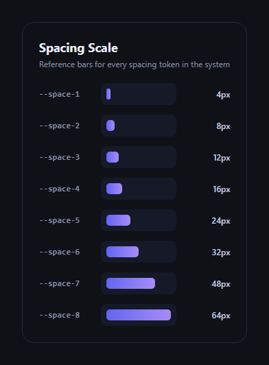
The spacing scale visualizer is the reference panel every design system documentation page needs: a row of bars sized proportionally to their pixel value, labeled with the token name and the exact px number, so anyone can see at a glance how --space-3 compares to --space-7. This snippet builds one in plain HTML, CSS, and JavaScript from a single data array.
One array drives everything
The scale array is the only place spacing values live — each entry is a { token, px } pair. The render loop computes every bar's width as a percentage of the largest value in the array (item.px / maxPx * 100), so the bars are always proportionally accurate to each other no matter how many tokens you add or what values you use. There's no separate hand-tuned width per row to keep in sync.
Reading the scale at a glance
Each row shows the token name in monospace (matching how it'd appear in code), a horizontal bar whose length is the visual signal, and the exact pixel value right-aligned for precision. The gradient fill gives the bars a bit of visual interest without competing with the information.
Why proportional bars matter
A plain list of numbers ("4, 8, 12, 16, 24, 32, 48, 64") doesn't communicate how a scale actually feels in a layout — proportional bars make the jump from --space-4 (16px) to --space-5 (24px) visually obvious as a 50% increase, which is exactly the kind of relationship spacing-scale decisions hinge on.
Customizing it
Swap in your own scale (linear, modular, or a t-shirt-size system like sm/md/lg), rename tokens to match your CSS custom properties, or add a "copy token" click handler. Pair it with a typography scale preview for a complete type-and-space reference, or a color swatch panel for a full design-tokens page.
Build with AI
Build, Understand, Optimize, and Extend It With AI
Design-token references are easy to get subtly wrong — bars that look proportional but aren't actually computed from the data, or hardcoded widths that drift out of sync the moment someone adds a token. Paste this snippet's HTML, CSS, and JS into an AI coding assistant like Claude and ask it to confirm every bar's width genuinely derives from item.px / maxPx rather than being eyeballed, and to suggest what happens to the layout if you add a token far larger than the current maximum (does the scale need a max-width cap or a logarithmic option for scales with a huge range?). It's also a good prompt for extending the panel: ask the assistant to add click-to-copy on each token, generate the scale from an actual set of CSS custom properties read via getComputedStyle, or build a matching modular-scale generator that computes px values from a base size and ratio instead of a hardcoded array.
Prompt to recreate it
Copy this into your AI assistant of choice to build the effect from scratch, or as a jumping-off point for your own variant:
Build a "design system spacing scale visualizer" in plain HTML, CSS, and JavaScript — no dependencies, no CDN.

Requirements:
- Define a single array of spacing tokens, each with a token name (e.g. "--space-1") and a pixel value (e.g. 4, 8, 12, 16, 24, 32, 48, 64).
- Render one row per token showing: the token name in monospace, a horizontal bar, and the exact pixel value.
- Compute each bar's width as a percentage of the LARGEST pixel value in the array (not a hardcoded width per row), so the bars are always proportionally accurate to each other and automatically adjust if tokens are added, removed, or changed.
- Keep the rendering driven entirely by the data array — no separate hardcoded list of widths or labels to maintain in sync.
- Style it as a clean reference card: dark theme, readable monospace token labels, a subtle gradient or solid fill on the bars, right-aligned pixel values.
Want to tighten it up first? Run this prompt through the AI Prompt Studio to score it across 8 quality dimensions, catch anti-patterns, and tune the wording for Claude, ChatGPT, or Gemini before you paste it in.
Step by step
How to Use
- 1Paste HTML, CSS, and JSA row renders for every token in the scale array.
- 2Read token and valueEach row shows the CSS variable name and its pixel value.
- 3Compare bar lengthsBars are proportional to the largest value in the scale.
- 4Edit the scale arrayAdd, remove, or rename tokens — bars recompute automatically.
- 5Match your CSS variablesRename tokens to mirror your real design-system custom properties.
Real-world uses
Common Use Cases
Got questions?
Frequently Asked Questions
No — every bar's width is computed as item.px / maxPx * 100, a percentage of the largest value in the scale array. Add a new token with a larger or smaller pixel value and every bar's proportions recompute automatically.
Edit the scale array's token and px fields to mirror your actual CSS custom properties (e.g. --space-1 through --space-8, or a t-shirt-size naming scheme). The rendering logic doesn't care about naming convention or value spacing.
Yes — the array accepts any px values in any order (though sorting ascending reads best). Proportional bar math works the same whether your scale is linear, modular (multiplied by a ratio), or an arbitrary custom set.
Yes — add a click listener to each row that copies the token string (e.g. via the Clipboard API) and shows a brief confirmation, following the same pattern as the color palette extractor snippet's copy-to-clipboard swatches.
Move the scale array into a constant or prop, map over it in your template to render rows, and compute each bar's width the same way (item.px / maxPx * 100) as an inline style or CSS custom property.