You Might Also Like
Learn Coding Visually
Learn to code with interactive, live-preview playgrounds — HTML, CSS, JavaScript, React & more.
 HTML Playground42 lessons · Click-based · Live preview
 CSS PlaygroundLearn CSS with a live editor
 JavaScript Playground60 lessons · DOM · Async · Canvas
 React PlaygroundLearn React with a live code editor
 GSAP PlaygroundLearn GSAP animation interactively
 SVG Playground44 lessons · shapes · paths · animation
 SCSS Playground45 lessons · Sass modules · tokens
 Tailwind PlaygroundLearn Tailwind CSS with a live editor
 Bootstrap 5 Playground50 lessons · live preview
CSS reading-flow Demo — Free Experimental Visual/Tab Order Sync
CSS reading-flow Demo · Layouts · Plain HTML, CSS & JS · Live preview
What's included
Features
About this UI Snippet
CSS reading-flow Demo — Keeping Tab Order Sane When Visual Order Isn't Source Order
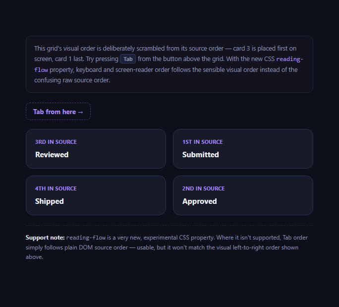
CSS has always let you rearrange elements visually without touching the DOM — grid-column/grid-row placement, order in flexbox, absolute positioning — but keyboard tab order and screen-reader reading order have traditionally followed raw DOM source order regardless of how the page actually looks. That mismatch is a well-known, persistent accessibility bug class: a grid can look perfectly ordered left-to-right on screen while a keyboard user tabbing through it jumps around unpredictably, because Tab is following the markup, not the layout. reading-flow is a new CSS property, part of the CSS Overflow/Display specifications' ongoing work, aimed directly at that gap.
What's scrambled in this demo, on purpose
The four cards in #flowGrid are written to the DOM in one order (Reviewed, Submitted, Shipped, Approved) but visually placed in a different order using explicit grid-column/grid-row values, so "Submitted" (1st in source) actually appears top-right on screen while "Reviewed" (3rd in source) appears top-left. This exact pattern — CSS Grid or Flexbox visually reordering content away from its source order — is extremely common in real layouts (responsive reflows, masonry-style card grids, dashboard widgets) and is exactly the situation where DOM-order-based tab sequences stop matching what a sighted user sees.
What reading-flow: grid-order actually changes
Setting reading-flow: grid-order on the grid container tells the browser to derive both keyboard tab order and the accessibility tree's reading order from the grid items' actual visual position, rather than their DOM source position — so tabbing through this scrambled grid follows the sane top-left-to-bottom-right sequence you see on screen, matching how a sighted user would naturally scan it, instead of jumping according to source order. This directly targets a category of bug that used to require either reordering markup to match every possible visual arrangement (impossible once responsive breakpoints reorder things differently at different widths) or resorting to tabindex values greater than zero, a technique widely considered a genuine anti-pattern because it creates its own, different order-mismatch problems and is broadly discouraged in accessibility guidance.
Very new — treat this as genuinely experimental
Be honest with yourself about where this property stands: as of 2026, reading-flow has only limited and early implementation support across browser engines, and the specification itself is still evolving. This is meaningfully newer and less settled than most other properties in this batch of snippets. There's no meaningful CSS-only fallback for its actual behavior — this snippet's @supports block simply omits the property where unsupported, and the browser falls back to plain DOM source order for Tab and screen-reader navigation, which stays fully usable but won't match the scrambled visual arrangement above.
The honest workaround today
Until reading-flow has broad support, the only reliable way to keep tab order aligned with visual order is to write your DOM in the order you want things read and tabbed through, and use CSS purely for the *visual* rearrangement layered on top — never reach for tabindex greater than zero to force a different order, since it's widely discouraged and tends to create worse, harder-to-reason-about inconsistencies than the problem it's solving. Pair this with the focus-visible explainer and the skip-to-content link as part of a broader keyboard-navigation accessibility toolkit.
Build with AI
Build, Understand, Optimize, and Extend It With AI
Paste this snippet's HTML and CSS into an AI coding assistant like Claude and ask it to explain precisely why grid-column/grid-row placement can visually reorder content without changing DOM order, and why that specific gap is what reading-flow is designed to close — understanding that distinction is the core of the whole property. It's also a good prompt for auditing your own dashboards or card grids: ask the assistant to identify any places where CSS visually reorders content away from its source order, since those are exactly the spots where keyboard tab order silently breaks today without reading-flow. You could ask it to check current browser support status for reading-flow specifically, since this is one of the newest properties around and support will keep changing after this snippet was written. Treat the demo as a teaching example for a real, common accessibility bug rather than a production-ready pattern to ship on its own yet.
Prompt to recreate it
Copy this into your AI assistant of choice to build the effect from scratch, or as a jumping-off point for your own variant:
Build a demo in plain HTML and CSS, no JavaScript, that illustrates the mismatch between visual order and DOM/tab order in a CSS Grid layout, and shows how the new, experimental reading-flow CSS property can fix it.

Requirements:
- A grid of at least 4 focusable card elements (e.g. anchor or button elements) written to the DOM in one order, but visually placed in a deliberately different order using explicit grid-column and grid-row values, so the visual left-to-right/top-to-bottom order clearly differs from the source order.
- Label each card visibly with its actual DOM source position (e.g. "1st in source", "2nd in source") so a reader can directly compare source order against visual position.
- Inside an @supports (reading-flow: grid-order) block, set reading-flow: grid-order on the grid container so that, in a supporting browser, keyboard Tab order and accessibility reading order follow the visual position of the cards rather than their DOM source order.
- Do not use tabindex values greater than zero anywhere as a workaround — explain in a code comment or on-page note why that approach is a discouraged anti-pattern.
- Add a focusable element just before the grid so a user can conveniently start tabbing from a known point and observe the resulting order.
- Include an honest, clearly visible note explaining that reading-flow is a very new and experimental CSS property with limited browser support as of 2026, and that in an unsupporting browser, Tab order will simply fall back to plain DOM source order rather than matching the visual layout.
Want to tighten it up first? Run this prompt through the AI Prompt Studio to score it across 8 quality dimensions, catch anti-patterns, and tune the wording for Claude, ChatGPT, or Gemini before you paste it in.
Step by step
How to Use
- 1Read the badges on each cardThey show each card's real DOM source order (1st through 4th), independent of screen position.
- 2Click "Tab from here"This focuses a starting point right above the grid.
- 3Press Tab repeatedlyIn a browser supporting reading-flow, focus moves in visual reading order (top-left, top-right, bottom-left, bottom-right).
- 4Compare to a browser without supportTab order there follows plain DOM source order — 1st, 2nd, 3rd, 4th — which won't match the visual grid.
- 5Inspect the grid-column/grid-row placementSee how visual order is scrambled independent of the HTML's own element order.
- 6Check the @supports (reading-flow: grid-order) blockThe only place reading-flow is actually applied.
Real-world uses
Common Use Cases
Got questions?
Frequently Asked Questions
Keyboard tab order and screen-reader reading order have traditionally followed raw DOM source order, regardless of how CSS visually repositions elements with grid-column/grid-row, flexbox order, or absolute positioning. This mismatch is a long-standing accessibility bug class: a layout can look perfectly ordered on screen while a keyboard user tabbing through it jumps around according to the markup instead of what they see.
Set on a grid container, it tells the browser to derive both keyboard tab order and the accessibility tree's reading order from the grid items' actual visual position rather than their DOM source position, so navigating through the grid follows the sensible on-screen order even when that differs from how the elements are written in the markup.
Very early, as of 2026 — this is one of the newest and least-settled properties covered in this collection, with only limited implementation across browser engines and an evolving specification. Treat it as genuinely experimental and verify current support in your specific target browsers before depending on it.
No meaningful one. Without reading-flow, the browser falls back to plain DOM source order for Tab and screen-reader navigation — a fully usable but not visually-matched order. The honest fallback approach is to write your DOM in the order you want things read and tabbed through, applying CSS purely for the visual rearrangement on top, rather than trying to fake reading-flow's exact behavior another way.
Setting explicit positive tabindex values to force a specific tab sequence is widely considered an anti-pattern in accessibility guidance: it creates a separate, hard-to-maintain order that has to be manually kept in sync with any layout change, and it interacts confusingly with the rest of the page's natural (zero/unset) tabindex elements, often producing a worse and more surprising experience than the DOM-order mismatch it was meant to fix.