You Might Also Like
Learn Coding Visually
Learn to code with interactive, live-preview playgrounds — HTML, CSS, JavaScript, React & more.
 HTML Playground42 lessons · Click-based · Live preview
 CSS PlaygroundLearn CSS with a live editor
 JavaScript Playground60 lessons · DOM · Async · Canvas
 React PlaygroundLearn React with a live code editor
 GSAP PlaygroundLearn GSAP animation interactively
 SVG Playground44 lessons · shapes · paths · animation
 SCSS Playground45 lessons · Sass modules · tokens
 Tailwind PlaygroundLearn Tailwind CSS with a live editor
 Bootstrap 5 Playground50 lessons · live preview
CSS text-box-trim Demo — Free Font Leading Trim Comparison
CSS text-box-trim Demo · Layouts · Plain HTML, CSS & JS · Live preview
What's included
Features
About this UI Snippet
CSS text-box-trim Demo — Why Headings Never Quite Touch a Border
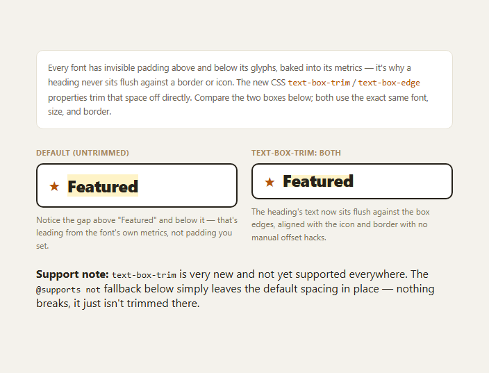
Every font reserves invisible vertical space above and below its glyphs as part of its own metrics — room for accents on capital letters, room for descenders on letters like "g" and "y", sized generously enough to cover every character the font ships, even on a line that uses none of them. That reserved space, historically called leading, is why a heading dropped into a tightly-bordered card, next to an icon, or against a horizontal rule never sits perfectly flush no matter how precisely you zero out margin and padding — the gap isn't spacing you added, it's baked into the font itself. text-box-trim is a new CSS property that removes it directly.
What's actually happening in the two boxes
Both boxes in this demo use the identical font, size, weight, and border — the only difference is that .trimmed-box h2 adds text-box-trim: trim-both alongside text-box-edge: cap alphabetic. In the default box, look closely at the gap between the top of the heading's border and the visible top of the "F" in "Featured," and the gap below the baseline before the border — that's the font's reserved ascent/descent space, present in every browser's default text rendering. In the trimmed box, that space is removed from both edges, so the heading's visible glyphs align flush with the icon beside it and the border around it.
How text-box-edge chooses the metric
text-box-trim decides which edges to trim (trim-start, trim-end, or trim-both), while text-box-edge decides which font metric to trim *to* on each edge — this demo uses cap alphabetic, meaning the top trims to the font's cap-height (the top of capital letters) and the bottom trims to the alphabetic baseline, which is usually what you want for a heading sitting in a tightly designed card or aligned next to an icon.
Why this has been a real, persistent design pain point
Before this property existed, designers and developers worked around the reserved leading with hand-tuned negative margins or fixed pixel offsets calculated per font — a fragile hack that breaks the moment the font, its version, or its fallback changes, since different fonts reserve different amounts of space. text-box-trim solves the actual problem at its source instead of compensating for it after the fact, which is why design tools like Figma have had an equivalent "trim" concept in their text engines for years while CSS had no way to express it.
Genuinely new — treat the fallback seriously
This is one of the newest properties in this batch of snippets: support is still rolling out unevenly across engines as of 2026, and it should not be assumed to be universally available yet. The @supports not (text-box-trim: trim-both) block in this snippet is deliberately a no-op — an unsupporting browser simply keeps the small reserved gap around the heading, which is still a completely valid, readable layout, just without the flush alignment. Never let the trimmed state be load-bearing for legibility; treat it purely as a polish layer. Pair this with the CSS reading-flow demo or container query units for more of the newest native CSS layer.
Build with AI
Build, Understand, Optimize, and Extend It With AI
Paste this snippet's CSS into an AI coding assistant like Claude and ask it to explain, using this exact comparison, what "reserved leading" or "half-leading" actually means in font metrics terms and why it's baked into every font rather than being something you can zero out with margin or padding — that background makes the rest of the property much easier to reason about. It's also a good prompt for auditing an existing design system: ask the assistant to find any negative-margin or fixed-pixel-offset hacks in your CSS that exist specifically to compensate for this reserved space, and evaluate whether text-box-trim could replace them, keeping in mind the fallback needs to remain a graceful no-op given current support levels. You could also ask it to explain the other text-box-edge metric keywords (like text or ex) and when each is the right choice versus cap alphabetic. Treat this as a snapshot of a brand-new property whose support will change — verify current browser coverage before shipping.
Prompt to recreate it
Copy this into your AI assistant of choice to build the effect from scratch, or as a jumping-off point for your own variant:
Build a side-by-side comparison demonstrating the new CSS text-box-trim and text-box-edge properties in plain HTML and CSS, with no JavaScript.

Requirements:
- Two visually identical boxes (same font, font-size, font-weight, border, and padding) each containing a heading next to a small icon, so any spacing difference between the two is caused only by the trim property, not by any other styling difference.
- The first box must use default, untrimmed text rendering, so the font's normal reserved leading is visible as a gap above and below the heading text relative to the box border and the adjacent icon.
- The second box must apply text-box-trim: trim-both together with text-box-edge: cap alphabetic to the heading, so its capital-letter top aligns to the cap-height metric and its bottom aligns to the alphabetic baseline, removing the reserved leading and making the heading sit flush against the border and align with the icon.
- Wrap the trimmed styling in a way that degrades gracefully in unsupporting browsers — an @supports not (text-box-trim: trim-both) block that is effectively a no-op, since the default (untrimmed) state is already a valid, readable layout and nothing should visually break there.
- Add a short, clearly labeled caption under each box explaining what it demonstrates, and a general note stating honestly that text-box-trim is a very new CSS property with still-uneven browser support as of 2026, so readers understand not to rely on it as anything more than a progressive enhancement.
Want to tighten it up first? Run this prompt through the AI Prompt Studio to score it across 8 quality dimensions, catch anti-patterns, and tune the wording for Claude, ChatGPT, or Gemini before you paste it in.
Step by step
How to Use
- 1Compare the two boxesLook at the gap above and below "Featured" in the left (default) box versus the right (trimmed) box.
- 2Check icon alignmentIn the trimmed box, the heading's cap-height lines up with the star icon; in the default box it sits slightly lower.
- 3Inspect text-box-trim: trim-bothApplied only to .trimmed-box h2 — the rest of the layout is identical CSS.
- 4Check text-box-edge: cap alphabeticTrims the top to cap-height and the bottom to the alphabetic baseline.
- 5Test in an unsupporting browserThe @supports not fallback is a no-op — the heading just keeps its default spacing.
- 6Try it on your own headingsApply the same two properties anywhere a heading sits inside a tight border or beside an icon.
Real-world uses
Common Use Cases
Got questions?
Frequently Asked Questions
Every font reserves vertical space above and below its glyphs as part of its own metrics — room for accents on capital letters and descenders like "g" or "y" — sized to cover every character the font supports, regardless of what a given line of text actually uses. That reserved space, historically called leading, remains even after you zero out margin and padding, because it lives inside the text's own line-height box, not in spacing you control directly.
text-box-trim decides which edge(s) of the text box to trim — trim-start, trim-end, or trim-both. text-box-edge decides which font metric each trimmed edge should align to, such as cap-height for the top or the alphabetic baseline for the bottom. You typically set both together, as this demo does with trim-both and cap alphabetic.
No — this is one of the newest CSS text properties as of 2026, and support is still rolling out unevenly across browser engines. Treat it as a genuinely experimental property rather than something you can assume is universally available, and always pair it with a fallback.
This snippet's @supports not (text-box-trim: trim-both) block is intentionally a no-op — an unsupporting browser simply keeps the font's default reserved spacing around the heading. That default state is still a completely valid, readable layout; it just isn't flush-aligned the way the trimmed box is, so nothing breaks or looks obviously wrong.
The negative-margin approach approximates the trim by guessing a fixed pixel offset for one specific font, which breaks the moment that font, its version, or a fallback font changes, since different fonts reserve different amounts of leading. text-box-trim solves the problem at the metric level using the font's own cap-height and baseline data, so it stays correct across font changes without hand-tuned numbers.