You Might Also Like
Learn Coding Visually
Learn to code with interactive, live-preview playgrounds — HTML, CSS, JavaScript, React & more.
 HTML Playground42 lessons · Click-based · Live preview
 CSS PlaygroundLearn CSS with a live editor
 JavaScript Playground60 lessons · DOM · Async · Canvas
 React PlaygroundLearn React with a live code editor
 GSAP PlaygroundLearn GSAP animation interactively
 SVG Playground44 lessons · shapes · paths · animation
 SCSS Playground45 lessons · Sass modules · tokens
 Tailwind PlaygroundLearn Tailwind CSS with a live editor
 Bootstrap 5 Playground50 lessons · live preview
CSS light-dark() Theme Demo — Free Native Auto Light/Dark Card
CSS light-dark() Theme Demo · Layouts · Plain HTML, CSS & JS · Live preview
What's included
Features
About this UI Snippet
CSS light-dark() Theme Demo — Zero-JS Automatic Theming
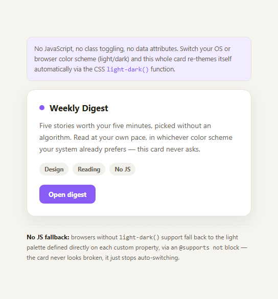
Most dark-mode implementations on the web involve either a media query duplicating every color variable under @media (prefers-color-scheme: dark), or a JavaScript-driven class/data-attribute toggle like the dark mode toggle snippet. The CSS light-dark() function, now shipping in current Chrome, Edge, Safari, and Firefox, offers a third option: define each color exactly once, as a light/dark pair, in a single custom property — no duplicated blocks, no JavaScript, no attribute to flip.
How light-dark() actually works
light-dark(lightValue, darkValue) is a CSS function that resolves to whichever of its two arguments matches the current color scheme. It requires color-scheme: light dark to be set on the element (usually :root) so the browser knows both palettes are genuinely supported and which preference to honor — without that declaration, light-dark() has no signal to resolve against. Every themed value in this card — background, border, text, accent — is written once as --bg: light-dark(#f5f4ef, #101218);, and the browser picks the right half automatically whenever the OS or browser-level color-scheme preference changes, live, with no reload and no script.
Why this beats duplicated media queries
The older approach of writing a full custom-property block once at :root and a second, overriding block inside @media (prefers-color-scheme: dark) { :root { ... } } works, but doubles the list of variables to maintain and makes it easy for the two blocks to drift out of sync as a design evolves. light-dark() keeps the light and dark value for a given token physically adjacent in the same declaration, which is both less code and harder to accidentally desync.
Where light-dark() doesn't replace JS toggles
This function only ever tracks the OS/browser-level prefers-color-scheme signal — it has no concept of a user-facing in-app toggle that overrides the system setting. If your product needs an explicit "force dark regardless of OS" switch, you still want the dark mode toggle or color mode toggle pattern, which can layer on top by setting color-scheme explicitly per user choice rather than only inheriting the OS default.
Honest support notes
light-dark() is genuinely new: it shipped in Chrome 123, Safari 17.5, and Firefox 120, all in 2024, so it's safe in any current evergreen browser as of 2026 but will fail silently-ish in older or less common engines. This snippet includes an @supports not (color: light-dark(#000, #fff)) block that redefines the same custom properties to a fixed light palette, so an unsupporting browser still renders a correct, readable card — it just won't auto-switch with the system preference there. Pair this with CSS container query units or the :has() selector playground for more of the modern, JS-free CSS toolkit.
Build with AI
Build, Understand, Optimize, and Extend It With AI
Paste this snippet's CSS into an AI coding assistant like Claude and ask it to explain exactly what color-scheme: light dark contributes beyond light-dark() itself, since the two are easy to conflate but serve different roles. It's also a good prompt for migrating an existing design system: ask the assistant to convert a stylesheet that currently duplicates :root and @media (prefers-color-scheme: dark) blocks into the single-declaration light-dark() form, flagging any values that don't cleanly reduce to a two-value pair. You could also ask it to reason about how this function should interact with a manual dark-mode toggle in a real product, since light-dark() alone only tracks the OS preference. Treat the snippet as a compact reference for a genuinely new CSS capability rather than a drop-in final answer for every theming need.
Prompt to recreate it
Copy this into your AI assistant of choice to build the effect from scratch, or as a jumping-off point for your own variant:
Build a themed card component using the native CSS light-dark() function, with no JavaScript and no class-based theme toggling.

Requirements:
- Set color-scheme: light dark on :root so the browser knows the page supports both palettes.
- Define every themed color (background, card background, border, text, muted text, accent, shadow) exactly once as a CSS custom property using light-dark(lightValue, darkValue) — do not write a separate @media (prefers-color-scheme: dark) block that redefines the same variables a second time.
- Build a small card UI (a heading, body text, a couple of tag chips, and a button) that consumes only these custom properties for its colors, so it re-themes automatically and instantly when the OS or browser color-scheme preference changes, with zero JavaScript and no page reload.
- Add an @supports not (color: light-dark(#000, #fff)) fallback block that redefines the same custom properties to a fixed, legible light palette, so the card still renders correctly in a browser that doesn't support light-dark() yet — it just won't auto-switch there.
- Include a short on-page note explaining that light-dark() only tracks the OS-level preference and has no concept of a manual in-app override, so a real product wanting an explicit user toggle still needs a JavaScript-driven approach layered on top.
Want to tighten it up first? Run this prompt through the AI Prompt Studio to score it across 8 quality dimensions, catch anti-patterns, and tune the wording for Claude, ChatGPT, or Gemini before you paste it in.
Step by step
How to Use
- 1Toggle your OS appearance settingSwitch your operating system between light and dark mode.
- 2Watch the card re-theme with zero reloadEvery color updates live — no page refresh, no script running.
- 3Inspect the CSS custom propertiesEach token like --bg is defined once as light-dark(lightValue, darkValue).
- 4Check color-scheme: light dark on :rootThis declaration is required for light-dark() to resolve correctly.
- 5Look at the @supports fallbackUnsupporting browsers get a fixed light palette instead of broken colors.
- 6Compare to a JS toggleThis approach has no manual override — pair with a real toggle if you need one.
Real-world uses
Common Use Cases
Got questions?
Frequently Asked Questions
It needs color-scheme: light dark set on the element (typically :root or html) so the browser knows the page genuinely supports both palettes and which preference to check. Without that declaration, light-dark() has no reliable signal to resolve against and will not switch correctly.
On its own, light-dark() only tracks the OS/browser-level prefers-color-scheme signal. It has no built-in concept of a manual, user-facing in-app override. If you want users to force a theme regardless of their OS setting, you still need a JS-driven approach like the dark mode toggle or color mode toggle snippets, which can set color-scheme explicitly per user choice.
It shipped in Chrome 123, Safari 17.5, and Firefox 120, all landing in 2024, so it is safe across all current evergreen browsers as of 2026. Older browser versions and some less common engines do not support it, which is why this snippet includes an @supports not (color: light-dark(#000, #fff)) fallback block.
The @supports not (color: light-dark(#000, #fff)) block redefines the same custom properties to a fixed, readable light palette, so the card renders correctly and legibly — it simply won't auto-switch with the system color-scheme preference in that browser, rather than showing broken or transparent colors.
It is more concise for token definitions: instead of a full :root block plus a duplicated @media (prefers-color-scheme: dark) { :root { ... } } block, each variable is written once with both values adjacent, reducing duplication and the risk of the two palettes drifting out of sync as the design changes. A media query approach still works and is more broadly supported, so it remains a reasonable choice for wider legacy support.