You Might Also Like
Learn Coding Visually
Learn to code with interactive, live-preview playgrounds — HTML, CSS, JavaScript, React & more.
 HTML Playground42 lessons · Click-based · Live preview
 CSS PlaygroundLearn CSS with a live editor
 JavaScript Playground60 lessons · DOM · Async · Canvas
 React PlaygroundLearn React with a live code editor
 GSAP PlaygroundLearn GSAP animation interactively
 SVG Playground44 lessons · shapes · paths · animation
 SCSS Playground45 lessons · Sass modules · tokens
 Tailwind PlaygroundLearn Tailwind CSS with a live editor
 Bootstrap 5 Playground50 lessons · live preview
Native CSS Masonry Gallery — Free grid-template-rows: masonry Demo
Native CSS Masonry Gallery · Layouts · Plain HTML, CSS & JS · Live preview
What's included
Features
About this UI Snippet
Native CSS Masonry Gallery — grid-template-rows: masonry, With an Honest Fallback
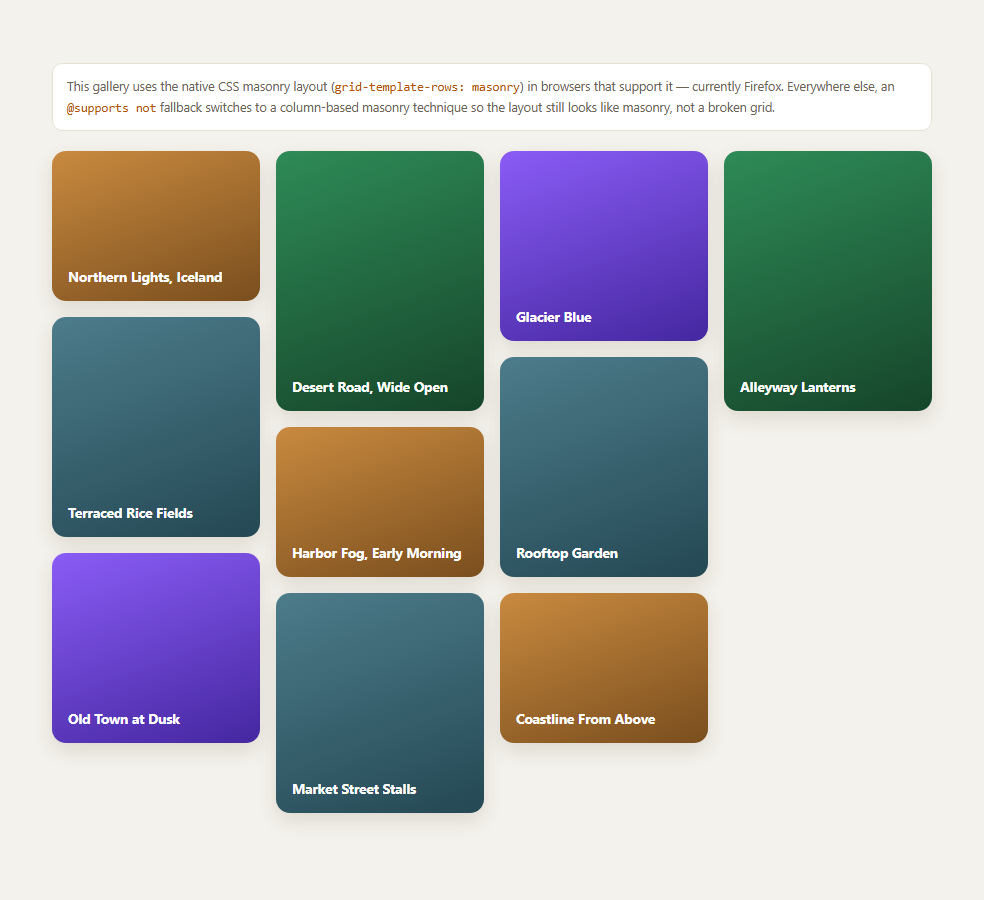
Masonry — the staggered, Pinterest-style waterfall layout where items pack into whichever column has the least content so far — has always required either JavaScript (measuring each item and repositioning it) or a compromise CSS technique. grid-template-rows: masonry is a genuinely native attempt to close that gap: hand row placement to the browser's own masonry algorithm inside an ordinary CSS Grid, with a single property and zero JavaScript.
What grid-template-rows: masonry actually does
Inside a normal grid, you declare grid-template-columns as usual, but set grid-template-rows: masonry instead of a track list. The browser then places items into whichever column currently has the shortest running height, exactly like a hand-rolled masonry algorithm would, producing the familiar staggered look without you writing any placement logic. Because it's still a grid under the hood, ordinary grid item properties keep working alongside it.
The honest support story
This is genuinely experimental as of 2026: Firefox has shipped support for CSS grid masonry, but Chromium and WebKit have not — both are instead exploring a separate "item-flow" masonry proposal with different syntax, and there is no cross-browser consensus yet on the final shape of native masonry in CSS. That means grid-template-rows: masonry will render a real masonry layout in Firefox today and needs a genuine fallback everywhere else — it is not a "ships everywhere, just needs a vendor prefix" situation.
The fallback: CSS columns(), not a broken grid
Rather than degrading to a plain, non-staggered grid in unsupporting browsers, this snippet's @supports not (grid-template-rows: masonry) block switches to the long-standing multi-column technique: columns: 4 200px turns the container into a CSS multi-column layout, each card becomes a column item, and break-inside: avoid stops a card being visually split across a column boundary. It's not pixel-identical to true masonry — items fill top-to-bottom within a column before moving to the next column, rather than always choosing the globally shortest column — but it produces a genuinely staggered waterfall look with zero JavaScript in every browser.
When to reach for this vs. a JS masonry library
If your grid item heights are known or fixed ahead of time (as in this demo) and you want the resilience of a pure-CSS approach with graceful native upgrade as browser support grows, this pattern is a good fit. If your items load asynchronously with unknown, changing heights (like a photo grid where images load progressively), a JS-measured masonry library or a scroll reveal grid-style approach paired with ResizeObserver may still be more robust until native masonry support is universal. Pair this with CSS subgrid or container query units for more of the current native-CSS-layout toolkit.
Build with AI
Build, Understand, Optimize, and Extend It With AI
Paste this snippet's CSS into an AI coding assistant like Claude and ask it to explain the practical difference between the native grid-template-rows: masonry algorithm and the columns()-based fallback — specifically why the fallback fills top-to-bottom within a column rather than always choosing the globally shortest column, since that distinction explains any visual gap you notice between browsers. It's also a good prompt for adapting this to real images: ask the assistant to swap the fixed-height cards for <img> elements with lazy loading, and to verify break-inside: avoid still behaves correctly with images versus flex/block content. You could ask it to keep an eye on Chromium and WebKit's masonry proposal status and flag if the syntax used here has since diverged from what shipped. Treat this as a snapshot of a genuinely moving spec, not a permanently settled API.
Prompt to recreate it
Copy this into your AI assistant of choice to build the effect from scratch, or as a jumping-off point for your own variant:
Build a masonry-style image gallery in plain HTML and CSS using the native CSS grid-template-rows: masonry property, with a real fallback for browsers that don't support it.

Requirements:
- A grid container with grid-template-columns using repeat(auto-fill, minmax(200px, 1fr)) and grid-template-rows: masonry, wrapped in an @supports (grid-template-rows: masonry) block so it only applies where the browser actually supports it.
- At least 8-10 card items with genuinely varying heights, to make the staggered waterfall packing visually obvious.
- A fallback rule set wrapped in @supports not (grid-template-rows: masonry) that switches the same container to a CSS multi-column layout using the columns shorthand (e.g. columns: 4 200px; column-gap), with break-inside: avoid on each card so no card is visually split across a column boundary — this must produce a genuinely staggered look, not a plain non-masonry grid.
- No JavaScript anywhere — both the native and fallback layouts must be pure CSS.
- Add a short on-page note honestly explaining that native CSS masonry is experimental as of 2026, currently supported in Firefox but not yet in Chromium or WebKit (which are pursuing a different "item-flow" proposal), so readers understand this is not yet a universally supported feature.
Want to tighten it up first? Run this prompt through the AI Prompt Studio to score it across 8 quality dimensions, catch anti-patterns, and tune the wording for Claude, ChatGPT, or Gemini before you paste it in.
Step by step
How to Use
- 1View the gallery in FirefoxCards pack into a true staggered masonry layout via native grid-template-rows: masonry.
- 2View it in Chrome, Edge, or SafariThe @supports not fallback kicks in: a CSS columns()-based masonry that still staggers, just column-first instead of grid-first.
- 3Resize the preview widthBoth the native and fallback paths reflow their column count responsively.
- 4Inspect the @supports blocksCompare the two rule sets — grid-template-rows: masonry vs columns: 4 200px.
- 5Swap in your own imagesReplace the .m-card divs' fixed heights with real <img> aspect ratios.
- 6Adjust column count/widthTune the auto-fill minmax() value and the columns() shorthand together.
Real-world uses
Common Use Cases
Got questions?
Frequently Asked Questions
As of 2026, Firefox has shipped support for native CSS grid masonry. Chromium (Chrome, Edge) and WebKit (Safari) have not shipped this exact property — both are instead exploring a separate "item-flow" masonry proposal with different syntax, and there is no finalized cross-browser standard yet. Treat this as genuinely experimental, not a feature you can rely on universally.
The fallback uses the CSS columns property (columns: 4 200px) with break-inside: avoid on each card — a well-established, widely supported technique. It produces a genuinely staggered waterfall look, but fills items top-to-bottom within one column before moving to the next, rather than always placing the next item in whichever column is currently shortest across the whole grid. The visual difference is usually minor but not pixel-identical to true masonry.
No — both paths are pure CSS. The native path uses grid-template-rows: masonry inside an ordinary CSS Grid; the fallback path uses the CSS columns shorthand. Neither requires a measuring pass, a ResizeObserver, or a masonry JS library.
Yes — replace each .m-card with a card containing an <img> at its natural aspect ratio (using width: 100%; height: auto), and both the native masonry algorithm and the columns() fallback will still work, since neither one requires you to specify a fixed height ahead of time.
You can ship it today because of the fallback — the layout degrades gracefully to a real staggered look everywhere, and Firefox users additionally get the more precise native masonry algorithm. Just don't assume native masonry syntax is stable or finalized yet; the Chromium/WebKit "item-flow" alternative could still change what the eventual cross-browser standard looks like.