Learn Coding Visually
Learn to code with interactive, live-preview playgrounds — HTML, CSS, JavaScript, React & more.
 HTML Playground42 lessons · Click-based · Live preview
 CSS PlaygroundLearn CSS with a live editor
 JavaScript Playground60 lessons · DOM · Async · Canvas
 React PlaygroundLearn React with a live code editor
 GSAP PlaygroundLearn GSAP animation interactively
 SVG Playground44 lessons · shapes · paths · animation
 SCSS Playground45 lessons · Sass modules · tokens
 Tailwind PlaygroundLearn Tailwind CSS with a live editor
 Bootstrap 5 Playground50 lessons · live preview
Dark Mode Toggle — Free HTML CSS JS Snippet
Dark Mode Toggle · Animations · Plain HTML, CSS & JS · Live preview
What's included
Features
About this UI Snippet
Dark Mode Toggle — .dark Class on Root, CSS Transitions & localStorage
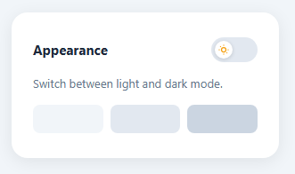
A dark mode toggle lets users switch between light and dark colour schemes — see also the icon-based color mode toggle and the multi-theme color theme switcher. It is a standard feature on every modern web product — documentation sites, dashboards, developer tools, and any product used in low-light environments. This snippet demonstrates the most common implementation pattern: a .dark class on the root element, CSS selectors for both themes, and smooth transitions between states.
The .dark class pattern
function switchTheme() { document.getElementById('page').classList.toggle('dark'); } toggles the .dark class on the root container (drive it from a styled toggle switch). All theme-aware CSS rules use the .dark prefix selector: .dark .card { background: #1e293b; }. This is clean, predictable, and easy to extend — any new element gets dark mode support by adding a .dark .element rule.
CSS transitions between themes
All themed elements have transition: background 0.3s and transition: color 0.3s. When .dark is toggled, all property changes animate simultaneously over 300ms. This produces a smooth blend between light and dark rather than an instant snap.
Saving preference with localStorage
To persist the user's choice, add localStorage.setItem('theme', 'dark') when switching to dark and localStorage.setItem('theme', 'light') when switching back. On page load, read localStorage.getItem('theme') and apply the class if it equals 'dark'. This restores the theme preference across sessions without a database.
Using CSS custom properties
For a larger project, replace hardcoded colours with CSS custom properties: :root { --bg: #f1f5f9; --surface: #fff; } and :root.dark { --bg: #0f172a; --surface: #1e293b; }. All elements reference var(--bg) and var(--surface). Toggling .dark on :root changes all variables at once.
Respecting OS preference
Use @media (prefers-color-scheme: dark) to apply dark mode automatically based on the OS setting. Combine with the localStorage preference: if the user has explicitly set a preference, honour it; otherwise, follow the OS.
The :root CSS variable swap
When the toggle switches to dark mode, a .dark class is added to the body or :root element. CSS rules under .dark override the default CSS variable values: .dark { --bg: #0f172a; --text: #f1f5f9; --surface: #1e293b; }. All components that use these variables automatically update — no component-specific dark mode logic needed. This is why CSS custom properties are the recommended approach for theming.
localStorage persistence
The toggle reads the user's preference from localStorage on page load: const saved = localStorage.getItem('color-scheme'). On toggle, it writes the new value. To prevent a flash of wrong theme on load, add an inline script in the document <head> (before any CSS) that reads localStorage and adds the .dark class immediately: <script>if(localStorage.getItem('color-scheme')==='dark')document.documentElement.classList.add('dark')</script>.
The CSS knob animation
The toggle knob uses position: absolute and transition: left 0.2s. In light mode, left: 3px places it on the left; in dark mode, left: calc(100% - 23px) places it on the right. The toggle background transitions from grey to indigo simultaneously. Both transitions have the same 0.2s duration so they move in sync.
Build with AI
Build, Understand, Optimize, and Extend It With AI
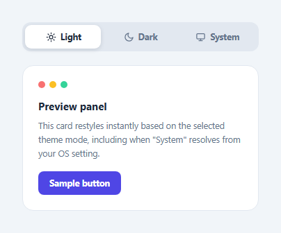
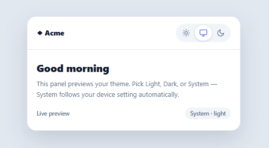
You don't have to guess why this toggle scales cleanly to a whole app. Paste this snippet's HTML, CSS, and JS into an AI coding assistant like Claude and ask it to explain exactly how the single classList.toggle call on the root element cascades through every .dark-prefixed selector, and why that pattern scales better than toggling inline styles on individual elements. The same assistant can help optimize it — ask whether migrating the hardcoded hex colors to CSS custom properties on :root would reduce the number of selectors that need a .dark override, and how to avoid a flash of the wrong theme on page load when reading a saved preference from localStorage. It's also useful for extending the toggle: ask it to add a three-way switch for light, dark, and system-following modes, sync the choice across browser tabs using the storage event, or drive the color-scheme meta tag so native form controls and scrollbars match the chosen theme too. Treat the code less like a finished artifact and more like a starting point for a conversation.
Prompt to recreate it
Copy this into your AI assistant of choice to build the effect from scratch, or as a jumping-off point for your own variant:
Build a dark mode toggle in plain HTML, CSS, and JavaScript that persists the user's choice and avoids a flash of the wrong theme — no framework, no library.

Requirements:
- A single toggle button that calls classList.toggle("dark") on one root container element, with every themed element's dark styling written as a ".dark .element" prefixed CSS rule rather than duplicating full styles.
- Add transition: background 0.3s, color 0.3s (or similar) on every themed element so switching themes animates smoothly rather than snapping instantly.
- A sliding knob inside the toggle button that moves via a CSS transform (not a left/top position change) when the .dark class is present, with a synchronized-duration transition so the knob and the track background finish animating at the same time.
- Swap between a sun icon and a moon icon inside the knob based on the .dark class, using CSS display toggling driven purely by the class, not JavaScript re-rendering the icon.
- Persist the chosen theme to localStorage on every toggle, and on page load read that stored value and apply the .dark class before the first paint — using an inline script placed in the document head, before any stylesheet — so returning visitors never see a flash of the opposite theme.
- Add a fallback for first-time visitors with no stored preference: check window.matchMedia("(prefers-color-scheme: dark)") and apply .dark automatically if the OS is set to dark, while still letting the manual toggle override it afterward.
Want to tighten it up first? Run this prompt through the AI Prompt Studio to score it across 8 quality dimensions, catch anti-patterns, and tune the wording for Claude, ChatGPT, or Gemini before you paste it in.
Source Code
<div class="page" id="page">
  <div class="card">
    <div class="top">
      <span class="title">Appearance</span>
      <button class="toggle" id="toggle" onclick="switchTheme()">
        <span class="knob">
          <svg class="sun-icon" width="12" height="12" viewBox="0 0 24 24" fill="none" stroke="currentColor" stroke-width="2.5"><circle cx="12" cy="12" r="5"/><line x1="12" y1="1" x2="12" y2="3"/><line x1="12" y1="21" x2="12" y2="23"/><line x1="4.22" y1="4.22" x2="5.64" y2="5.64"/><line x1="18.36" y1="18.36" x2="19.78" y2="19.78"/><line x1="1" y1="12" x2="3" y2="12"/><line x1="21" y1="12" x2="23" y2="12"/></svg>
          <svg class="moon-icon" width="12" height="12" viewBox="0 0 24 24" fill="none" stroke="currentColor" stroke-width="2.5"><path d="M21 12.79A9 9 0 1 1 11.21 3 7 7 0 0 0 21 12.79z"/></svg>
        </span>
      </button>
    </div>
    <p class="desc">Switch between light and dark mode.</p>
    <div class="swatch-row">
      <div class="swatch"></div><div class="swatch"></div><div class="swatch"></div>
    </div>
  </div>
</div>
* { box-sizing: border-box; margin: 0; padding: 0; }
body { font-family: system-ui, sans-serif; }
.page { min-height: 100vh; display: flex; align-items: center; justify-content: center; background: #f1f5f9; transition: background 0.3s; padding: 24px; }
.page.dark { background: #0f172a; }
.card { background: #fff; border-radius: 18px; padding: 28px 24px; width: 300px; box-shadow: 0 4px 20px rgba(0,0,0,0.08); transition: background 0.3s; display: flex; flex-direction: column; gap: 14px; }
.dark .card { background: #1e293b; }
.top { display: flex; justify-content: space-between; align-items: center; }
.title { font-size: 15px; font-weight: 700; color: #1e293b; transition: color 0.3s; }
.dark .title { color: #f1f5f9; }
.desc { font-size: 13px; color: #64748b; line-height: 1.6; }
.toggle { width: 52px; height: 28px; border-radius: 28px; background: #e2e8f0; border: none; cursor: pointer; position: relative; padding: 0; transition: background 0.3s; }
.dark .toggle { background: #6366f1; }
.knob { position: absolute; top: 4px; left: 4px; width: 20px; height: 20px; border-radius: 50%; background: #fff; display: flex; align-items: center; justify-content: center; transition: transform 0.3s; box-shadow: 0 1px 4px rgba(0,0,0,0.15); }
.dark .knob { transform: translateX(24px); }
.sun-icon { display: block; color: #f59e0b; }
.moon-icon { display: none; color: #6366f1; }
.dark .sun-icon { display: none; }
.dark .moon-icon { display: block; }
.swatch-row { display: flex; gap: 8px; }
.swatch { flex: 1; height: 32px; border-radius: 8px; background: #f1f5f9; transition: background 0.3s; }
.dark .swatch { background: #334155; }
.swatch:nth-child(2) { background: #e2e8f0; }
.dark .swatch:nth-child(2) { background: #475569; }
.swatch:nth-child(3) { background: #cbd5e1; }
.dark .swatch:nth-child(3) { background: #1e293b; }function switchTheme() { document.getElementById('page').classList.toggle('dark'); }Step by step
How to Use
- 1Click the toggle in the previewClick the toggle button to switch between light and dark. All elements transition simultaneously over 300ms.
- 2Update the colour valuesIn the CSS panel, update the light-mode colours on elements and the .dark overrides to match your palette.
- 3Add more dark-mode rulesFor each new element, add a .dark .element { } rule with dark-mode colour values. The JS toggle applies to all of them.
- 4Persist preferenceIn the JS panel, add localStorage.setItem("theme", isDark ? "dark" : "light") after the toggle. On load, read it and apply the class.
- 5Move to CSS custom propertiesReplace hardcoded colours with CSS variables. Define :root { --bg: #f1f5f9 } and :root.dark { --bg: #0f172a }. Reference var(--bg) everywhere.
- 6Export in your formatClick "HTML" for a standalone file, "JSX" for a React component, or "Tailwind" for a React + Tailwind version.
Real-world uses
Common Use Cases
Got questions?
Frequently Asked Questions
function switchTheme() toggles the .dark class on the root container element. All CSS dark-mode rules use .dark as a prefix selector — .dark .card { background: #1e293b; }. When the class is added, the browser applies the dark overrides; when removed, it reverts to the light values.
background and color transitions are set on all themed elements: transition: background 0.3s, color 0.3s. When .dark is toggled, all matching properties animate from their current value to the new value over 300ms simultaneously.
Add localStorage.setItem("theme", "dark") when switching to dark mode and "light" when switching back. On page load, read localStorage.getItem("theme") and add the .dark class if it equals "dark". This restores the preference without a server-side cookie.
Define :root { --bg: #f1f5f9; --surface: #fff; --text: #1e293b; } and :root.dark { --bg: #0f172a; --surface: #1e293b; --text: #f1f5f9; }. Reference var(--bg) on elements. Toggle .dark on :root — all variables update at once.
Add @media (prefers-color-scheme: dark) { .page { /* dark styles */ } } in the CSS. On page load in JS, check !localStorage.getItem("theme") && window.matchMedia("(prefers-color-scheme: dark)").matches and apply .dark if true.
Yes. Click "JSX" for a React component. In React, use useState for the dark/light boolean, useEffect to persist to localStorage on change, and useEffect on mount to read localStorage and apply the initial theme.