You Might Also Like
Learn Coding Visually
Learn to code with interactive, live-preview playgrounds — HTML, CSS, JavaScript, React & more.
 HTML Playground42 lessons · Click-based · Live preview
 CSS PlaygroundLearn CSS with a live editor
 JavaScript Playground60 lessons · DOM · Async · Canvas
 React PlaygroundLearn React with a live code editor
 GSAP PlaygroundLearn GSAP animation interactively
 SVG Playground44 lessons · shapes · paths · animation
 SCSS Playground45 lessons · Sass modules · tokens
 Tailwind PlaygroundLearn Tailwind CSS with a live editor
 Bootstrap 5 Playground50 lessons · live preview
Segmented Toggle — Free HTML CSS JS Control Snippet
Segmented Toggle · Buttons · Plain HTML, CSS & JS · Live preview
What's included
Features
About this UI Snippet
Segmented Toggle — iOS-Style Segmented Control with a Sliding Resizing Glider
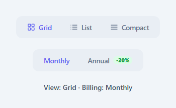
The segmented control — a row of options in a single pill where one is always selected — is the cleaner alternative to a dropdown when you have two to four mutually exclusive choices: view modes, billing periods, time ranges, filters. The hallmark of a good one is the "glider": a highlight that slides smoothly from segment to segment rather than blinking on and off. This component builds a proper segmented toggle with a glider that both slides and resizes to fit segments of different widths, icon support, keyboard navigation, and a live readout — in HTML, CSS, and vanilla JavaScript.
The sliding, resizing glider
A single white .sgt-glider element sits behind the segments with z-index: 0 while the segment buttons sit above at z-index: 1. When a segment is selected, moveGlider() reads that segment's offsetWidth and offsetLeft and sets the glider's width and transform: translateX() to match (offset by the 4px container padding). Both are CSS-transitioned, so the glider glides across and grows or shrinks to exactly fit the new segment — important because "Grid", "List", and "Compact", or "Monthly" and "Annual -20%", are all different widths. Measuring from the live DOM means it is always pixel-correct without hard-coded sizes.
Why transform, not left
The glider animates with transform: translateX() rather than animating the left property. Transforms are GPU-composited and do not trigger layout, so the slide stays at 60fps; animating left would force a layout recalculation on every frame. Combined with the width transition (which does relayout the glider only, a tiny element), the motion is smooth and cheap.
A reusable group setup
setupGroup() wires any segmented control — it is called twice here, once for the three-way view toggle and once for the two-way billing toggle, proving the pattern scales to any number of segments. Each group manages its own glider, its own active state via the .active class and aria-selected, and writes its choice into a shared state object that drives the live readout. Adding a third control is one more setupGroup() call.
Keyboard navigation and ARIA
Each control is a role="tablist" of role="tab" buttons with aria-selected tracking the choice. Arrow Left and Arrow Right move the selection within a group (wrapping around with modulo) and move focus to the newly selected segment — the expected keyboard behaviour for a segmented control. Because the segments are real <button>s, they are focusable and clickable out of the box; the active segment's text also recolours to the accent so the selection is clear even to users who do not perceive the glider's position.
Resize handling
If the layout reflows — a font loads, the container resizes, the page goes responsive — the glider must re-align to the (possibly moved) active segment. A resize listener re-runs each group's moveGlider() for its current active index, so the glider never drifts out from under the selected segment. This is the detail that separates a robust control from one that looks broken after a window resize.
Customisation
Add or remove segments in the markup (and the matching LABELS entry); the glider adapts to the new widths automatically. Drop the SVG icons or add your own, use the .sgt-pill badge for callouts like discounts, swap the #6366f1 active colour and the #e9eef4 track for your palette, and read the selected values from the state object (or wire select() to your app — change a layout, toggle pricing, filter a list).
Build with AI
Build, Understand, Optimize, and Extend It With AI
You don't need to work out how setupGroup wires two independent controls from one function by hand. Paste this snippet's HTML, CSS, and JS into an AI coding assistant like Claude and ask it to explain exactly how moveGlider derives both a width and a translateX offset from offsetWidth and offsetLeft, or why the glider animates transform instead of the left property. The same assistant can help optimize it, for instance checking whether the resize listener recalculating both gliders on every resize event should be throttled, or whether a ResizeObserver on each container would be more efficient than a single window-level listener. It's also useful for extending the behavior: ask it to add a third segmented group driven by the same setupGroup call, animate the glider with a subtle overshoot easing, or persist each control's selection to localStorage so the choice survives a page reload. Treat the code less like a finished artifact and more like a starting point for a conversation.
Prompt to recreate it
Copy this into your AI assistant of choice to build the effect from scratch, or as a jumping-off point for your own variant:
Build an iOS-style segmented toggle with a sliding, resizing glider in plain HTML, CSS, and JavaScript, no framework, no libraries.

Requirements:
- Write one reusable setup function that takes a container id, a glider element id, and a state key, and can be called multiple times to wire up multiple independent segmented controls on the same page without them interfering with each other.
- Each control needs a single glider element positioned behind its segment buttons with a lower z-index, and the buttons must sit above it so they remain clickable.
- On selecting a segment, read that segment's offsetWidth and offsetLeft from the live DOM and set the glider's width and a translateX transform to match exactly (adjusting for the container's own padding) — do not hard-code segment sizes.
- The glider must animate using transform (translateX) for position, not the left property, so the slide is GPU-composited and does not trigger layout on every frame; width may transition normally since only the small glider element relays out.
- Give each control role="tablist" on the container and role="tab" with aria-selected on each button, and support Arrow Left / Arrow Right keys to move the selection within that control with wrap-around at both ends, moving keyboard focus to the newly active segment.
- At least one control must support segments with visibly different content widths (e.g. one plain-text segment and one segment containing both text and a small badge) to prove the glider resizes correctly rather than assuming uniform segment widths.
- Add a window resize listener that re-runs the glider positioning for every control's currently active segment, so the glider never drifts out of alignment after a layout reflow.
Want to tighten it up first? Run this prompt through the AI Prompt Studio to score it across 8 quality dimensions, catch anti-patterns, and tune the wording for Claude, ChatGPT, or Gemini before you paste it in.
Step by step
How to Use
- 1Paste the HTML, CSS, and JSTwo segmented controls render — a three-way view toggle with icons and a two-way billing toggle — plus a live readout of both choices.
- 2Click a segmentThe white glider slides to that segment and resizes to fit it, the segment text turns accent-coloured, and the readout updates.
- 3Use arrow keysFocus a control and press Left/Right to move the selection within it with wrap-around; focus follows the active segment.
- 4Resize the windowThe gliders re-align to their active segments so they never drift after a layout change.
- 5Add or change segmentsEdit the segment buttons and the matching LABELS array; the glider adapts to the new widths automatically.
- 6Wire it upRead choices from the state object or connect select() to change a view, toggle pricing, or filter; swap the accent colour.
Real-world uses
Common Use Cases
Got questions?
Frequently Asked Questions
moveGlider() reads the selected segment's offsetWidth and offsetLeft from the rendered DOM and sets the glider's width and translateX to match (minus the 4px container padding). Because it measures the actual element, the glider fits "Grid" or "Compact" or "Annual -20%" exactly — no hard-coded widths. Both width and transform are CSS-transitioned, so it animates the size change as it slides.
Animating left forces the browser to recalculate layout on every frame, which causes jank. transform: translateX() is handled by the compositor on the GPU and skips layout entirely, so the slide stays smooth at 60fps. The width transition does relayout, but only the tiny glider element, which is cheap. This transform-first approach is the standard for performant UI animation.
It needs to re-measure when the layout changes. This snippet adds a window resize listener that re-runs moveGlider() for each group's currently active segment, so the glider snaps back under the selected segment after any reflow (resize, font load, responsive breakpoint). If your control lives in a resizable container, you can also use a ResizeObserver on the container for the same effect.
For a new segment, add another button to the group and a matching label to that group's LABELS array — the glider adapts to its width automatically. For a whole new control, add the markup with its own glider id and call setupGroup('newId', 'newGliderId', key) with a new state key. The setup function is fully reusable, which is why two independent controls work from the same code.
Hold the active index in state per control. For the glider, keep refs to the segment elements and an effect that, when the index changes (and on resize), reads the active segment's offsetLeft/offsetWidth and sets the glider style. Bind .active/aria-selected to index comparisons and the keyboard handler to onKeyDown. The CSS — track, glider, transitions — ports unchanged; only the measure-and-position effect moves into the framework's lifecycle.