Source Code
<div class="cards">
  <div class="card">
    <div class="tier">Free</div>
    <div class="price">$0<span>/mo</span></div>
    <ul>
      <li>5 projects</li>
      <li>1 GB storage</li>
      <li>Email support</li>
      <li class="off">API access</li>
    </ul>
    <button class="btn outline">Get started</button>
  </div>
  <div class="card featured">
    <div class="badge">Popular</div>
    <div class="tier">Pro</div>
    <div class="price">$12<span>/mo</span></div>
    <ul>
      <li>Unlimited projects</li>
      <li>50 GB storage</li>
      <li>Priority support</li>
      <li>API access</li>
    </ul>
    <button class="btn solid">Get started</button>
  </div>
</div>
* { box-sizing: border-box; margin: 0; padding: 0; }
body { font-family: system-ui, sans-serif; background: #f1f5f9; display: flex; align-items: center; justify-content: center; min-height: 100vh; padding: 20px; }
.cards { display: flex; gap: 16px; align-items: flex-start; }
.card {
background: #fff;
border-radius: 16px;
padding: 28px 24px;
width: 200px;
border: 1.5px solid #e2e8f0;
position: relative;
}
.card.featured { border-color: #6366f1; box-shadow: 0 8px 32px rgba(99,102,241,0.15); }
.badge {
position: absolute;
top: -10px;
left: 50%;
transform: translateX(-50%);
background: #6366f1;
color: #fff;
font-size: 11px;
font-weight: 700;
padding: 2px 10px;
border-radius: 20px;
}
.tier { font-size: 12px; font-weight: 700; text-transform: uppercase; letter-spacing: 0.6px; color: #6366f1; margin-bottom: 8px; }
.price { font-size: 32px; font-weight: 800; color: #1e293b; line-height: 1; margin-bottom: 20px; }
.price span { font-size: 13px; color: #94a3b8; }
ul { list-style: none; display: flex; flex-direction: column; gap: 8px; margin-bottom: 24px; }
li { font-size: 13px; color: #475569; display: flex; align-items: center; gap: 6px; }
li::before { content: '✓'; color: #22c55e; font-weight: 700; font-size: 12px; }
li.off { color: #cbd5e1; }
li.off::before { content: '✗'; color: #e2e8f0; }
.btn {
width: 100%;
padding: 9px;
border-radius: 8px;
font-size: 13px;
font-weight: 600;
cursor: pointer;
transition: all 0.15s;
}
.btn.outline { background: none; border: 1.5px solid #e2e8f0; color: #475569; }
.btn.outline:hover { border-color: #6366f1; color: #6366f1; }
.btn.solid { background: #6366f1; border: none; color: #fff; }
.btn.solid:hover { background: #4f46e5; }Learn Coding Visually
Learn to code with interactive, live-preview playgrounds — HTML, CSS, JavaScript, React & more.
 HTML Playground42 lessons · Click-based · Live preview
 CSS PlaygroundLearn CSS with a live editor
 JavaScript Playground60 lessons · DOM · Async · Canvas
 React PlaygroundLearn React with a live code editor
 GSAP PlaygroundLearn GSAP animation interactively
 SVG Playground44 lessons · shapes · paths · animation
 SCSS Playground45 lessons · Sass modules · tokens
 Tailwind PlaygroundLearn Tailwind CSS with a live editor
 Bootstrap 5 Playground50 lessons · live preview
Pricing Card — Free HTML CSS SaaS Pricing Snippet
Pricing Card · Pricing · Plain HTML & CSS · Live preview
What's included
Features
About this UI Snippet
Pricing Card — HTML & CSS Two-Tier SaaS Layout with Popular Badge
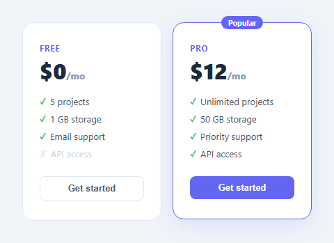
Pricing cards are one of the highest-impact UI components on any SaaS or subscription product page. They present plan options side by side, show what each tier includes and excludes, and direct users toward the recommended plan. Getting the design right directly affects conversion — a highlighted featured card, a clear feature comparison, and differentiated CTAs are all standard conversion-optimisation techniques.
This snippet gives you a complete, production-ready two-tier pricing card in plain HTML and CSS — no JavaScript required. A Free plan and a Pro plan sit side by side in a flex container. The Pro card is visually elevated with an accent border and coloured glow shadow. A "Popular" badge floats above the featured card. Both cards have a feature list with included and excluded items and appropriately styled call-to-action buttons.
The Popular badge positioning
The "Popular" badge uses a classic absolute-positioning trick. The featured .card has position: relative. The .badge inside it has position: absolute; top: -10px; left: 50%; transform: translateX(-50%). The top: -10px pulls the badge 10px above the top edge of the card — half in, half out. The left: 50% moves it to the horizontal midpoint of the card, and translateX(-50%) shifts it left by half its own width, centering it precisely regardless of the badge text length. To change the badge text, update the HTML. To reposition it to a corner, change left: 50%; transform: translateX(-50%) to right: 16px and remove the translateX.
Featured card visual differentiation
The .card.featured selector overrides the default border-color from neutral grey to the brand accent colour #6366f1. It also adds box-shadow: 0 8px 32px rgba(99,102,241,0.15) — a soft, coloured glow that lifts the card off the background. These two CSS properties together communicate "this is the recommended plan" without any text label. The shadow colour matches the border colour with a low opacity so it feels cohesive rather than generic.
The checkmark and cross feature list
The feature list uses CSS ::before pseudo-elements instead of real characters in the HTML. li::before { content: '✓'; color: #22c55e; font-weight: 700; } adds a green tick before every list item. The .off class overrides this: li.off::before { content: '✗'; color: #e2e8f0; } and dims the text with lighter colour. Showing excluded features in the lower tier — rather than just leaving them off the list — is a deliberate UX pattern. It makes the gap between plans visible and gives users a concrete reason to upgrade.
Two button variants
The Free plan uses .btn.outline — no fill, a light border, and dark text. The Pro plan uses .btn.solid — filled with the accent colour and white text. This visual hierarchy reinforces which plan is more desirable without changing the button label. Both buttons get a hover state: the outline button gains an accent border and text colour, the solid button darkens slightly.
Adding a third tier
To add an Enterprise tier, copy a .card div and paste it as a third child of .cards. The display: flex; gap: 16px layout accommodates it automatically. Add flex-wrap: wrap and min-width: 200px to the .cards container for responsive wrapping on smaller screens.
Connecting to a monthly/annual toggle
This card shows static prices. To add a monthly/annual toggle, see the Pricing Toggle snippet in this library — it uses JavaScript to swap price values between two datasets and animates the number change with a CSS transition.
Saving your customised version
After editing, click "Save as" in the editor header, type a name, and press Enter. Saves to IndexedDB and appears in the Saved tab in the sidebar.
Build with AI
Build, Understand, Optimize, and Extend It With AI
You don't have to reverse-engineer the badge centering trick on your own. Paste this snippet's HTML, CSS, and JS into an AI coding assistant like Claude and ask it to explain exactly how the combination of top -10px, left 50 percent, and translateX(-50%) centers the Popular badge regardless of its text length, and why the checkmark and cross symbols come from CSS pseudo-elements instead of being typed directly into the HTML. The same assistant can help optimize it, for example checking whether the featured card's border-color and box-shadow values stay visually consistent if you change the accent color, or whether the outline versus solid button styling communicates the right visual hierarchy on a dark background. It's also useful for extending the effect: ask it to add a third Enterprise tier card, wire the two "Get started" buttons to different Stripe price IDs, or add a subtle hover lift animation to the featured card only. Treat the code less like a finished artifact and more like a starting point for a conversation.
Prompt to recreate it
Copy this into your AI assistant of choice to build the effect from scratch, or as a jumping-off point for your own variant:
Build a two-tier SaaS pricing card layout in plain HTML and CSS only, with no JavaScript.

Requirements:
- Two cards side by side in a flex row that stay top-aligned to each other regardless of content height differences, each showing a plan tier name, a price with a smaller "/mo" suffix, a feature list, and a call-to-action button.
- One card must be visually marked as the featured/recommended plan using an accent border color and a soft colored box-shadow glow, distinct from the other card's neutral gray border.
- The featured card must have a small pill-shaped "Popular" badge that floats above its top edge, horizontally centered over the card regardless of the badge text's length — achieved using absolute positioning combined with a 50 percent left offset and a negative half-width transform, not a fixed pixel offset.
- Every feature list item must show a checkmark or a cross purely through a CSS pseudo-element (no image, no icon font, no extra markup in the HTML) — included features get a green checkmark character, and features marked as excluded get a muted gray cross character with dimmed, de-emphasized text.
- The featured card's call-to-action button must be visually filled/solid while the other card's button is outlined, reinforcing which plan is recommended without needing any additional label text.
- Make sure the whole thing is trivially extensible to a third tier by duplicating one card element, without requiring any changes to the flex container's CSS.
Want to tighten it up first? Run this prompt through the AI Prompt Studio to score it across 8 quality dimensions, catch anti-patterns, and tune the wording for Claude, ChatGPT, or Gemini before you paste it in.
Step by step
How to Use
- 1Load the snippetClick "Pricing Card" in the sidebar Library tab. The HTML and CSS panels load instantly and the preview shows the two-tier card layout.
- 2Update plan names and pricesIn the HTML panel, replace Free/$0 and Pro/$12 with your actual tier names and prices. Update the /mo label to /yr if billing is annual.
- 3Edit the feature listsUpdate the li text in each card. Add class="off" to any feature excluded from a tier — it gets a grey cross and dimmed text automatically.
- 4Move the featured highlightTo highlight a different card, move class="card featured" and the .badge div to that card. The accent border, glow, and badge move with it.
- 5Change the accent colourFind #6366f1 in the CSS panel and replace all instances with your brand colour. Updates the badge, featured border, glow, tier label, and solid button in one go.
- 6Export in your formatClick "HTML" for a standalone file, "JSX" for a React component, or "Tailwind" for a React + Tailwind CSS version.
Real-world uses
Common Use Cases
Got questions?
Frequently Asked Questions
A pricing card displays a single subscription plan — its name, price, included features, and a call-to-action button. Multiple pricing cards sit side by side in a pricing table so users can compare plans. A highlighted "featured" card communicates the recommended choice and typically achieves the highest conversion rate.
The featured card has position: relative. The badge inside has position: absolute; top: -10px; left: 50%; transform: translateX(-50%). The top: -10px lifts it above the card border. left: 50% moves it to the horizontal centre of the card, and translateX(-50%) shifts it left by half its own width to centre it regardless of text length.
In the HTML panel, copy one of the .card divs and paste it as a third child of .cards. The flex layout places it automatically. Add flex-wrap: wrap and min-width: 200px to the .cards container so it wraps to a new line on mobile instead of overflowing.
Add class="off" to any li element. The CSS rule li.off::before { content: '✗' } replaces the green checkmark with a grey cross, and the text colour lightens automatically. This pattern makes the difference between tiers tangible and encourages upgrades.
This snippet shows static prices. For a toggle, see the Pricing Toggle snippet in this library — it uses JavaScript to switch price values between two datasets and animates the number change. You can combine both: use this card layout with the toggle logic from that snippet.
Find #6366f1 in the CSS panel and replace all instances with your brand hex. This updates the badge background, featured border colour, the box-shadow glow colour, the tier label, and the solid button in one search-and-replace.
Yes. Click "JSX" to download a React component or "Tailwind" for a Tailwind CSS version. In React, make the plan data (name, price, features) into props so you can render multiple cards from an array. The featured prop controls the highlighted state.