Source Code
<section class="pricing">
<div class="pricing-head">
<h1>Simple, transparent pricing</h1>
<p>Start free, scale as you grow. No hidden fees, no surprises.</p>
<div class="toggle-row">
<span class="tog-label" id="m-lbl">Monthly</span>
<button class="tog" id="tog" onclick="switchBilling()" aria-label="Toggle billing">
<span class="knob"></span>
</button>
<span class="tog-label dim" id="a-lbl">Annual <span class="save-chip">Save 20%</span></span>
</div>
</div>
<div class="plans">
<div class="plan">
<div class="plan-name">Starter</div>
<div class="plan-desc">For individuals and small projects</div>
<div class="plan-price"><span class="amount" id="p0">$0</span><span class="period">/mo</span></div>
<a href="#" class="plan-cta outline">Get started free</a>
<ul class="feat-list">
<li class="yes">5 projects</li>
<li class="yes">1 GB storage</li>
<li class="yes">Community support</li>
<li class="no">Custom domain</li>
<li class="no">API access</li>
<li class="no">Team collaboration</li>
</ul>
</div>
<div class="plan featured">
<div class="popular">Most popular</div>
<div class="plan-name">Pro</div>
<div class="plan-desc">For professionals and growing teams</div>
<div class="plan-price"><span class="amount" id="p1">$12</span><span class="period">/mo</span></div>
<a href="#" class="plan-cta solid">Start free trial</a>
<ul class="feat-list">
<li class="yes">Unlimited projects</li>
<li class="yes">50 GB storage</li>
<li class="yes">Priority support</li>
<li class="yes">Custom domain</li>
<li class="yes">API access</li>
<li class="no">Team collaboration</li>
</ul>
</div>
<div class="plan">
<div class="plan-name">Team</div>
<div class="plan-desc">For teams and organisations</div>
<div class="plan-price"><span class="amount" id="p2">$39</span><span class="period">/mo</span></div>
<a href="#" class="plan-cta outline">Get started</a>
<ul class="feat-list">
<li class="yes">Unlimited projects</li>
<li class="yes">500 GB storage</li>
<li class="yes">Dedicated support</li>
<li class="yes">Custom domain</li>
<li class="yes">API access</li>
<li class="yes">Team collaboration</li>
</ul>
</div>
</div>
<p class="guarantee">✦ 14-day free trial · No credit card required · Cancel anytime</p>
</section>* { box-sizing: border-box; margin: 0; padding: 0; }
body { font-family: system-ui, sans-serif; background: #f8fafc; min-height: 100vh; padding: 40px 20px; }
.pricing { max-width: 1000px; margin: 0 auto; display: flex; flex-direction: column; align-items: center; gap: 40px; }
.pricing-head { text-align: center; display: flex; flex-direction: column; align-items: center; gap: 12px; }
.pricing-head h1 { font-size: clamp(24px,4vw,36px); font-weight: 800; color: #1e293b; letter-spacing: -0.5px; }
.pricing-head p { font-size: 15px; color: #64748b; }
.toggle-row { display: flex; align-items: center; gap: 10px; margin-top: 4px; }
.tog-label { font-size: 13px; font-weight: 600; color: #1e293b; transition: color 0.2s; }
.tog-label.dim { color: #94a3b8; }
.tog { width: 44px; height: 24px; border-radius: 24px; background: #6366f1; border: none; cursor: pointer; position: relative; transition: background 0.2s; padding: 0; }
.knob { position: absolute; width: 18px; height: 18px; border-radius: 50%; background: #fff; top: 3px; left: 3px; transition: transform 0.2s; box-shadow: 0 1px 3px rgba(0,0,0,0.2); }
.tog.annual .knob { transform: translateX(20px); }
.save-chip { font-size: 10px; font-weight: 700; background: rgba(22,163,74,0.12); color: #16a34a; padding: 1px 6px; border-radius: 10px; margin-left: 4px; }
.plans { display: grid; grid-template-columns: repeat(3,1fr); gap: 16px; width: 100%; align-items: start; }
@media (max-width: 700px) { .plans { grid-template-columns: 1fr; } }
.plan { background: #fff; border-radius: 20px; padding: 28px 24px; border: 1.5px solid #e2e8f0; display: flex; flex-direction: column; gap: 16px; position: relative; transition: box-shadow 0.15s; }
.plan:hover { box-shadow: 0 8px 32px rgba(0,0,0,0.08); }
.plan.featured { border-color: #6366f1; box-shadow: 0 8px 32px rgba(99,102,241,0.15); }
.popular { position: absolute; top: -12px; left: 50%; transform: translateX(-50%); background: #6366f1; color: #fff; font-size: 11px; font-weight: 700; padding: 3px 12px; border-radius: 20px; white-space: nowrap; }
.plan-name { font-size: 18px; font-weight: 800; color: #1e293b; }
.plan-desc { font-size: 12px; color: #64748b; margin-top: -10px; }
.plan-price { display: flex; align-items: baseline; gap: 2px; }
.amount { font-size: 40px; font-weight: 800; color: #1e293b; line-height: 1; transition: color 0.2s; }
.period { font-size: 13px; color: #94a3b8; }
.plan-cta { display: block; text-align: center; padding: 11px; border-radius: 10px; font-size: 14px; font-weight: 600; text-decoration: none; transition: all 0.15s; }
.plan-cta.solid { background: #6366f1; color: #fff; }
.plan-cta.solid:hover { background: #4f46e5; }
.plan-cta.outline { border: 1.5px solid #e2e8f0; color: #475569; }
.plan-cta.outline:hover { border-color: #6366f1; color: #6366f1; }
.feat-list { list-style: none; display: flex; flex-direction: column; gap: 8px; }
.feat-list li { font-size: 13px; display: flex; align-items: center; gap: 8px; }
.feat-list li::before { content: ''; width: 16px; height: 16px; border-radius: 50%; flex-shrink: 0; background-size: contain; }
.feat-list li.yes { color: #1e293b; }
.feat-list li.yes::before { background: rgba(22,163,74,0.15); background-image: url("data:image/svg+xml,%3Csvg xmlns='http://www.w3.org/2000/svg' viewBox='0 0 24 24' fill='none' stroke='%2316a34a' stroke-width='3' stroke-linecap='round'%3E%3Cpolyline points='20 6 9 17 4 12'/%3E%3C/svg%3E"); }
.feat-list li.no { color: #94a3b8; text-decoration: line-through; }
.feat-list li.no::before { background: rgba(148,163,184,0.15); background-image: url("data:image/svg+xml,%3Csvg xmlns='http://www.w3.org/2000/svg' viewBox='0 0 24 24' fill='none' stroke='%2394a3b8' stroke-width='3' stroke-linecap='round'%3E%3Cline x1='18' y1='6' x2='6' y2='18'/%3E%3Cline x1='6' y1='6' x2='18' y2='18'/%3E%3C/svg%3E"); }
.guarantee { font-size: 12px; color: #94a3b8; }const monthly = [0, 12, 39];
const annual = [0, 10, 31];
let isAnnual = false;
function switchBilling() {
isAnnual = !isAnnual;
const tog = document.getElementById('tog');
tog.classList.toggle('annual', isAnnual);
document.getElementById('m-lbl').classList.toggle('dim', isAnnual);
document.getElementById('a-lbl').classList.toggle('dim', !isAnnual);
const prices = isAnnual ? annual : monthly;
prices.forEach((p, i) => {
document.getElementById('p' + i).textContent = '$' + p;
});
}Learn Coding Visually
Learn to code with interactive, live-preview playgrounds — HTML, CSS, JavaScript, React & more.
 HTML Playground42 lessons · Click-based · Live preview
 CSS PlaygroundLearn CSS with a live editor
 JavaScript Playground60 lessons · DOM · Async · Canvas
 React PlaygroundLearn React with a live code editor
 GSAP PlaygroundLearn GSAP animation interactively
 SVG Playground44 lessons · shapes · paths · animation
 SCSS Playground45 lessons · Sass modules · tokens
 Tailwind PlaygroundLearn Tailwind CSS with a live editor
 Bootstrap 5 Playground50 lessons · live preview
Pricing Page — Free HTML CSS JS 3-Tier Snippet
Pricing Page · Pricing · Plain HTML, CSS & JS · Live preview
What's included
Features
About this UI Snippet
Pricing Page — Complete 3-Tier SaaS Layout with Annual Toggle, SVG Icons & Conversion Design
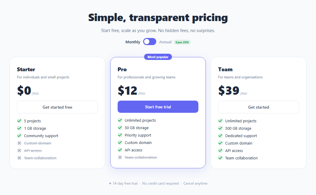
If you are building a SaaS landing page and need a pricing section that actually converts, this snippet gives you the complete HTML, CSS, and JavaScript in one copy-paste block. Three plan tiers, a monthly/annual billing toggle, a full feature comparison list, and a guarantee row — all styled with conversion-optimisation principles built in.
How the annual billing toggle works
The toggle uses two JavaScript arrays: one for monthly prices and one for annual prices. The switchBilling() function flips a boolean, picks the correct array, and updates each price element's textContent. A CSS knob slides right via transform: translateX(20px) when the .annual class is added to the button. The "Monthly" label dims and the "Annual" label brightens — both controlled by toggling a .dim class. The "Save 20%" badge stays visible on the annual label at all times, making the discount visible before the user interacts.
Featured plan design pattern
The middle Pro plan uses class="plan featured" which applies an accent-coloured border (border-color: #6366f1) and a soft coloured glow (box-shadow: 0 8px 32px rgba(99,102,241,0.15)). The "Most popular" badge sits outside the normal card flow: position: absolute; top: -12px; left: 50%; transform: translateX(-50%) centres it over the top edge so it appears to hover above the card. The CTA button uses a filled solid style instead of outline, further differentiating the recommended tier visually.
Check and cross feature icons without an icon library
The feature list items use CSS ::before pseudo-elements with background-image set to an inline SVG data URI. The SVG is URL-encoded — %3Csvg for the opening tag, %2316a34a for the green colour. No img tag, no external font, no library import. The green check circle appears on li.yes items and the grey cross on li.no items. The .no items also get text-decoration: line-through so excluded features are visually struck out — a deliberate UX pattern that makes plan differences obvious and encourages upgrades.
Grid layout with natural heights
The three-column layout uses display: grid; grid-template-columns: repeat(3,1fr); align-items: start. The align-items: start is important — without it, all cards would stretch to the same height as the tallest card, which looks wrong when feature list lengths differ. With start, each card is exactly as tall as its content. A responsive media query switches to a single column below 700px.
Customising this snippet
Change plan names, prices, and feature lists directly in the HTML. Update the monthly and annual arrays in the JS. Move class="plan featured" to whichever plan you want to highlight. Replace #6366f1 throughout the CSS to match your brand colour. The guarantee row text at the bottom is a plain paragraph — edit it to match your trial or refund policy.
Exporting for your stack
Click "JSX" to download a React component. Click "Tailwind" to download a React + Tailwind CSS version. Both export options convert the pricing section automatically. In React, manage isAnnual with useState and compute each price as isAnnual ? annual[i] : monthly[i].
Build with AI
Build, Understand, Optimize, and Extend It With AI
You don't have to work out the toggle-to-price-array wiring by hand. Paste this snippet's HTML, CSS, and JS into an AI coding assistant like Claude and ask it to explain exactly how switchBilling keeps the sliding knob's transform, the two label's dim classes, and the three price elements' text content all in sync from one boolean flip, and why align-items start on the plans grid matters when the three feature lists have different lengths. The same assistant can help optimize it, for example checking whether the inline SVG data-URI checkmarks in the feature list are the most maintainable approach if you need to add a fourth or fifth plan, or whether the monthly and annual price arrays should instead be a single array of objects keyed by plan for less error-prone indexing. It's also useful for extending the effect: ask it to wire each CTA button to a real Stripe Checkout session using the correct monthly or annual price ID, add a fourth Enterprise tier with a "Contact sales" CTA instead of a price, or animate the price number changing instead of an instant text swap. Treat the code less like a finished artifact and more like a starting point for a conversation.
Prompt to recreate it
Copy this into your AI assistant of choice to build the effect from scratch, or as a jumping-off point for your own variant:
Build a complete three-tier SaaS pricing page section in plain HTML, CSS, and vanilla JavaScript, with a working monthly/annual billing toggle — no libraries.

Requirements:
- A toggle switch styled as a pill-shaped button with a sliding circular knob, plus a "Monthly" label and an "Annual" label (with a small "Save 20%" chip always visible next to it) on either side, where clicking the toggle slides the knob to the opposite side using a CSS transform transition and dims whichever label is not currently active.
- Two parallel JavaScript arrays (one of monthly prices, one of annual prices, indexed the same way as the three plan cards) so that clicking the toggle updates every plan's displayed price by reading from whichever array matches the new billing period — with no page reload.
- Three plan cards laid out in a CSS grid that keeps each card exactly as tall as its own content (not stretched to match the tallest card), since the three feature lists have different lengths.
- One card marked as the featured/recommended plan with an accent border color, a soft colored box-shadow glow, and a "Most popular" badge that floats centered above the card's top edge regardless of the badge text's length.
- Every feature list item must show a green checkmark or a muted gray cross via a CSS pseudo-element referencing an inline, URL-encoded SVG data URI in background-image — no icon font, no separate image files — and excluded features must also get a line-through text style.
- A closing guarantee line below the three cards (trial length, no credit card required, cancel anytime) and make sure the toggle, the featured plan's accent color, and the checkmark colors are all easy to re-theme by changing a single hex value used consistently across the CSS.
Want to tighten it up first? Run this prompt through the AI Prompt Studio to score it across 8 quality dimensions, catch anti-patterns, and tune the wording for Claude, ChatGPT, or Gemini before you paste it in.
Step by step
How to Use
- 1Click the billing toggleToggle between Monthly and Annual pricing. The knob slides right, labels swap colour, and prices update from the JS arrays. No page reload needed.
- 2Update plan names and pricesIn the JS panel, edit the monthly and annual arrays — one number per plan. In the HTML, update the plan-name div, plan-desc, and CTA link text for each column.
- 3Update the feature listsEdit each li text inside the .feat-list. Apply class="yes" to included features (shows green check) and class="no" to excluded features (shows grey cross and line-through text).
- 4Change the featured plan columnMove class="plan featured" and the <div class="popular"> element to whichever plan column you want to highlight. The accent border, glow, and popular badge all move with it.
- 5Change the brand colourFind #6366f1 in the CSS panel and replace all instances with your hex. This updates the toggle, featured border, glow shadow, solid CTA button, and save chip in one pass.
- 6Export in your formatClick "HTML" to download a standalone file, "JSX" for a React component with isAnnual state, or "Tailwind" for a React + Tailwind CSS version. "Copy all" copies the full code.
Real-world uses
Common Use Cases
Got questions?
Frequently Asked Questions
Two JavaScript arrays — monthly and annual — hold one price per plan. switchBilling() flips the isAnnual boolean, selects the right array, and updates each .amount span via textContent. The CSS knob animation uses transform: translateX(20px) toggled by the .annual class on the button. The label colours swap by toggling a .dim class on each label span.
Each li::before pseudo-element uses background-image with an inline SVG data URI. The SVG markup is URL-encoded — spaces become %20, # becomes %23, angle brackets become %3C/%3E. A 16x16 circle provides the background fill, and the SVG draws the check or cross on top. This works in all modern browsers with no external dependency.
Add a fourth .plan div inside .plans and add a fourth price to both the monthly and annual arrays in the JS. Update the grid CSS to grid-template-columns: repeat(4,1fr). For responsive layouts, use repeat(auto-fill, minmax(220px,1fr)) instead — the browser places as many columns as fit the viewport width automatically.
Yes. Click "JSX" to download a React component. In React, replace the vanilla JS toggle with useState(false) for isAnnual. Compute each price as isAnnual ? annual[i] : monthly[i] inline. For Next.js, drop the component into a page file or import it as a section component. The Tailwind export converts all CSS classes to utility classes for Tailwind CSS v3+ projects.