Source Code
<div class="ftt-wrap">
  <table class="ftt-table" id="fttTable">
    <thead>
      <tr>
        <th class="ftt-corner">Feature</th>
        <th>Basic</th>
        <th>Pro</th>
        <th>Team</th>
      </tr>
    </thead>
    <tbody>
      <tr>
        <th>
          <span class="ftt-label">Rate limiting</span>
          <button type="button" class="ftt-info" data-tip="Caps how many API requests your account can make per minute, so one runaway script can't take down your account or affect other customers.">?</button>
        </th>
        <td>60/min</td><td>600/min</td><td>6,000/min</td>
      </tr>
      <tr>
        <th>
          <span class="ftt-label">Audit logs</span>
          <button type="button" class="ftt-info" data-tip="A timestamped, tamper-evident record of every login, permission change, and data export in your account — needed for SOC 2 and most compliance audits.">?</button>
        </th>
        <td data-no></td><td data-no></td><td data-yes></td>
      </tr>
      <tr>
        <th>
          <span class="ftt-label">Data residency</span>
          <button type="button" class="ftt-info" data-tip="Choose which geographic region your data is physically stored in (e.g. EU-only), rather than it defaulting to wherever capacity is available.">?</button>
        </th>
        <td data-no></td><td data-no></td><td data-yes></td>
      </tr>
      <tr>
        <th>
          <span class="ftt-label">Webhook retries</span>
          <button type="button" class="ftt-info" data-tip="If a webhook delivery to your server fails (e.g. it's briefly down), we automatically retry with backoff instead of silently dropping the event.">?</button>
        </th>
        <td data-no></td><td data-yes></td><td data-yes></td>
      </tr>
      <tr>
        <th>
          <span class="ftt-label">Seat-based billing</span>
          <button type="button" class="ftt-info" data-tip="You're billed per active user seat rather than a flat team price, so cost scales up or down automatically as people join or leave.">?</button>
        </th>
        <td data-yes></td><td data-yes></td><td data-yes></td>
      </tr>
    </tbody>
  </table>
</div>*{box-sizing:border-box;margin:0;padding:0}
body{font-family:system-ui,-apple-system,sans-serif;background:#f5f6fb;display:flex;justify-content:center;align-items:center;min-height:100vh;padding:24px}
.ftt-wrap{width:min(680px,96vw);overflow-x:auto}
.ftt-table{width:100%;border-collapse:collapse;background:#fff;border:1px solid #e7e9f2;border-radius:16px;overflow:visible;font-size:14px}
.ftt-table th,.ftt-table td{padding:13px 16px;text-align:center;border-bottom:1px solid #eef0f6}
.ftt-table tbody th{text-align:left;color:#3b4156;font-weight:600;white-space:nowrap;position:relative}
.ftt-corner{text-align:left;color:#9aa0b4;font-weight:600;font-size:13px}
.ftt-table thead th{color:#16182a;font-weight:800}
.ftt-table td{color:#3b4156}
.ftt-label{margin-right:6px}
.ftt-info{position:relative;display:inline-flex;align-items:center;justify-content:center;width:16px;height:16px;border-radius:50%;border:1.5px solid #c2c6d4;background:#fff;color:#8a8fac;font-size:10px;font-weight:800;font-family:inherit;cursor:pointer;line-height:1;padding:0}
.ftt-info:hover,.ftt-info:focus-visible{border-color:#6366f1;color:#6366f1}
.ftt-tooltip{position:absolute;bottom:calc(100% + 9px);left:0;width:230px;background:#16182a;color:#e7e9f7;font-size:11.5px;font-weight:500;line-height:1.5;padding:10px 12px;border-radius:9px;box-shadow:0 10px 30px rgba(0,0,0,.25);z-index:20;opacity:0;pointer-events:none;transform:translateY(4px);transition:opacity .12s,transform .12s}
.ftt-tooltip::after{content:'';position:absolute;top:100%;left:14px;border:6px solid transparent;border-top-color:#16182a}
.ftt-tooltip.ftt-visible{opacity:1;transform:translateY(0)}
td[data-yes]::after{content:'';display:inline-block;width:18px;height:18px;border-radius:50%;background:#10b981;-webkit-mask:url("data:image/svg+xml,%3Csvg xmlns='http://www.w3.org/2000/svg' viewBox='0 0 24 24' fill='none' stroke='white' stroke-width='3' stroke-linecap='round' stroke-linejoin='round'%3E%3Cpath d='M20 6L9 17l-5-5'/%3E%3C/svg%3E") center/12px no-repeat;mask:url("data:image/svg+xml,%3Csvg xmlns='http://www.w3.org/2000/svg' viewBox='0 0 24 24' fill='none' stroke='white' stroke-width='3' stroke-linecap='round' stroke-linejoin='round'%3E%3Cpath d='M20 6L9 17l-5-5'/%3E%3C/svg%3E") center/12px no-repeat;vertical-align:middle}
td[data-no]::after{content:'\2013';color:#c2c6d4;font-weight:700}
@media(max-width:560px){.ftt-table th,.ftt-table td{padding:10px 8px;font-size:12.5px}.ftt-tooltip{width:190px}}var infoButtons = document.querySelectorAll('.ftt-info');
// Build one tooltip element per info button, populated from its own
// data-tip text, so every row genuinely explains its own feature.
infoButtons.forEach(function (btn) {
var tooltip = document.createElement('div');
tooltip.className = 'ftt-tooltip';
tooltip.textContent = btn.dataset.tip;
tooltip.setAttribute('role', 'tooltip');
btn.parentElement.appendChild(tooltip);
btn.setAttribute('aria-describedby', '');
function show() { tooltip.classList.add('ftt-visible'); }
function hide() { tooltip.classList.remove('ftt-visible'); }
btn.addEventListener('mouseenter', show);
btn.addEventListener('mouseleave', hide);
btn.addEventListener('focus', show);
btn.addEventListener('blur', hide);
btn.addEventListener('click', function (e) {
e.preventDefault();
tooltip.classList.toggle('ftt-visible');
});
});
// Clicking anywhere outside a tooltip closes any open ones (for the
// click-to-toggle behavior on touch devices).
document.addEventListener('click', function (e) {
if (e.target.classList.contains('ftt-info')) return;
document.querySelectorAll('.ftt-tooltip.ftt-visible').forEach(function (t) {
t.classList.remove('ftt-visible');
});
});Learn Coding Visually
Learn to code with interactive, live-preview playgrounds — HTML, CSS, JavaScript, React & more.
 HTML Playground42 lessons · Click-based · Live preview
 CSS PlaygroundLearn CSS with a live editor
 JavaScript Playground60 lessons · DOM · Async · Canvas
 React PlaygroundLearn React with a live code editor
 GSAP PlaygroundLearn GSAP animation interactively
 SVG Playground44 lessons · shapes · paths · animation
 SCSS Playground45 lessons · Sass modules · tokens
 Tailwind PlaygroundLearn Tailwind CSS with a live editor
 Bootstrap 5 Playground50 lessons · live preview
Feature Table with Explainer Tooltips — Free Info-Icon Pricing Table (HTML/CSS/JS)
Feature Table with Explainer Tooltips · Pricing · Plain HTML, CSS & JS · Live preview
What's included
Features
About this UI Snippet
Feature Table with Explainer Tooltips — Explain Jargon Where It's Read
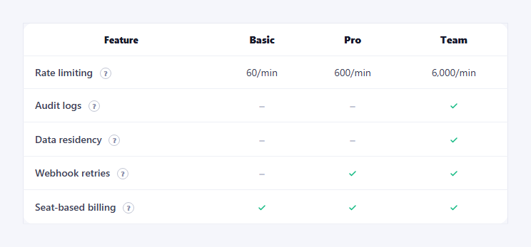
"Audit logs," "webhook retries," "data residency" — pricing tables are full of terms a buyer either already understands or has to leave the page to look up. This snippet keeps them on the page: every feature row gets its own small info icon, and hovering or tapping it reveals a plain-language tooltip explaining exactly what that row means, written specifically for that feature.
Genuinely distinct content per row
Each info button carries its own data-tip text — not a shared generic string. Rate limiting's tooltip explains request caps and why they exist; audit logs' tooltip explains what's logged and who needs it for compliance; data residency's explains choosing a storage region. Because the explanation lives on the button that triggers it, adding a new feature row with its own real tooltip is a one-attribute change, and no two rows ever show the same boilerplate text.
Tooltips built once, toggled cheaply
On load, the script creates one tooltip <div> per info button, reading its text from that button's own data-tip attribute and appending it into the same table cell. Showing and hiding afterward only toggles a ftt-visible class — no DOM creation happens on hover, so opening a tooltip is instant even on a table with many rows.
Works with mouse, keyboard, and touch
Hover and blur handle mouse users; focus/blur on the button make it reachable and dismissible by keyboard alone (a real <button>, not a styled span, so it's natively focusable); a click handler toggles the tooltip for touch devices where hover doesn't exist, with a document-level click listener that closes any open tooltip when you tap elsewhere. Three input modes, one visibility mechanism.
Real yes/no feature cells alongside the explanations
The rows that need it also carry data-yes/data-no cells rendered as CSS-masked checkmarks or a dash, the same pattern as a plain pricing feature table — the tooltip explains the row's *meaning*, the cell states each plan's actual *value*, and the two stay visually separate so neither is cluttered.
Where it fits
Use it as the technical-depth section below a simpler pricing card grid, pair it with a pricing faq for broader questions, or reuse it inside an enterprise pricing page where the jargon density is highest.
Customizing it
Add more rows and tooltip text freely — the DOM-construction loop scales to any number of buttons. Reposition tooltips (above vs. below the row) based on available viewport space, or swap the plain-text tooltip for one with a short "learn more" link.
Build with AI
Build, Understand, Optimize, and Extend It With AI
You don't have to design the accessible-tooltip pattern from scratch. Paste this snippet's HTML, CSS, and JS into an AI coding assistant like Claude and ask it to explain exactly how it builds one tooltip element per info button up front (reading each button's own data-tip text) rather than creating a shared tooltip and repositioning it, and why attaching focus/blur handlers alongside mouseenter/mouseleave — plus a separate click-to-toggle path with a document-level dismiss listener — covers mouse, keyboard, and touch input with a single consistent visibility mechanism. The same assistant can help you extend it: ask how to auto-flip a tooltip's position when it would overflow the viewport near the top of the page, how to support rich tooltip content (a short paragraph plus a "learn more" link) instead of plain text, or how to close a tooltip automatically when the Escape key is pressed. Treat the code less like a finished artifact and more like a starting point for a conversation.
Prompt to recreate it
Copy this into your AI assistant of choice to build the effect from scratch, or as a jumping-off point for your own variant:
Build a pricing feature comparison table where each feature row has an info icon revealing an explanatory tooltip, in plain HTML, CSS, and vanilla JavaScript with no framework or library.

Requirements:
- A real semantic table with a header row of plan names and a body where each row's label cell contains both the feature name and a small round button (an actual <button> element, not a styled span or icon font) that will trigger a tooltip.
- Store each row's explanation as a data attribute on its own info button (e.g. data-tip="..."), and make sure every row's explanation text is genuinely different and specific to that feature — not a shared placeholder string copy-pasted across rows.
- On page load, build one tooltip element per info button (reading its text from that button's own data-tip attribute) and insert it into the DOM near its button, rather than creating and destroying a tooltip element every time it's shown.
- Make the tooltip open on mouse hover AND on keyboard focus of the button (so it's usable without a mouse), and close on mouseleave/blur — plus support a click-to-toggle behavior for touch devices where hover doesn't apply, with a way to dismiss an open tooltip by clicking anywhere else on the page.
- Also include a couple of rows that use a supported/unsupported indicator per plan (rendered via a data attribute, not a raw checkmark character) alongside the tooltip-explained label, so the table shows both what a feature means and whether each plan includes it.
- Make sure the table remains usable on narrow viewports (horizontal scroll or a responsive layout) and that tooltip positioning and sizing adapt reasonably on small screens.
Want to tighten it up first? Run this prompt through the AI Prompt Studio to score it across 8 quality dimensions, catch anti-patterns, and tune the wording for Claude, ChatGPT, or Gemini before you paste it in.
Step by step
How to Use
- 1Paste HTML, CSS, and JSA five-row comparison table renders with an info icon per row.
- 2Hover an info iconIts own tooltip appears, explaining that specific feature.
- 3Tab to an icon with the keyboardFocus shows the tooltip; blur hides it — no mouse needed.
- 4Tap an icon on mobileClick toggles the tooltip open; tapping elsewhere closes it.
- 5Compare two rowsEach tooltip's wording is written specifically for that row.
- 6Add a new feature rowSet a fresh data-tip attribute — no other code changes needed.
Real-world uses
Common Use Cases
Got questions?
Frequently Asked Questions
No — each info button has its own data-tip attribute with wording written specifically for that feature. Rate limiting's tooltip explains request caps and why they matter, audit logs' explains what's tracked and why compliance teams need it, and data residency's explains choosing a storage region. No two rows share the same boilerplate.
On page load, the script loops over every .ftt-info button, creates one tooltip div per button using that button's own data-tip text as its content, and appends it into the table cell. After that, showing or hiding it is just toggling a CSS class (ftt-visible) — no new DOM elements are created on hover, keeping it fast even with many rows.
Yes. Each info trigger is a real <button> element (not a styled span), so it's natively reachable with Tab. The script attaches focus and blur listeners alongside mouseenter/mouseleave, so tabbing to an icon shows its tooltip and moving focus away hides it, with no mouse required.
Each button also has a click handler that toggles its own tooltip's visibility, and a separate document-level click listener closes any open tooltip when you tap anywhere that isn't an info button. This covers touch devices where hover events never fire.
Store which row's tooltip is open (if any) in a single piece of state, keyed by row id, and render each tooltip's visibility from that state rather than manipulating a class directly. Each row's explanation text lives as a plain string in your feature-row data rather than a data attribute, but the show/hide logic maps directly to state.