Source Code
<section class="section">
<div class="top-row">
<div class="plan-cards">
<div class="plan">
<div class="plan-name">Pro</div>
<div class="plan-price">$39<span>/mo</span></div>
<div class="plan-desc">For growing teams up to 25 seats</div>
<a href="#" class="btn-outline">Get started</a>
<ul class="feat-list">
<li>25 team seats</li>
<li>100 GB storage</li>
<li>Priority support</li>
<li>API access</li>
</ul>
</div>
<div class="plan enterprise">
<div class="ent-badge">Enterprise</div>
<div class="plan-name">Custom</div>
<div class="plan-price custom">Let's talk</div>
<div class="plan-desc">Tailored for large organisations and compliance needs</div>
<a href="#" class="btn-solid">Contact sales</a>
<ul class="feat-list">
<li class="ent">Unlimited seats</li>
<li class="ent">Unlimited storage</li>
<li class="ent">Dedicated account manager</li>
<li class="ent">SLA guarantee</li>
<li class="ent">SSO / SAML</li>
<li class="ent">Custom contract & billing</li>
<li class="ent">On-premise option</li>
</ul>
</div>
</div>
</div>
<div class="logos-strip">
<div class="logos-label">Trusted by enterprise teams at</div>
<div class="logos-row">
<span class="co">Acme Corp</span>
<span class="co">GlobalTech</span>
<span class="co">Nexus Group</span>
<span class="co">Vertex Inc</span>
<span class="co">Orbit Labs</span>
</div>
</div>
<div class="faq-strip">
<div class="faq-item" onclick="toggleFaq(this)">
<span>Can we trial Enterprise before committing?</span>
<span class="faq-chevron">+</span>
<div class="faq-ans">Yes — we offer a 30-day Enterprise pilot for qualified organisations. Contact our sales team to arrange a scoped trial with your own data.</div>
</div>
<div class="faq-item" onclick="toggleFaq(this)">
<span>Do you support SSO and SAML?</span>
<span class="faq-chevron">+</span>
<div class="faq-ans">Yes. Enterprise plans include SSO integration via SAML 2.0, supporting Okta, Azure AD, Google Workspace, and any standard identity provider.</div>
</div>
<div class="faq-item" onclick="toggleFaq(this)">
<span>What does the SLA guarantee cover?</span>
<span class="faq-chevron">+</span>
<div class="faq-ans">Enterprise SLAs cover 99.9% uptime with financial credits if breached, plus 24/7 incident response with a dedicated on-call contact for P0/P1 issues.</div>
</div>
</div>
</section>* { box-sizing: border-box; margin: 0; padding: 0; }
body { font-family: system-ui, sans-serif; background: #f8fafc; min-height: 100vh; padding: 40px 24px; }
.section { max-width: 800px; margin: 0 auto; display: flex; flex-direction: column; gap: 32px; }
.plan-cards { display: grid; grid-template-columns: 1fr 1fr; gap: 16px; }
@media (max-width: 600px) { .plan-cards { grid-template-columns: 1fr; } }
.plan { background: #fff; border: 1.5px solid #e2e8f0; border-radius: 18px; padding: 28px 24px; display: flex; flex-direction: column; gap: 16px; position: relative; }
.plan.enterprise { border-color: #6366f1; box-shadow: 0 8px 32px rgba(99,102,241,0.1); }
.ent-badge { position: absolute; top: -11px; right: 20px; background: #6366f1; color: #fff; font-size: 10px; font-weight: 700; letter-spacing: 0.5px; padding: 3px 12px; border-radius: 20px; }
.plan-name { font-size: 14px; font-weight: 700; color: #64748b; text-transform: uppercase; letter-spacing: 0.8px; }
.plan-price { font-size: 40px; font-weight: 900; color: #0f172a; line-height: 1; }
.plan-price span { font-size: 14px; font-weight: 500; color: #94a3b8; }
.plan-price.custom { font-size: 28px; color: #6366f1; }
.plan-desc { font-size: 13px; color: #64748b; line-height: 1.6; }
.btn-solid { background: #6366f1; color: #fff; font-size: 14px; font-weight: 700; padding: 11px; border-radius: 10px; text-decoration: none; text-align: center; transition: background 0.15s; }
.btn-solid:hover { background: #4f46e5; }
.btn-outline { background: transparent; color: #475569; font-size: 14px; font-weight: 600; padding: 11px; border-radius: 10px; text-decoration: none; text-align: center; border: 1.5px solid #e2e8f0; transition: all 0.15s; }
.btn-outline:hover { border-color: #6366f1; color: #6366f1; }
.feat-list { list-style: none; display: flex; flex-direction: column; gap: 8px; }
.feat-list li { font-size: 13px; color: #475569; display: flex; align-items: center; gap: 8px; }
.feat-list li::before { content: '✓'; font-size: 11px; font-weight: 700; width: 18px; height: 18px; border-radius: 50%; display: flex; align-items: center; justify-content: center; background: rgba(100,116,139,0.12); color: #475569; flex-shrink: 0; }
.feat-list li.ent::before { background: rgba(99,102,241,0.12); color: #6366f1; }
/* Logos */
.logos-strip { background: #fff; border: 1px solid #e2e8f0; border-radius: 14px; padding: 20px 24px; text-align: center; }
.logos-label { font-size: 11px; font-weight: 600; text-transform: uppercase; letter-spacing: 1px; color: #94a3b8; margin-bottom: 14px; }
.logos-row { display: flex; justify-content: center; gap: 28px; flex-wrap: wrap; }
.co { font-size: 14px; font-weight: 700; color: #cbd5e1; letter-spacing: 0.3px; }
/* FAQ */
.faq-strip { background: #fff; border: 1px solid #e2e8f0; border-radius: 14px; overflow: hidden; }
.faq-item { padding: 16px 20px; border-bottom: 1px solid #f1f5f9; cursor: pointer; display: grid; grid-template-columns: 1fr auto; gap: 12px; row-gap: 0; font-size: 14px; font-weight: 600; color: #0f172a; transition: background 0.12s; }
.faq-item:last-child { border-bottom: none; }
.faq-item:hover { background: #fafafa; }
.faq-chevron { font-size: 18px; font-weight: 300; color: #94a3b8; transition: transform 0.2s; }
.faq-item.open .faq-chevron { transform: rotate(45deg); color: #6366f1; }
.faq-ans { grid-column: 1 / -1; font-size: 13px; font-weight: 400; color: #64748b; line-height: 1.7; max-height: 0; overflow: hidden; transition: max-height 0.3s ease, padding-top 0.2s; }
.faq-item.open .faq-ans { max-height: 120px; padding-top: 10px; }function toggleFaq(item) {
item.classList.toggle('open');
}Learn Coding Visually
Learn to code with interactive, live-preview playgrounds — HTML, CSS, JavaScript, React & more.
 HTML Playground42 lessons · Click-based · Live preview
 CSS PlaygroundLearn CSS with a live editor
 JavaScript Playground60 lessons · DOM · Async · Canvas
 React PlaygroundLearn React with a live code editor
 GSAP PlaygroundLearn GSAP animation interactively
 SVG Playground44 lessons · shapes · paths · animation
 SCSS Playground45 lessons · Sass modules · tokens
 Tailwind PlaygroundLearn Tailwind CSS with a live editor
 Bootstrap 5 Playground50 lessons · live preview
Enterprise Pricing — Free HTML CSS JS Snippet
Enterprise Pricing · Pricing · Plain HTML, CSS & JS · Live preview
What's included
Features
About this UI Snippet
Enterprise Pricing — Custom "Let's Talk" Card, Feature Comparison, Logo Strip & Inline FAQ
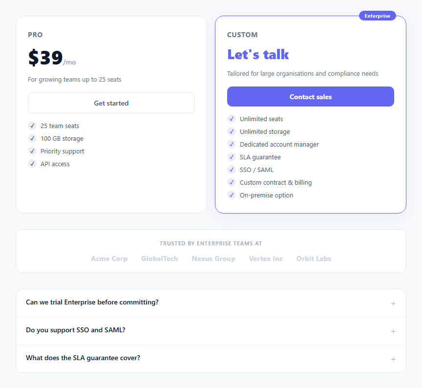
Enterprise pricing pages follow a specific pattern: one or two self-serve plans on the left (often a plan selector or pricing cards), and an enterprise custom pricing card on the right with a "Contact sales" or "Let's talk" CTA replacing a price. This snippet provides the complete enterprise pricing section: a Pro plan card alongside an Enterprise custom pricing card with highlighted features, a trusted-by logo strip, and an inline FAQ accordion for the three most common enterprise objections.
The Enterprise custom pricing card
The Enterprise card uses "Let's talk" instead of a price — the standard pattern for custom enterprise deals where pricing depends on seat count, contract length, and compliance requirements. The card has an accent border (indigo), a coloured box-shadow glow, and a floating "Enterprise" badge at the top-right. Feature list items use an indigo checkmark icon instead of grey, visually signalling premium tier.
Feature list differentiation
Pro features use grey check circles (.feat-list li::before). Enterprise features use indigo check circles (.ent). This colour distinction reinforces which tier each feature belongs to when the cards are compared side by side.
The trusted-by logo strip
A muted logo strip below the cards communicates that other enterprise organisations have trusted your product. In production, replace the text placeholders with actual company SVG wordmarks at consistent opacity.
The inline FAQ accordion
Three enterprise-specific FAQ questions answer the most common sales objections: trial availability, SSO/SAML support, and SLA coverage. These questions match the real blockers in enterprise procurement conversations. The accordion uses a CSS max-height transition — the same pattern as the Pricing FAQ snippet.
When to use this page
Add the enterprise pricing section below your standard pricing tiers when your product has an enterprise tier. It signals to enterprise buyers that you take their needs seriously — compliance, SSO, dedicated support, custom contracts — without burying this information in a separate page.
The inline FAQ
Three enterprise-specific FAQ questions placed directly on the pricing page address the most common procurement blockers without requiring a separate FAQ page navigation. Enterprise procurement teams evaluate multiple vendors simultaneously. Removing even one extra click from the evaluation process reduces dropout. The max-height CSS accordion keeps questions compact while revealing full detail answers on demand — using the same pattern as the standalone Pricing FAQ snippet in this library.
Build with AI
Build, Understand, Optimize, and Extend It With AI
You don't have to take the max-height accordion trick on faith. Paste this snippet's HTML, CSS, and JS into an AI coding assistant like Claude and ask it to explain exactly why the FAQ answer uses a max-height transition instead of animating height directly, and what the fixed 120px ceiling means for an answer that turns out to be longer than expected. The same assistant can help optimize it — ask whether the enterprise card's box-shadow glow and the Pro card's plain border are doing enough visual differentiation on a very wide screen, and whether the toggleFaq function should close other open FAQ items when one opens instead of allowing several to stay open at once. It's also useful for extending the section: ask it to add a third pricing tier between Pro and Enterprise, wire the Contact sales button to a real scheduling link, or add per-plan annual/monthly billing toggle that updates both cards' prices together. Treat the code less like a finished artifact and more like a starting point for a conversation.
Prompt to recreate it
Copy this into your AI assistant of choice to build the effect from scratch, or as a jumping-off point for your own variant:
Build an enterprise pricing section in plain HTML, CSS, and JavaScript with a two-tier comparison card, a logo strip, and an accordion FAQ — no library.

Requirements:
- A responsive two-column grid of pricing cards (collapsing to one column on narrow viewports) where the first card shows a standard numeric price and the second, enterprise card shows "Let's talk" text in place of a price, since enterprise pricing is negotiated rather than fixed.
- The enterprise card must be visually distinguished with an accent-colored border, a colored box-shadow glow, and a floating badge positioned with absolute positioning at its top edge, overlapping the card's own border.
- Each card's feature list must use a checkmark icon built from a pseudo-element (not an image), with the enterprise card's checkmarks rendered in the accent color and the standard card's checkmarks in a neutral gray, so the two feature sets are visually distinguishable at a glance.
- A muted "trusted by" logo strip below the cards showing several company names or wordmarks at reduced opacity.
- A FAQ accordion where each question is a clickable row that toggles an "open" class on itself; the answer element's height transition must be implemented with a max-height CSS transition (not height directly, since height cannot transition from auto), and a chevron or plus icon must rotate via CSS transform when its row is open.
- The accordion's JavaScript must be a single generic toggle function reused by every FAQ row via a shared click handler, not per-row duplicated logic.
- Ensure the enterprise card's call-to-action is textually and visually distinct from the standard card's self-serve signup button (e.g. "Contact sales" versus "Get started"), since they lead to different conversion paths.
Want to tighten it up first? Run this prompt through the AI Prompt Studio to score it across 8 quality dimensions, catch anti-patterns, and tune the wording for Claude, ChatGPT, or Gemini before you paste it in.
Step by step
How to Use
- 1Update the Pro plan price and featuresChange $39/mo and the feature list items in the Pro card. The btn-outline CTA links to your self-serve signup URL.
- 2Update the Enterprise feature listEdit the Enterprise .feat-list li.ent items to match your actual enterprise tier features — SSO, SLA, dedicated support, custom billing, HIPAA compliance, etc.
- 3Wire the Contact sales buttonSet href="#" on .btn-solid to your Calendly link, HubSpot form, or sales team email (mailto:). The enterprise CTA should open a low-friction contact path — not a full pricing form.
- 4Replace the logo placeholdersReplace the .co text spans with actual customer company SVG wordmarks. Use consistent height (24px) and opacity (0.3–0.5) for all logos to maintain visual cohesion.
- 5Update the FAQ questionsEdit the three FAQ question and answer texts to match your actual enterprise differentiators. Common questions: trial length, data residency, security certifications (SOC 2, ISO 27001), GDPR compliance, custom SLAs.
- 6Export in your formatClick "HTML" for a standalone file, "JSX" for a React component, or "Tailwind" for a Tailwind CSS version.
Real-world uses
Common Use Cases
Got questions?
Frequently Asked Questions
Replace href="#" on .btn-solid with your Calendly URL: https://calendly.com/your-team/enterprise-demo. Or open an in-page modal (see the Modal snippet in this library): onclick="openSalesModal()". For HubSpot: use their Meetings embed link. For a mailto: link: href="mailto:sales@yourcompany.com?subject=Enterprise inquiry". The important thing is to minimise friction — a direct Calendly link converts better than a form for enterprise buyers who are time-poor.
Add a third card div to .plan-cards in the HTML. Change grid-template-columns to repeat(3, 1fr). For responsive, add @media (max-width:800px) { .plan-cards { grid-template-columns: 1fr 1fr; } } and @media (max-width:500px) { .plan-cards { grid-template-columns: 1fr; } }. Keep the Enterprise card rightmost with the accent border.
Add a badge div inside .plan (the non-enterprise card): <div class="popular-badge">Most popular</div>. Style it: position: absolute; top: -11px; left: 20px; background: #f59e0b; color: #fff; font-size: 10px; font-weight: 700; padding: 3px 12px; border-radius: 20px. The .plan div already has position: relative. Give the Pro card a yellow or amber accent border to differentiate it from the Enterprise indigo border.
Yes. Click "JSX" to download. The FAQ toggle needs "use client" since it uses onclick. Manage open FAQ state with useState<number|null>(null). Apply the open class conditionally: className={"faq-item" + (openIdx === i ? " open" : "")}. The rest of the component can be a Server Component in Next.js App Router — no client-side JavaScript for the static card and logo content.