Source Code
<div class="ass-wrap">
  <div class="ass-head">
    <h2>Pricing that fits how you work</h2>
    <div class="ass-toggle" role="tablist">
      <button type="button" class="ass-opt active" data-segment="individual" role="tab" aria-selected="true">Individuals</button>
      <button type="button" class="ass-opt" data-segment="team" role="tab" aria-selected="false">Teams</button>
      <span class="ass-thumb" id="assThumb"></span>
    </div>
  </div>

  <div class="ass-cards" id="assCards"><!-- populated by JS --></div>
</div>*{box-sizing:border-box;margin:0;padding:0}
body{font-family:system-ui,-apple-system,sans-serif;background:#f1f5f9;min-height:100vh;padding:44px 20px}
.ass-wrap{max-width:900px;margin:0 auto}
.ass-head{text-align:center;margin-bottom:32px}
.ass-head h2{font-size:26px;font-weight:800;color:#0f172a;margin-bottom:18px;letter-spacing:-.01em}
.ass-toggle{position:relative;display:inline-flex;background:#e2e8f0;border-radius:999px;padding:4px}
.ass-opt{position:relative;z-index:2;border:none;background:none;font-family:inherit;font-size:13.5px;font-weight:700;color:#475569;padding:10px 24px;border-radius:999px;cursor:pointer;transition:color .25s}
.ass-opt.active{color:#0f172a}
.ass-thumb{position:absolute;top:4px;left:4px;height:calc(100% - 8px);width:calc(50% - 4px);background:#fff;border-radius:999px;box-shadow:0 3px 10px rgba(15,23,42,.12);transition:transform .3s cubic-bezier(.4,0,.2,1);z-index:1}
.ass-thumb.shift{transform:translateX(100%)}
.ass-cards{display:grid;grid-template-columns:repeat(3,1fr);gap:18px;transition:opacity .2s ease}
.ass-cards.swapping{opacity:0}
@media (max-width:760px){.ass-cards{grid-template-columns:1fr}}
.ass-card{background:#fff;border-radius:16px;padding:26px 22px;border:1.5px solid #e2e8f0;position:relative}
.ass-card.featured{border-color:#6366f1;box-shadow:0 16px 40px rgba(99,102,241,.14)}
.ass-card-badge{position:absolute;top:-11px;left:50%;transform:translateX(-50%);background:#6366f1;color:#fff;font-size:10.5px;font-weight:800;padding:4px 12px;border-radius:999px;text-transform:uppercase;letter-spacing:.04em}
.ass-tier{font-size:14px;font-weight:800;color:#0f172a;margin-bottom:6px}
.ass-tagline{font-size:12.5px;color:#94a3b8;margin-bottom:16px;min-height:32px}
.ass-price{font-size:32px;font-weight:800;color:#0f172a;margin-bottom:2px}
.ass-price span{font-size:13px;font-weight:600;color:#94a3b8}
.ass-per{font-size:12px;color:#94a3b8;margin-bottom:18px}
.ass-features{list-style:none;display:flex;flex-direction:column;gap:9px;margin-bottom:20px}
.ass-features li{font-size:12.5px;color:#475569;padding-left:20px;position:relative;font-weight:600}
.ass-features li::before{content:'✓';position:absolute;left:0;color:#16a34a;font-weight:800}
.ass-btn{width:100%;border-radius:9px;padding:11px;font-size:13.5px;font-weight:700;cursor:pointer;font-family:inherit;border:1.5px solid #e2e8f0;background:#fff;color:#0f172a;transition:background .15s}
.ass-card.featured .ass-btn{background:#6366f1;color:#fff;border-color:#6366f1}// Two entirely separate plan datasets, not a shared template with a swapped label —
// switching segments changes which plans exist, not just their price.
var PLANS = {
individual: [
{ tier: 'Starter', tagline: 'Try it out, no card required', price: '0', per: 'forever free', features: ['3 active projects', '1 GB storage', 'Community support'], cta: 'Get started', featured: false },
{ tier: 'Plus', tagline: 'For serious solo work', price: '9', per: 'per month', features: ['Unlimited projects', '25 GB storage', 'Priority email support', 'Custom themes'], cta: 'Start free trial', featured: true },
{ tier: 'Pro', tagline: 'Freelancers billing clients', price: '19', per: 'per month', features: ['Everything in Plus', 'Client-facing sharing links', 'Invoicing tools', 'Export to PDF/CSV'], cta: 'Start free trial', featured: false },
],
team: [
{ tier: 'Team', tagline: 'Small teams getting started', price: '15', per: 'per user / month', features: ['Unlimited projects', 'Shared team workspace', 'Role-based permissions', '100 GB pooled storage'], cta: 'Start free trial', featured: false },
{ tier: 'Business', tagline: 'Growing teams that need control', price: '29', per: 'per user / month', features: ['Everything in Team', 'SSO and SCIM provisioning', 'Advanced audit logs', 'Priority chat support'], cta: 'Start free trial', featured: true },
{ tier: 'Enterprise', tagline: 'Custom contracts at scale', price: 'Custom', per: 'talk to sales', features: ['Everything in Business', 'Dedicated success manager', 'Custom SLA and uptime terms', 'On-premise deployment option'], cta: 'Contact sales', featured: false },
]
};
var opts = document.querySelectorAll('.ass-opt');
var thumb = document.getElementById('assThumb');
var cardsEl = document.getElementById('assCards');
function cardHtml(plan) {
var priceDisplay = plan.price === 'Custom'
? plan.price
: '$' + plan.price;
var featureItems = plan.features.map(function (f) {
return '<li>' + f + '</li>';
}).join('');
return (
'<div class="ass-card' + (plan.featured ? ' featured' : '') + '">' +
(plan.featured ? '<span class="ass-card-badge">Most popular</span>' : '') +
'<div class="ass-tier">' + plan.tier + '</div>' +
'<div class="ass-tagline">' + plan.tagline + '</div>' +
'<div class="ass-price">' + priceDisplay + '</div>' +
'<div class="ass-per">' + plan.per + '</div>' +
'<ul class="ass-features">' + featureItems + '</ul>' +
'<button type="button" class="ass-btn">' + plan.cta + '</button>' +
'</div>'
);
}
function renderSegment(segment) {
cardsEl.innerHTML = PLANS[segment].map(cardHtml).join('');
}
function switchTo(segment, shiftThumb) {
cardsEl.classList.add('swapping');
window.setTimeout(function () {
renderSegment(segment);
cardsEl.classList.remove('swapping');
}, 160);
if (shiftThumb) {
thumb.classList.toggle('shift', segment === 'team');
}
}
opts.forEach(function (btn) {
btn.addEventListener('click', function () {
opts.forEach(function (b) {
b.classList.remove('active');
b.setAttribute('aria-selected', 'false');
});
btn.classList.add('active');
btn.setAttribute('aria-selected', 'true');
switchTo(btn.dataset.segment, true);
});
});
renderSegment('individual');Learn Coding Visually
Learn to code with interactive, live-preview playgrounds — HTML, CSS, JavaScript, React & more.
 HTML Playground42 lessons · Click-based · Live preview
 CSS PlaygroundLearn CSS with a live editor
 JavaScript Playground60 lessons · DOM · Async · Canvas
 React PlaygroundLearn React with a live code editor
 GSAP PlaygroundLearn GSAP animation interactively
 SVG Playground44 lessons · shapes · paths · animation
 SCSS Playground45 lessons · Sass modules · tokens
 Tailwind PlaygroundLearn Tailwind CSS with a live editor
 Bootstrap 5 Playground50 lessons · live preview
Pricing with Audience Segment Switcher — Free Snippet
Pricing with Audience Segment Switcher · Pricing · Plain HTML, CSS & JS · Live preview
What's included
Features
About this UI Snippet
Pricing with Audience Segment Switcher — Two Full Plan Sets, One Toggle
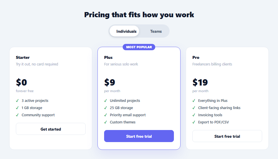
Most pricing toggles switch a billing period — monthly becomes annual, the same three plans just get cheaper. This snippet's toggle does something different: it switches the *audience*, and with it, an entirely different set of plans. "Individuals" shows a Starter/Plus/Pro lineup built around solo work; "Teams" shows a Team/Business/Enterprise lineup built around seats, permissions, and SSO. The two segments don't share a single plan — flipping the toggle is closer to visiting two separate pricing pages than adjusting one number.
A dataset per segment, not a template with conditionals
PLANS is a plain object with two keys, individual and team, each holding an array of plan objects with their own tier, tagline, price, per, features, cta, and featured fields. There is no shared plan template with an if (segment === 'team') branch buried inside it — each array is a complete, independently editable dataset. This matters because individual and team plans rarely differ by just a price: the feature sets, the number of tiers, and even the pricing unit (flat monthly vs. per-user-per-month) can all differ, and a shared-template approach would fight that reality.
`cardHtml()` renders any plan object the same way
Regardless of which segment it came from, every plan object is rendered by one cardHtml(plan) function that builds a card's markup from the plan's fields — including a special case for plan.price === 'Custom' (the Enterprise tier), which renders without a dollar sign, and a conditional ass-card-badge for whichever plan has featured: true. Because both segments' plan objects share the same shape, adding a segment or changing which plans have three vs. four tiers requires no changes to cardHtml() at all.
The cross-fade swap, not an instant re-render
Switching segments doesn't call renderSegment() directly — it goes through switchTo(), which first adds a .swapping class (opacity: 0, CSS-transitioned) to the card grid, waits 160ms for that fade-out to visually complete, *then* re-renders the grid's innerHTML with the new segment's cards and removes .swapping to fade back in. Re-rendering the DOM while the old cards are still fully visible would show a jarring instant content swap — even though the content change here is much larger than a single price update (going from a 3-tier layout to a possibly-differently-priced 3-tier layout with completely different copy), the same fade timing pattern smooths it out.
The sliding pill toggle
The two toggle buttons sit above an absolutely-positioned .ass-thumb element that slides between them via transform: translateX(100%), toggled by a .shift class — the same mechanic used for segmented iOS-style controls. This is deliberately decoupled from the card re-render: the thumb position update and the card content swap happen independently side by side, called from the same click handler.
Handling a plan with no numeric price
The Enterprise plan's price field is the string 'Custom' rather than a number. cardHtml() checks for this specific value and skips prefixing a dollar sign, so "Custom" renders on its own rather than as the nonsensical "$Custom". This is a common real-world requirement for enterprise tiers where price is negotiated, not published.
Extending to a third segment
Add a third key to PLANS (say, nonprofit) with its own array of plan objects, add a third .ass-opt toggle button with data-segment="nonprofit", and adjust the thumb's CSS width from calc(50% - 4px) to roughly a third — the same adjustment needed for a three-option toggle in general, since the current thumb math assumes exactly two segments.
Why this differs from a monthly/annual toggle
A monthly/annual toggle (see Pricing Toggle) recomputes one price on the same fixed set of plans. This snippet's toggle swaps the entire plan array — different tier names, different feature sets, sometimes a different number of tiers altogether — because "for individuals" and "for teams" describe genuinely different products, not just a different way of paying for the same one.
Build with AI
Build, Understand, Optimize, and Extend It With AI
Rather than untangling a single template trying to serve two very different plan sets, paste this snippet's HTML, CSS, and JS into an AI coding assistant like Claude and ask it to explain why PLANS is structured as two fully independent arrays instead of one shared array with per-plan conditionals for "individual" vs "team" fields — and what maintenance problems the conditional approach tends to cause as the two segments' plans diverge further over time. The same assistant is useful for extending the pattern: ask it to add a third audience segment and generalize the sliding-thumb math from a fixed 50% width to one computed from the number of options, or to make the fade-swap duration configurable. It can also help you think through whether a "Custom" priced tier needs a contact form modal wired to its CTA button rather than the same generic click handler as the other plans. Treat the code less like a finished artifact and more like a starting point for a conversation.
Prompt to recreate it
Copy this into your AI assistant of choice to build the effect from scratch, or as a jumping-off point for your own variant:
Build a pricing section in plain HTML, CSS, and vanilla JavaScript with a two-option sliding pill toggle ("Individuals" / "Teams") that swaps the entire grid of pricing cards to a completely different, independently-defined set of plans — not just a price change on the same cards — no library.

Requirements:
- A JavaScript data object with two keys, each holding an array of plan objects (tier name, short tagline, price, billing-period label, an array of feature strings, a CTA button label, and a boolean marking whether it's the featured/most-popular tier). The two arrays should be free to have a different number of plans and different feature counts from each other.
- One shared rendering function that takes a single plan object and returns its card markup, used identically regardless of which segment array the plan came from. It must handle a plan whose price is the literal string "Custom" (for a negotiated enterprise-style tier) by omitting the dollar-sign prefix that every other numeric-priced plan gets.
- Clicking a toggle option must fade the current card grid to transparent via a CSS transition, and only after that transition's duration has elapsed, replace the grid's contents with the newly selected segment's rendered cards and fade the grid back to visible — not swap the content instantly while still opaque.
- The toggle itself should be a segmented control: two buttons layered over one absolutely-positioned sliding "thumb" element that animates from behind one button to behind the other via a CSS transform transition when the active option changes.
- The featured/most-popular card in whichever segment is showing should have a visually distinct border and a small badge, driven by that plan's own data field rather than a fixed card position.
Want to tighten it up first? Run this prompt through the AI Prompt Studio to score it across 8 quality dimensions, catch anti-patterns, and tune the wording for Claude, ChatGPT, or Gemini before you paste it in.
Step by step
How to Use
- 1Click Individuals or TeamsThe entire card grid cross-fades to a completely different plan set, not just updated prices on the same cards.
- 2Edit a segment's plansIn the JS panel, edit the array under PLANS.individual or PLANS.team — each plan object has tier, tagline, price, per, features, cta, and featured fields.
- 3Add or remove a tierAdd or delete a plan object from either array — cardHtml() renders however many plans exist with no other changes needed.
- 4Handle a custom/negotiated priceSet a plan's price field to the string "Custom" (as the Enterprise tier does) to skip the dollar-sign prefix.
- 5Add a third segmentAdd a new key to PLANS, a matching toggle button with a data-segment attribute, and adjust the thumb width/shift logic for three options.
- 6Export in your formatClick "HTML" for a standalone file, "JSX" for a React component, or "Tailwind" for a React + Tailwind version.
Real-world uses
Common Use Cases
Got questions?
Frequently Asked Questions
A monthly/annual toggle recomputes one price on the same fixed set of plans. This toggle swaps the entire array of plan objects — different tier names, different feature lists, sometimes a different number of tiers and even a different pricing unit (per-user vs flat) — because the two audiences represent genuinely different offerings, not just a different way of paying for the same plans.
Clicking a segment button first adds a .swapping class (opacity: 0, CSS-transitioned) to the card grid, then waits 160ms — matched to that transition's duration — before rewriting the innerHTML with the new segment's cards and removing .swapping to fade back in. Re-rendering the grid instantly, without this fade sequence, would show the old cards vanish and the new ones appear in the same frame, reading as a layout glitch rather than an intentional transition.
cardHtml() checks whether a plan's price field is exactly the string "Custom". If so, it renders that string directly with no dollar-sign prefix; every other plan's numeric price string gets a $ prepended. This lets a negotiated-price tier live in the same data array and render through the same function as every other plan.
Add a new key to the PLANS object (for example PLANS.nonprofit) holding its own array of plan objects in the same shape as the individual and team arrays, add a third toggle button with data-segment="nonprofit", and change the thumb's CSS width from calc(50% - 4px) to roughly a third of the toggle's width, since the current sliding-thumb math assumes exactly two segments.
Yes. Each segment is just an array under PLANS, and cardHtml() is mapped over whatever plans exist in that array with no assumption about a fixed count. One segment could have two plans and another could have four with no code changes required beyond editing the data.
Each plan object carries its own featured: true/false flag, and cardHtml() conditionally adds the .featured class and the "Most popular" badge based on that flag rather than always highlighting, say, the second card. This means the featured tier can be a different position (or absent entirely, as in the Enterprise-anchored team segment) per segment without touching the rendering logic.