You Might Also Like
Learn Coding Visually
Learn to code with interactive, live-preview playgrounds — HTML, CSS, JavaScript, React & more.
 HTML Playground42 lessons · Click-based · Live preview
 CSS PlaygroundLearn CSS with a live editor
 JavaScript Playground60 lessons · DOM · Async · Canvas
 React PlaygroundLearn React with a live code editor
 GSAP PlaygroundLearn GSAP animation interactively
 SVG Playground44 lessons · shapes · paths · animation
 SCSS Playground45 lessons · Sass modules · tokens
 Tailwind PlaygroundLearn Tailwind CSS with a live editor
 Bootstrap 5 Playground50 lessons · live preview
Feature Comparison Matrix Table — Free HTML CSS Pricing Table Snippet
Feature Comparison Matrix Table · Pricing · Plain HTML, CSS & JS · Live preview
What's included
Features
About this UI Snippet
Feature Comparison Matrix Table — HTML & CSS Pricing Comparison
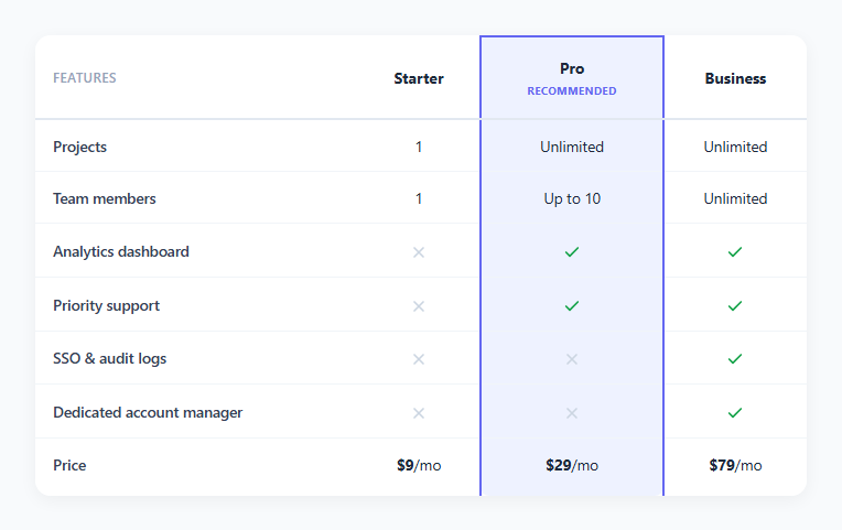
When a pricing page has more than a couple of plans, a simple side-by-side card layout stops being enough — buyers need to compare specific features row by row across every plan. A feature comparison matrix solves this: plans become columns, features become rows, and each cell shows either a checkmark, an X, or a specific value like "Unlimited" or "Up to 10."
This snippet builds that matrix in plain HTML and CSS, with one plan visually called out as the recommended option.
How the checkmark/x cells work
Each boolean feature cell contains a small inline SVG — either a checkmark path or an X path — wrapped in a .cell-icon span with either a .yes or .no class. .yes colors the icon green, .no colors it a muted gray, so scanning down a column instantly shows which features that plan includes. For non-boolean features (like "Team members"), the cell just contains plain text — "1", "Up to 10", "Unlimited" — since a checkmark can't represent a variable value.
How the recommended column highlight works
Every single cell in the "Pro" column — its header, and every cell in every row below it — shares one .recommended class. That class applies a tinted background and colored left/right borders. Because the class is repeated down the entire column rather than applied once to a wrapping element, the highlight forms one continuous vertical band that reads clearly even though HTML tables have no native way to style "a column" as a single unit — CSS can only target table cells individually (or via the more limited <colgroup>/<col> elements, which can't set borders or many other properties reliably across browsers). Repeating the class on every cell is the standard, most reliable workaround.
Rounding the highlighted column's corners
The recommended column's header gets border-radius: 8px 8px 0 0 and its last-row cell gets border-radius: 0 0 8px 8px, so the continuous highlighted band reads as one rounded "card" floating within the otherwise flat table — a detail that reinforces the column's separateness from its neighbors.
Why use a table element at all instead of a CSS grid of cards
A real <table> keeps the semantic row/column relationship intact — a screen reader can announce "Pro, Analytics dashboard: yes" correctly, and the browser's native table layout keeps every row's cells vertically aligned across columns automatically, which is exactly the alignment guarantee you want when comparing plans feature-by-feature.
Build with AI
Build, Understand, Optimize, and Extend It With AI
Give this snippet's HTML and CSS to an AI coding assistant like Claude and ask it to explain why highlighting an entire table column in CSS requires repeating a single class on every cell in that column, rather than using a single selector the way you would highlight an entire row — and to review whether the <colgroup>/<col> alternative would work for your specific styling needs (it generally cannot set borders reliably, which is why the repeated-class approach is used here). It's also worth asking the assistant to help add proper accessible text alongside the decorative checkmark/x icons, and to generate the JavaScript template function that would render this exact table structure from a features/plans config object or CMS collection, so the comparison data can be maintained separately from the markup.
Prompt to recreate it
Copy this into your AI assistant of choice to build the effect from scratch, or as a jumping-off point for your own variant:
Build a pricing feature comparison table in plain HTML and CSS — no JavaScript required for the static version, no pricing-table library.

Requirements:
- A real semantic <table> with a header row listing plan names as columns and a first column listing feature names as rows, so the row/column relationships are correctly understood by assistive technology.
- Each boolean feature cell must show either a checkmark or an X using inline SVG icons (not an icon font), colored distinctly (e.g. green for included, muted gray for not included) via a shared class rather than one-off inline styles.
- At least one row must show a non-boolean value (such as a specific number or "Unlimited") instead of a checkmark, demonstrating the table supports both feature types.
- Exactly one plan column must be visually highlighted as "recommended" — every cell in that column, including its header, must share one repeated CSS class that gives the entire column a continuous tinted background and colored side borders, with rounded corners on the very top and very bottom cells of that column so it reads as a distinct floating card within the table.
- Wrap the table in a horizontally scrollable container so it remains usable on narrow mobile screens without squeezing columns unreadably thin.
- The markup pattern for one row must be simple and repeatable enough to be generated from a plans/features configuration object via a small template function.
Want to tighten it up first? Run this prompt through the AI Prompt Studio to score it across 8 quality dimensions, catch anti-patterns, and tune the wording for Claude, ChatGPT, or Gemini before you paste it in.
Step by step
How to Use
- 1Load the snippetClick "Feature Comparison Matrix Table" in the sidebar Library tab to see a three-plan comparison table with the Pro column highlighted.
- 2Scroll horizontally on narrow screensSwitch to the Mobile device preview — the table scrolls horizontally within its wrapper rather than squeezing columns unreadably thin.
- 3Add a feature rowIn the HTML panel, copy an existing <tr> and add a new feature name plus one cell per plan, remembering to add the recommended class to whichever cell falls under the highlighted plan.
- 4Change which plan is recommendedMove the recommended class from the Pro column's header and cells to a different plan's corresponding header and cells throughout the table.
- 5Restyle the highlightIn the CSS panel, adjust the background tint and border color on the .recommended selectors to match your brand accent.
- 6Export in your formatClick "HTML" for a standalone file, "JSX" for React, or "Tailwind" for React + Tailwind CSS.
Real-world uses
Common Use Cases
Got questions?
Frequently Asked Questions
CSS has no direct selector for "an entire table column" the way it does for rows. Instead, every cell that belongs to the highlighted column — its header and every row's cell in that position — shares one repeated .recommended class, which applies a consistent tinted background and border to each cell individually, forming what visually reads as one continuous highlighted band.
Remove the recommended class from every cell currently in that column (the header and each row's corresponding <td>) and add it to the equivalent cells under the plan you want to highlight instead — the CSS rules apply automatically based on the class, with no other markup changes.
Yes. Rows like "Team members" simply put plain text inside the <td> instead of the cell-icon markup — "Unlimited", "Up to 10", or any other value works, since not every feature is a strict yes/no.
A semantic <table> preserves the row/column relationships in a way screen readers understand natively, announcing something like "Pro, Analytics dashboard: yes" correctly. It also guarantees every row's cells align vertically across all columns automatically, which is the core requirement of a comparison matrix.
The table sits inside a .matrix-wrap container with overflow-x: auto, so on narrow screens the whole table becomes horizontally scrollable rather than squeezing its columns down to an unreadable width.
Copy an existing <tr> in the tbody, change the feature name in the first cell, and update each plan's cell to either the checkmark/x icon markup or a plain text value — remembering to keep the recommended class on whichever cell falls under the highlighted plan.
Yes. Apply position: sticky; left: 0 with an opaque background to every .feature-col cell, similar to the technique used for a sticky table header, so the feature names remain visible as the plan columns scroll beneath them.
The icons are decorative SVGs with no accessible text by default. For full accessibility, add a visually-hidden text node inside each cell (like "Included" or "Not included") alongside the icon, so screen reader users hear the actual meaning rather than nothing at all.