Source Code
<section class="section">
  <div class="section-head">
    <h2 class="section-title">Choose your plan</h2>
    <p class="section-sub">Change or cancel at any time. No hidden fees.</p>
  </div>

  <div class="plans" id="plans">

    <label class="plan-card" data-plan="starter">
      <input type="radio" name="plan" value="starter" onchange="selectPlan('starter')">
      <div class="plan-inner">
        <div class="plan-check"><svg width="13" height="13" viewBox="0 0 24 24" fill="none" stroke="currentColor" stroke-width="3" stroke-linecap="round"><polyline points="20 6 9 17 4 12"/></svg></div>
        <div class="plan-name">Starter</div>
        <div class="plan-price">$0<span>/mo</span></div>
        <div class="plan-desc">Perfect for individuals and small projects just getting started.</div>
        <ul class="plan-features">
          <li>✓ 5 projects</li>
          <li>✓ 1 GB storage</li>
          <li>✓ Community support</li>
        </ul>
      </div>
    </label>

    <label class="plan-card featured" data-plan="pro">
      <input type="radio" name="plan" value="pro" checked onchange="selectPlan('pro')">
      <div class="plan-popular">Most popular</div>
      <div class="plan-inner">
        <div class="plan-check"><svg width="13" height="13" viewBox="0 0 24 24" fill="none" stroke="currentColor" stroke-width="3" stroke-linecap="round"><polyline points="20 6 9 17 4 12"/></svg></div>
        <div class="plan-name">Pro</div>
        <div class="plan-price">$12<span>/mo</span></div>
        <div class="plan-desc">For professional teams that need more power and collaboration.</div>
        <ul class="plan-features">
          <li>✓ Unlimited projects</li>
          <li>✓ 50 GB storage</li>
          <li>✓ Priority support</li>
          <li>✓ API access</li>
        </ul>
      </div>
    </label>

    <label class="plan-card" data-plan="team">
      <input type="radio" name="plan" value="team" onchange="selectPlan('team')">
      <div class="plan-inner">
        <div class="plan-check"><svg width="13" height="13" viewBox="0 0 24 24" fill="none" stroke="currentColor" stroke-width="3" stroke-linecap="round"><polyline points="20 6 9 17 4 12"/></svg></div>
        <div class="plan-name">Team</div>
        <div class="plan-price">$39<span>/mo</span></div>
        <div class="plan-desc">For growing organisations that need advanced tools and analytics.</div>
        <ul class="plan-features">
          <li>✓ Everything in Pro</li>
          <li>✓ 500 GB storage</li>
          <li>✓ Team collaboration</li>
          <li>✓ Analytics dashboard</li>
        </ul>
      </div>
    </label>

  </div>

  <div class="cta-section">
    <div class="selected-summary" id="selected-summary">
      <div class="ss-plan" id="ss-plan">Pro — $12/mo</div>
      <div class="ss-desc">Billed monthly · Cancel anytime</div>
    </div>
    <button class="cta-btn" id="cta-btn" onclick="proceedToCheckout()">
      Continue with Pro
      <svg width="14" height="14" viewBox="0 0 24 24" fill="none" stroke="currentColor" stroke-width="2.5" stroke-linecap="round"><polyline points="9 18 15 12 9 6"/></svg>
    </button>
  </div>
</section>
* { box-sizing: border-box; margin: 0; padding: 0; }
body { font-family: system-ui, sans-serif; background: #f8fafc; min-height: 100vh; padding: 40px 24px; display: flex; align-items: center; justify-content: center; }
.section { width: 100%; max-width: 800px; display: flex; flex-direction: column; gap: 24px; }
.section-head { text-align: center; }
.section-title { font-size: clamp(22px,4vw,30px); font-weight: 800; color: #0f172a; letter-spacing: -0.4px; }
.section-sub { font-size: 14px; color: #64748b; margin-top: 6px; }
/* Plans grid */
.plans { display: grid; grid-template-columns: repeat(3,1fr); gap: 14px; padding-top: 14px; }
@media (max-width: 600px) { .plans { grid-template-columns: 1fr; } }
.plan-card { position: relative; cursor: pointer; display: block; }
.plan-card input { position: absolute; opacity: 0; width: 0; height: 0; }
.plan-inner { background: #fff; border: 2px solid #e2e8f0; border-radius: 16px; padding: 22px 18px; transition: border-color 0.15s, box-shadow 0.15s, transform 0.15s; display: flex; flex-direction: column; gap: 12px; height: 100%; }
.plan-card:hover .plan-inner { border-color: #c7d2fe; }
.plan-card:has(input:checked) .plan-inner { border-color: #6366f1; box-shadow: 0 4px 24px rgba(99,102,241,0.15); }
.plan-card.featured:has(input:checked) .plan-inner { transform: translateY(-2px); }
/* Check indicator */
.plan-check { width: 22px; height: 22px; border-radius: 50%; border: 2px solid #e2e8f0; display: flex; align-items: center; justify-content: center; align-self: flex-end; transition: all 0.15s; color: transparent; flex-shrink: 0; }
.plan-card:has(input:checked) .plan-check { background: #6366f1; border-color: #6366f1; color: #fff; }
.plan-popular { position: absolute; top: -11px; left: 50%; transform: translateX(-50%); z-index: 2; background: #6366f1; color: #fff; font-size: 10px; font-weight: 700; padding: 3px 12px; border-radius: 20px; white-space: nowrap; }
.plan-name { font-size: 14px; font-weight: 700; color: #64748b; text-transform: uppercase; letter-spacing: 0.6px; }
.plan-price { font-size: 36px; font-weight: 900; color: #0f172a; line-height: 1; }
.plan-price span { font-size: 14px; font-weight: 400; color: #94a3b8; }
.plan-desc { font-size: 12px; color: #64748b; line-height: 1.6; }
.plan-features { list-style: none; display: flex; flex-direction: column; gap: 6px; }
.plan-features li { font-size: 12px; color: #475569; }
/* CTA section */
.cta-section { display: flex; align-items: center; justify-content: space-between; background: #fff; border: 1px solid #e2e8f0; border-radius: 14px; padding: 16px 20px; gap: 16px; flex-wrap: wrap; }
.ss-plan { font-size: 15px; font-weight: 800; color: #0f172a; }
.ss-desc { font-size: 12px; color: #94a3b8; margin-top: 2px; }
.cta-btn { display: flex; align-items: center; gap: 6px; background: #6366f1; color: #fff; border: none; border-radius: 10px; padding: 12px 24px; font-size: 14px; font-weight: 700; cursor: pointer; white-space: nowrap; transition: background 0.15s; font-family: inherit; }
.cta-btn:hover { background: #4f46e5; }const PLANS = {
starter: { name: 'Starter', price: 'Free' },
pro: { name: 'Pro', price: '$12/mo' },
team: { name: 'Team', price: '$39/mo' },
};
let selected = 'pro';
function selectPlan(plan) {
selected = plan;
const p = PLANS[plan];
document.getElementById('ss-plan').textContent = p.name + ' — ' + p.price;
document.getElementById('cta-btn').innerHTML =
'Continue with ' + p.name +
'<svg width="14" height="14" viewBox="0 0 24 24" fill="none" stroke="currentColor" stroke-width="2.5" stroke-linecap="round"><polyline points="9 18 15 12 9 6"/></svg>';
}
function proceedToCheckout() {
alert('Proceeding to checkout with: ' + PLANS[selected].name + ' (' + PLANS[selected].price + ')\n\nWire this to your Stripe checkout session URL.');
}Learn Coding Visually
Learn to code with interactive, live-preview playgrounds — HTML, CSS, JavaScript, React & more.
 HTML Playground42 lessons · Click-based · Live preview
 CSS PlaygroundLearn CSS with a live editor
 JavaScript Playground60 lessons · DOM · Async · Canvas
 React PlaygroundLearn React with a live code editor
 GSAP PlaygroundLearn GSAP animation interactively
 SVG Playground44 lessons · shapes · paths · animation
 SCSS Playground45 lessons · Sass modules · tokens
 Tailwind PlaygroundLearn Tailwind CSS with a live editor
 Bootstrap 5 Playground50 lessons · live preview
Plan Selector — Free HTML CSS JS Radio Cards Snippet
Plan Selector · Pricing · Plain HTML, CSS & JS · Live preview
What's included
Features
About this UI Snippet
Plan Selector — Radio Card Grid, CSS :has() Active State, Summary Bar & Checkout CTA
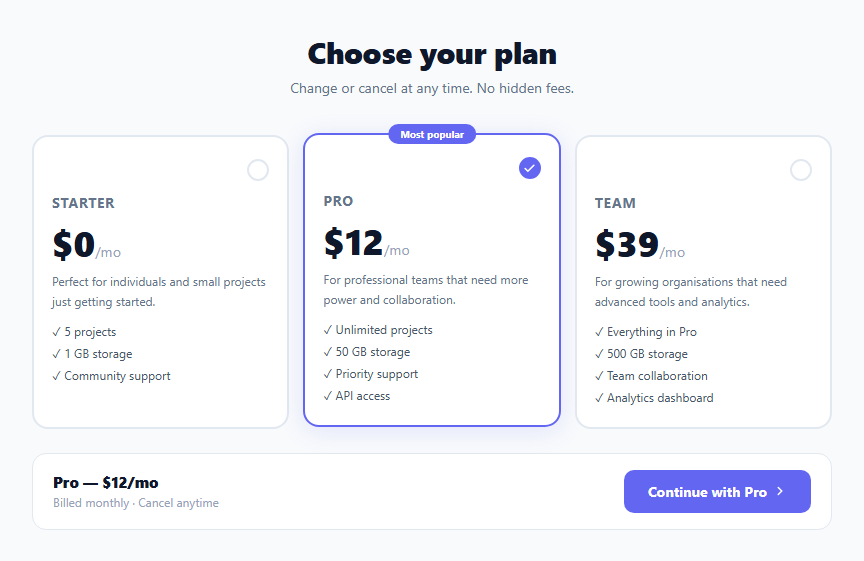
A plan selector combines the information density of a comparison table with the interaction clarity of radio buttons. Users see all plans side by side, click to select, and proceed with a single CTA. This pattern is increasingly used for upgrading, onboarding plan selection, and billing settings pages where users need to choose one plan from several options. This snippet provides a complete plan selector: three radio card inputs with CSS :has() active state, an animated check indicator, a popular badge, feature lists, and a summary bar that updates as the user selects different plans.
The CSS :has() selector for radio card state
The key technique: .plan-card:has(input:checked) .plan-inner targets the card's inner div when the hidden radio input inside it is checked. This replaces the older JavaScript class-toggle pattern entirely — no click handler needed to apply the selected visual style. :has() is supported in all modern browsers (Chrome 105+, Safari 15.4+, Firefox 121+). The border, box-shadow, and check indicator all update automatically when the radio changes.
The floating check indicator
Each .plan-check starts as an empty circle with a grey border and transparent SVG checkmark. When the card is selected (.plan-card:has(input:checked) .plan-check), the background becomes indigo and the SVG becomes white via color: #fff. The SVG inherits the text colour, making this a single CSS property change rather than multiple fill/stroke updates.
The summary bar
The bottom bar shows the selected plan name and price, updated by the JavaScript selectPlan() function. The CTA button label also updates — "Continue with Pro", "Continue with Starter" — so users always know which plan they are confirming. This reduces the cognitive load of remembering which radio they clicked.
Keyboard accessibility
Since the plan cards are label elements wrapping radio inputs, full keyboard navigation works natively: Tab to focus any radio, arrow keys to move between radios, Space to select. No JavaScript keyboard handling needed.
Connecting to Stripe
In proceedToCheckout(), replace the alert with stripe.redirectToCheckout({ priceId: PLAN_PRICE_IDS[selected] }) or a navigation to your checkout URL with the plan as a query parameter.
Handling the :has() browser support fallback
CSS :has() is supported in Chrome 105+, Safari 15.4+, and Firefox 121+. For older browser support, add a JavaScript fallback: document.querySelectorAll(".plan-card input").forEach(input => input.addEventListener("change", () => { document.querySelectorAll(".plan-card").forEach(c => c.classList.toggle("is-checked", c.contains(input))); })). Add .plan-card.is-checked .plan-inner styles alongside the :has() rules.
Build with AI
Build, Understand, Optimize, and Extend It With AI
You don't have to puzzle out the CSS-only state trick on your own. Paste this snippet's HTML, CSS, and JS into an AI coding assistant like Claude and ask it to explain exactly how the selector plan-card colon has open paren input colon checked close paren targets a parent based on a child's state, and why that removes the need for a JavaScript click handler just to toggle the active-card styling. The same assistant can help optimize it, for example checking whether the PLANS lookup object and the selectPlan function stay in sync if a fourth plan is added, or whether a JavaScript fallback is worth adding for browsers that predate wide :has() support. It's also useful for extending the effect: ask it to add an annual/monthly billing toggle that swaps every plan's displayed price, wire proceedToCheckout into a real Stripe Checkout session, or make the "Most popular" badge configurable per plan instead of hardcoded to one card. Treat the code less like a finished artifact and more like a starting point for a conversation.
Prompt to recreate it
Copy this into your AI assistant of choice to build the effect from scratch, or as a jumping-off point for your own variant:
Build a pricing plan selector in plain HTML, CSS, and vanilla JavaScript that uses the CSS :has() pseudo-class to style the selected card, with no JavaScript class-toggling for the active state.

Requirements:
- Three plan cards, each a label element wrapping a visually hidden (not display:none) radio input sharing the same name attribute, so only one can be selected at a time and the whole card is a native, keyboard-operable form control.
- Style the selected card's visual container using a CSS selector of the form .plan-card:has(input:checked) targeting descendants, applying a distinct border color and box-shadow — with zero JavaScript required to add or remove that styling when the radio's checked state changes.
- A small circular check indicator inside each card that is an empty outlined circle by default and becomes a filled, colored circle with a visible checkmark only when that card's radio is checked, again driven purely by the :has() selector rather than a class toggle.
- One card marked as the recommended/most-popular option with a floating badge label positioned above the card.
- A summary bar below the grid of cards that displays the currently selected plan's name and price and a "Continue with [Plan Name]" button whose label text updates via JavaScript whenever a different radio's change event fires.
- A checkout button click handler that, for now, can just report which plan was selected, but is written to be easily replaced with a real payment provider's checkout redirect using the selected plan's price identifier.
Want to tighten it up first? Run this prompt through the AI Prompt Studio to score it across 8 quality dimensions, catch anti-patterns, and tune the wording for Claude, ChatGPT, or Gemini before you paste it in.
Step by step
How to Use
- 1Click any plan card to select itThe selected card gets an indigo border and glow. The check indicator fills. The summary bar at the bottom updates to show the selected plan name and price. Click "Continue with X" to proceed.
- 2Update plan names, prices, and featuresEdit the plan-name, plan-price, and plan-features list inside each .plan-card label. Update the PLANS object in JS to match the names and prices for the summary bar and CTA button.
- 3Change the featured/popular planMove the class="plan-card featured" and the .plan-popular badge div to whichever plan you want to highlight as recommended. The CSS :has() active state works on all three cards equally.
- 4Wire the checkout button to StripeIn proceedToCheckout(), replace the alert with stripe.redirectToCheckout({ priceId: PLAN_PRICE_IDS[selected] }). Define PLAN_PRICE_IDS = { starter: "price_xxx", pro: "price_yyy", team: "price_zzz" } mapping plan values to Stripe price IDs.
- 5Add annual/monthly toggleSee the Pricing Toggle snippet in this library. Add it above the plan grid. Wire it to update the plan prices in both the plan-price elements and the PLANS object. Use two price sets: MONTHLY_PLANS and ANNUAL_PLANS, swapping on toggle.
- 6Export in your formatClick "HTML" for a standalone file, "JSX" for a React component with useState for selected plan, or "Tailwind" for a React + Tailwind CSS version.
Real-world uses
Common Use Cases
Got questions?
Frequently Asked Questions
.plan-card:has(input:checked) .plan-inner selects the .plan-inner element inside any .plan-card that contains a checked input. When the hidden radio input becomes checked (via click on the label or keyboard selection), the browser automatically re-evaluates :has() and applies the border, box-shadow, and check indicator styles. No click handler, no classList.add(), no JavaScript — the CSS responds to the native radio state change in real time.
Add the checked attribute to the radio input of the plan you want pre-selected: <input type="radio" name="plan" value="pro" checked>. In the JavaScript, update the initial selected variable: let selected = "pro". Also call selectPlan("pro") at the bottom of the script to sync the summary bar with the pre-selected plan on page load.
Define price IDs: const STRIPE_PRICES = { starter: "price_starter_monthly", pro: "price_pro_monthly", team: "price_team_monthly" }. In proceedToCheckout(): const stripe = Stripe("pk_live_xxx"); stripe.redirectToCheckout({ lineItems: [{ price: STRIPE_PRICES[selected], quantity: 1 }], mode: "subscription", successUrl: window.location.origin + "/success", cancelUrl: window.location.href }). Load the Stripe.js script in the HTML head.
Click "JSX" to download. Replace the radio inputs with React-controlled inputs: <input type="radio" checked={selected === "pro"} onChange={() => setSelected("pro")}>. The CSS :has() selector still works with React-rendered HTML — it responds to the DOM checked state regardless of how it was set. Manage selected with useState("pro"). Derive the summary bar content from the selected state value using the PLANS object.