Source Code
<div class="wrap">
  <div class="heading-row">
    <h2>Choose your plan</h2>
    <p>All plans include a 14-day free trial. No credit card required.</p>
  </div>
  <div class="table-scroll">
  <table class="comp-table">
    <thead>
      <tr>
        <th class="feature-col">Features</th>
        <th>
          <div class="plan-head">
            <div class="plan-name">Starter</div>
            <div class="plan-price">$0<span>/mo</span></div>
            <a href="#" class="plan-btn outline">Get started</a>
          </div>
        </th>
        <th class="featured">
          <div class="plan-head">
            <div class="popular-badge">Most popular</div>
            <div class="plan-name">Pro</div>
            <div class="plan-price">$12<span>/mo</span></div>
            <a href="#" class="plan-btn solid">Get started</a>
          </div>
        </th>
        <th>
          <div class="plan-head">
            <div class="plan-name">Team</div>
            <div class="plan-price">$39<span>/mo</span></div>
            <a href="#" class="plan-btn outline">Get started</a>
          </div>
        </th>
      </tr>
    </thead>
    <tbody>
      <tr class="section-row"><td colspan="4">Core</td></tr>
      <tr>
        <td class="feature-label">Projects</td>
        <td>5</td>
        <td class="featured">Unlimited</td>
        <td>Unlimited</td>
      </tr>
      <tr>
        <td class="feature-label">Storage</td>
        <td>1 GB</td>
        <td class="featured">50 GB</td>
        <td>500 GB</td>
      </tr>
      <tr>
        <td class="feature-label">Team members</td>
        <td>1</td>
        <td class="featured">5</td>
        <td>Unlimited</td>
      </tr>
      <tr class="section-row"><td colspan="4">Features</td></tr>
      <tr>
        <td class="feature-label">API access</td>
        <td><span class="no">✗</span></td>
        <td class="featured"><span class="yes">✓</span></td>
        <td><span class="yes">✓</span></td>
      </tr>
      <tr>
        <td class="feature-label">Custom domain</td>
        <td><span class="no">✗</span></td>
        <td class="featured"><span class="yes">✓</span></td>
        <td><span class="yes">✓</span></td>
      </tr>
      <tr>
        <td class="feature-label">Analytics</td>
        <td>Basic</td>
        <td class="featured">Advanced</td>
        <td>Advanced + Export</td>
      </tr>
      <tr>
        <td class="feature-label">Priority support</td>
        <td><span class="no">✗</span></td>
        <td class="featured"><span class="yes">✓</span></td>
        <td><span class="yes">✓</span></td>
      </tr>
      <tr class="section-row"><td colspan="4">Enterprise</td></tr>
      <tr>
        <td class="feature-label">SSO / SAML</td>
        <td><span class="no">✗</span></td>
        <td class="featured"><span class="no">✗</span></td>
        <td><span class="yes">✓</span></td>
      </tr>
      <tr>
        <td class="feature-label">Audit logs</td>
        <td><span class="no">✗</span></td>
        <td class="featured"><span class="no">✗</span></td>
        <td><span class="yes">✓</span></td>
      </tr>
      <tr>
        <td class="feature-label">SLA uptime</td>
        <td>99.5%</td>
        <td class="featured">99.9%</td>
        <td>99.99%</td>
      </tr>
    </tbody>
  </table>
  </div>
</div>
* { box-sizing: border-box; margin: 0; padding: 0; }
body { font-family: system-ui, sans-serif; background: #f1f5f9; display: flex; align-items: flex-start; justify-content: center; min-height: 100vh; padding: 24px; }
.wrap { width: 100%; max-width: 820px; }
.heading-row { text-align: center; margin-bottom: 28px; }
.heading-row h2 { font-size: 24px; font-weight: 800; color: #1e293b; margin-bottom: 8px; }
.heading-row p { font-size: 14px; color: #64748b; }
.table-scroll { overflow-x: auto; border-radius: 16px; border: 1px solid #e2e8f0; background: #fff; box-shadow: 0 2px 12px rgba(0,0,0,0.05); }
.comp-table { width: 100%; border-collapse: collapse; }
thead th { padding: 20px 16px 16px; text-align: center; vertical-align: top; font-weight: 400; border-bottom: 1px solid #e2e8f0; position: relative; min-width: 140px; }
thead th.feature-col { text-align: left; min-width: 180px; }
thead th.featured { background: #f5f3ff; border-left: 1.5px solid #6366f1; border-right: 1.5px solid #6366f1; }
.popular-badge { display: inline-block; background: #6366f1; color: #fff; font-size: 11px; font-weight: 700; padding: 3px 12px; border-radius: 20px; white-space: nowrap; }
.plan-head { display: flex; flex-direction: column; align-items: center; gap: 8px; }
.plan-name { font-size: 13px; font-weight: 700; color: #475569; text-transform: uppercase; letter-spacing: 0.5px; }
.plan-price { font-size: 28px; font-weight: 800; color: #1e293b; line-height: 1; }
.plan-price span { font-size: 13px; font-weight: 500; color: #94a3b8; }
.plan-btn { display: inline-block; padding: 8px 18px; border-radius: 8px; font-size: 13px; font-weight: 600; text-decoration: none; transition: all 0.15s; white-space: nowrap; }
.plan-btn.solid { background: #6366f1; color: #fff; }
.plan-btn.solid:hover { background: #4f46e5; }
.plan-btn.outline { border: 1.5px solid #e2e8f0; color: #475569; }
.plan-btn.outline:hover { border-color: #6366f1; color: #6366f1; }
tbody td { padding: 12px 16px; font-size: 13px; color: #475569; border-bottom: 1px solid #f1f5f9; text-align: center; }
tbody td.feature-label { text-align: left; font-weight: 500; color: #1e293b; }
tbody td.featured { background: #faf8ff; border-left: 1.5px solid #6366f1; border-right: 1.5px solid #6366f1; }
tbody tr:last-child td.featured { border-bottom: 1.5px solid #6366f1; }
.section-row td { background: #f8fafc; font-size: 11px; font-weight: 700; text-transform: uppercase; letter-spacing: 0.6px; color: #6366f1; padding: 8px 16px; text-align: left; border-bottom: 1px solid #e2e8f0; }
.yes { color: #16a34a; font-size: 16px; font-weight: 700; }
.no { color: #cbd5e1; font-size: 16px; }Learn Coding Visually
Learn to code with interactive, live-preview playgrounds — HTML, CSS, JavaScript, React & more.
 HTML Playground42 lessons · Click-based · Live preview
 CSS PlaygroundLearn CSS with a live editor
 JavaScript Playground60 lessons · DOM · Async · Canvas
 React PlaygroundLearn React with a live code editor
 GSAP PlaygroundLearn GSAP animation interactively
 SVG Playground44 lessons · shapes · paths · animation
 SCSS Playground45 lessons · Sass modules · tokens
 Tailwind PlaygroundLearn Tailwind CSS with a live editor
 Bootstrap 5 Playground50 lessons · live preview
Comparison Table — Free HTML CSS Pricing Snippet
Comparison Table · Tables · Plain HTML & CSS · Live preview
What's included
Features
About this UI Snippet
Comparison Table — Featured Column, Section Row Dividers & Check/Cross Indicators
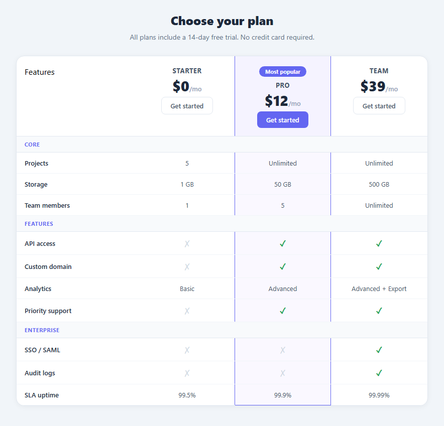
A feature comparison table is the most effective layout for communicating the difference between product tiers side by side. Instead of separate pricing cards, a comparison table lets users scan any specific feature across all plans in one eye movement — making the upgrade decision faster and clearer. This snippet provides a complete HTML and CSS comparison table with a featured column accent, section row dividers, check and cross indicators, plan CTA buttons, and horizontal scroll for mobile. No JavaScript required.
How the featured column accent works
The continuous vertical column highlight is achieved by applying the .featured class to every td in the Pro column — not just the column header. Each .featured td gets border-left: 1.5px solid #6366f1 and border-right: 1.5px solid #6366f1. The last row's .featured td also gets border-bottom. The header th.featured gets the same left and right borders. Together these create a continuous bordered box from the very top of the table to the very bottom, enclosing the entire Pro column, without any JavaScript or absolute-positioned overlay.
The .popular-badge inside the featured header uses position: absolute; top: -12px; left: 50%; transform: translateX(-50%) — the classic centering trick that floats the badge above the column header regardless of text length.
Why grey for "not included" instead of red
The .no indicator uses light grey (✗ in #94a3b8) rather than red. On a feature comparison table, most cells in the lower-tier columns will be "not included." Red is an alarming colour — a table full of red crosses makes the lower tiers look broken or dangerous rather than simply limited. Grey communicates "not available at this tier" without negative connotation, reducing visual noise while still making the tier difference clear.
Section row dividers
.section-row cells use colspan="4" to span the full table width and render a category label — Core, Features, Enterprise — in uppercase with a light background. These dividers group related feature rows into scannable sections. On a long feature list, section dividers are essential for preventing the table from becoming an undifferentiated wall of checkmarks.
Responsive horizontal scroll
A five-column comparison table is inherently wide. The .table-scroll wrapper uses overflow-x: auto so the table scrolls horizontally on narrow screens without breaking the fixed column widths. The scrollbar appears only when needed.
Adapting to your product
Replace plan names, prices, and feature rows directly in the HTML. Move the .featured class to any column. Add section-row tr elements to introduce new feature groups. For an annual billing toggle, wire in the Pricing Toggle snippet and update .plan-price textContent on switch — the table structure is unchanged.
Build with AI
Build, Understand, Optimize, and Extend It With AI
You don't have to puzzle out why the featured column border never has gaps by staring at the table markup. Paste this snippet's HTML, CSS, and JS into an AI coding assistant like Claude and ask it to explain exactly why the featured class has to be applied to every single td in the column rather than to a wrapper element, and why that only works cleanly with border-collapse set on the table. The same assistant can help optimize it — for instance asking whether a very long feature list would benefit from sticky positioning on the feature-label column so it stays visible while scrolling horizontally on mobile. It's also useful for extending the table: ask it to add a monthly/annual pricing toggle that swaps the price text without changing the table structure, generate the whole table from a plans/features data array instead of hand-written markup, or add row-level tooltips explaining technical feature names. Treat the code less like a finished artifact and more like a starting point for a conversation.
Prompt to recreate it
Copy this into your AI assistant of choice to build the effect from scratch, or as a jumping-off point for your own variant:
Build a pricing feature-comparison table in plain HTML and CSS only — no JavaScript required, no table libraries.

Requirements:
- A standard HTML table with border-collapse: collapse, one header column for feature names and one column per pricing plan, each plan header containing a name, a price, and a call-to-action link/button.
- One plan column must be visually "featured": apply a distinct background and a left/right border to every single td in that column (not just the header, not a wrapper div), plus a matching border on the header cell and a bottom border on the very last row's cell in that column, so the accent forms one unmistakably continuous box running from the top of the table to the bottom with zero gaps between rows.
- A "most popular" badge on the featured column's header, centered horizontally over the column using absolute positioning and a translateX(-50%) transform so it stays centered regardless of the badge text length.
- Section-divider rows that span the full table width (colspan across all columns) with a distinct background and uppercase label, used to group related feature rows (e.g. "Core", "Features", "Enterprise") so a long feature list doesn't read as one undifferentiated wall of rows.
- Included/excluded feature values must be rendered as a checkmark and a cross, where the "excluded" mark uses a muted gray rather than red, since a column full of red crosses reads as broken rather than simply a lower tier.
- Wrap the table in a container with overflow-x: auto so it can be scrolled horizontally on narrow viewports without breaking the column widths or wrapping cell content awkwardly.
Want to tighten it up first? Run this prompt through the AI Prompt Studio to score it across 8 quality dimensions, catch anti-patterns, and tune the wording for Claude, ChatGPT, or Gemini before you paste it in.
Step by step
How to Use
- 1Update plan names and pricesIn the HTML panel, change the plan name text, price number, and /mo period label in each th.plan-head. Update each plan-btn link text and href to your checkout URLs.
- 2Update feature row valuesChange each td content — text values for quantitative features, or a span with class="yes" for included and class="no" for excluded features. The colour is applied automatically by the class.
- 3Add or remove a plan columnAdd a new th in the thead and a matching td in every tbody and tfoot row. The table width distributes automatically. Remove a plan by deleting its th and all its td elements.
- 4Change which column is featuredRemove .featured from all current td elements in the middle column. Add .featured to all td elements in the new column you want to highlight. Move the .popular-badge div to that column header.
- 5Add new feature rowsCopy any existing tr and paste it inside the tbody. Change the .feature-label td text and the td values for each plan. Place it under the correct .section-row group to keep features organised by category.
- 6Export in your formatClick "HTML" for a standalone file, "JSX" for a React component mapping a plans array and features array, or "Tailwind" for a React + Tailwind CSS version.
Real-world uses
Common Use Cases
Got questions?
Frequently Asked Questions
The .featured class is applied to every individual td in the Pro column — not just the header or a wrapper div. Each cell gets border-left and border-right at 1.5px. Because table cells are adjacent with no gap between them (border-collapse: collapse), the borders line up perfectly to create one continuous vertical line. The last row adds border-bottom to close the box, and the header adds the top and left/right borders.
Move the .popular-badge div from the current featured th to the new th. Also move the .featured class from every td in the current column to every td in the new column — all tbody cells and the tfoot cell. The badge positioning is relative to its parent th, so it automatically centres over the new column.
See the Pricing Toggle snippet for the complete toggle implementation. Add the toggle HTML above the table. In JS, define a monthly array and an annual array indexed by plan column. On switchBilling(), update each .plan-price span textContent. The table layout does not change — only the price text updates.
The .table-scroll wrapper with overflow-x: auto already handles horizontal scrolling on narrow screens — the table maintains its full column widths and the user scrolls horizontally. For a fully stacked mobile layout, use @media (max-width: 600px) { .comp-table { display: block } tr, td { display: block } thead tr { display: none } } and add data-label attributes to cells for column context.
Yes. Click "JSX" to download. In React, define a plans array (with name, price, featured, buttonLabel) and a features array (with label, section, and a value per plan). Map plans to th columns and features to tr rows. Apply conditional className for .featured based on the plan.featured property. For Next.js, pass plans and features as props from getStaticProps.
Use the CSS Tooltip snippet from this library. Add data-tip="Explanation text" to each .feature-label td. Paste the tooltip CSS rules. The tooltip appears on hover entirely through CSS — no JavaScript needed. This is especially useful for technical feature names that need a one-sentence explanation.