Source Code
<div class="pf-wrap">
<table class="pf-table" id="pfTable">
<thead>
<tr>
<th class="pf-corner">Compare plans</th>
<th><div class="pf-plan">Free<span>$0</span></div></th>
<th class="pf-pop"><div class="pf-plan">Pro<span>$29</span><em>Popular</em></div></th>
<th><div class="pf-plan">Team<span>$79</span></div></th>
</tr>
</thead>
<tbody>
<tr><th>Projects</th><td>3</td><td class="pf-pop">Unlimited</td><td>Unlimited</td></tr>
<tr><th>Team members</th><td>1</td><td class="pf-pop">10</td><td>Unlimited</td></tr>
<tr><th>Analytics</th><td data-no></td><td class="pf-pop" data-yes></td><td data-yes></td></tr>
<tr><th>Custom domains</th><td data-no></td><td class="pf-pop" data-yes></td><td data-yes></td></tr>
<tr><th>Priority support</th><td data-no></td><td class="pf-pop" data-no></td><td data-yes></td></tr>
<tr><th>SSO & SAML</th><td data-no></td><td class="pf-pop" data-no></td><td data-yes></td></tr>
<tr class="pf-cta"><th></th><td><button type="button">Choose</button></td><td class="pf-pop"><button type="button" class="pf-primary">Choose</button></td><td><button type="button">Choose</button></td></tr>
</tbody>
</table>
</div>*{box-sizing:border-box;margin:0;padding:0}
body{font-family:system-ui,-apple-system,sans-serif;background:#f5f6fb;display:flex;justify-content:center;align-items:center;min-height:100vh;padding:24px}
.pf-wrap{width:min(720px,96vw);overflow-x:auto}
.pf-table{width:100%;border-collapse:collapse;background:#fff;border:1px solid #e7e9f2;border-radius:16px;overflow:hidden;font-size:14px}
.pf-table th,.pf-table td{padding:14px 16px;text-align:center;border-bottom:1px solid #eef0f6}
.pf-table tbody th{text-align:left;color:#3b4156;font-weight:600;white-space:nowrap}
.pf-corner{text-align:left;color:#9aa0b4;font-weight:600;font-size:13px}
.pf-plan{display:flex;flex-direction:column;align-items:center;gap:2px;color:#16182a;font-weight:700;font-size:15px}
.pf-plan span{font-size:22px;font-weight:800}
.pf-plan em{font-size:10px;font-weight:700;text-transform:uppercase;letter-spacing:.05em;color:#6366f1;background:#eef0ff;padding:2px 7px;border-radius:999px;font-style:normal}
.pf-table td{color:#3b4156}
/* Highlight the popular column with a subtle tinted band. */
.pf-pop{background:#f7f8ff}
thead .pf-pop{background:#eef0ff;position:relative}
td[data-yes]::after{content:'';display:inline-block;width:18px;height:18px;border-radius:50%;background:#10b981;-webkit-mask:url("data:image/svg+xml,%3Csvg xmlns='http://www.w3.org/2000/svg' viewBox='0 0 24 24' fill='none' stroke='white' stroke-width='3' stroke-linecap='round' stroke-linejoin='round'%3E%3Cpath d='M20 6L9 17l-5-5'/%3E%3C/svg%3E") center/12px no-repeat;mask:url("data:image/svg+xml,%3Csvg xmlns='http://www.w3.org/2000/svg' viewBox='0 0 24 24' fill='none' stroke='white' stroke-width='3' stroke-linecap='round' stroke-linejoin='round'%3E%3Cpath d='M20 6L9 17l-5-5'/%3E%3C/svg%3E") center/12px no-repeat;vertical-align:middle}
td[data-no]::after{content:'–';color:#c2c6d4;font-weight:700}
.pf-cta td{padding-top:18px;padding-bottom:18px}
.pf-cta button{font-family:inherit;font-weight:700;font-size:13px;padding:9px 18px;border-radius:9px;border:1.5px solid #d7dbe7;background:#fff;color:#3b4156;cursor:pointer;transition:transform .1s}
.pf-cta button:active{transform:scale(.96)}
.pf-cta .pf-primary{background:#6366f1;border-color:#6366f1;color:#fff}
@media(max-width:560px){.pf-table th,.pf-table td{padding:11px 9px;font-size:13px}}var table = document.getElementById('pfTable');
// Highlight the whole column on hover for easy scanning across many rows.
function setCol(index, on) {
if (index < 1) return; // skip the row-label column
var rows = table.querySelectorAll('tr');
rows.forEach(function (row) {
var cells = row.children;
if (cells[index]) cells[index].style.background = on ? 'rgba(99,102,241,.08)' : '';
});
}
table.querySelectorAll('td, thead th').forEach(function (cell) {
cell.addEventListener('mouseenter', function () { setCol(cell.cellIndex, true); });
cell.addEventListener('mouseleave', function () { setCol(cell.cellIndex, false); });
});
table.querySelectorAll('.pf-cta button').forEach(function (btn) {
btn.addEventListener('click', function () {
var plan = table.rows[0].cells[btn.parentElement.cellIndex].innerText.trim().split('\n')[0];
console.log('chose plan:', plan);
});
});Learn Coding Visually
Learn to code with interactive, live-preview playgrounds — HTML, CSS, JavaScript, React & more.
 HTML Playground42 lessons · Click-based · Live preview
 CSS PlaygroundLearn CSS with a live editor
 JavaScript Playground60 lessons · DOM · Async · Canvas
 React PlaygroundLearn React with a live code editor
 GSAP PlaygroundLearn GSAP animation interactively
 SVG Playground44 lessons · shapes · paths · animation
 SCSS Playground45 lessons · Sass modules · tokens
 Tailwind PlaygroundLearn Tailwind CSS with a live editor
 Bootstrap 5 Playground50 lessons · live preview
Pricing Feature Table — Free HTML CSS JS Plan Compare Table
Pricing Feature Table · Pricing · Plain HTML, CSS & JS · Live preview
What's included
Features
About this UI Snippet
Pricing Feature Table — Compare Plans Feature by Feature
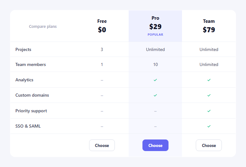
The pricing feature table is the side-by-side plan comparison you scroll to when a three-card pricing block isn't enough — a grid of features down the side and plans across the top, with ticks and dashes showing what each tier includes. This snippet builds an accessible, responsive one with a semantic HTML table, CSS, and a small JavaScript enhancement for column highlighting.
A real, semantic table
The comparison is a genuine <table> with <thead> plan headers and row <th> feature labels, so it conveys structure to screen readers and is easy to scan and maintain. border-collapse plus a rounded, clipped wrapper gives it a card-like finish without losing table semantics. On narrow screens the wrapper scrolls horizontally (overflow-x: auto) so columns never crush — the standard responsive pattern for wide comparison tables.
Check marks without icon fonts
Whether a plan includes a feature is expressed with a single data-yes or data-no attribute on the cell — no images, no icon font. A green circular check is drawn entirely in CSS by masking a circle with an inline SVG tick via -webkit-mask/mask, and a missing feature shows a muted en dash. Because the mark is generated from a data attribute, toggling a feature is a one-character markup change and the table stays clean.
Highlighting the popular plan
The recommended column carries a pf-pop class on each of its cells, which paints a subtle tinted band down the whole column and adds a "Popular" pill and a filled primary button in that plan's header and CTA row. This vertical highlight is what draws the eye to the plan you want to sell without a separate floating card.
Column hover scanning
Long comparison tables are hard to read across, so a small script highlights the entire column you're hovering. On mouseenter of any cell it tints every cell sharing that cellIndex, and clears it on mouseleave — making it easy to trace one plan's row of values down a tall table. The row-label column is skipped so only plan columns light up.
CTA row
The final row holds a "Choose" button per plan, with the popular plan's button styled as the primary action. Clicking reads the plan name from the header cell at the same column index and logs it — the hook where you'd start checkout or selection.
Customizing it
Add or remove feature rows and plan columns freely; the structure and hover logic adapt by column index. Change the accent, the tint of the popular band, or the check colour. Pair it with a pricing card block above it, a pricing toggle for monthly/yearly, and a pricing faq below.
Build with AI
Build, Understand, Optimize, and Extend It With AI
You don't have to figure out the masked-SVG checkmark trick or the column-highlight logic by hand. Paste this snippet's HTML, CSS, and JS into an AI coding assistant like Claude and ask it to explain exactly how the CSS mask property paints a colored circle in the shape of an inline SVG checkmark for cells with a data-yes attribute, and how setCol uses each cell's native cellIndex property to tint an entire column on hover without any extra data attributes. The same assistant can help optimize it, for example checking whether attaching separate mouseenter and mouseleave listeners to every single cell scales well if the table grows to dozens of rows, or whether a single delegated listener on the table would be more efficient. It's also useful for extending the effect: ask it to make the "Choose" button actually trigger a checkout flow instead of just logging to the console, add a way to collapse less-important feature rows behind a "show more" toggle, or make the popular column configurable via a single data attribute instead of hardcoded classes. Treat the code less like a finished artifact and more like a starting point for a conversation.
Prompt to recreate it
Copy this into your AI assistant of choice to build the effect from scratch, or as a jumping-off point for your own variant:
Build a responsive pricing feature comparison table in plain HTML, CSS, and vanilla JavaScript using a real semantic table element — no charting or comparison-table library.

Requirements:
- A genuine HTML table with a thead row of plan names and prices as column headers, and a tbody where each row's first cell is a feature name (a row header) followed by one cell per plan showing either a supported/unsupported indicator or a plain text value (like a number or "Unlimited").
- Render whether a plan includes a feature using a data attribute on the cell (for example data-yes or data-no) rather than typing a checkmark or dash character directly into the HTML, and draw the actual checkmark visually using a CSS mask or clip technique referencing an inline SVG path, with the excluded state showing a plain muted dash character instead.
- Give one column (the recommended/popular plan) a distinct tinted background applied to every cell in that column, plus a "Popular" label in its header and a visually distinct filled call-to-action button in its final row, while the other plans get an outlined button style.
- Add a hover behavior where moving the mouse over any single cell (in the header or body, excluding the leftmost feature-name column) highlights every other cell that shares that same column, and removes the highlight when the mouse leaves — implemented using the cell's native table column index rather than manually tracking column identifiers.
- Wrap the table in a horizontally scrollable container so it doesn't break the page layout on narrow viewports, and make sure every "Choose" button's click handler can identify which plan it belongs to by reading that plan's header cell text.
Want to tighten it up first? Run this prompt through the AI Prompt Studio to score it across 8 quality dimensions, catch anti-patterns, and tune the wording for Claude, ChatGPT, or Gemini before you paste it in.
Step by step
How to Use
- 1Paste HTML, CSS, and JSA three-plan comparison table renders.
- 2Scan the featuresTicks and dashes show what each plan includes.
- 3Hover a columnThe whole plan column highlights for scanning.
- 4Note the popular planPro shows a tinted band, pill, and primary CTA.
- 5Click ChooseThe handler logs the selected plan.
- 6Edit a featureToggle data-yes / data-no on a cell.
Real-world uses
Common Use Cases
Got questions?
Frequently Asked Questions
Each cell carries a data-yes or data-no attribute. A green circular check is rendered in CSS by masking a coloured circle with an inline SVG tick via mask and -webkit-mask, and a missing feature shows a muted en dash. Toggling a feature is a one-character markup change, with no icon font or image files.
Every cell in the recommended column carries a pf-pop class that paints a subtle tinted band down the column, and the header and CTA row add a Popular pill and a filled primary button. This vertical highlight draws the eye to the plan you want to sell without needing a separate floating card.
Wide comparison tables are hard to read across, so on mouseenter of any cell the script tints every cell sharing the same cellIndex, then clears it on mouseleave. This lets you trace one plan's values down a tall table; the row-label column is skipped so only plan columns light up.
Yes. The table sits in a wrapper with overflow-x: auto, so on narrow screens it scrolls horizontally instead of crushing the columns, and a media query tightens the padding and font size. This is the standard responsive approach for comparison tables too wide to reflow.
Render the rows from a features array and the columns from a plans array, outputting data-yes/data-no from each plan's feature map. Drive the popular class from a plan flag. For column hover, store a hovered column index in state and apply a highlight class by index rather than mutating styles directly. The table and mask CSS port unchanged.