Source Code
<div class="dct-card">
  <div class="dct-head">
    <h3>Team members</h3>
    <div class="dct-cols-wrap" id="dctWrap">
      <button type="button" class="dct-cols-btn" id="dctBtn" aria-haspopup="true" aria-expanded="false">
        <svg width="15" height="15" viewBox="0 0 24 24" fill="none" stroke="currentColor" stroke-width="2"><path d="M3 5h18M3 12h18M3 19h18"/></svg>
        Columns <span class="dct-count" id="dctCount"></span>
      </button>
      <div class="dct-menu" id="dctMenu" role="menu"></div>
    </div>
  </div>

  <div class="dct-table-wrap">
    <table class="dct-table" id="dctTable"></table>
  </div>
</div>*{box-sizing:border-box;margin:0;padding:0}
body{font-family:system-ui,-apple-system,sans-serif;background:#f8fafc;min-height:100vh;display:flex;align-items:flex-start;justify-content:center;padding:40px 24px}
.dct-card{background:#fff;border-radius:16px;padding:18px;width:100%;max-width:620px;box-shadow:0 18px 44px rgba(15,23,42,.08)}
.dct-head{display:flex;align-items:center;justify-content:space-between;margin-bottom:14px}
.dct-head h3{font-size:16px;font-weight:800;color:#0f172a}
.dct-cols-wrap{position:relative}
.dct-cols-btn{display:inline-flex;align-items:center;gap:7px;border:1.5px solid #e2e8f0;background:#fff;border-radius:9px;padding:8px 13px;font-size:13px;font-weight:700;color:#475569;cursor:pointer;transition:border-color .15s}
.dct-cols-btn:hover{border-color:#cbd5e1}
.dct-count{background:#eef2ff;color:#4f46e5;font-size:11px;font-weight:800;border-radius:999px;padding:1px 7px}
.dct-menu{position:absolute;top:calc(100% + 7px);right:0;background:#fff;border:1px solid #e2e8f0;border-radius:11px;box-shadow:0 18px 44px rgba(15,23,42,.16);padding:6px;z-index:20;width:190px;
opacity:0;transform:translateY(-6px) scale(.98);transform-origin:top right;pointer-events:none;transition:opacity .15s,transform .15s}
.dct-cols-wrap.open .dct-menu{opacity:1;transform:translateY(0) scale(1);pointer-events:all}
.dct-menu label{display:flex;align-items:center;gap:9px;padding:8px 10px;border-radius:7px;font-size:13px;font-weight:600;color:#1e293b;cursor:pointer;transition:background .12s}
.dct-menu label:hover{background:#f8fafc}
.dct-menu input{width:16px;height:16px;accent-color:#6366f1}
.dct-menu label.locked{opacity:.5;cursor:not-allowed}
.dct-table-wrap{overflow-x:auto}
.dct-table{width:100%;border-collapse:collapse;font-size:13px;min-width:380px}
.dct-table th,.dct-table td{padding:11px 13px;text-align:left;white-space:nowrap}
.dct-table thead th{background:#f8fafc;color:#475569;font-weight:700;font-size:11.5px;text-transform:uppercase;letter-spacing:.03em;border-bottom:1.5px solid #e2e8f0}
.dct-table tbody td{border-bottom:1px solid #f1f5f9;color:#334155}
.dct-table tbody tr:hover{background:#fafbfc}
.dct-table tbody td:first-child{font-weight:700;color:#0f172a}
.dct-badge{display:inline-block;padding:2px 9px;border-radius:999px;font-size:10.5px;font-weight:700}
.dct-badge.active{background:#dcfce7;color:#15803d}
.dct-badge.away{background:#fef3c7;color:#a16207}var COLUMNS = [
{ key: 'name', label: 'Name', locked: true },
{ key: 'role', label: 'Role', visible: true },
{ key: 'team', label: 'Team', visible: true },
{ key: 'email', label: 'Email', visible: true },
{ key: 'status', label: 'Status', visible: true },
];
var ROWS = [
{ name: 'Priya Nair', role: 'Engineer', team: 'Platform', email: 'priya@acme.io', status: 'active' },
{ name: 'Marcus Webb', role: 'Designer', team: 'Product', email: 'marcus@acme.io', status: 'active' },
{ name: 'Yuki Tanaka', role: 'Product Manager', team: 'Product', email: 'yuki@acme.io', status: 'away' },
{ name: 'Elena Cruz', role: 'Engineer', team: 'Platform', email: 'elena@acme.io', status: 'active' },
{ name: 'Tom Rivera', role: 'Sales Lead', team: 'Revenue', email: 'tom@acme.io', status: 'away' },
];
var table = document.getElementById('dctTable');
var menu = document.getElementById('dctMenu');
var wrap = document.getElementById('dctWrap');
function renderMenu() {
menu.innerHTML = COLUMNS.map(function (c) {
return '<label class="' + (c.locked ? 'locked' : '') + '">' +
'<input type="checkbox" data-key="' + c.key + '"' + (c.visible || c.locked ? ' checked' : '') + (c.locked ? ' disabled' : '') + '>' +
c.label + (c.locked ? ' (fixed)' : '') + '</label>';
}).join('');
}
function cell(row, key) {
if (key === 'status') {
return '<span class="dct-badge ' + row.status + '">' + (row.status === 'active' ? 'Active' : 'Away') + '</span>';
}
return row[key];
}
function renderTable() {
var shown = COLUMNS.filter(function (c) { return c.locked || c.visible; });
var head = '<thead><tr>' + shown.map(function (c) { return '<th>' + c.label + '</th>'; }).join('') + '</tr></thead>';
var body = '<tbody>' + ROWS.map(function (r) {
return '<tr>' + shown.map(function (c) { return '<td>' + cell(r, c.key) + '</td>'; }).join('') + '</tr>';
}).join('') + '</tbody>';
table.innerHTML = head + body;
document.getElementById('dctCount').textContent = shown.length;
}
menu.addEventListener('change', function (e) {
var cb = e.target;
if (cb.type !== 'checkbox') return;
var col = COLUMNS.filter(function (c) { return c.key === cb.dataset.key; })[0];
if (col && !col.locked) { col.visible = cb.checked; renderTable(); }
});
document.getElementById('dctBtn').addEventListener('click', function () {
wrap.classList.toggle('open');
this.setAttribute('aria-expanded', wrap.classList.contains('open'));
});
document.addEventListener('click', function (e) {
if (!wrap.contains(e.target)) { wrap.classList.remove('open'); document.getElementById('dctBtn').setAttribute('aria-expanded', 'false'); }
});
renderMenu();
renderTable();Learn Coding Visually
Learn to code with interactive, live-preview playgrounds — HTML, CSS, JavaScript, React & more.
 HTML Playground42 lessons · Click-based · Live preview
 CSS PlaygroundLearn CSS with a live editor
 JavaScript Playground60 lessons · DOM · Async · Canvas
 React PlaygroundLearn React with a live code editor
 GSAP PlaygroundLearn GSAP animation interactively
 SVG Playground44 lessons · shapes · paths · animation
 SCSS Playground45 lessons · Sass modules · tokens
 Tailwind PlaygroundLearn Tailwind CSS with a live editor
 Bootstrap 5 Playground50 lessons · live preview
Data Table Column Toggle — Show/Hide Columns UI
Data Table Column Toggle · Tables · Plain HTML, CSS & JS · Live preview
What's included
Features
About this UI Snippet
Data Table Column Toggle — Show/Hide Columns with a Picker Dropdown
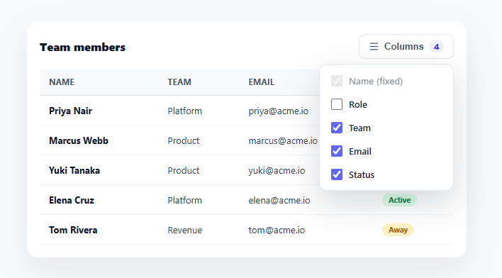
Dense data tables try to show everything, and on smaller screens or for focused tasks that's too much. Letting users pick which columns they see — a "Columns" dropdown of checkboxes — turns an overwhelming grid into one tailored to what each person actually needs. This snippet builds that column-toggle pattern in plain HTML, CSS, and vanilla JavaScript: a checklist dropdown, a locked always-visible column, and a table that re-renders to match.
Columns as data, visibility as state
The table is defined by a COLUMNS array, each entry carrying a key, a label, and a visibility flag (plus an optional locked). renderTable() filters that array to the currently-visible columns and builds the header and every row from the result — so showing or hiding a column is just flipping its visible flag and re-rendering. There's no fragile per-column DOM manipulation (hiding <td>s by index, which breaks the moment columns reorder); the table is always a clean projection of the column config, which is the robust way to do this.
A locked column that can't be turned off
Some columns are the table's anchor — usually the name or ID that identifies each row. Marking a column locked keeps its checkbox checked and disabled in the picker (shown as "Name (fixed)") and always includes it in the render, so a user can't accidentally hide the one column that makes the rest meaningful. This guard is what keeps the feature from producing a useless table of anonymous data.
The picker dropdown
A "Columns" button opens a dropdown of checkboxes, one per column, with a live count badge showing how many are currently visible. Toggling a checkbox updates that column's flag and immediately re-renders the table. The dropdown is a standard menu: it opens on click, closes on an outside click, animates in with opacity and transform only, and the button carries aria-haspopup and a toggled aria-expanded. The count badge gives instant feedback ("4 of 5 shown") without opening the menu.
Cell rendering that handles types
Not every column is plain text — a status column renders a colored badge, for instance. A small cell() function maps a column key to its rendered content, so special columns format correctly while the rest fall through to their raw value. This keeps the render loop generic (it doesn't care what a column contains) while still supporting rich cells, and it's the hook where you'd add formatting for dates, currency, or links.
Horizontal scroll and responsive intent
The table sits in an overflow-x: auto wrapper so that even with several columns shown it stays usable on narrow screens — and the whole point of column toggling is that users on small screens can hide what they don't need to avoid that scroll entirely. The two work together: the toggle is the primary tool for fitting the table to the viewport, and horizontal scroll is the graceful fallback when many columns are kept.
Persisting the user's choice
The visible-column set is exactly the kind of preference worth remembering. Because visibility lives in the COLUMNS config, persisting it is trivial — save the visible keys to localStorage on change and restore them on load — so a user's tailored view survives a refresh. The FAQs cover that plus per-user server-side persistence for logged-in apps.
Build with AI
Build, Understand, Optimize, and Extend It With AI
You don't have to reason through the render pipeline by memory. Paste this snippet's HTML, CSS, and JS into an AI coding assistant like Claude and ask it to explain exactly how renderTable filters the COLUMNS array before building the header and body strings, and why that approach avoids the bugs that come from hiding table cells by index instead. The same assistant can help optimize it — ask whether rebuilding the entire table's innerHTML on every checkbox toggle is wasteful for a table with hundreds of rows, and what a more surgical DOM update would look like. It's also useful for extending the picker: ask it to add drag-to-reorder columns that changes the COLUMNS array order, a "reset to default" button, or saving the visible column set to localStorage so it survives a page refresh. Treat the code less like a finished artifact and more like a starting point for a conversation.
Prompt to recreate it
Copy this into your AI assistant of choice to build the effect from scratch, or as a jumping-off point for your own variant:
Build a data table with a "Columns" show/hide picker dropdown in plain HTML, CSS, and JavaScript — no library.

Requirements:
- Define the table's structure as a COLUMNS array of objects, each with a key, a label, a visible boolean, and an optional locked flag — never hardcode the table headers or cells directly in markup.
- Write a single render function that filters COLUMNS down to the ones that are locked or visible, then builds both the table header row and every body row from that filtered list, so the header and body can never drift out of sync with each other.
- A locked column must always render regardless of its visible flag, and its checkbox in the picker must render checked and disabled, so users can never hide the column that identifies each row (e.g. a name or ID column).
- A "Columns" trigger button opens a dropdown menu of one checkbox per column; toggling any non-locked checkbox must update that column's visible flag and immediately re-render the table.
- Show a live count badge on the trigger button reflecting how many columns are currently visible, updated every time the render function runs.
- Implement a generic cell-rendering function that maps a column's key to its displayed content, so most columns fall through to the row's plain value while at least one specific column (e.g. a status field) renders as a colored badge instead of raw text.
- Close the dropdown menu when a click occurs outside of it, and animate the menu's appearance using only opacity and transform so it never causes a layout shift.
- Wrap the table in a horizontally scrollable container so it stays usable even when many columns are shown at once on a narrow screen.
Want to tighten it up first? Run this prompt through the AI Prompt Studio to score it across 8 quality dimensions, catch anti-patterns, and tune the wording for Claude, ChatGPT, or Gemini before you paste it in.
Step by step
How to Use
- 1Paste HTML, CSS, and JSA team-members table renders with all columns shown and a "Columns" button showing the visible count.
- 2Open the column pickerClick "Columns" to open a checklist of every column; Name is locked and shown as "(fixed)".
- 3Toggle columnsUncheck a column (e.g. Email) — it disappears from the table instantly and the count badge updates.
- 4Try the locked columnNote that Name can't be unchecked, so the table always keeps the column that identifies each row.
- 5Edit columns and dataChange the COLUMNS array (keys, labels, locked) and the ROWS data — the picker and table rebuild from them.
- 6Persist the choiceSave the visible column keys to localStorage on change and restore on load so the user's view survives a refresh.
Real-world uses
Common Use Cases
Got questions?
Frequently Asked Questions
Because visibility is stored on the COLUMNS config, save the visible keys (COLUMNS.filter(c => c.visible || c.locked).map(c => c.key)) to localStorage whenever a checkbox changes, and on load read them back and set each column's visible flag accordingly before the first renderTable(). For a logged-in app, store the preference server-side against the user so it follows them across devices.
Hiding cells by index (e.g. display:none on the nth <td>) is fragile — it breaks if columns reorder, and you must keep header and body indices in sync manually. Rendering both the header and rows from the same filtered column array means the table is always a correct projection of the config, with no index bookkeeping, which is far more robust as the table grows.
Mark them locked in the COLUMNS array — the picker renders their checkbox as checked and disabled, and renderTable() always includes locked columns regardless of the visible flag. This guarantees the row-identifying column (name, ID) is always present so the rest of the data stays meaningful.
For reordering, make the picker a drag-sortable list and reorder the COLUMNS array on drop — since the table renders from the array order, it reflects the new order automatically. For pinning a column to the left, render it in a separate sticky-positioned column or apply position: sticky to its cells; the visibility logic stays the same.
In React, hold the columns config (with visibility) in useState and derive the visible set with useMemo, rendering the table and picker from it; in Vue, use a reactive columns array with computed; in Angular, use a component array with getters. The filter-and-render approach is identical — only the per-toggle re-render moves into the framework's reactivity.