You Might Also Like
Learn Coding Visually
Learn to code with interactive, live-preview playgrounds — HTML, CSS, JavaScript, React & more.
 HTML Playground42 lessons · Click-based · Live preview
 CSS PlaygroundLearn CSS with a live editor
 JavaScript Playground60 lessons · DOM · Async · Canvas
 React PlaygroundLearn React with a live code editor
 GSAP PlaygroundLearn GSAP animation interactively
 SVG Playground44 lessons · shapes · paths · animation
 SCSS Playground45 lessons · Sass modules · tokens
 Tailwind PlaygroundLearn Tailwind CSS with a live editor
 Bootstrap 5 Playground50 lessons · live preview
Tactile Brutalist Press Button — HTML CSS JS Snippet
Tactile Brutalist Press Button · Buttons · Plain HTML, CSS & JS · Live preview
What's included
Features
About this UI Snippet
Tactile Brutalist Press Button — Hard Offset Shadow, Physical Press Animation & High-Contrast UI
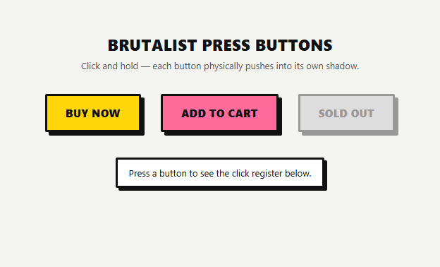
Neumorphism dominated button design in the early 2020s: soft, low-contrast surfaces with blurred dual shadows meant to look carved out of a single material. It looked elegant in a design file and tested poorly in the real world — low contrast made buttons hard to see, and the blurred shadow gave no clear affordance for what was actually clickable. This snippet is the opposite approach: a tactile, brutalist button that communicates "this is a physical, pressable object" through hard edges, flat saturated color, and a shadow that behaves like a real 3D offset rather than a soft glow.
Why brutalist, tactile design fits 2026 interfaces
Interface design in 2026 has swung toward directness and high contrast, partly as a reaction to the sameness of soft, blurred, low-information UI, and partly because accessibility-first design demands stronger visual distinction between interactive and static elements. A brutalist button uses a thick 3px solid black border, a completely flat fill color with no gradient, and a hard-edged box-shadow: 5px 5px 0 #111 — note there is no blur radius, which is the detail that separates this from a conventional drop shadow and makes the shadow read as a literal offset silhouette sitting behind the button, like a printed sticker peeling slightly off the page. This aesthetic borrows directly from print design, punk zine layouts, and early web brutalism, and it is being reintroduced deliberately in product UI because it is unmistakably legible: users do not need to guess whether something is clickable.
The physical press mechanic
The defining interaction in this snippet is not the resting appearance, it's what happens on press. On :active, the button's transform shifts by exactly the same distance as the shadow offset — translate(5px, 5px) against a 5px 5px shadow — while the box-shadow itself collapses to 0 0 0. The visual result is that the button appears to travel down into the space the shadow was occupying, exactly as if a raised physical object were being pushed flush against the surface behind it. This only reads correctly if the translate distance and the shadow's default offset match precisely; a common mistake is to translate more or less than the shadow offset, which breaks the illusion and makes the movement look arbitrary rather than mechanical.
Why the transition is short and linear-feeling, not springy
The CSS transition: transform 0.08s ease, box-shadow 0.08s ease is deliberately fast and un-bouncy. Brutalism as a visual language is about directness, not playfulness — a soft spring or elastic easing curve would undercut the hard-edged aesthetic by making the press feel cushioned. An 80ms linear-feeling transition keeps the interaction snappy and immediate, closer to a mechanical switch than a squishy button. A subtle hover state is included too: on hover the button lifts by 1px in the opposite direction with a slightly larger shadow, previewing the pressable affordance before the user commits to a click.
Accessibility and keyboard support
Because :active only fires reliably for pointer interactions in some browsers, this snippet also toggles an .is-pressed class via keydown/keyup listeners for Space and Enter, so keyboard users see the identical press animation, not just a focus ring. A visible :focus-visible outline (a thick offset outline, matching the brutalist language rather than a soft browser-default blue ring) ensures keyboard focus is unmistakable. The high-contrast black-on-saturated-color palette used here (#ffd60a yellow, #ff6b9a pink, #d3ff5c lime) is intentional: this style should not be softened with muted pastels, since low contrast defeats the entire premise of a tactile, unmistakably clickable button.
Build with AI
Build, Understand, Optimize, and Extend It With AI
Paste this snippet's HTML, CSS, and JS into an AI coding assistant like Claude and ask it to explain exactly why the :active transform value has to numerically match the resting box-shadow offset for the "press into the shadow" illusion to read correctly — that relationship is the entire trick behind the animation and is worth understanding before you start customizing it. You can also ask the assistant to help you build a Tailwind-only version using arbitrary value utilities for the hard shadow and active-state transform, or to add a third "long-press" visual state for buttons that trigger a destructive or slow action. It's a good candidate for asking the assistant to audit for accessibility gaps too, such as whether the keyboard press animation and focus outline remain distinct enough from each other when both are visible at once.
Prompt to recreate it
Copy this into your AI assistant of choice to build the effect from scratch, or as a jumping-off point for your own variant:
Build a tactile, brutalist-style button component in plain HTML, CSS, and JavaScript with a hard offset shadow that visually collapses when the button is pressed.

Requirements:
- Each button has a thick (3-4px) solid, high-contrast border, a flat saturated fill color with no gradient or blur, minimal or no border-radius, and a box-shadow with zero blur radius offset diagonally (e.g. 5px 5px 0 #000) so it reads as a literal object silhouette rather than a soft drop shadow.
- On :active (and via an equivalent keyboard-triggered state for Space/Enter activation), the button must translate by the exact same distance as its resting shadow offset while the shadow itself shrinks to zero, so it looks like the button physically presses down into the space the shadow occupied.
- Use a fast, non-bouncy transition (around 80-120ms, linear or ease, not a spring/elastic curve) on transform and box-shadow only — the interaction should feel direct and mechanical, not soft or playful.
- Include a subtle hover state that slightly lifts the button and enlarges its shadow before it is pressed, to preview the pressable affordance.
- Provide at least 2-3 button variants in different flat saturated colors, plus a properly styled disabled state (muted colors, cursor: not-allowed) that keeps the same thick-border shape.
- Ensure the button remains keyboard accessible: a visible, high-contrast focus outline distinct from the hover/press styling, and identical press-animation behavior whether triggered by mouse or keyboard.
Want to tighten it up first? Run this prompt through the AI Prompt Studio to score it across 8 quality dimensions, catch anti-patterns, and tune the wording for Claude, ChatGPT, or Gemini before you paste it in.
Step by step
How to Use
- 1Press and hold a buttonClick and hold any enabled button in the demo. Notice the button translates diagonally by the exact distance its shadow was offset, and the shadow itself shrinks to zero — this is the "press into the shadow" mechanic driven entirely by the :active pseudo-class.
- 2Match the translate distance to the shadow offsetThe resting state uses box-shadow: 5px 5px 0 #111 and :active uses transform: translate(5px, 5px). These two numbers must match exactly, or the press will look like the button is floating rather than sinking into place. If you change the shadow offset, update the active-state transform to match.
- 3Add or change color variantsDuplicate a .brute-yellow style block, rename the class (e.g. .brute-blue), and set a flat, saturated background color. Keep the 3px solid #111 border and the box-shadow color unchanged across variants so the tactile language stays consistent regardless of fill color.
- 4Keep keyboard users in syncThe JS toggles an .is-pressed class on keydown/keyup for Space and Enter so keyboard activation shows the same press animation as a mouse click. If you add new buttons dynamically, re-attach these listeners or delegate them from a parent container.
- 5Style the disabled state deliberatelyThe SOLD OUT button demonstrates a disabled state: a muted grey fill, grey border and shadow, and cursor: not-allowed. Keep the same thick-border shape so disabled buttons are still recognizable as buttons, just visibly inactive.
- 6Export and drop into your interfaceClick HTML to download a standalone file, or JSX for a React component. In Tailwind, recreate the shadow with an arbitrary value like shadow-[5px_5px_0_#111] and the active state with active:translate-x-[5px] active:translate-y-[5px] active:shadow-none.
Real-world uses
Common Use Cases
Got questions?
Frequently Asked Questions
The illusion of the button pressing "into" its shadow only works if the two numbers match. The shadow at rest represents the distance between the button's top surface and the surface behind it. When you translate the button by that same distance while shrinking the shadow to zero, the button visually lands exactly where the shadow used to end, simulating it physically compressing flat. If the translate distance is smaller or larger than the shadow offset, the motion looks disconnected from the shadow and breaks the physical metaphor.
You can, but it works against the aesthetic. Brutalist design specifically rejects the soft, friendly rounded-corner language of neumorphism and most default UI kits in favor of sharp, deliberate edges. This snippet uses border-radius: 2px, just enough to avoid razor-sharp corners rendering awkwardly on some displays, while still reading as essentially square. If you need heavier rounding for brand consistency, consider whether the hard-offset shadow technique still fits your visual language, since the combination of soft corners and a hard shadow can look inconsistent.
Adjust the transition duration on .brute-btn — 0.08s is very fast and mechanical; going up to 0.12-0.15s still feels responsive but slightly softer, while dropping below 0.05s can feel too abrupt to register as an animation at all. Keep the easing as ease or linear rather than a bouncy cubic-bezier, since spring easing contradicts the direct, un-cushioned feel that defines this style.
Yes. The core press mechanic relies on :active, which touch browsers trigger on touchstart and release on touchend, so the press-and-release animation still plays correctly on mobile. The hover lift effect simply will not trigger on touch devices, which is expected and harmless — the primary tactile feedback (the press itself) is preserved regardless of input method.
Add the disabled attribute to the button and rely on the :disabled CSS selector already in this snippet, which swaps the fill, border, and shadow to a muted grey while keeping the same thick-border shape and setting cursor: not-allowed. This keeps the disabled button recognizable as the same component family rather than looking like a different, broken element.