You Might Also Like
Learn Coding Visually
Learn to code with interactive, live-preview playgrounds — HTML, CSS, JavaScript, React & more.
 HTML Playground42 lessons · Click-based · Live preview
 CSS PlaygroundLearn CSS with a live editor
 JavaScript Playground60 lessons · DOM · Async · Canvas
 React PlaygroundLearn React with a live code editor
 GSAP PlaygroundLearn GSAP animation interactively
 SVG Playground44 lessons · shapes · paths · animation
 SCSS Playground45 lessons · Sass modules · tokens
 Tailwind PlaygroundLearn Tailwind CSS with a live editor
 Bootstrap 5 Playground50 lessons · live preview
Checkout Trust & Security Badge Strip — HTML CSS JS Snippet
Checkout Trust & Security Badge Strip · Cards · Plain HTML, CSS & JS · Live preview
What's included
Features
About this UI Snippet
Checkout Trust & Security Badge Strip — Secure Checkout Badges, Payment Icons & Tooltip Reassurance for Higher Conversion
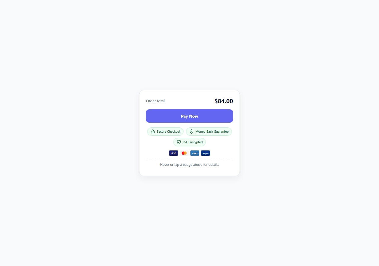
Cart and checkout abandonment is one of the most expensive UX failures in ecommerce, and a meaningful share of it comes down to a single moment of hesitation right before a customer commits their card details: *is this actually safe?* Trust-driven UX addresses this directly by surfacing concrete, verifiable security and guarantee signals at the exact point of highest anxiety — immediately below the pay button — rather than burying them in a footer or terms page nobody reads before checking out. This snippet builds a compact, interactive trust badge strip: a "Secure Checkout" lock badge, a money-back guarantee badge, an SSL encryption badge, and a row of accepted payment method marks, each with a hover/tap tooltip that gives one concrete sentence of reassurance rather than a vague icon alone.
Why visible trust signals matter more in 2026 checkout design
As more of the web fills with AI-generated content, synthetic reviews, and increasingly convincing phishing pages, users have become more skeptical by default, and generic trust badges that used to work on visual pattern-matching alone (a small padlock icon, a vague "100% Secure" ribbon) now carry less weight because they are trivial to fake. The trust-driven UX pattern that actually moves the needle in 2026 pairs a recognizable badge with a specific, checkable claim: not just an SSL icon, but a tooltip explaining what SSL actually protects; not just a guarantee ribbon, but the actual refund window ("30 days, no questions asked"). Specificity is what separates a genuine trust signal from decorative badge-wallpaper that users have learned to tune out.
Structure: badges, payment marks, and the reassurance tooltip
The strip is built from two visually distinct badge types. The three pill-shaped .trust-item buttons (Secure Checkout, Money-Back Guarantee, SSL Encrypted) use a soft green palette (#f0fdf4 background, #166534 text) that borrows the universal "safe/good" association from status colors elsewhere in the product, paired with a simple inline SVG icon — a padlock, a shield-with-checkmark, and a shield-with-check for SSL — drawn directly in markup so no icon font or external asset request is needed. Below the trust pills sits a row of .pay-icon payment method marks, deliberately built as generic inline SVG rectangles with initials rather than real brand logos, since reproducing actual card network logos requires their brand guidelines and licensing; the point for this snippet is to demonstrate the pattern and layout, not to ship production-ready brand assets. Both badge types share one tips object keyed by a data-tip attribute, and hovering, focusing, or tapping any badge updates a single shared .tooltip-box beneath the row with that badge's specific reassurance sentence.
Interaction: hover for desktop, tap for touch, focus for keyboard
Because trust signals need to work identically for mouse, keyboard, and touch users, each badge listens for four separate events: mouseenter/mouseleave for hover, focus/blur for keyboard tabbing, and click for touch devices where hover does not exist. All four route through the same showTip(key) function, which looks the badge's key up in the shared tips object and writes the matching sentence into the tooltip box, adding an .active class that darkens the text so the currently-shown tip is visually distinct from the idle placeholder copy. This single-shared-tooltip approach (versus a separate floating tooltip per badge) keeps the component lightweight and avoids the z-index and positioning complexity that per-element floating tooltips typically introduce, while still giving every badge in the strip its own specific, checkable claim.
Where this sits in a real checkout flow
The demo wraps the strip in a minimal checkout mock — an order total, a primary "Pay Now" button, and the trust strip immediately beneath it — because placement matters as much as content. Trust signals shown far from the actual payment action (e.g. only in a footer) do far less to reduce last-second hesitation than the same signals shown in the direct visual path between "I'm about to pay" and "I clicked pay." Keep the strip close to the payment button, keep each badge's claim concrete and specific, and avoid stacking more than four or five badges, since an overcrowded trust strip starts to look like noise rather than a credible, scannable set of guarantees.
Build with AI
Build, Understand, Optimize, and Extend It With AI
Paste this snippet's HTML, CSS, and JS into an AI coding assistant like Claude and ask it to walk through how the shared data-tip/tips-object pattern lets one .tooltip-box serve every badge in the strip, so you understand the tradeoff versus giving each badge its own floating tooltip before you decide which approach fits your real checkout page. It's also worth asking the assistant to help you replace the placeholder payment icons with your actual payment processor's official brand SVGs while keeping the tooltip wiring intact, and to add an aria-live region so the tooltip text change is announced to screen reader users automatically on focus. Finally, ask it to help you A/B test different badge combinations or tooltip copy by extracting the tips object into an easily swappable config so you can measure which specific trust claims actually move your checkout completion rate.
Prompt to recreate it
Copy this into your AI assistant of choice to build the effect from scratch, or as a jumping-off point for your own variant:
Build a checkout trust and security badge strip in plain HTML, CSS, and JavaScript that sits beneath a "Pay Now" button in a small checkout mock.

Requirements:
- Include at least three trust badges (for example Secure Checkout with a lock icon, a money-back guarantee, and SSL Encrypted) built as real button elements with inline SVG icons, no external icon fonts or images.
- Include a small row of generic (non-trademarked) payment method marks built as simple inline SVGs, each individually hoverable/tappable like the trust badges.
- All badges share a single tooltip display area beneath the strip. Hovering, keyboard-focusing, or tapping any badge updates that shared area with one specific, concrete reassurance sentence unique to that badge (not a vague "100% Secure" placeholder) — implement this via a single lookup object keyed by a data attribute, not per-badge floating tooltips.
- Wire up all the necessary events so the interaction works identically across mouse (hover), keyboard (focus/blur), and touch (tap/click) input.
- Wrap the strip in a minimal checkout mock (an order total and a primary pay button) so the strip's placement directly beneath the payment action is demonstrated, not just the badges in isolation.
- Keep the whole component self-contained, accessible (focusable badges, sufficient color contrast), and free of any real trademarked brand logos.
Want to tighten it up first? Run this prompt through the AI Prompt Studio to score it across 8 quality dimensions, catch anti-patterns, and tune the wording for Claude, ChatGPT, or Gemini before you paste it in.
Step by step
How to Use
- 1Hover, tab, or tap a badgeHover any trust pill or payment icon with a mouse, tab to it with the keyboard, or tap it on a touch device. The shared .tooltip-box beneath the strip updates with that badge's specific reassurance sentence, pulled from the tips object in the JS by matching the data-tip key.
- 2Add a new trust badgeCopy a .trust-item button, give it a new data-tip value (e.g. "tip-privacy"), swap the inline SVG icon path, and add a matching entry to the tips object in JS keyed by that same string, e.g. tips["tip-privacy"] = "We never sell your personal data to third parties."
- 3Replace the placeholder payment icons with your ownThe .pay-icon marks are generic inline SVGs with initials, not real brand logos — replace them with your payment processor's official brand SVGs (check each network's brand guidelines before using their logo) and keep each one wrapped with a data-tip attribute so the tooltip pattern still works.
- 4Write specific, checkable tooltip copyAvoid vague reassurance like "100% Secure!" — state the actual mechanism or policy: what encryption standard is used, how many days the guarantee window is, or what specifically is never shared. Specific claims read as more credible and are what actually reduces checkout hesitation.
- 5Position the strip directly beneath the pay buttonTrust signals work best placed in the direct visual path right after the primary payment action, not in a page footer. Keep the .trust-strip and .pay-icons rows immediately below .pay-btn as shown in this demo's .checkout-mock structure.
- 6Export and integrate into your real checkoutClick HTML to download a standalone file, or JSX for a React component. Wire the tips object to real content from your legal/policy pages so the guarantee window and security claims shown always match your actual current policy.
Real-world uses
Common Use Cases
Got questions?
Frequently Asked Questions
For a live production checkout, use the official brand assets from each payment network (Visa, Mastercard, PayPal, etc.) after reviewing their brand usage guidelines, since most networks have specific rules about how their logo can be displayed. The generic initials-based SVG marks in this snippet exist to demonstrate the layout and interaction pattern without touching real trademarked logos — swap them out before shipping to production.
Concrete, specific trust signals placed near the payment action are well documented to reduce checkout hesitation, particularly for first-time customers or higher-value purchases, because they directly address the "is this safe" moment of doubt. The effect is strongest when the claims are specific and verifiable (a named encryption standard, an exact refund window) rather than vague marketing language, and when the badges are placed in the direct visual path of the payment button rather than buried in a footer.
Replace the static tips object with data fetched from your policy or legal content source (a CMS field, a config file, or an API response) at page load, keeping the same data-tip key structure so the showTip() lookup logic does not need to change. This ensures the guarantee window, security claims, and payment options shown always reflect your current actual policy rather than stale hard-coded copy.
The badges are real button elements that receive focus and trigger the tooltip update on both focus and blur, so keyboard users see the same reassurance text as mouse users. For stronger screen reader support, consider adding aria-live="polite" to the .tooltip-box element so its content change is announced automatically when a badge receives focus, rather than relying on the user to notice the visual text change.
Most conversion research suggests three to five well-chosen, specific trust signals is the effective range — beyond that, badges start to visually compete with each other and can read as compensating for something ("why do they need to reassure me this much?") rather than as straightforward confidence-building. This snippet's three trust pills plus a small payment-icon row sits comfortably within that range.